profound-labs / wallcalendar

Wallcalendar LaTeX documentclass
Other
90 stars 24 forks source link

11x17 half/half layout #4

Closed anarcat closed 6 years ago

anarcat commented 6 years ago

Hi!

Those calendars seem to be designed towards a single-page, 8.5x11 (or A4 in metric) but I would like to print a more classic "split in half" calendar (with a spiral binding in the middle) which is usually built with a larger 11x17" (or A3 in metric) sheet split in half.

The biggest advantage is that there is more room in the calendar part of the sheet to write stuff down. In the "small landscape" layout, there is not much room for people to write notes in the calendar, and I'd like to make that better. It would also mean writing the events directly in the calendar grid instead of below the grid.

Have you considered working on such a layout? How much work would be involved in porting this?

Thanks!

gambhiro commented 6 years ago

Hello there, interesting idea.

The origin of this class is that I produce wall calendars with it. So the examples are all about that sort of layout, where you want an image and the days on the wall, but not for taking notes or making schedules.

Implementing a different layout is certainly possible. There is a command that gets called for every month to do page layout. This is empty at the start, and will do nothing if not redefined, so there are no assumptions about how it should lay out the elements. Each layout design redefines this command to specify how the pages should be produced.

Two pages per month (one side photo, one side notes) are not a problem either.

Could you add an image of a good example of the layout you have in mind? A photo would be best.

I don't have time to design it now but I'm happy to give guidance or I might come back to it later.

anarcat commented 6 years ago

This is pretty much what I'm trying to replicate:

a two-page wall calendar with a spiral binding in the middle, photo on top, grid below

I would describe this as a "two-page wall calendar with a spiral binding in the middle, photo on top, grid below, about A3 sized". I also want the "holidays" to be inline, directly in the grid boxes, as a small note so there's still room for hand-written stuff. Here's another example which show that aspect better:

similar calendar, showing events in days in subscript

It's pretty much "two pages per month", but I couldn't find such an example in the docs. Did I miss something?

I must admit my experience with Latex graphic layout gymnastic are limited and it's where I generally give up angrily whenever I try to make sense of things. :) I would be very happy to try if you give me a few hints to get started though. So far I'm down to using ODT or PDF templates and it hurts just to think about going that route. :/

gambhiro commented 6 years ago

Thanks for the images and description. It looks useful too.

I would like to give it a go sometime.

Do you need this by some particular time, for printing a personal calendar for example?

anarcat commented 6 years ago

yeah, i want to print this for the new year, and would like proof-reading samples by early December. No pressure though, I can always fallback to doing the stuff myself, either in LaTeX (unlikely, TBH) or (more likely) as SVG templates.

one thing that's tricky in that layout is that it needs to be printed recto-verso and my mind melts just to think how it would actually lay out in a PDF document. Maybe it would be easier (and require less post-processing) to print it on A4 (US legal) instead and just join those instead of cutting a A3/11x17.

thank you so much for your consideration!

gambhiro commented 6 years ago

Checkout the notes-page branch and take a look at doc/examples/cal-photo-and-notes.tex.

Link to the pdf: cal-photo-and-notes.pdf

Also see screenshots below. Looking quite good I think!

Is this the sort of thing you had in mind?

Try to adapt the example and let me know if you get stuck. I would agree that it is not the most straightforward to understand where to manipulate which part of the calendar.

I recommend cloning the notes-page branch, and copying the example and its asset files (data, photos and fonts folders) to the project root, then compiling the document there.

This is in order to make sure the wallcalendar.cls, .lua scripts and i18n/ files are loaded from the local folder, not from the system folders (from TeXLive for example). If you compile directly in the doc/examples folder, latex will not tell you that these files are missing, it will instead load them from the system folders and then error out with obscure messages. I usually have symlinks setup in doc/examples which point back to ../../wallcalendar.cls and so on, but copying is more clear in terms of you knowing what is happening.

cd wallcalendar
cp doc/examples/cal-photo-and-notes.tex .
cp -r doc/examples/data .
cp -r doc/examples/photos .
cp -r doc/examples/fonts .

Then compile:

lualatex -interaction=nonstopmode -halt-on-error ./cal-photo-and-notes.tex

How are you planning to produce your calendar? It can be printed on a home printer, an inkjet on thicker (120-150gsm) glossy paper can produce nice results. But you also have to trim and bind, so taking the PDF (with cropmarks, use the showtrims option) to a printing shop might be better.

The first page have to be a title page (or empty) so that the following pages are photo and notes as facing pages. The facing photo and note pages don't have to be rotated. If the printer can do two-sided print (also called duplex print) then select Duplex over long edge. Or else the pages have to be turned manually in which case it will depend on the machine.

I assumed you would want to print on A4 sheets, so the spacing is tweaked for looking good at that size.

The effective calendar size have to be smaller because you want to cut the photo pages such that the edge of the photo extends ~3mm over the margin (called bleed image cut), and so the bleed space and trim marks also have to fit on that A4 sheet.

The devil is in the details, several parts have to be aligned and tweaked by hand to match up.

The images have to be cropped to the correct aspect ratio, and include them that way.

The days can have a background photo (like the Bombadil image in the example) but this is done manually by positioning extra \node elements over the calendar.

cal-photo-and-notes pdf_078

With the showtrims option enabled:

cal-photo-and-notes pdf_079

anarcat commented 6 years ago

On 2018-10-26 08:15:52, Gambhiro wrote:

Checkout the notes-page branch and take a look at doc/examples/cal-photo-and-notes.tex.

Link to the pdf: cal-photo-and-notes.pdf

Also see screenshots below. Looking quite good I think!

Oh wow, awesome! :)

It looks gorgeous, thanks!

Is this the sort of thing you had in mind?

I'll have to try out a print first, but that's pretty much it, yes!!

Try to adapt the example and let me know if you get stuck.

Will do! And I will definitely provide feedback, either as comments here or as a pull request. :)

I would agree that it is not the most straightforward to understand where to manipulate which part of the calendar.

This also depends how it's printed. It's very different if printed on A3 and cut than A4... I still have to wrap my head around this, I'm not a printer. :p

I recommend cloning the notes-page branch, and copying the example and its asset files (data, photos and fonts folders) to the project root, then compiling the document there.

It's pretty much how I proceeded here already because wallcalender is not included in the texlive distribution in Debian. :(

[...]

How are you planning to produce your calendar? It can be printed on a home printer, an inkjet on thicker (120-150gsm) glossy paper can produce nice results. But you also have to trim and bind, so taking the PDF (with cropmarks, use the showtrims option) to a printing shop might be better.

I'll bring this to a print shop. I don't have a good color printer here.

The first page have to be a title page (or empty) so that the following pages are photo and notes as facing pages. The facing photo and note pages don't have to be rotated. If the printer can do two-sided print (also called duplex print) then select Duplex over long edge. Or else the pages have to be turned manually in which case it will depend on the machine.

I assumed you would want to print on A4 sheets, so the spacing is tweaked for looking good at that size.

Okay. I'm in north america, so this will likely be US Legal (8.5x11 inches), unfortunately, but I can probably figure that out.

The effective calendar size have to be smaller because you want to cut the photo pages such that the edge of the photo extends ~3mm over the margin (called bleed image cut), and so the bleed space and trim marks also have to fit on that A4 sheet.

The devil is in the details, several parts have to be aligned and tweaked by hand to match up.

The images have to be cropped to the correct aspect ratio, and include them that way.

Good to know, thanks!

The days can have a background photo (like the Bombadil image in the example) but this is done manually by positioning extra \node elements over the calendar.

I'm probably not going to be using that feature, but good to know.

cal-photo-and-notes pdf_078

With the showtrims option enabled:

cal-photo-and-notes pdf_079

That looks just gorgeous. Thanks!

I wonder though, I'm not sure I need the notes section below, is that easy to get rid of?

Thanks for all that hard work, it's really appreciated and unblocked a huge worry I had about the project.

By the way, I tried to figure out how you created the moonphases CSV file, and ended up going down a crazy rabbit hole with astronomy calculations. I figured it would be useful for other purposes because I have grand goals for the project: I want to include more than moon phases and stuff like the best time to watch saturn or whatever... I just got the moon phases so far:

https://gitlab.com/anarcat/undertime/blob/master/moonphases.py

... aaaand I did it the wrong way too. But anyways, I figured that might be useful for you as well. :) The output is not exactly a CSV file, but it should be easy to post-process.

Thanks again!

anarcat commented 6 years ago

There's a typo in the .tex file:

! LaTeX Error: File `mountains-crop' not found.

That's easy to fix with:

--- a/doc/examples/cal-photo-and-notes.tex
+++ b/doc/examples/cal-photo-and-notes.tex
@@ -201,7 +201,7 @@
         minimum width=\calPaperWidth + 6mm,
         minimum height=\calPaperHeight + 6mm,
       ] {%
-        \includegraphics[height={\calPaperHeight + 6mm}]{mountains-crop}%
+        \includegraphics[height={\calPaperHeight + 6mm}]{green-mountains-crop}%
       };

       \node (title-bg) [

I've also tried to tweak the size to follow the US Letter standard, and I think I have succeeded... The images need to be re-cropped as well, I think. But I need to process my own images anyways, so I've postponed this for now:

diff --git i/doc/examples/cal-photo-and-notes.tex w/doc/examples/cal-photo-and-notes.tex
index f83965f..b0be036 100644
--- i/doc/examples/cal-photo-and-notes.tex
+++ w/doc/examples/cal-photo-and-notes.tex
@@ -4,8 +4,12 @@
   eventsCsv = ./data/holidays.csv,
   markDefaultsCsv = ./data/mark_defaults.csv,
   imageFolder = ./photos/,
-  paperWidth = 282mm,% 297mm - 15mm
-  paperHeight = 195mm,% 210mm - 15mm
+  % A4
+  %paperWidth = 282mm,% 297mm - 15mm
+  %paperHeight = 195mm,% 210mm - 15mm
+  % US Letter
+  paperWidth = 262mm,% 279mm - 15mm
+  paperHeight = 201mm,% 216mm - 15mm
   topMargin = 12mm,
   trimSpace = 15mm,
   %showtrims,
@@ -195,7 +199,7 @@
 \mbox{}

 \AddToShipoutPictureFG*{%
-  \put(\LenToUnit{-3mm},\LenToUnit{-3mm}){%
+  \put(\LenToUnit{-18mm},\LenToUnit{-3mm}){%
     \begin{tikzpicture}
       \node (bg) [
         minimum width=\calPaperWidth + 6mm,

So now I need to shove my images in there.

I would also like to figure out how just remove the notepad (? is that how you call the dotted lines below the grid?) to get more space for the grid.

I did try to mess around:

https://github.com/profound-labs/wallcalendar/blob/a5779cff8f3ce893c57afe596962d15ad3484101/wallcalendar.cls#L1364

but couldn't figure it out...

Anyways, when I get a little further I'll let you know, thanks so much! :)

gambhiro commented 6 years ago

You had a good start there, I pushed some code to the notes-pages branch to address some of the above.

I changed the size in the example to US Letter as well, the spacing seems to have survived okay.

Also extracted the notepad drawing to a command so that it can be optionally renewed to empty.

In the example you'll see \renewcommand\photoAndNotesFmt part, at the end of which:

  % Optionally, disable the notepad area, and then the calendar can be taller.
  % Test the calendar size on a month with six rows.
  %
  %\renewcommand\notepadContent{}%
  %\setlength{\@t@calendar@minimumHeight}{\calPaperHeight - 20mm}%

Cool, you are mixing in some astronomy to watch!

The moon phases data I got from the AerisWeather service which has an API to make requests on their database. This responds with JSON, then I piped that into jq to select time and phase, then text-massaged it until was csv.

So I had everything at hand and I added doc/examples/data/moonphases-2019.csv.

anarcat commented 6 years ago

You had a good start there, I pushed some code to the notes-pages branch to address some of the above.

Great!

I changed the size in the example to US Letter as well, the spacing seems to have survived okay.

Right. So I diverged a bit from that and started customizing the calendar, in my calendes branch here:

https://github.com/anarcat/wallcalendar/tree/calendes

I've merged your branch with mine, and it does not look like I have anything that useful for you.

One diff I still have that you might be interested in is this:

diff --git c/doc/examples/cal-photo-and-notes.tex w/doc/examples/cal-photo-and-notes.tex
index 5b5f9a1..7fbdde3 100644
--- c/doc/examples/cal-photo-and-notes.tex
+++ w/doc/examples/cal-photo-and-notes.tex
@@ -222,7 +222,7 @@
 \mbox{}

 \AddToShipoutPictureFG*{%
-  \put(\LenToUnit{-3mm},\LenToUnit{-3mm}){%
+  \put(\LenToUnit{-27mm},\LenToUnit{-3mm}){%
     \begin{tikzpicture}
       \node (bg) [
         minimum width=\calPaperWidth + 6mm,

I meddled with this quite a few times otherwise the front heading is misaligned to the right. There's a gap to the left of the "white background" (not sure how to describe that):

image

This was fixed in the following (disparate, sorry) commits: https://github.com/anarcat/wallcalendar/commit/4982e13a7bc8790af7decede618560fc5bc722dc https://github.com/anarcat/wallcalendar/commit/34696c13

After the fix, it looks like this:

image

Sorry for the pic change, it's the one i'm using as a first page right now. :)

Also extracted the notepad drawing to a command so that it can be optionally renewed to empty.

In the example you'll see \renewcommand\photoAndNotesFmt part, at the end of which: [...]

That's awesome! I guess I also need to tweak \@t@calendar@verticalSpacing, something like this?

diff --git a/doc/examples/cal-photo-and-notes.tex b/doc/examples/cal-photo-and-notes.tex
index 15f58cd..7fbdde3 100644
--- a/doc/examples/cal-photo-and-notes.tex
+++ b/doc/examples/cal-photo-and-notes.tex
@@ -58,13 +58,13 @@
   % - month and year label
   % - notepad area
   % - extra white space
-  \setlength{\@t@calendar@verticalSpacing}{30mm}%
+  \setlength{\@t@calendar@verticalSpacing}{3mm}%
   %
   % Optionally, disable the notepad area, and then the calendar can be taller.
   % Test the calendar size on a month with six rows.
   %
-  %\renewcommand\notepadContent{}%
-  %\setlength{\@t@calendar@minimumHeight}{\calPaperHeight - 20mm}%
+  \renewcommand\notepadContent{}%
+  \setlength{\@t@calendar@minimumHeight}{\calPaperHeight - 20mm}%
 }

 % === January ==========================================================

Cool, you are mixing in some astronomy to watch!

Yes!!! I still need to figure that one out exactly. Moon phases are "easy" (see below) but the rest is a little trickier.

The moon phases data I got from the AerisWeather service which has an API to make requests on their database. This responds with JSON, then I piped that into jq to select time and phase, then text-massaged it until was csv.

So I had everything at hand and I added doc/examples/data/moonphases-2019.csv.

I did add this thing to generate the moon phases to the Makefile:

( echo 'date;day_text;note' ;
 ~/src/undertime/moonphases.py 2019 2020 | cut -f 1,3 -d ' ' \
| sed 's/ /;/;s/new/\\NewMoon/;s/first/\\FirstQuarter/;s/full/\\FullMoon/;s/third/\\LastQuarter/;s/$/;/' \
) > data/moonphases.csv

That lives in https://github.com/anarcat/wallcalendar/commit/411b2cade5ed7f10bd19e5096721bfb0968097cb but it's somewhat useful only if you have undertime installed (and even then, I need to make a new release to ship moonphases). Fun fact: because of timezone changes, some moon phase changes fall on a different day. Quite a few, actually:

$ git diff --stat origin/notes-page  data/moonphases-2019.csv  
 doc/examples/data/moonphases-2019.csv | 18 +++++++++---------
 1 file changed, 9 insertions(+), 9 deletions(-)

It's always one day off so it's not a big deal, but I've kept my local (UTC-4) copy in my branch. You might want to make sure which timezone is generated by the API and that it matches yours! :)

Another diff I have is, obviously, the holidays which are in french and a little sillier than usual, see https://github.com/anarcat/wallcalendar/commit/a0c8689e0064f1d5d802f61da6e7bcedfbe44d31. I should probably stick that in a different file to mimise the diff, but whatever. :) I moved that to a different file now (anarcat.csv) so that I can pick that one (I do that with symlinks, but whatever).

I would welcome advice on how to crop the images. I got full resolution images here (6000x4000) straight out of camera (mostly) and it seems the calendar behaves quite well when I just shove those in there, but i wonder if I'm doing something wrong. Aspect ratio seems okay, but maybe I just can't tell yet... :/ How do you crop the images? Is there some automated process I can use?

Another thing I'm wondering is how hard it would be to add a "back" to the calendar, one last page where I could add credits, explanations and references. I guess whatever I added before \end{document} will just show up on the last page normally?

By the way, the project I'm working on is a photography experiment: take pictures with the goal of having one picture per month, and share the calendar with friends. If you wish I could ship you a copy, considering how much help you've given me! :) And if you don't mind I would credit you in that end page as well if I manage to get this printed as I want...

Thanks again for your help.

gambhiro commented 6 years ago

I'll have a better look at your comments later, just wanted to quickly respond to the cropping question.

Very manual: I open the image in GIMP, and set "Fixed aspect ratio" on the Rectangle Select tool. It takes integers, so you can use the inch numbers (11x8.5) multiplied up: 110:85. Then select the area and crop.

It also helps to put guides on the edges by selecting all (Ctrl + A) and using Image > Guides > New Guides from Selection.

anarcat commented 6 years ago

Excellent, thanks! That was one of the last pieces missing. :)

anarcat commented 6 years ago

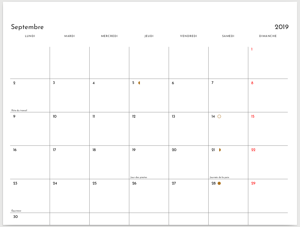
Ah, and I found a problem with months that span over 6 distinct weeks, like september 2019:

image

anarcat commented 6 years ago

as for the "back" of the calendar, I've used the following patch: https://github.com/anarcat/wallcalendar/commit/94273a806dccbd1a56a1a6ef00c0382430b220e2. Basically, I just include an external file and use normal LaTeX markup. I'm wondering why it fallsback on the modern font instead of the font used in the rest of the calendar, but that's a minor issue i can probably figure out on my own.

gambhiro commented 6 years ago

Your undertime tool is neat, I had that scheduling promblem several times too.

Thanks for pointing out moonphases.py, I didn't know about the ephem library. I need to produce lists of moon phases regularly as well, I will remember this tip.

Title page positioning

In the title page, at \AddToShipoutPictureFG*, it shouldn't be necessary to adjust the positioning offsets.

Turn on the showtrims class option at the top to observe how it works -- it may also help to increase the trimSpace to 30mm so that the cropmarks are fully visible.

\AddToShipoutPictureFG* has its (0,0) at the lower left. A -3mm, -3mm offset pulls the image 3mm beyond the margin to allow the bleed cut, and the decoration is 6mm taller and wider than the trimmed paper size, so the top right corner will also extend 3mm beyond the trim margin.

This is not affected by the specific page size (A4 or US Letter).

If the node labelled (title-bg) is out of alignment, the image was probably not cropped to the paper's aspect ratio, and so when scaled up, pulls the size of the (bg) node out of the correct size.

Where correct size for a decoration with 3mm bleed on all four sides is

minimum width=\calPaperWidth + 6mm,
minimum height=\calPaperHeight + 6mm,

Calendar size and spacing

When adjusting the calendar size, start with the extreme case, i.e. a month with six rows (weeks).

The size is in a fixed size container, i.e. doesn't stretch to fill the page when the month has less weeks. It looks very odd when the rectangles are different size from one month to the next.

You had the right start, \@t@calendar@minimumHeight and \@t@calendar@verticalSpacing are the ones to tweak. The former affects the size of the grid area, the latter is extra spacing to allow the month, year and day names to fit in.

Custom holidays

You can specify your event notes either at the top in the class options,

  eventsCsv = ./data/holidays.csv,

Or use this command to draw them when setting \SetEvents{September}, just like the moon phases (which only don't show text because the note column is empty in the csv).

\parseMonthMarksDayTextInlineUsing{./data/moonphases-2018.csv}%

Extra pages

In the document body you can add content as usual. The \MonthPage commands produce two pages, but otherwise don't control the content.

Typefaces

The fonts are loaded with the fontspec package. It can load font files available on your system by name,

\newfontfamily\dejaVuSans{DejaVu Sans}

Or by path and file name:

\newfontfamily\josefinSans[Path = {./fonts/}]{JosefinSans-Regular.ttf}

The default font is set with

\setmainfont{TeX Gyre Pagella}

In the calendar \photoAndNotesFmt has \josefinSans inserted where I thought that was a good idea.

High quality cool and free fonts are published at:

https://www.fontsquirrel.com/

Lots more (and less carefully selected) at

https://www.fontzillion.com/

Credits

Truly not necessary. I'm glad that it benefits someone else too. Link to the package's github page if you wish.

Good luck with the photo project!

I hope the above lets you continue.

anarcat commented 6 years ago

On 2018-10-28 00:52:27, Gambhiro wrote:

Your undertime tool is neat, I had that scheduling promblem several times too.

I hope that tool is useful for you! :) Let me know how it can be improved...

Thanks for pointing out moonphases.py, I didn't know about the ephem library. I need to produce lists of moon phases regularly as well, I will remember this tip.

Just a warning, I found out about PyEphem before I knew Skyfield. So if you ever work on this, you should see if Skyfield does what you want first, since it's much better designed, as explained in the comments on top of the moonphases.py file.

Title page positioning

[...]

Calendar size and spacing

[...]

Thanks for those tips! That should get me out of the woodwork. :)

Custom holidays

You can specify your event notes either at the top in the class options,

  eventsCsv = ./data/holidays.csv,

Or use this command to draw them when setting \SetEvents{September}, just like the moon phases (which only don't show text because the note column is empty in the csv).

\parseMonthMarksDayTextInlineUsing{./data/moonphases-2018.csv}%

I see, I didn't realize it was the same mechanism! That's cool. That said, I have used a symlink because I wanted to avoid needless diffs with you...

[...]

Typefaces

[...]

Thanks for those tips! I must admit I'm not very familiar with the graphic elements of LaTeX and those are very useful!

Credits

Truly not necessary. I'm glad that it benefits someone else too. Link to the package's github page if you wish.

Good luck with the photo project!

I hope the above lets you continue.

It does! I think it unblocks everything I was having trouble with. :) One last thing I'm juggling with is how to keep my changes (e.g. the colophon) private... I wonder if I could just move all of the .tex file, data/ photos/ and all the good stuff in another repository and point at the .cls file somehow. I googled around to see how to change the TeX search path but I couldn't figure it out... Nor could I figure out how to "install" your stuff directly. But it's probably something I can figure out on my own.

I will definitely link to the Github project in the credits then. I can send you a copy of the PDF if you want. ;)

Thanks again for the stellar support!

gambhiro commented 6 years ago

Since I tend to make little project-specific changes anyway (adjusting sizes and spacing for example), I usually clone this repo, remove some files and commit the .cls and so on with the rest of the project to make sure it will compile a year from now as well.

These files are not necessary in that case:

rm doc/ -r
rm LICENSE.txt Makefile README.md wallcalendar-code.pdf wallcalendar-layouts.png wallcalendar.pdf

If you wanted to install it though, the make local-install task in the project root will try to install it at $TEXMFHOME/tex.

gambhiro commented 6 years ago

Yes, send me a link to the PDF when your project is ready, I am curious about it.

I plan to add the relevant notes to the docs, see what else can be done for this feature and then merge to master.

anarcat commented 6 years ago

On 2018-10-29 06:45:22, Gambhiro wrote:

If you wanted to install it though, the make local-install task in the project root will try to install it at $TEXMFHOME/tex.

Excellent, that's what I was looking for.

I plan to add the relevant notes to the docs, see what else can be done for this feature and then merge to master.

Well, the make local-install would certainly be a useful addition to the docs, but I'm sure there are more things to do there. :) In any case when I get my head out of the weeds, I'll try to contribute docs back, especially when / if I try to do this again next year! ;)

norbusan commented 6 years ago

Thanks @gambhiro for this nice extension

CASE CLOSED!!! I forgot to update the holidays.csv which still refers to 2018 ...

Sorry for the noise!

================= original request ========== I just tried to adjust your example for 2019. I copied all the files and can compile the original document without any problem and obtain the same output as yours.

Then I changed 2018 to 2019 in some places in the document and tried to compile it, but get strange errors:

! Package pgf Error: No shape named cal09-2018-09-10 is known.

See the pgf package documentation for explanation.
Type  H <return>  for immediate help.
 ...                                              

l.246 ... and notes, put photo=full page]{September}

? 

i checked several times but there is no 2018 mentioned anymore. I attach the 2019 file (as .txt file to get support for it)

Do you have any idea?

Thanks

Norbert calendar2019.txt

gambhiro commented 6 years ago

@anarcat Thanks for the feature request, it was a good feature to add to the class. The notes-page branch is now merged to master.

@norbusan Good to head the class being used, I'm glad you found the error.

anarcat commented 6 years ago

@norbusan i had trouble with those when the events wouldn't be updated to follow the new year. check those CSV files...

@gambhiro thanks for all the good work!! :) i've got the first prints of the calendar done which I'll get to see soon, i'm quite excited about all this :)