programminghistorian / ph-submissions

The repository and website hosting the peer review process for new Programming Historian lessons
http://programminghistorian.github.io/ph-submissions
138 stars 112 forks source link

Lesson Proposal: Creating Interactive Visualizations with Plotly #518

Closed scottkleinman closed 9 months ago

scottkleinman commented 1 year ago

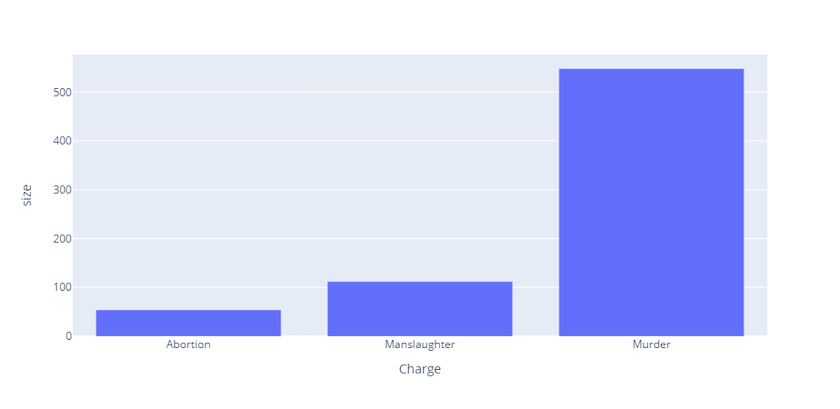
The Programming Historian has received the following proposal for a lesson on 'Creating Interactive Visualizations with Plotly' by @gdmeo. The proposed learning outcomes of the lesson are:

The draft has been uploaded to https://github.com/programminghistorian/ph-submissions/blob/gh-pages/en/drafts/originals/interactive-visualization-with-plotly.md and staged at https://programminghistorian.github.io/ph-submissions/en/drafts/originals/interactive-visualization-with-plotly.

Note that figures in the draft have been removed because they contain dynamic code that will not render on GitHub. Each figure has been converted (for the moment) to a standalone web page and can be found in https://github.com/programminghistorian/ph-submissions/tree/gh-pages/assets/interactive-visualization-with-plotly. To view the figure, click on the link in the staged version of the tutorial. Eventually, we will try to embed the figures within the tutorial text itself if Jekyll allows.

I will act as editor for the review process. My role is to solicit two reviews from the community and to manage the discussions, which should be held here on this forum. I have already read through the lesson and provided feedback, to which the author has responded.

Members of the wider community are also invited to offer constructive feedback which should post to this message thread, but they are asked to first read our Reviewer Guidelines (reviewer guidelines) and to adhere to our anti-harassment policy (below). We ask that all reviews stop after the second formal review has been submitted so that the author can focus on any revisions. I will make an announcement on this thread when that has occurred.

I will endeavor to keep the conversation open here on Github. If anyone feels the need to discuss anything privately, you are welcome to email me. You can always turn to our ombudsperson (Dr Ian Milligan - i2milligan@uwaterloo.ca) if you feel there's a need for an ombudsperson to step in.

Anti-Harassment Policy _

This is a statement of the Programming Historian's principles and sets expectations for the tone and style of all correspondence between reviewers, authors, editors, and contributors to our public forums.

The Programming Historian is dedicated to providing an open scholarly environment that offers community participants the freedom to thoroughly scrutinize ideas, to ask questions, make suggestions, or to requests for clarification, but also provides a harassment-free space for all contributors to the project, regardless of gender, gender identity and expression, sexual orientation, disability, physical appearance, body size, race, age or religion, or technical experience. We do not tolerate harassment or ad hominem attacks of community participants in any form. Participants violating these rules may be expelled from the community at the discretion of the editorial board. If anyone witnesses or feels they have been the victim of the above described activity, please contact our ombudsperson (Dr Ian Milligan - i2milligan@uwaterloo.ca). Thank you for helping us to create a safe space.

MBanuelos commented 1 year ago

General Comments

Overall, the authors describe plotly, the differences between the modules, and its use cases clearly and succinctly. The reasons for why to use plotly over other packages are described in detail. The connection between plotly express and graph objects are easy to follow and the authors provide explicit examples of why graph objects offer more customizability with tables and subplots.

Introduction

Lesson Goals

Prerequisites

Building Graphs with Plotly Express

Building Graphs with Plotly Graph Objects

Minor Formatting Suggestions

roblewiscpp commented 1 year ago

General Comments

Thanks very much to the authors for having written an engaging and helpful tutorial on a really interesting topic! My thanks as well to @scottkleinman for inviting me to review it. I apologize to everyone for my delay in submitting my comments!

Overall, this tutorial (on creating data visualizations in Python using Plotly) is clear and easy to follow. I think it offers some extremely exciting possibilities for scholars and students working in the digital humanities!

From the outset, the authors make it clear that the “model reader” has a decent functional operating familiarity with Python. This is fine, but I think that the tutorial could take steps at several points to gently aid those users who are less confident or familiar with Python (as I note below). In addition, it might well refer users to the Programming Historian lesson on using Jupyter Notebooks ([https://programminghistorian.org/en/lessons/jupyter-notebooks]. This simple gesture would help those (like me) who might need a bit more hand-holding in using Python to simply get started on the tutorial.

The set-up is very straightforward. The lesson uses Roger Lane’s “Homicides in Philadelphia, 1839-1932” dataset, which is accessible via the Historical Violence Database project organized by Ohio State University. This seems to be a pretty sustainable format, although it might be useful to have this particular .csv file hosted on the Programming Historian website itself, if possible.

The tutorial also articulates clear objectives at the outset, and flows quite smoothly from one step to the next. (There is a confusing issue with the way the figures are labeled, as I note below). The workflow is perfectly appropriate; it’s a bit lengthy but not unwieldy. I initially thought the second portion on Plotly Graph Objects (which is pretty highly technical) might well be omitted from this tutorial, but – on reflection – I think it is necessary to include it. The lesson is also designed so that it so that users can easily stop after the first section and either skip the second part, if desired, or come back and do that portion later.

As one general suggestion for improvement, I think the tutorial needs to be more effective in preparing users to use Plotly on their own. This may be a reflection of my own rudimentary familiarity with Python, but I finished the tutorial a bit unsure as to how I would adapt the instructions (and code) to generate figures for my own datasets. I think that the tutorial could offer a bit more explanation of some of the coding principles as it goes along (as I note below). I think it can also return to the question of payoff and applicability at the end, in the Summary section. It might be possible here to remind tutorial users of some of the key syntaxes that they used in creating those different kinds of graphs. At the very least, I think the conclusion should offer a bit more guidance and encouragement for users to use Plotly for their own purposes.

What follows here are four separate sections with specific edits and comments. The first deals with making the tutorial function more effectively. The second deals with technical issues with a few of the graphs, while the third section addresses the confusing (and inconsistent) issue of the way figures are labeled. The fourth and final section addresses other mechanical issues (typos, etc.).

Suggestions for making the tutorial function more effectively (especially for those less familiar with Python)

In general, I think the tutorial should note somewhere (perhaps after the first graph) that, with every graph created via Plotly Express or Plotly Graph Objects, the user can hover over the upper-right hand corner and access options (downloading the plot as a .png image, zoom, pan, box select, lasso select, etc.)

Technical issues with graphs

Labeling of figures and graphs:

As noted near the outset, this is not a huge problem, but it generates some confusion throughout. The running list of figures in the tutorial itself (Figures 1-18) does not align with the way the figures themselves (internally) are labeled, as noted below.

One other (very minor) point related to the figures: since the tutorial only uses a portion of the Philadelphia homicide dataset, would it be better to label the charts 1902-1932, instead of 1839-1932?

Mechanical errors (this section might duplicate @scottkleinman's role – sorry!)

scottkleinman commented 1 year ago

Added some light formatting.

scottkleinman commented 1 year ago

With respect to the kaleido issue, there are a number of StackOverflow discussions. Here are two that seem relevant:

UPDATE: It looks like kaleido is used automatically by Plotly for rendering if it is installed; but it is not installed automatically with Plotly. See https://github.com/plotly/Kaleido#use-kaleido-to-export-plotlypy-figures-as-static-images. My recommendation would be to included pip install -U kaleido with the Plotly and Pandas installs at the top. You could include a separate discussion when you talk about exporting static images and suggest installing kaleido at that point. You would also have to instruct the user to restart their notebook kernel. But I think that might introduce unnecessary complications.

gdmeo commented 1 year ago

Thank you to the peer reviewers for their helpful and rich feedback. I have listed the revisions made to the tutorial below, ordered by reviewer and addressed point-by-point -- as a quick caveat, this is a rather lengthy revisions response! Two quick things to address first: 1) the line numbers I have used as a reference correspond to line numbers in the draft markdown file (and are only approximate due to adding/removing/editing along the way); 2) the main problem remaining is the issue of labelling figures (a problem raised by both reviewers), since this depends on editorial opinion and how PH intend to display them (either as standalone web pages or embedded images) -- this issue is outlined in more detail within the responses below.

Revisions following feedback from first reviewer (@MBanuelos ):Lesson goals: o Last goal now combined into the second one, rewritten as ‘how to create and export graphs using plotly.express and plotly.graph_objects’ (line 40)

Prerequisites: o Changed item no.1 to include Python 3 rather than Python (line 47) o Changed item no.2 to ‘intermediate-level understanding of Python’ (from ‘reasonable’ understanding) (line 48)

Building graphs with plotly express: o (Under ‘Setting Up Plotly Express’) The note on working with Jupyter Notebook (JN) has now been removed since it is no longer accurate; this is because I have changed this paragraph to include installation of kaleido (and explanatory footnote), as discussed later in these responses. (lines 89-92) o (Under ‘Importing and Cleaning Data) Agree that this assumes some knowledge of preprocessing data, so I’ve added this to the prerequisites (line 51). To make things more accessible, I have also given more information and description to the steps taken in importing and cleaning data, which I mention in my responses to the second peer reviewer below. o Figure titles: yes, these figure headings have all gone off-kilter (also something pointed out by second reviewer). I’m not entirely sure of the best fix here because in my source code and original markdown file the titles/numbering are correct. @scottkleinman , I think this happened when the figures were added as external links. The first visual, linked as ‘Figure 1’ (line 168), was not given a heading in my code because it’s a very basic sample and I wanted to show the reader a figure without a heading before showing how to create a heading (and thereon starting the numbering sequence), therefore it made sense not to give this first graph a fig. number. This has meant that the graph linked as ‘Figure 2’ (line 187) was the one which I gave the heading of ‘Figure 1’ in the code (line 179), because it’s the first figure I gave a heading to. Similarly, the graph linked as ‘Figure 3’ (line 218) has a heading of ‘Figure 2’ in my code (line 210), and so on for the rest of the figures. Some potential fixes:

  1. Is it possible for us change the link name for the first visualisation from ‘Figure 1’ to ‘Sample figure’ (or something similar) and then to renumber the following ones so that they match the headings given in the code, as this would ensure that the figure numbers and heading numbers are matching?
  2. Alternatively, I can change my headings so that they start at Figure 2 (with the first figure not having a heading to display).
  3. OR I can remove figure numbers from my graph titles altogether, since they're not really needed (I don't generally refer to figures later in the text). Does this make sense? Which option is preferrable?

o (Under ‘Adding Animation: Dropdown Bars’) I’ve changed the phrasing of ‘adding a dropdown to flick between’ by using the word ‘toggle’ instead as this feels more fitting (line 346) o On the color=”Charge” issue – yes, it would be helpful to clarify that we are inputting a string here, which isn’t typical. I’ve noticed that this also comes in earlier in the piece under the ‘Bar Charts’ section (at line 181), so I’ll address this here as it’s the first instance. I have therefore added a comment on that line to emphasise that this is intentional, that Plotly expects a string here (# Note that the 'color' parameter takes the name of our column ("Charge") as a string). I have also expanded on my discussion of using the ‘color’ argument in the text above this example (line 172), which now notes that ‘We use the title argument to add a title, the labels argument to change the y-axis labels from 'size' to 'Count', and the color argument to colour the bars according to a given variable (in this example we will use the crime type, "Charge").

Building graphs with plotly graph objects: o On formatting print(fig) command differently, I’m assuming that the issue here is the formatting of the output (?), which is a little full-on. One option here is to convert the graph object into a dictionary as then it is outputted more neatly in JN, so I’ve changed the command to print(fig.to_dict()) (line 533) and copied in the new output (lines 536-646). However, although this was MUCH neater in JN, it’s just as messy in the GitHub preview than the original (which I’ve kept in at lines 648-736), so I’m not entirely sure what the best approach is here. @scottkleinman , do you have any thoughts/suggestions? o (Under subplots section) Good point on re-running code potentially leading to adding more traces. This seems to be something which only affects the subplots and only JN users, so I’ve added a cautionary note under the first instance where a trace is added ‘Step 3: Add first graph…’. (line 892). This warns users about rerunning code and duplicating traces and advises restarting the kernel if needed. o On needing kaleido package for exporting figures, I have added this to the ‘Setting Up’ section near the start of the tutorial (line 92), including the installation command and a footnote which briefly explains what kaleido is (line 1125).

Minor formatting: fixed the misspelling of ‘dashbaords’ to ‘dashboards’ (line 67)

Revisions following feedback from second reviewer (@roblewiscpp):

General comments: o On the issue of the tutorial sometimes being too advanced: this issue is mostly addressed in changes made under the ‘suggestions for making the tutorial function more effectively’ section (see below), but two additional changes to note: 1) I have updated the familiarity prerequisite to intermediate-level as mentioned above (line 48) to help clarify that the tutorial isn’t particularly suitable for beginners; 2) I have added a link to the PH Jupyter Notebook tutorial as suggested, which can now be found under the ‘Prerequisites’ section (‘This tutorial was developed using Jupyter Notebook. For those who are unfamiliar with this software, the Programming Historian offers an excellent tutorial on how to create, edit and export Jupyter Notebooks here’)(line 53) o On hosting the .csv file, I agree that this could be useful in case for some reason the dataset is taken down. @scottkleinman , are you happy for me to send this over to you, or to point me in the direction of where to upload it? o On the issue of preparing users to work with Plotly on their own: agreed that more could be done here. This is again address partly in the ‘suggestions for making the tutorial function more effectively’ section below. I have also expanded the ‘Summary’ section as suggested to reiterate some of the key syntaxes covered in the tutorial so that users are aware of the most important takeaways (a mini ‘cheatsheet’)(lines 1113-1128). This hopefully gives users guidance to take some of these key functions and implement them using their own code, as the reviewer points out.

• Suggestions for making the tutorial function more effectively (especially for those less familiar with Python): o (¶10) On indicating that users should create a new notebook: completely forgot to add this important step! Now added to the step of creating new notebook to the ‘Setting Up’ section (after the installation instruction as ‘With these packages installed, create a new Jupyter notebook…ideally, your notebook should be stored in the same folder as the downloaded sample dataset)(line94). o (¶12) On including more information about how users will be importing and cleaning the dataset and describing what the code is doing: I agree that this section could be clearer for users. I have therefore made two revisions here: 1) added three bullet-points at the start of the paragraph which outline the main steps taken for data preprocessing (lines 107-109); 2) added comments to the code itself in order to describe what each step of the code is doing (lines 113, 124, 127, 130, 135, 140, 145, 150, and 153) o (¶17) I have added the comment ‘# Create bar chart using the .bar() method (in a new code cell)’ as suggested to make the step clearer for users (line 195) o (¶38) On flagging to users that the graph won’t show yet, I agree that this would be helpful. I have therefore added a sentence before this paragraph (but after creating the graph) which notes that the graph has been created but is not yet visible (and that we will display it once we have updated the layout in the next step) (line 354). o (¶44) As above, I have edited the text to note that the graph will not be displayed at this stage (line 411). o (¶43-47) On why creating a graph with a dropdown bar to switch between categories is advantageous given the built-in isolating of elements discussed in ¶18: this is a really good point, and in some ways I would argue that it doesn’t add much advantage. Some things that maybe make it a useful option: 1) ability of add dynamic titles (which change as you switch to see a different element); 2) ability of adding dynamic labels; and 3) less ‘fiddly’ and cleaner than double-clicking to isolate elements as in the earlier example. I have therefore added several sentences towards the end of that section (line 514) which explains that the isolating of elements can be done either using the dropdown bar (as shown in this example) or using the graph’s legend (as shown in the earlier example), but that the former option allows users to add dynamic labels and titles to their graphs. o (¶55) On the print(fig) statement: this line has already been amended, as noted in my responses to reviewer #1 o (¶92) On encouraging users to export their own figure: in theory, they should be exporting the figure we just made by following to code given here, providing they also stored their figure as ‘fig’. However, to make it clearer that they would just need to change the ‘fig’ to whatever their graph is stored as, I have added a comment at the first instance where we export (line 1118). o On noting that every graph allows users to hover over and download the plot, I absolutely agree. I have therefore added a sentence on this just after creating the first graph (as suggested) at line 190.

Technical issues with graphs: o On issue with Fig. 10, very good spot…female and male are definitely the wrong way around - this was because of a small typo in the code, which I’ve now fixed. I’ve also changed the title from 8b to 8a, because it is the first example of Figure 8 (with 8b instead being the below example, where we make the same figure but using Plotly Express r/t Plotly Graph Objects)(lines 785-89). @scottkleinman , do these changes mean that the figure in the standalone web page will need to be regenerated (since I’m unsure whether you did this manually or if it will update based on the code)? o (¶75) On issues with creating the boxplot: I have tried this again with two different computers and don’t seem to come across any errors, so I’m not entirely sure what the problem is/what it looks like. Perhaps this is something you could screenshot and show me, as otherwise I am unsure how/what to fix? o (¶88) On issue with svg and kaleido: I have addressed this issue earlier in these responses, so hopefully resolved now. I have also removed the preceding paragraph (¶86) about changing the renderer because it's not very useful or necessary and instead have stuck simply to explaining that in almost all cases the fig.show() will allow us to display the figure.

Labeling of figures and graphs: o Numbering issue: This is something which is addressed in the comments above under responses to MBanuelos. Hopefully once we have renumbered the links to the standalone web pages then the numbering will be in sync, but I will revisit this once those have been updated. o Unlabelled figures: most of these were unlabelled intentionally, but some were missed. I have therefore added where appropriate o Fig 18 labelled as Fig 9: this is a complex one as discussed above because I deliberately didn’t number the figures which were ‘intermediary’ steps in building a main figure, but they have been numbered when added as standalone web pages. This means that I didn’t originally count Figs12-17, for example, as part of the sequence, because I didn’t give them a heading/title, and therefore what is linked as Fig 18 would actually be Fig 10 according to my sequence. I’m unsure how to proceed here because I don’t know whether these standalone links will be kept in this format or whether they will be embedded and in which case won’t be numbered in that way. I’m holding out on this one until I have Scott’s opinion. o On relabelling charts as 1902-1932 r/t 1839-1932: unsure here, as I’m worried that changing these to 1902 will confuse readers (who have been told that the original dataset covers 1839-1932). @scottkleinman , do you think it’s best for me to change to 1902 and maybe add an explanatory footnote that we are using data mostly from 1902 onwards, or just to leave as is?

• Mechanical errors: o Misspelling of argument now fixed o Can also see that the marker overlaps with the text, but unsure if this is something which I can fix personally or whether it’s something for @scottkleinman to look at (?) o Typo for ‘you did’ now fixed o Agreed on maybe this needs changing, but one I will revisit once labelling issue is sorted o Typo for ‘linegraph’ now fixed o Not entirely sure what a modifier is (!) but I’ve rephrased the whole sentence so that hopefully the issue is removed (line 1135).

Hopefully, this addresses the majority of issues raised with only a couple of issues remaining. Thank you again to the the reviewers for taking the time to read, test and make suggestions on this tutorial.

scottkleinman commented 1 year ago

I'm going to try to cover these a few issues at a time, leaving the complex numbering/labelling of figures until some of the less complex issues are resolved.

# print(fig.to_dict())
print(fig.to_json()[0:1000)

{
  "data": [
    {
      "hovertemplate": "Charge=Murder<br>Assailant age=%{x}<br>Victim age=%{y}<extra></extra>",
      "legendgroup": "Murder",
      "marker": { "color": "#636efa", "symbol": "circle" },
      "mode": "markers",
      "name": "Murder",
      "orientation": "v",
      "showlegend": true
    ...
scottkleinman commented 1 year ago

Adding some further comments here:

We don't need to worry about paragraph markers overlapping the text since they won't be displayed in the published tutorial.

I think pretty much all the other issues are contingent on my re-running the code and generating new asset files. In doing so, I will attempt to reproduce the grey frame issue.

Re-creating all the asset files will also allow me to address the complex figure naming issue. I still hope to embed dynamic Plotly graphs in the tutorial, but for the next stage I will save them as both standalone HTML files and static images. The static images will appear in the tutorial text (replacing the current "Figure 1", "Figure 2", etc.) and will have appropriate captions. Asset files will be named descriptively, not by figure number to prevent the kind of misalignment that exists currently.

Over the next few days I will attempt to make these changes. With any luck, the result will match the original intent of the labelling, but, once the process is complete, I will check in with @gdmeo to make sure that it really does match what she intended.

scottkleinman commented 1 year ago

@gdmeo, I have come up with a workflow to re-generate all the figures, but there is no point in doing it yet until I have feedback from you on the title issue reproduced below:

On relabelling charts as 1902-1932, My reading of of the introduction to the dataset is that the full database covers 1839-1932, but the downloaded dataset begins in 1902. So I would recommend changing the labels. I think it would be a good idea to add the text in bold to ¶9. "This tutorial uses Roger Lane’s ‘Homicides in Philadelphia, 1839-1932’ dataset for demonstrative purposes. The dataset and its related documents are available freely via the Historical Violence Database project organised by Ohio State University. This tutorial will work with a subset of the data covering the years 1902-1932".

If you can give me the OK to change the titles to read "1902", I'll go ahead and generate the new plots.

gdmeo commented 1 year ago

Hi @scottkleinman, Replying to your comments here:

Thanks again for your help!

scottkleinman commented 11 months ago

I think this tutorial is ready to move forward, if you want to have a look @hawc2.

hawc2 commented 11 months ago

@anisa-hawes this lesson looks ready for copy edits.

@scottkleinman I don't see any issues with the rendering of this lesson. Am I missing something or is everything working now?

scottkleinman commented 11 months ago

@hawc2, the images render but, because they are static, they don't show off the interactivity of Plotly (and sort of defeat the purpose of the tutorial). I've done a quick recreation of two possible solutions here. Take a look at the two example images (their titles are in green). One embeds the interactive Plotly image. That would be ideal if we can pull it off. The other links the static image to the HTML file, which would be an acceptable fallback if we can't do it the other way. Let me know if that makes sense.

I should add that the embedding method doesn't have to be an iframe. If we can load the Plotly JS and CSS files, the images can be an HTML div. (I'd have to generate the divs, but that's not difficult.) I tried this at the very beginning, but I put the files in the /assets folder, which may not have been right.

hawc2 commented 11 months ago

Cool, that's a neat trick @scottkleinman. I'm fine with either and/or both solutions. The separate HTML file is a fine way to do it, but if we could embed plots it would be great. I'm curious what @ZoeLeBlanc and @anisa-hawes think?

I don't think this question should hold up this lesson going through copy editing or publication. If we can't figure out how to embed plots that are interactive, let's publish the lesson with static images, and work to remediate the interactivity later.

scottkleinman commented 11 months ago

I'll add an example with an embedded div to the link above, just in case it's helpful...

anisa-hawes commented 11 months ago

Dear @scottkleinman,

I apologise for the delay in confirming the outcome of the tests I did following our conversation about the .html figures. Previously, the figures were duplicated (one static + one "floating" link to an .html file).

Our YAML headers define which directory will be called upon to display images, and images files used as figures in our lessons need to be saved in the /images directory. Additionally, my understanding is that there is a requirement for these to be files with specific extensions: .png, .jpeg, .jpg, .gif. It seems that the build fails completely when we upload a file with a different extension. (I think our _includes specify which files the liquid syntax can reference).

I do understand your ambition to display the figures in this lesson as interactive plots. However, this isn't a unique case. For example, Visualizing Data with Bokeh and Pandas describes the interactivity that can be achieved using words, and Making an Interactive Web Application with R and Shiny uses a Gif animation to display the interactivity.

While the lesson is about creating interactive visualisations with Plotly, it isn't creating interactive visualisations with Plotly in GitHub using Markdown. So, in my view, at this stage it would be preferable to avoid inventing a one-off alternative to the liquid syntax that we currently use across all other lessons. Although I appreciate that opportunities for further interactive image elements is something we may want to add to a list of wishes for our future infrastructure.

anisa-hawes commented 11 months ago

Hello again @scottkleinman,

Some further notes:

In https://github.com/programminghistorian/ph-submissions/commit/165a675b0c19d82676082096b23c297e41dc8cfd and https://github.com/programminghistorian/ph-submissions/commit/642feb41672d5f70441e4606be7ff74f7cc5c82b, I corrected the figure numbering sequence which was out-of-sync because the first figure displayed was missing its number. I also removed the figure image numbers that were included inside code blocks to hard-code plot titles throughout the lesson – we can teach the method of hard-coding titles using template text instead of duplicating our captions (we're developing a new standard practice where each caption begins: Figure 1., etc).

I adjusted line 187 to explain how a reader can hard-coding titles within their plots if required. Again, this is not a unique case – we handled the same thing with Scalable Reading of Structured Data which explains how to create hard-coded titles:

If you want to hard-code titles into your plot, you can add title = and subtitle = alongside the other labels.

This is really a sustainability issue, because it complicates future translation and lesson maintenance (if an image is translated / replaced / moved / updated). An update was required to Scalable Reading very shortly after publication which heightened our awareness of this, where a calculated total had been mis-input.

Indeed, in this case, now that the figures are in the correct order, we need to recreate them because the hard-coded figure numbers are still shown in those .png images. Do you or Grace @gdmeo have time to do this? (using the template text I've slotted in, rather than the titles which duplicate our figure numbers and captions). Or would you like Charlotte and I to handle it ahead of copyediting?

scottkleinman commented 11 months ago

@anisa-hawes, I understand the difficulty of including interactive visualisations, given the restrictions on file extensions in the image folder. If there is no way to include page-specific CSS and JS files, we are stuck with static images. I was unaware of the precedents to this problem in the other tutorials you point out, so it seems like those precedents should be followed. I think the author should have the option to generate animated gifs for some or all of the images or describe the interactivity in words. @gdmeo, do you have a preference?

Just so I understand, correctly, titles should be removed from all images, and statement should be made about how to add a title if you want one? If that's correct, I can do that and re-generate all the images.

anisa-hawes commented 11 months ago

Thank you, @scottkleinman. I think GIFs which describe the interactivity that can be achieved would be ideal. If @gdmeo has time to create them, Charlotte and I would be delighted to take care of replacing the static images when the animations are ready 🙂

Yes, if possible, I'd like to avoid duplication of our figure captions with titles inside the plots.

I understand that you want to show how to hard-code these (alongside labels) into plots, so I think using placeholder text (as Grace has done at line 242 title="A formatted title!", plus a statement which clearly explains is a good option. I've made an attempt to explain that titles can be hard-coded at line 185:

However, this isn't the most visually appealing graph; it could use a title, some colours, and a clearer y-axis label. We could have done this when we initially created the bar chart by passing additional arguments into the .bar() method. We can use the title argument to hard-code a title into our plot, the labels argument to change the y-axis labels from 'size' to 'Count', and the color argument to colour the bars according to a given variable (in this example we will use the crime type, "Charge").

But (of course) I welcome your edits ! or suggestions about where this might be better-placed within the lesson (line 235 could be another option?)

Elsewhere, if you and Grace are committed to keeping the hard-coded captions in place (e.g., title="Female and male weapon use, Philadelphia homicides (1902-1932)") I think we could still avoid exact repetition in the figure caption (caption="Figure 6. Female and male weapon use, Philadelphia homicides (1902-1932)").

In cases such as this one, my sense is that the caption= might be usefully adjusted to read something more descriptive. It seems to me that the sample data is much less important than what is being created using Plotly and how. I wonder if the captions (and descriptive alt-text) can reflect that? Maybe the captions can focus on which gestures generate the interactive elements rather than what the data is? With this approach we could avoid the repetition, and it might benefit readers' understanding of the method too.

I've already removed the figure numbers from the hard-coded captions https://github.com/programminghistorian/ph-submissions/commit/642feb41672d5f70441e4606be7ff74f7cc5c82b but the new static images (or new GIFs) will need to be created without these because the numbers are out-of-sync with (as well as superfluous to) the figure numbers in our captions.

scottkleinman commented 11 months ago

There may be a few places where additional explanations about how to add a title are necessary, such as in the instructions for using Plotly graph objects (paragraphs 59-62). But that could be one. I wonder if something like this could be done:

fig = px.bar(
    phl_by_charge,
    x="Charge",
    y="size",
    # title="Add your title here",
    labels={"size": "Count"},
    color="Charge", # Note that the 'color' parameter takes the name of our column ('Charge') as a string
)

This would have three advantages:

  1. We can generate the tutorial images without titles, but anyone copying the code can simply uncomment them.
  2. The title is boilerplate which can be translated easily.
  3. There is no duplication between titles and captions.

There is an additional issue with duplication between alt-text and captions. I wasn't sure what standards are in place for this, so I introduced a few tweaks (at least in some of the images) to the alt-text which describe the type of graph in the image. But a little more could be done if you have suggestions.

Meanwhile, I'll generate new images without the titles within the next day or so.

anisa-hawes commented 11 months ago

Thank you, @scottkleinman. The commented out titles sound like an excellent solution. Are you thinking that you will stick with static images rather than GIFs? Either is okay, but I think a description of the interactive elements would be useful to add in if the plots remain static.

In terms of alt-text, there are (lots of) guidance notes around online, but I haven't developed something PH-specific yet.

I did find Amy Cesal's guide to Writing Alt Text for Data Visualization useful. This guide advises that alt-text for graphs and data visualisations should consist of the following:

alt="Chart type of data type where reason for including chart"

What Amy Cesal's guide achieves which I think is important, is prompting an author to reflect on their reasons for including the graph or visualisation. What idea does this support? What can a reader learn or understand from this visual?

You are right that it could be useful for us to define how alt-text and captions are distinct. My sense is that alt-text should be more specifically descriptive of any elements that will be inaccessible if a reader cannot see the visuals.

I think the Graphs section of Diagram Center's guidance is quite useful. Some key points (relevant to all graph types) I take away from it are:

scottkleinman commented 11 months ago

Thanks, @anisa-hawes. I'm glad this opens up some wider questions for PH. In the meantime, I'll try to implement some of the guidance you've sent along and check with Grace on the gif issue, just in case she is not getting notifications from GitHub.

scottkleinman commented 11 months ago

The first plot example now provides various alternative methods of embedding the image. The last example shows how the interactive image can be directly embedded within the tutorial text by pasting in the code and linking to the javascript in the /assets folder. As proof of concept, it works, so we just need to decide whether it is sustainable.

hawc2 commented 11 months ago

@anisa-hawes is this lesson ready for copyedits? Any last things you need from @scottkleinman or myself?

scottkleinman commented 11 months ago

@anisa-hawes @hawc2 NB. If we choose to link static images to interactive HTML files in the /assets folder or embed the interactive files, I will have to generate those files (I've only done the first one as a proof of concept). But that's a relatively fast process, as I have a Jupyter notebook to do it. So just let me know if you need that done.

anisa-hawes commented 11 months ago

Thank you, @hawc2.

@scottkleinman shared some different options for displaying the interactive plots, and with his help, I have implemented one of those options (replacing our standard liquid syntax with .html <figure> tags throughout the lesson. We now have the .png plots displayed, and the .html interactive plots linked, so that if a reader clicks on either an image or the link in its caption, they open an interactive version of the plot in a new tab.

Scott is going to regenerate the .html plots which need to be updated because they duplicate the captions and use figure numbers which are incorrect in the sequence + one .png which needs updating for the same reason.

Meanwhile, Charlotte and I can move forwards with copyediting next week. We’ll be alert for references to figures / figure numbers, which will need to be re-aligned with the sequence. We'll also be attentive to descriptions of what is seen or shown, so that the linked .html figures are referenced specifically where an interaction is mentioned.

Thank you for your patience, and thank you for sharing your knowledge @scottkleinman ✨

scottkleinman commented 11 months ago

For convenience, I'm transferring over some questions @anisa-hawes asked on Slack:

anisa-hawes commented 11 months ago

Thank you, @scottkleinman. I really appreciate you taking the time to update that set of .html plots + the .png file. Thanks also for clarifying that Figure 13 displays as expected.

I've cleared the files that are no longer needed from the /assets directory. One final query on this: am I correct that we can also remove plotly-2.14.0.min.js? (I double-checked and it isn't referenced anywhere within the lesson). If you/or Grace @gdmeo could confirm, I'll remove that file too I'll leave that where it is!

For now, the Preview is available here: https://programminghistorian.github.io/ph-submissions/en/drafts/originals/interactive-visualization-with-plotly

Next step: copyediting ✨

scottkleinman commented 11 months ago

Thanks, @anisa-hawes. With respect to plotly-2.14.0.min.js, you need to leave it in there. It is imported by each of the .html files and drives the interactivity.

charlottejmc commented 11 months ago

Hello @gdmeo and @scottkleinman, I've prepared a PR with the copyedits for your review.

There, you'll be able to review the 'rich-diff' to see my edits in detail. You'll also find brief instructions for how to reply to any questions or comments which came up during the copyedit.

When you're both happy, we can merge in the PR.

charlottejmc commented 10 months ago

Hi @gdmeo,

I have now merged the copyedit branch into the main gh-pages branch of our ph-submissions repository. You can still have a detailed look at the changes I made by clicking on this link to the merge commit. Please do still feel free to flag up any issues or changes you would like to mention!

gdmeo commented 10 months ago

Hi @charlottejmc, thanks for all your time and help here.

I've had a look through and this all looks good to me. I did see one typo / grammatical error in one of the code comments at line 366 as follows:

animation_frame="Year", # Use the animation_frame to specify which variable to measure for change

I think maybe I just forgot to remove the word 'the', or the comment could be changed to 'Use the animation_frame parameter to...'.

Other than that, I can't see any issues and am happy with it (granted I've only done a fairly surface-level check because everything is hectic!).

Thanks again :)

charlottejmc commented 10 months ago

Thank you for your feedback @gdmeo! I've made that change in the .md file now.

charlottejmc commented 10 months ago

Most of the typesetting has now been completed. I have followed your suggestion @scottkleinman and added the dataset as a .csv file in our assets folder under sample-dataset-philadelphia-homicides-1902-1932.csv, and linked to it directly in the lesson.

The figures do need some additional work though:

scottkleinman commented 10 months ago

I have some time today, so I can take a first crack at this. @gdmeo, I'll let you know when I'm done, and you can give it a look.

anisa-hawes commented 10 months ago

Thank you, @charlottejmc.

I can answer a couple of the questions you've asked here:

Let me take a look at the assets directory. I may have made an error here, and uploaded an outdated 19.html.... Yes! My mistake. Now removed: https://github.com/programminghistorian/ph-submissions/commit/d36f08fd61937cf0386efc3d954c6182722b5e2f

scottkleinman commented 10 months ago

I've made a first pass at re-doing the captions and alt-text. @charlottejmc or @anisa-hawes, can you have a look? This was surprisingly hard!

anisa-hawes commented 10 months ago

Thank you for this first pass, @scottkleinman! I think we need to draw out some more description of the plots and their interactive features in the alt-text, so that we are filling in the visuals for non-sighted readers.

Rather than centring the sample data, I think our figure captions need to help readers understand how the plots are developing as the code progresses, pointing to which interactive features have been added at each stage.

@charlottejmc and I have set aside some time to review / collaborate on this later today and we'll come back to you with some suggestions.

scottkleinman commented 10 months ago

@gdmeo, We have identified a potential issue with the dropdown graph (Figure 8), which you can view here. When the bar chart is displayed, the legend title correctly displays "Gender of accused". But, when you switch to the pie chart view, the legend does not change (it should probably read "Weapon" or "Weapon type". I have not found any way to control this behaviour in the Plotly documentation, and the best I could do is hide the legend title completely. That is an option, but we wanted to check if you know of a way to modify the legend title dynamically when a dropdown effect is triggered. Can you help?

gdmeo commented 10 months ago

Hi both,

Hoping emailing will work as I currently don't have access to Github (currently emailing from a train on my phone).

I'll take a look at this at some point in the next fortnight -- a bit hectic as literally just started the new job & I have a fixed publication revision deadline to meet. I was hoping to get this sorted quickly today, but when I ran the code locally I didn't get this error, so I'm thinking that I might need to set aside a day or two to figure out why this is happening for the version on here (but not the original file I'm working with locally).

As a quick, related note, I've also noticed that the pie chart tab of the figure displays not only the incorrect title but also the incorrect categories. Under the legend, I can see that every category has been listed twice (so 'Gun' is listed twice, as is 'Vehicle'). I'm guessing this might be happening because it's trying to list the categories for both males and females (?), although I'm not entirely sure why (and obviously this isn't intentional). As I mentioned, I'll probably need to set a good chunk of time to look into this. I'll get on this as soon as I can.

All the best,

Grace

On Sun, Nov 12, 2023 at 10:37 PM Scott Kleinman @.***> wrote:

@gdmeo https://github.com/gdmeo, We have identified a potential issue with the dropdown graph (Figure 8), which you can view here https://programminghistorian.github.io/ph-submissions/assets/interactive-visualization-with-plotly/interactive-visualization-with-plotly-08.html. When the bar chart is displayed, the legend title correctly displays "Gender of accused". But, when you switch to the pie chart view, the legend does not change (it should probably read "Weapon" or "Weapon type". I have not found any way to control this behaviour in the Plotly documentation, and the best I could do is hide the legend title completely. That is an option, but we wanted to check if you know of a way to modify the legend title dynamically when a dropdown effect is triggered. Can you help?

— Reply to this email directly, view it on GitHub https://github.com/programminghistorian/ph-submissions/issues/518#issuecomment-1807264999, or unsubscribe https://github.com/notifications/unsubscribe-auth/ASMJVRRMMEEP6RCDPFA5OZDYEFFRTAVCNFSM6AAAAAARDTC5WKVHI2DSMVQWIX3LMV43OSLTON2WKQ3PNVWWK3TUHMYTQMBXGI3DIOJZHE . You are receiving this because you were mentioned.Message ID: @.***>

scottkleinman commented 10 months ago

Thanks, @gdmeo. It looks like updating plots from dropdowns is not well-described in the Plotly docs. I've been able to figure out that args takes two dicts and a list, the first two for data and layout and the last one for annotations. That suggests that the button method for the pie chart should look something like

args=[
    {"type": "pie", "values": "size", "names": "Weapon"}, {}, []
]

I've tried it, and, unfortunately, it gives me a pie chart with seven wedges of 14.3% and does not change the legend. However, I hope this is useful as a starting point.

charlottejmc commented 10 months ago

I've also taken a crack at adjusting the captions and alt-text to make them a little more consistent and clear throughout the lesson. @anisa-hawes and @scottkleinman, your work made this so much easier for me, thank you! You can review my edits here.

Just one note for @scottkleinman and @gdmeo about Figure 19: I believe this section of the lesson is using a previous example of a figure to teach how to View and Export it. However, the text tells us we are going to work with Figure 3 ("The methods discussed here will use a basic line graph, identical to that created earlier in the tutorial (see Figure 3)" para 87) and the code block just below indeed creates a line graph (fig = px.line(). Are you sure we want to be displaying the bar chart from Figure 1 below, then?

scottkleinman commented 10 months ago

Thanks, @charlottejmc. I think you're right that the image source should be en-or-interactive-visualization-with-plotly-03.png, and the link (around the image and in the caption) should be interactive-visualization-with-plotly-03.html. The code is definitely for a line graph.

charlottejmc commented 10 months ago

Hello @hawc2,

This lesson's sustainability + accessibility checks are in progress.

EN: http://programminghistorian.github.io/ph-submissions/en/drafts/originals/interactive-visualization-with-plotly

Publisher's sustainability + accessibility actions:

Authorial / editorial input to YAML:

The image must be:

- name: Forename Surname
  orcid: 0000-0000-0000-0000
  team: false
  bio:
    en: |
      Forename Surname is an Assistant Professor in the Department of Subject at the University of City.

Files to prepare for transfer to Jekyll:

Promotion:

charlottejmc commented 10 months ago

@scottkleinman and @gdmeo, I've had a quick look around myself for an avatar and I quite like this one:

swan-cropped-greyscaled

I somehow feel like it gives a sense of the "visualization" and the "Plot", with the lines and x-axis going through the middle.

Let me know what you think, and please feel free to suggest your own, as explained in my comment above!

charlottejmc commented 10 months ago

Thanks, @charlottejmc. I think you're right that the image source should be en-or-interactive-visualization-with-plotly-03.png, and the link (around the image and in the caption) should be interactive-visualization-with-plotly-03.html. The code is definitely for a line graph.

Just to confirm, I have made those changes in the .md file.

charlottejmc commented 10 months ago

I have noticed that there are a few outstanding points from the checklist in my comment above. @gdmeo, here is what we still need from you to move the lesson over to the Publication phase (when you get the chance!):

The image must be:

- name: Forename Surname
  orcid: 0000-0000-0000-0000
  team: false
  bio:
    en: |
      Forename Surname is an Assistant Professor in the Department of Subject at the University of City.

Thank you very much!

anisa-hawes commented 10 months ago

Thank you, @charlottejmc! 🙂


Hello @gdmeo,

As Scott explains and provides details above, we noted a problem with the interactive plot linked to Figure 8. When switching from Bar Chart to Pie Chart, the graph’s legend appears to display an error.

The bar chart view plots Counts of homicide prosecutions according to the Weapon types and the duo-colour bars enable readers to understand the proportion of Female and Male accused assailants involved in cases of each weapon type. The legend is titled Gender of Accused, and the two colour attributes are defined. Upon switching to Pie Chart view the legend is still labelled Gender of Accused, but the colour attributes define the Weapon Types.

hawc2 commented 10 months ago

@gdmeo will you have time in the next week or two to address these final changes/fixes?

gdmeo commented 10 months ago

Hi Alex,

Hoping you'll get this if I reply via email as don't have access to GH presently. Unfortunately not, I'm afraid. I can probably do some of the more minor fixes (e.g. declaration, finding a photo) via mobile phone, but I'm unable to fix the block of code where there seems to be an error since I don't currently have access to a computer (am in-between jobs present and don't have a personal computer) and therefore have no way to experiment and make the changes -- realistically, this particular fix is something I probably can't get round to until maybe just before Christmas. If there's a hurry, I'm happy to cut out the bit of the tutorial where the error seems to be (as it's not an essential component) and then I can finish off the smaller tasks quickly. Which is best for you?

All the best,

Grace

On Wed, Nov 29, 2023 at 3:07 PM Alex Wermer-Colan @.***> wrote:

@gdmeo https://github.com/gdmeo will you have time in the next week or two to address these final changes/fixes?

— Reply to this email directly, view it on GitHub https://github.com/programminghistorian/ph-submissions/issues/518#issuecomment-1832076300, or unsubscribe https://github.com/notifications/unsubscribe-auth/ASMJVRSPCR5RFSAS5S22U7DYG5FTJAVCNFSM6AAAAAARDTC5WKVHI2DSMVQWIX3LMV43OSLTON2WKQ3PNVWWK3TUHMYTQMZSGA3TMMZQGA . You are receiving this because you were mentioned.Message ID: @.***>

gdmeo commented 10 months ago

Hi @hawc2. Update: Managed to get access to a computer and have a dig around. Unfortunately, the issue with Figure 8 isn't resolvable in a feasible (i.e. tutorial-friendly) way...it's a long story, but basically adding a dropdown bar to flick between the graphs raises conceptual issues that aren't easily handled within Plotly Express. This is especially difficult in this instance as we're trying to toggle between a graph with three data points (the stacked bar chart) and one with only two (the pie chart). I can go into more detail if needed, but sticking with brevity for now!

There are ways around these issues but they involve adding a LOT of code and complexity to the tutorial (as well as being a bit hacky), which I think would confuse users, especially since we won't have covered more advanced topics like graph objects yet in the tutorial. I've also tried simplifying the figure so that it transitions from a horizontal to vertical bar chart, but this still doesn't eliminate most of the issues, so that doesn't seem like a good fix either.

With all this in mind, I think it's best just to remove that example and the following one (figs 8 and 9) from the tutorial (Fig 9 furthers the discussion of using dropdown bars). Or possibly some of the discussion from creating Fig 8 could go into Fig 9, but that might be a bit fiddly.

What do you think we should do in this case? As a heads up: unsure when I'll get computer access again, but I'll keep my eye on emails.