 SidharthBansal
commented
5 years ago
SidharthBansal
commented
5 years ago Nice idea. Can you please explain your design in detail? Please share link or video of the website where it is live. That will be great.
Closed oorjitchowdhary closed 5 years ago
SidharthBansal
commented
5 years ago Nice idea. Can you please explain your design in detail? Please share link or video of the website where it is live. That will be great.
 oorjitchowdhary
commented
5 years ago
oorjitchowdhary
commented
5 years ago I haven't seen it on any live website yet... I just came through this idea.
Here are some grid images that we can add...
For answers

For questions

These three for activities.. We can decide which one for activity posted and activity attempted


SidharthBansal
commented
5 years ago Can you please suggest your idea in detail? Where we should use these grid images?
On Thu, Dec 27, 2018, 5:47 PM Oorjit Chowdhary <notifications@github.com wrote:
I haven't seen it on any live website yet... I just came through this idea.
Here are some grid images that we can add...
For answers [image: answer icon] https://user-images.githubusercontent.com/39333058/50479945-2135df80-09ff-11e9-98ea-912a0f83d79b.png
For questions [image: faq-icon] https://user-images.githubusercontent.com/39333058/50479949-2430d000-09ff-11e9-9615-2aa0676f378c.png
These three for activities.. We can decide which one for activity posted and activity attempted [image: activity icon] https://user-images.githubusercontent.com/39333058/50479950-25fa9380-09ff-11e9-858f-e8fcc4d9d97f.jpg [image: activity attempt icon] https://user-images.githubusercontent.com/39333058/50479954-298e1a80-09ff-11e9-9e2c-3eaa90b6af6b.png [image: activity] https://user-images.githubusercontent.com/39333058/50479955-2bf07480-09ff-11e9-8697-68c6dd92b916.jpg
— You are receiving this because you commented. Reply to this email directly, view it on GitHub https://github.com/publiclab/plots2/issues/4423#issuecomment-450140406, or mute the thread https://github.com/notifications/unsubscribe-auth/AUACQ8hN8uIoKOSYvWwx5mKDjJVicNi4ks5u9LpWgaJpZM4ZinqP .
 grvsachdeva
commented
5 years ago
grvsachdeva
commented
5 years ago @publiclab/community-reps your thoughts are required. Thanks!
oorjitchowdhary
commented
5 years ago So currently in the profile page, we have a lot of empty space and the center shows 4 things
x questions, x activities posted, x activities attempted and x answers posted...
The current UI is very plain and simply shows it as text in 2 lines. (see the pic)
What we could do is, we can make these into 4 quadrants through a 2x2 image grid
 arungoel123456
commented
5 years ago
arungoel123456
commented
5 years ago @oorjitchowdhary Can I work on this issue
SidharthBansal
commented
5 years ago Yes
On Thu, Jan 24, 2019, 11:19 AM Arun Goel <notifications@github.com wrote:
@oorjitchowdhary https://github.com/oorjitchowdhary Can I work on this issue
— You are receiving this because you commented. Reply to this email directly, view it on GitHub https://github.com/publiclab/plots2/issues/4423#issuecomment-457075321, or mute the thread https://github.com/notifications/unsubscribe-auth/AUACQ2vsTqPNy7aC5y1skITmN9auwN1mks5vGUl8gaJpZM4ZinqP .
arungoel123456
commented
5 years ago Thanks @SidharthBansal .... I am working on this
arungoel123456
commented
5 years ago @jywarren , @SidharthBansal can u please suggest some changes?
 IshaGupta18
commented
5 years ago
IshaGupta18
commented
5 years ago @arungoel123456 are you new at contributing to publiclab/plots2 ?
arungoel123456
commented
5 years ago @IshaGupta18 yes
IshaGupta18
commented
5 years ago Then I would encourage you to start with some first-timer-only issues that are created especially to welcome new comers to the community. You can find them at:
https://github.com/publiclab/plots2/issues?q=is%3Aopen+is%3Aissue+label%3Afirst-timers-only
Once you are a bit more familiar with the codebase, you can take up bigger issues! Looking forward to your work here at publiclab!
arungoel123456
commented
5 years ago @IshaGupta18 I am almost completed with editing . So let me do it and complete this issue .
IshaGupta18
commented
5 years ago Okay that's great! I just wanted you to feel welcomed!
arungoel123456
commented
5 years ago I have just made a pr . Mentors please review
 jywarren
commented
5 years ago
jywarren
commented
5 years ago Hi @arungoel123456 - thank you for your PR at https://github.com/publiclab/plots2/pull/4734 -- however I wanted to echo @IshaGupta18 and say that for a PR it may be best to go through the process of completing a small change and getting familiar with both the codebase and the workflow.
But also - let's keep sharing and brainstorming ideas for the profile page! I think there's a lot of design, discussion, refinement that'd have to happen before we're quite ready for code.
I started doing a bit of an analysis of the profile page here: https://docs.google.com/presentation/d/1TCZoTfuhamRVrUak8aDgqJAwSgyhRtZg2Pgacl2_4zc/edit#slide=id.g4b41dd6a91_0_0
Just trying to analyze how it's currently laid out and how we might reorganize it. I think it's good to look at other examples of profile pages too, like the GitHub one or profile pages on other sites. What do you think?
IshaGupta18
commented
5 years ago Yes this would be lovely @jywarren . Would you like if I design a few wireframes for the profile page UI? Would that be okay? Also, I want you to know that I am facing a bit of an issue with my system's Ruby, so I'll fix it and get back to coding work ASAP. Thanks a lot.
jywarren
commented
5 years ago oh that'd be lovely, thank you! Oh, good luck with that, please check out RVM as well, i use it and it's pretty nice!
On Thu, Jan 31, 2019 at 2:14 PM Isha Gupta notifications@github.com wrote:
Yes this would be lovely @jywarren https://github.com/jywarren . Would you like if I design a few wireframes for the profile page UI? Would that be okay? Also, I want you to know that I am facing a bit of an issue with my system's Ruby, so I'll fix it and get back to coding work ASAP. Thanks a lot.
— You are receiving this because you were mentioned. Reply to this email directly, view it on GitHub https://github.com/publiclab/plots2/issues/4423#issuecomment-459469210, or mute the thread https://github.com/notifications/unsubscribe-auth/AABfJ14n4S18NRG9rbRhbZavn0UUlPvfks5vI0CMgaJpZM4ZinqP .
arungoel123456
commented
5 years ago @jywarren so should I modify the profile page according to the design u have sent ?
IshaGupta18
commented
5 years ago Thank you @jywarren. @arungoel123456 the design sent by @jywarren is just a mock up. This is a big planning and design issue and requires some brainstorming before the design can be finalised and implemented.
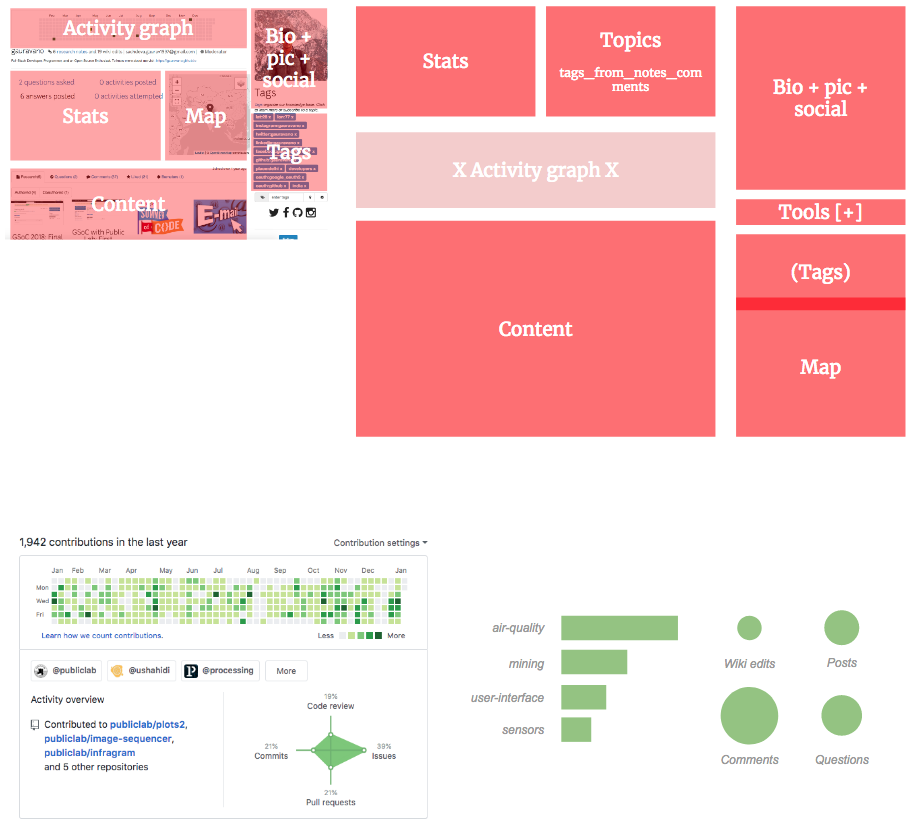
IshaGupta18
commented
5 years ago So here's a mockup for profile page, the grid in the middle if the page takes too much space and it's links are not even active, so for the time being I scrapped it out of the design. @jywarren I took a bit of your information from you profile page xP. How does this look to you?
jywarren
commented
5 years ago Hey this is awesome!
To be honest I was thinking of removing the activity graph because on most peoples' profiles it's pretty empty. Writing a post on PL.org is not quite like making a commit, so this is reasonable. Although we could also consider adding comments to the graph; maybe that'd improve it. Still, I think it may be more important to think about what topics people are engaging on rather than their activity "grid". Maybe this opens up more space in the design?
I like how the map is up high. Could you paste in a map graphic to sort of see what that'd look like?
Also, maybe rss feed could be just the RSS icon and could appear in line with the social icons...
And the "stats" line could be moved to the circular "tabs" at the bottom -- like Research notes (23) Wikis (41) and such. What do you think?
Finally, how might we display a bit more information about the tags/topics people have engaged on, rather than their profile tags (which honestly are more for utility use right now, so we might even just display them below the bio -- there shouldn't be too many of them anyways.)
One last thought - the Bio (About) area could get pushed down with too much content, so maybe we should show the first 300 or so px of height, but cut it off (using CSS only), and show an "expand" or "read more" link to show the rest.
This is very cool! @edieblu @ebarry take a look!
IshaGupta18
commented
5 years ago Thanks a lot! I think all the suggestions here are wonderful. I could implement all of them in a new mockup and even I feel that the grid takes up too much space and isn't very much required. I was going to put icons and stats along with the titles in bubbles so that would okay.
About the tags, I really like the idea. Actually, I am weaving one of my GSoC proposals around tags only so I would love to add a feature related to it, I think we can brainstorm on it a bit more, on how to use tags in which the user has engaged on their profile page to make it more personalised for them.
And we could make the about box an accordion for more information. I was also thinking of putting a place holder like 'tell us a bit about yourself' for people who have an empty bio.
How does this sound?
jywarren
commented
5 years ago This all sounds great!!!!
On Mon, Feb 4, 2019, 11:02 AM Isha Gupta <notifications@github.com wrote:
Thanks a lot! I think all the suggestions here are wonderful. I could implement all of them in a new mockup and even I feel that the grid takes up too much space and isn't very much required. I was going to put icons and stats along with the titles in bubbles so that would okay.
About the tags, I really like the ides. Actually, I am weaving one of my GSoC proposals around tags only so I would love to add a feature related to it, I think we can brainstorm on it a bit more, on how to use tags in which the user has engaged on their profile page to make it more personalised for them.
And we could make the about box an accordion for more information. I was also thinking of putting a place holder like 'tell us a bit about yourself' for people who have an empty bio.
How does this sound?
— You are receiving this because you were mentioned. Reply to this email directly, view it on GitHub https://github.com/publiclab/plots2/issues/4423#issuecomment-460303373, or mute the thread https://github.com/notifications/unsubscribe-auth/AABfJ4LTXQdksfBRCd8OLBXsF-2SesReks5vKFlagaJpZM4ZinqP .
 edieblu
commented
5 years ago
edieblu
commented
5 years ago Hey @IshaGupta18 really cool design! 👍
I would definitely add the "tell us about yourself" prompt for those that haven't added the bio yet as you suggested. I think this would encourage users to flesh out their profiles - which is important for getting them more engaged overall :)
Not sure if linking to GitHub or Instagram makes sense, however, I really do like the icons under the user image. Maybe we could instead feature some of the user-selected best content - for example, a research note that they are most proud of, or a link to a project that they manage.
As far as I know, the plan for the user profile is to link to stuff on Public Lab (and not to link outside to other pages that much).
There seems to be a lot of interest around displaying projects especially (that's why my suggestion above about featuring one project that the user selected).
I really like the round shape for the activity feed (and the user icon). I agree with @jywarren that you could just add a number of posts next to it.
The only issue that I see is that, proportionally, I don't know if all of these things would fit on one (laptop page) - especially if we work with fonts 16px and up :)
In any case, good job! 👍 You got this :)
IshaGupta18
commented
5 years ago Thanks a lot @edieblu ! I added the social icons because I saw them on some profile but I think it would be okay to remove them and add something more useful in their place like you said.
To tackle the proportionality issue, I think we would be able to reduce some space after the removal of the grid and try some other adjustments.
Would this be okay?
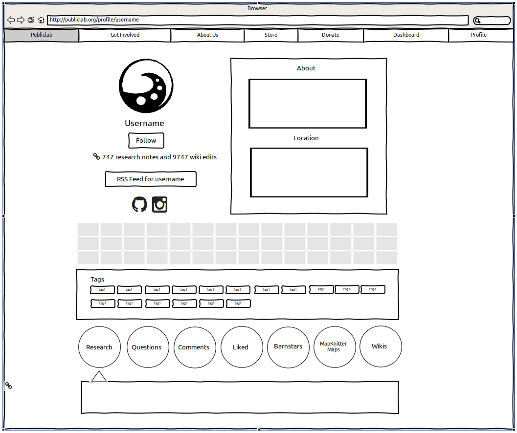
IshaGupta18
commented
5 years ago Okay so here's the updated mock up, we can implement that tag customisation thing in the page, now that we have some room

I think this looks more organzied and cleaner. What do you think @jywarren ?
jywarren
commented
5 years ago OK, apologies, circling back here! We have a few threads all interconnecting and I wanted to see if we could try to incorporate them in one thread. Please check out https://publiclab.org/notes/lekhidugtal/03-13-2019/ui-wireframe-for-profile-page too -- let's discuss a bit there!
grvsachdeva
commented
5 years ago Also, I just closed a PR https://github.com/publiclab/plots2/pull/4734 which was raised against this issue. Closed because of inactivity. @arungoel123456 you can help us in makeover if interested. Thanks!
jywarren
commented
5 years ago With our new profile pages, i'm going to close this up! Thanks, all!!!
Please describe the problem (or idea)
The current
user profile pagelooks very unorganized and broken. I think we can design it and make it look much better.How about a small image grid for the
activities,questionsandanswers. Also, we can reduce theshare your locationmap size and I think fit it below the username as a horizontal tab rather than a big square.Similar to this but with good images rather than coloured bg.
Please show us where to look
https://publiclab.org/profile/
your_profile(when logged in)What's your PublicLab.org username?
oorjit_chowdhary
Browser, version, and operating system
Chrome, Windows 10
Thank you!
Your help makes Public Lab better! We deeply appreciate your helping refine and improve this site.
To learn how to write really great issues, which increases the chances they'll be resolved, see:
https://publiclab.org/wiki/developers#Contributing+for+non-coders