 agnes-joseph
commented
5 years ago
agnes-joseph
commented
5 years ago @abhishekmishragithub Can I get further details on this?
Closed abhishekmishragithub closed 4 years ago
agnes-joseph
commented
5 years ago @abhishekmishragithub Can I get further details on this?
 abhishekmishragithub
commented
5 years ago
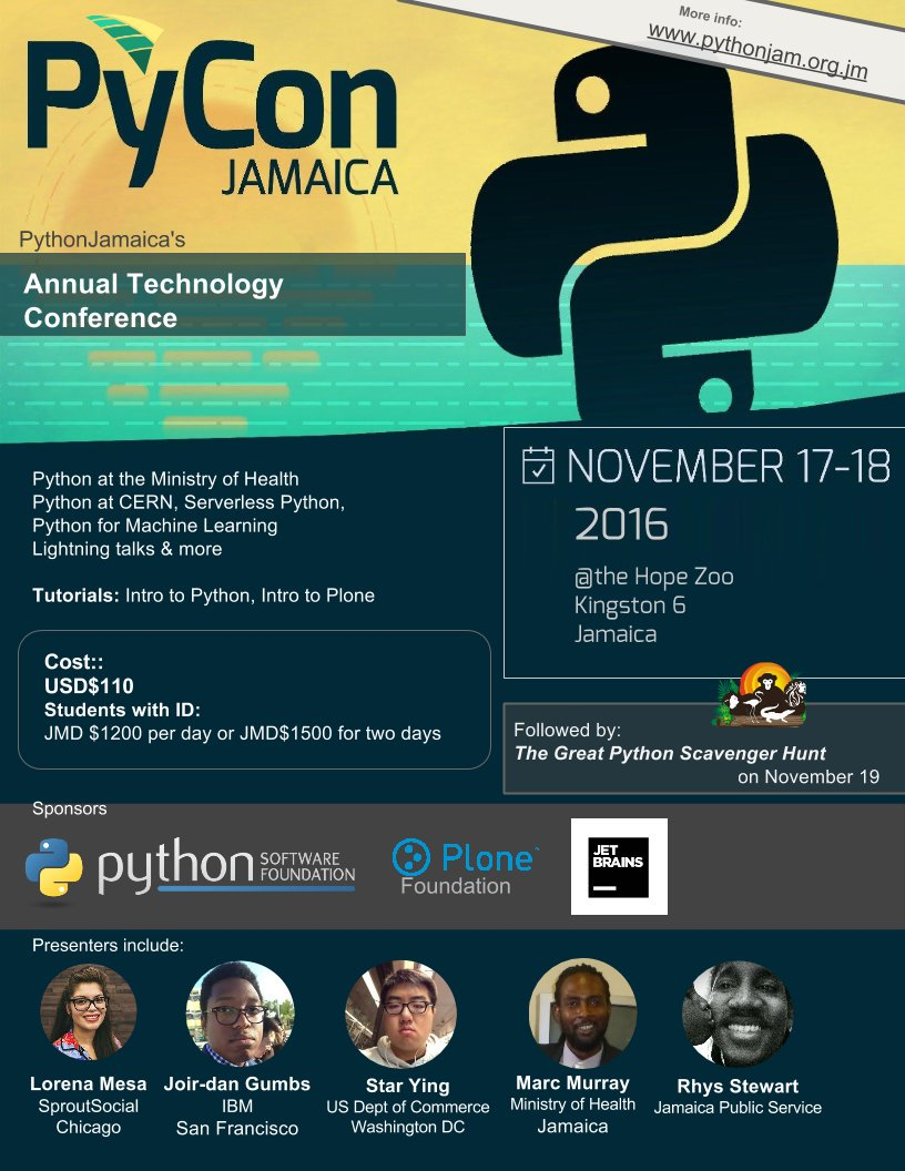
abhishekmishragithub
commented
5 years ago @agnes-joseph it could be something like this, where in one flyer we can all PyCon Detail.

 bravegnu
commented
5 years ago
bravegnu
commented
5 years ago More examples:

 abhishekmishragithub
commented
5 years ago
abhishekmishragithub
commented
5 years ago @bravegnu you got it better 👍
agnes-joseph
commented
5 years ago Thanks for the example @abhishekmishragithub and @bravegnu . By when would you need this? Also, can I get the required dimensions?
bravegnu
commented
5 years ago @agnes-joseph A4 should work.
bravegnu
commented
5 years ago @agnes-joseph @astronomersiva Just wanted to check on this.
agnes-joseph
commented
5 years ago Will try to work on this in the weekend, by when do you need it? @bravegnu
bravegnu
commented
5 years ago Monday should work. Next time around you can let us know when it can be done. We can work it from there.
agnes-joseph
commented
5 years ago Sure @bravegnu Will keep that in mind :)
agnes-joseph
commented
5 years ago 
Came up with this as a rough draft, should anything else be added? Also, which file format should I send it as?
bravegnu
commented
5 years ago The file format: PDF and PNG
The content looks sufficient. Here are few changes that needs to be made, in terms of the design.
For the top background, we can drop the outline from the logo and use a different shape. The idea is to avoid playing around with the logo too much.
The bottom background outline can be retained as such, but please use the outline from the latest version of the logo. You can get the latest SVGs from https://github.com/pythonindia/inpycon2019-tasks/tree/master/art
I have marked a few places in the image below, that does not have sufficient contrast.

bravegnu
commented
5 years ago 1. For the top background, we can drop the outline from the logo and use a different shape. The idea is to avoid playing around with the logo too much.
Or if we would like to keep the symmetry between the top and bottom outline, the elements within the top outline can be dropped.
But the outlines are themselves actually a good idea, because if the poster is affixed on a noticeboard it will attract attention.
agnes-joseph
commented
5 years ago @bravegnu Thanks for the feedback. Will make the suggested changes and upload. Completely forgot about the logo! I'll replace it
agnes-joseph
commented
5 years ago  Made the suggested changes and cleaned up the layout. Again, this is a rough draft, do let me know if it's fine. I'll make some small changes and push the PDF version
bravegnu
commented
5 years ago Looks good @agnes-joseph Can we also have Grayscale variant (preferrably with a white background, instead of the shaded background), suitable for printing on standard laser printer.
agnes-joseph
commented
5 years ago Pycon 2019.zip Included RGB CYMK and Greyscale variant
bravegnu
commented
5 years ago Thanks @agnes-joseph One final change request, can we move the background icons to the left hand side? Atleast in the grayscale version it makes some of the text hard to read.
agnes-joseph
commented
5 years ago PyCon Poster 2.zip Here you go!
bravegnu
commented
5 years ago A few more fixes before we can finalize:
agnes-joseph
commented
5 years ago Sure. Will make the changes by tonight
agnes-joseph
commented
5 years ago
Paper Pamphlet design for promotion work