 mrityunjoypc
commented
7 years ago
mrityunjoypc
commented
7 years ago Hi,
Something like this could work.
(the two pythons forming a 'W' of thr pyWinAuto),

@sorry, doesn't have a professional touch. Hope someone would comeup with a better one.
 sotaho
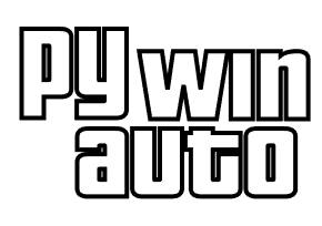

 airelil
 vasily-v-ryabov


 gnomic
 hansonap


 maniprksh
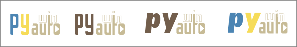
My friend Anna (her profile at Behance.net) has painted several icons for our project. There are the best sketches (watermarked) she made for us:
We are in doubt which of these beautiful icons to choose. :) Any opinions and suggestions are welcome!