 qgib
commented
5 years ago
qgib
commented
5 years ago Author Name: Jürgen Fischer (@jef-n)
- description was changed from See screenshot attached.
Left is Windows right is Linux same dataset/QGIS version.
As you see in the Windows box, it is not as clear as in the Linux box that one of the layers/groups is 'active'. Also I saw users click on the name of the group and then nothing happens, because you have to click on the little 'button/icon' to the right. Which on Linux are more or less visible as 'buttons', but on the Windows screen (not so big screen) as you see it is one big grey bar in which it is not obvious that you have to click on it next to a group.
I'm not sure what the easiest or best solution is here:
- Either make the Groups in Windows more or less look the same as in Linux (though it is not super clear either there in my opinion)?
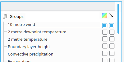
- Add visibility checkboxes in front of every group row?
- Make the name clickable too, so clicking the name already makes it visible (though that is maybe tricky).
Anyway, as said, this is a feature request, it's not a real issue. Thanks.
to 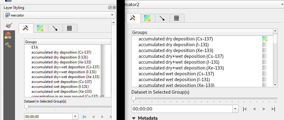
Left is Windows right is Linux same dataset/QGIS version.
As you see in the Windows box, it is not as clear as in the Linux box that one of the layers/groups is 'active'. Also I saw users click on the name of the group and then nothing happens, because you have to click on the little 'button/icon' to the right. Which on Linux are more or less visible as 'buttons', but on the Windows screen (not so big screen) as you see it is one big grey bar in which it is not obvious that you have to click on it next to a group.
I'm not sure what the easiest or best solution is here:
- Either make the Groups in Windows more or less look the same as in Linux (though it is not super clear either there in my opinion)?
- Add visibility checkboxes in front of every group row?
- Make the name clickable too, so clicking the name already makes it visible (though that is maybe tricky).
Anyway, as said, this is a feature request, it's not a real issue. Thanks.
Author Name: Richard Duivenvoorde (@rduivenvoorde) Original Redmine Issue: 21385
Left is Windows right is Linux same dataset/QGIS version.
As you see in the Windows box, it is not as clear as in the Linux box that one of the layers/groups is 'active'. Also I saw users click on the name of the group and then nothing happens, because you have to click on the little 'button/icon' to the right. Which on Linux are more or less visible as 'buttons', but on the Windows screen (not so big screen) as you see it is one big grey bar in which it is not obvious that you have to click on it next to a group.
I'm not sure what the easiest or best solution is here:
Anyway, as said, this is a feature request, it's not a real issue. Thanks.