qwikifiers / qwik-ui

Qwik's official Headless and styled component library
https://qwikui.com
MIT License
558 stars 115 forks source link

RFC: Checkbox Component and Its API #729

Open TheMcnafaha opened 2 weeks ago

TheMcnafaha commented 2 weeks ago

Table of Contents

Goal

The goal of this RFC is to obtain the best user experience for our checkbox component. Particularly, I want feedback on how to handle the API of both the simple standalone checkbox and a list of checkboxes that are all controlled by one parent checkbox.

Background information

The W3C splits checkboxes into two types: (1) two-state and (2) mixed-state. Below are two pictures, one for each W3C example:

image image

The first image shows a bunch of two-state checkboxes; you can only leave the checkboxes in the first image as "checked" or "empty". The second image shows a leading mixed-state checkbox. While the difference may not seem to be much, the mixed-state checkbox has to handle multiple unique features that can be grouped into three kinds: (A) parent-to-child behaviors, (B) child-to-parent behaviors, and (C) mixed-state behavior. Each kind of behavior is described more below:

A) parent-to-child:

  1. Marking the mixed-state as "checked" makes all of its children checkboxes as "checked" too.
  2. Marking the mixed-state as "empty makes all of its children checkboxes as "empty" too.

B) child-to-parent:

  1. If all the children checkboxes are "checked", the mixed-state checkbox is automatically left as "checked" too.
  2. If all the children checkboxes are "empty", the mixed-state checkbox is automatically left as "empty" too.

C) mixed-state:

  1. the mixed-state checkbox enters its mixed state when some, but not all, of its children checkboxes are checked. Below is an image showing what this looks like: image

Lack of alternative solutions

Nearly every current UI library has a checkbox component. Of those that have them, some implement the mixed-state functionality. Of those that have the mixed functionality, none that I've seen provide a primitive, guide, or general example on how to use their mixed-state checkbox the way the W3C outlines.

I have managed to make this work. I have attached appropriate images below showing all 3 possible states and the source code.

image image image image

Code overview

Checklist

The "Checklist* component (starts on line 5 of image above) needs to be used anytime two or more checkboxes are grouped due to ARIA. As it is, this component requires the user to pass an ID that matches text that labels the grouped checkboxes.

Mixed State Checkbox

The first checkbox (starts on line 6 of image above). This checkbox has the property of "checklist" as "true", meaning that it behaves as a mixed-state checkbox instead of the default "two-state" checkbox. This is done so that consumers don't need to use more than one component to get both two-state and mixed-state behavior. Under the hood, it looks like this: image

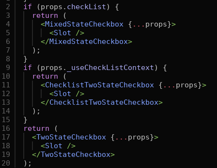
So, it would be easy to makes this API work instead: image

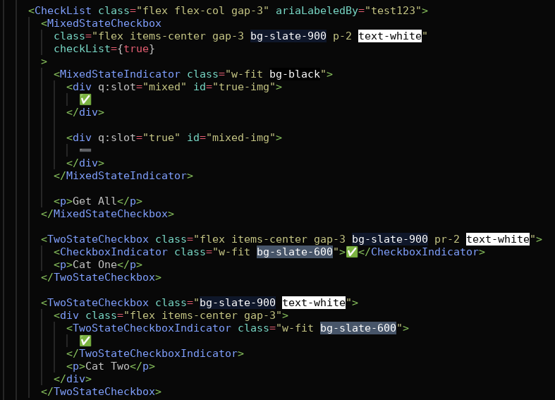
This alternative API makes the difference between the two types of checkbox more explicit at the expense of having two components. I'm 50/50 on whether it would be a good idea to make the distinction between the two components more explicit or not.

Mixed State Indicator

image Because a mixed-state checkbox must have a total of three visual state (blank, mixed,checked), the indicator supports two graphics. I currently achieve this by using two named slots: "mixed" and "true". These allow for the correct graphic/element to be shown. I think it would be a good idea to use slots here (and other places in the library too) because they allow the most amount of user-customization while notably simplifying the code structure and HTML output. The only downside is that users would need to familiarized with another Qwik-ism, but I think this is a very easy part to understand and is a valuable piece of information. Nonetheless, if I'm the only one that likes this idea, I don't have a problem adding two more components to replace the two current named slots.

I am currently calling it "ChecklistIndicator" because its meant to show the state of all the other checkboxes inside the Checklist component, but it could also just be called "MixedStateIndicator". I slightly favor the current name.

Two State Checkox

image The classic checkbox. The only notable part is the "CheckboxIndicator", which is just a way to hide or show any passed children to it based on the state of the checkbox.

Checkbox Label

Currently, any text that's passed on the checkbox becomes its label: image 
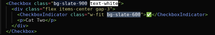
I need to do more testing to ensure this is the case, but assuming it was, should I still add a label component to make the label part more explicit or leave it as it is?

Naming

All names are up for improvements/suggestions.

maiieul commented 2 weeks ago

First off, A.M.A.Z.I.N.G RFC! Really cool! Thanks @TheMcnafaha!

Now I have a couple of questions/remarks πŸ•Ί:

1) on the API, I prefer keeping it unified with something like Checkbox Checklist CheckboxIndicator. TwoStateCheckbox is very off-putting to me, so unless there is an absolute necessity to have it like that, I'd rather avoid it if we can.

2) on the naming, I think we've started adopting the dot syntax. So maybe Checklist, Checkbox.Root, Checkbox.Indicator? @thejackshelton WDYT of Checkbox.Root? It's a bit odd to have a .Root inside of a Checklist, no? Could we remove the .Root on the other components?

3) on q-slot, it may look ugly to React users, but this reminds me of Vue. I personally don't mind if it means more flexibility than a regular component. Please, could you create issues for each component where you think it would be great to have that pattern πŸ™

4) on the checkbox label, I don't think it's a good idea to automatically transform text into a label. Labels can be used with other components such as inputs or switches, so I think it's good to have a separate component and simply stick it in the code examples (or use the native label to avoid confusion πŸ€·β€β™‚οΈ). That's how Radix and Shadcn do it btw, but I think it logically makes sense either way.

5) on the checkbox indicator, is it possible to separately customize the background of the checkbox? For example, when using an icon with no background color?

TheMcnafaha commented 2 weeks ago

Thanks for the feedback @maiieul

on the naming, I think we've started adopting the dot syntax.

Yes, the components should be moved to the dot syntax.

Please, could you create issues for each component where you think it would be great to have that pattern πŸ™

I'd be happy to do this. I'll try to make a report on the components that I think would be benefited the most by the end of next month.

on the checkbox indicator, is it possible to separately customize the background of the checkbox? For example, when using an icon with no background color?

Yes.

I don't think it's a good idea to automatically transform text into a label. Labels can be used with other components such as inputs or switches, so I think it's good to have a separate component and simply stick it in the code examples

I hadn't considered the part you mentioned in the second sentence. I will try to make the native label work as you suggested too.

thejackshelton commented 2 weeks ago

I really enjoy the depth you've explained here @TheMcnafaha. After reading through the RFC, here's some of my thoughts:

checkList prop

The checkList true prop, it seems to me that this should always be true when the Checklist is a parent of the checkbox.

Perhaps we can use an inline component in the Checklist to check for the existence of <Checkbox />, that way a prop is not needed for the consumer, and it is automatically upgraded into a checklist.

A label

The preferred way to compute an accessible name whenever possible, is visual content and the use of aria-labelledby.

In the select, I check if the SelectLabel component is passed on the server by the consumer, and if so, the text inside becomes its accessible name.

The fallback is the content inside of the Select. If the user wants to make the content inside the component hidden, they can use our VisuallyHidden component.

We want to create experiences that are tailored to our applications, and this seems to be what Kobalte UI has done, by providing these components for accessible names, descriptions, error states, etc.

Slots

The slots are pretty off putting to me, for someone to know how to use it, they would need to look through a specific portion of the docs, which is likely going to add frustration, or at the very least, be harder to manage than a component included in the dot notation syntax (or the top of the docs & in code examples).

Checklist & Checkbox: Two components?

My biggest concern here would be intuitive customization. By that I mean, what would people expect?

Another thing to mention, is that it is similar to how the disclosure and accordion components work. It seems to me that a Checklist could be another new component, built on top of the Checkbox primitive.

I think both are pretty declarative of what they do, and a similar separation of what we have to the disclosure + accordion makes sense. I could also see it being one component and then the checklist being an advanced section of the docs.

Amazing

@TheMcnafaha this is a big let him cook moment. πŸ‘¨β€πŸ³ awesome job so far, look forward to trying it out.