rachelyeohm / pe

0 stars 0 forks source link

Truncated remark box #17

Open rachelyeohm opened 1 week ago

rachelyeohm commented 1 week ago

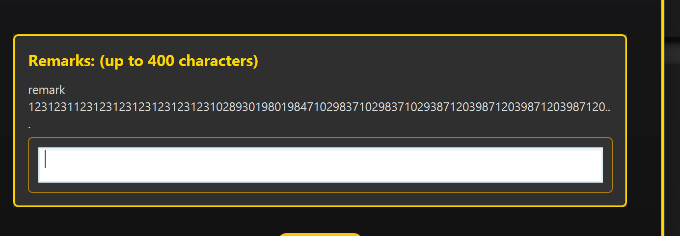
image.png The remark box of the moreinfo popup screen truncates any long remarks. When the remark box allows up to 400 character, but provides no way to see the remark in full, it could be an inconvenience to users.

nus-pe-script commented 1 week ago

Team's Response

The problem does not hinder the user's ability to use this feature. It is a cosmetic issue

Items for the Tester to Verify

:question: Issue type

Team chose [type.FunctionalityBug] Originally [type.FeatureFlaw]

Reason for disagreement: [replace this with your explanation]


## :question: Issue severity Team chose [`severity.VeryLow`] Originally [`severity.Medium`] - [x] I disagree **Reason for disagreement:** I agree that this is more of a FunctionalityBug, because the intended behaviour was not followed. However, I would not agree that this constitutes severity.VeryLow (which would indicate a cosmetic bug). I respectfully argue that the issue **significantly affects usability for regular users**. The remark box advertises a 400-character limit as shown in the original screenshot. However, in practice, when a user enters a remark under this limit, the text gets truncated. The user cannot: 1. View the full content of their remark. 2. Retrieve the lost content in any way. The truncation issue renders the remark box rather unusable for its intended purpose (recording and **reviewing** notes on clients). Let me raise a use case of the target user (property agent) recording remarks on a client. Given the following reasonable remark of ~390 characters: > Client prefers properties near public transport and schools. Mentioned interest in 3-bedroom units with modern interiors, balcony space, and good natural light. Budget is flexible, but prefers options under $800k. Previously discussed areas like Green Valley or Rivertown. Likes open floor plans and is okay with minor renovations. Prioritized quick move-in. Client seems fussy about the layout. The remark box truncates the remark as follows: ![image.png](https://raw.githubusercontent.com/rachelyeohm/pe/main/files/7419d402-96f8-4614-922d-248b94f9d436.png) One can see how about half of the comments are truncated, with no way to access what is previously written. In another scenario, where the user / property agent might separate their points into different lines, the following remark barely shows at all in the remark box: > Location Preferences: > - Near public transport and schools. > - Areas of interest: Green Valley, Rivertown. > > Property Features: > - 3-bedroom units with modern interiors. > - Balcony space and good natural light. > - Open floor plans preferred. ![image.png](https://raw.githubusercontent.com/rachelyeohm/pe/main/files/7f8b0dd9-145d-4d3c-b4d8-09777710ed91.png) Again, I would like to emphasise that there is **no way** to click in to see the full remark. For property agents who understandably want to review their notes on their clients, this would definitely cause significant inconvenience. For this reason, I maintain that it should be classified as medium severity. Thank you for the opportunity for clarification.