 fskreuz
commented
6 years ago
fskreuz
commented
6 years ago Slogan could need a refresh. It's probably no longer "Next-gen" (it probably was 5 years ago). And I think I remember someone also mentioned before to ditch the green. A "bold" color would be great.
As for the logo... Hmm... 🤔 Here's your competition:
React, Redux, GraphQL: (I really like FB's logo continuity)

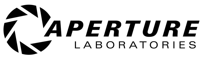
React, Angular, Vue: (Angular's shield for heroism, needed against monstrous code :trollface: )

Inferno

CodeIgniter and Laravel (just throwing this in. I used to work with CI.)

Meteor:

 evs-chris
 simonlayfield
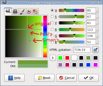
 ceremcem
 PaulMaly
 paulocoghi


 TotallyInformation

 Rich-Harris
 LeJared


Warning, almost manifesto. Reading carefully! ))))))
Hi everyone - maintainers and developers!
I believe that Ractive is the most simple, but the most powerful front-end framework I ever used. In past, I'd used Backbone and Angular. Quite recently, I'd tried React and Vue. But no one of them could give me the same simplicity, convenience, and functionality that Ractive gives.
In spite of the fact that Ractive is an excellent tool for building web apps, he isn't so popular, even in comparison with younger colleagues (hi Vue). And our community isn't very numerous. 5К+ stars on GitHub are not the most outstanding result.
However, Ractive is still alive and develops. Thank you very much @evs-chris, @fskreuz, @martypdx and other guys who maintain it. And of course to you @Rich-Harris, founder of Ractive.
I use Ractive in my work since 2013. Now in the end of 2017, we are very close to version 1.0. I believe it could be a turning point in the history of Ractive. I believe we could make Ractive more widespread and popular to involve new developers and maintainers.
To do that, we need to not only develop Ractive itself but also to form an ecosystem around him. We need to have awesome docs, awesome plugins and libs, awesome learning materials and other resources. And also we need to make little bit more marketing activities.
My version of the new logo you can find here. As you can see, the main concept is as though the logo is an element of a Periodic Table. I think it's quite cool. Also, I offer to change Ractive's slogan to something short and simple to read. I found this article by Eugene Mirotin from TopTal and I think what its title is what we look for - "Ractive.js - Web Apps Made Easy".
Thanks that you have read it. Please, leave your comments and put a thumb up if you agree with my proposals. Thus I will be able to estimate a need for this work. Also, I hope that my logo and slogan become a part of new Ractive's brand.
Good luck!
UPDATE:
Ractive's new logo I offer: