Team's Response
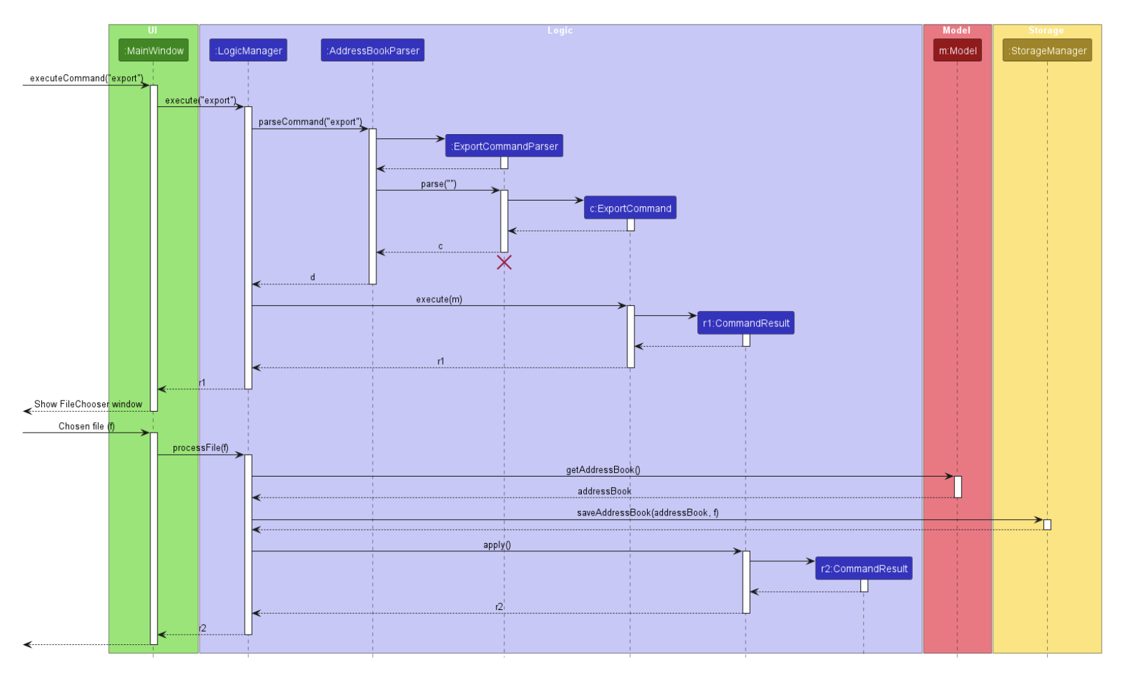
The sequence diagram is readable and understandable to people with knowledge of UML diagrams.
It is not too much information as you are still able to view all the details clearly without overlapping arrows or components.
At most, it is a cosmetic issue. Hence, the response will be severity.VeryLow.
Therefore, we will classify this bug response as Rejected.
Items for the Tester to Verify
:question: Issue response
Team chose [response.Rejected]
- [ ] I disagree
Reason for disagreement: [replace this with your explanation]
## :question: Issue severity Team chose [`severity.VeryLow`] Originally [`severity.Low`] - [ ] I disagree **Reason for disagreement:** [replace this with your explanation]
Overview
Screenshot below (page 11 of DG)
Suggestions
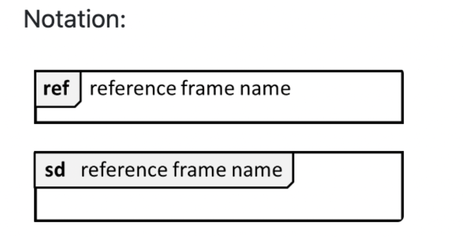
Notation for ref frames
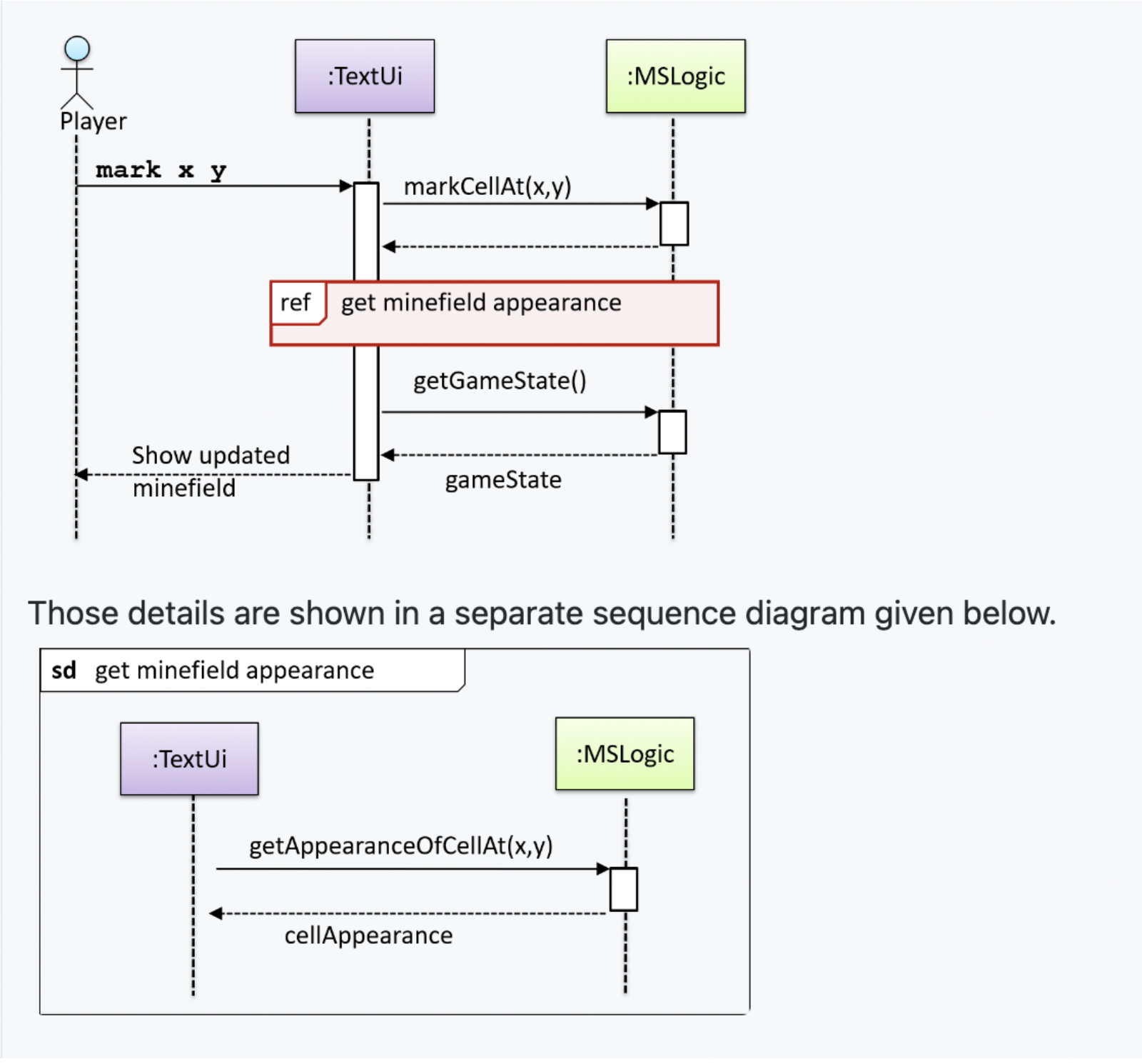
Example:
Additional Notes