rchain / bounties

RChain Bounty Program
MIT License
90 stars 62 forks source link

M> (G) REV Token Logo #148

Closed patrick727 closed 6 years ago

patrick727 commented 6 years ago

Summary of member driven initiative to reinvent the RChain Cooperative logo.

Public Discord - #logo-design

Drivers - @ValeBF, @llerner, @patrick727

Summary:

Final Design

Runner-Up

After weeks of collaboration on the github issue, the drivers moved for final feedback into #logo-design on the public discord, where many members contributed thoughtfully and multiple varations and iterations where created and shared to the group.

2018-01-08: The Drivers for the logo design concluded on a final design(now the "runner up"). Based on the points below.

2 Tone Color Palette (red and black)

Hollow center to represent "genesis block"

Represents consensus in a distributed network, with the "R" for "RChain" as the connections

Works well in shrunken sizes

Works well on printouts

After announcing it in #logo-design on the public discord, multiple contributors had a specific request to eliminate the hollow center that represents the genesis block.

A Board member suggested to create a poll within the #polling-station on the public discord in order to vote on the final two options; the option with the hollow center, and the option without.

The poll was created and described on that Wednesdays debrief - video link here

2018-01-10: Roughly 40 people voted between the two options and the poll was closed. Resulting in the "Final Design".

Outstanding Considerations.

Only 40 people voted in total, which is considerable for "active" members, but not representative of the total membership(almost 600 at the time of this)

The last minute decision to poll was good intentioned, but members expressed that, moving forward, these types of process' should be laid out in advanced, presented with adquetate time for members to be made aware, and followed through the deadline with no exceptions in order to cultivate discipline.

Integration with .coop branding is still a meaningful consideration that will need to be revisited.

The REV logo and RChain Cooperative Logo should be distinct, the existing logo(cattlebrand) will become the REV logo and the new one will be the co-ops.

Contributors:

@kitblake, @ab, @AyAyRon_P, @barry_cynamon, @ian, @mythocurrency, @✨dachshundwizard✨, @Jonathanks, @phillip, @nicoalayev, @tet, @Navneet, @Mrinal Manohar, @kirkwood, @crys, @chrisb, @amir, , @abdul rehman,, @Ed, @phluid, @oscarpif:, @Hamish, @42erinlee, @lamouette, @ddayan

ValeBF commented 6 years ago

Some questions I have:

I as understand Rchain I think REV logo should look as a son brand... in my opinion should follow the style it use currently. I know the concepts you are using for this are : intergalactic theme, wormhole with fibonacci, I will keep this line.

patrick727 commented 6 years ago

Hey @ValeBF

Does that help?

ValeBF commented 6 years ago

Hi! Here I have some concepts I worked on for the REV token logo, I tried to keep on mind the theme you mentioned but also was very important see REV as son brand of RCHAN. This is a initial phase I wait for your feedback and thoughts to keep working.

Please let me know how the brad should named : REV or REV TOKEN or none of them just the icon. Also I would like to know if the proposed colors are working on the purpose of the icon or maybe you have something else on mind.

REV- native 1.0.pdf

patrick727 commented 6 years ago

@ValeBF thank you for working on this immediately.

I sent it out through our channels for feedback and will have the feedback for you soon.

Cheers

kitblake commented 6 years ago

Hi Valeria,

It's always fun to see a doc with variants like you made. Later in this mail I'll provide some design critique, which is a personal opinion, but first let me explain a couple requirements of a logo for a token.

  1. The logo has to be reducible.
  2. It has to function in B&W.

Since the logo is for software, as opposed to print, it must have a distinct form and be reducible. It'll need to work as a tiny icon. It must be a shape that is recognizable at small resolutions. That also means that text cannot be an integral part of the logo. To see what I mean have a look at this index site: https://www.worldcoinindex.com/ All the logos have been reduced to favicon size, 16x16 pixels. That's a test you'll need to make.

In a mobile app, like a wallet, the icon will be small and it also could appear in push notifications. On Android have a look at the notification bar at the top of the screen. Those icons have a pure B&W variant (actually just white and transparent). For smaller phones the icon is 18x18 pixels.

So when I opened your PDF in Preview I scaled it way down, like this: rev_logo_reduced

From this functional test you see that the icon on page 2 works the best. The first one with the double spiral ends up looking like a kiss. That's not a message we want to convey. ;) The third and fourth get antialiased into an indistinct blur.

You'll also notice that the RHOC logo in the upper right corner fails. It contains text which gets blurred into unreadability.

About the color: if you look again at that index page you'll notice that there's a preponderance of blue logos. Blue is the safest color for a logo so that's not surprising. There are almost no logos with a deep red color. So I'm quite fond of the RChain scarlet you're using because it's powerful and will help the RHOC/REV to stand out.

About the text: the logo needs to function as an icon, with no text. But when it does have text, like we might use on our site, then 'REV' is enough, we don't need 'Token'. Typographically, my favorite is again page 2. The typeface has style and the weight is strong. Page 1 is kinda standard, page 3 is retro-theatrical, and page 4 is better than page 1 but still standard.

The RChain RHOC logo with text uses the Brandon Grotesque font. You could try using that one for backwards compatibility. Probably has a nice V.

About the logo concept(s): I'll save page 2 for last.

If you continue with the spiral aspect, be careful with the single. There's a famous logo in the open source world, for the Debian Linux distribution, which we shouldn't get too close to: https://duckduckgo.com/?q=debian+logo&iax=images&ia=images It's also often in scarlet.

The double spiral sketches don't have that echo. Remember that our galaxy, the Milky Way, is a double spiral as well.

@patrick727 Do you know what REV is an acronym for?

It's a particularly nice acronym because it could be 'revolution', and that's certainly appropriate. Also engineers talk about revs as shorthand for the number of rotations. If you pronounce it with a French accent as rêve it means dream.

Maybe think about the wave aspect. It fits with revolution and disruption. In the grand scale of things revolutions occur at regular intervals. You see waves in the timeline.

There's also a key concept in our software: concurrency. The RChain blockchain will be able to handle multiple concurrent processes happening simultaneously. I'm not sure how to represent that visually but it's one of the differentiating factors we could use as inspiration.

Good luck and play away!

patrick727 commented 6 years ago

Great feedback @kitblake. I'm not quite sure what the REV is an acronym for but the metaphors for revolution(s) work well.

burn1ngchr0me commented 6 years ago

screen shot 2017-11-19 at 4 53 35 pm

burn1ngchr0me commented 6 years ago

My early rough take on it

ValeBF commented 6 years ago

Hi there!

That is a great feedback @kitblake . Everything you mention is an invaluable input for me to work, there are very important elements to have on mind and you made clear some doubts I had.

I will keep working in some new concepts based on your comments and I will show you soon.

burn1ngchr0me commented 6 years ago

All are good ideas! I am just throwing some things out there for thought. rev-logo-ideas

kitblake commented 6 years ago

Nice input @pythonical. Electrons whirling around a nucleus could represent concurrent processes. Did you make this yourself? I've seen something like it used for Generator, a sound art space in NYC, but that was more of a retro rendition.

Concurrency is a tricky concept to visualize. I thought about:

  1. A multi-armed spinning spiral
  2. An octopus

But having faint or fading lines is problematic when it gets reduced to icon size: rev_atom

It's better to have some sort of solid shape that is still recognizable at small resolutions.

But don't let my critique hamper the brainstorming! You and @ValeBF and anybody else should feed fuel to the fire.

burn1ngchr0me commented 6 years ago

i made it using free 'swooshes' and such but yes the problem with it is waaaay too many look a likes (i was looking at them this morning i hadn't before i made it) but a circle is also a very tough one to make stand out since so many use them and when small a circle doesn't stand out much. i also was trying to think of different ways to show 'revolving/motion' and came up with this idea. i have looked at thousands of logos since becoming a member as i really think the double 'R' also needs some smoothing out but i haven't found anything or been able to put together anything that just screams 'that's it!' its tough trying to do a proper logo!

burn1ngchr0me commented 6 years ago

oh i also like using the 'Raleway' font. I think it is a bit more elegant than Roboto (Ethereum uses that) but both are open source and great.

kitblake commented 6 years ago

Ah, so that was it, I was wondering while looking at that broad opening in the R.

Raleway also has a lower case l that can be differentiated from an upper case I (which the font in Github does not, sigh). Always look for the capitalized word Italic to test.

ValeBF commented 6 years ago

Hi! I worked on some new concepts based on your comments I maintained option #2 as long as you favorite was that one. Here I tried to show you the minimum size and B/W version.

I also deleted completely the font for now, because as I understood it we ned to focus on the icon and when we decide any direction I will look for a complementary Typography and style.

Please let me know your thoughts.

REV-.native.2.0.pdf

patrick727 commented 6 years ago

Ooh @ValeBF the first 4 are really nice

I like what you did.

@kitblake , @pythonical , @llerner what do you think?

burn1ngchr0me commented 6 years ago

Those are all very well done! My favs are 2 and 4!

ian-bloom commented 6 years ago

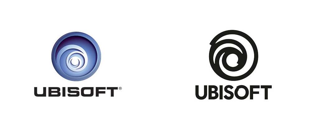
Looks nice, but we should Avoid Generic & Overused (swirls and atoms). Google swirl logos Google atom logos

Seagate Logo Focus Web Marketing Ubisoft

Microstock Milan

patrick727 commented 6 years ago

Thanks @drbloom.

I actually think the swirl is really nice and a base that we started with, but I see your points.

In the interest of time, can we put this for a vote through Jake's github voting mechanism. Or is there another way that we can vote on the option we like the most?

SurveyMonkey?

I sent off feedback for leadership but we will need to drive this forward.

llerner commented 6 years ago

I agree. These all look familiar. There was an earlier design that looks like this. I think the mathematics and notion of ratios plays well on the math of RChain

======================== Lawrence I Lerner o/m: 630.248.0663 lawrencelerner@gmail.com

Blog: lawrenceilerner.com http://www.lawrenceilerner.com/twitter: RevInnovator https://twitter.com/#!/RevInnovator

On Nov 21, 2017, at 22:53 , drbloom notifications@github.com wrote:

Avoid Generic & Overused (swirls and atoms). Google swirl logos https://www.google.com/search?q=swirl+logos&source=lnms&tbm=isch&sa=X Google atom logos https://www.google.com/search?q=atom+logos&tbm=isch&tbo=u&source=univ&sa=X https://camo.githubusercontent.com/4c43e92182efc19a160aeaa9ffb16cd16b5f9874/68747470733a2f2f7669676e65747465342e77696b69612e6e6f636f6f6b69652e6e65742f6c6f676f70656469612f696d616765732f302f30372f4c6f676f5f536561676174655f4f6e652d636f6c6f722e7376672f7265766973696f6e2f6c61746573743f63623d3230313530343138313330373339 https://camo.githubusercontent.com/fb0424e076fb4faf2aaa48891c66842db5bc4e97/68747470733a2f2f7365656b6c6f676f2e636f6d2f696d616765732f572f7765622d6d61726b6574696e672d6c6f676f2d394435303241383935322d7365656b6c6f676f2e636f6d2e676966 https://camo.githubusercontent.com/4ba024b4a741f5abe73a8f5c3f499b0c3bd6a69b/68747470733a2f2f7777772e756e646572636f6e73696465726174696f6e2e636f6d2f6272616e646e65772f61726368697665732f756269736f66745f6c6f676f5f6265666f72655f61667465722e6a7067 — You are receiving this because you were mentioned. Reply to this email directly, view it on GitHub https://github.com/rchain/Members/issues/148#issuecomment-346259684, or mute the thread https://github.com/notifications/unsubscribe-auth/Ac5RIDijOVpLc837ybhxRi_b24bDejUjks5s48TtgaJpZM4QTlEw.

kitblake commented 6 years ago

My fave is #5 (if it were red :), I'll explain later.

ValeBF commented 6 years ago

I saw the close similarity to the concepts I sent but I draw everything from scratch I have every lines and sketches also I know more research is my responsibility.

The golden ratio is infinite but some times we (designer) take same lines some times, they are clean and our eye follows them easily. I know there are some concepts that please some people on the team and some others dont, likable design is subjective and I always find this kind of situations.

I will suggest other round of concepts based on 3 options you select to guide my inspiration.

I will follow your instructions please let me know.

ValeBF commented 6 years ago

@kitblake Here is option #5 on Rchain Red

REV-.native.b2.0.pdf

ian-bloom commented 6 years ago

Do you all remember these logo submissions from last year ? from Slack #Design channel

burn1ngchr0me commented 6 years ago

Does REV need its own logo? Does XRP have its own or just the Ripple logo?

ian-bloom commented 6 years ago

It was previously suggested to create a simple symbol to represent the REV. It would be nice to design a symbol that somehow emphasizes Utility over Value. By utility, I mean what the REV actually measures - bandwidth, storage, and compute. More abstractly, REV is expended to generate consensus, or agreement about what is the true state of transactions. Contrast this with today's symbols that merely represent economic value:

Character Name Browser
U+0024 DOLLAR SIGN $
U+00A2 CENT SIGN ¢
U+00A3 POUND SIGN £
U+00A4 CURRENCY SIGN ¤
U+00A5 YEN SIGN ¥
U+058F ARMENIAN DRAM SIGN ֏
U+060B AFGHANI SIGN ؋
U+09F2 BENGALI RUPEE MARK
U+09F3 BENGALI RUPEE SIGN
U+09FB BENGALI GANDA MARK
U+0AF1 GUJARATI RUPEE SIGN
U+0BF9 TAMIL RUPEE SIGN
U+0E3F THAI CURRENCY SYMBOL BAHT ฿
U+17DB KHMER CURRENCY SYMBOL RIEL
U+20A0 EURO-CURRENCY SIGN
U+20A1 COLON SIGN
U+20A2 CRUZEIRO SIGN
U+20A3 FRENCH FRANC SIGN
U+20A4 LIRA SIGN
U+20A5 MILL SIGN
U+20A6 NAIRA SIGN
U+20A7 PESETA SIGN
U+20A8 RUPEE SIGN
U+20A9 WON SIGN
U+20AA NEW SHEQEL SIGN
U+20AB DONG SIGN
U+20AC EURO SIGN
U+20AD KIP SIGN
U+20AE TUGRIK SIGN
U+20AF DRACHMA SIGN
U+20B0 GERMAN PENNY SIGN
U+20B1 PESO SIGN
U+20B2 GUARANI SIGN
U+20B3 AUSTRAL SIGN
U+20B4 HRYVNIA SIGN
U+20B5 CEDI SIGN
U+20B6 LIVRE TOURNOIS SIGN
U+20B7 SPESMILO SIGN
U+20B8 TENGE SIGN
U+20B9 INDIAN RUPEE SIGN
U+20BA TURKISH LIRA SIGN
U+20BB NORDIC MARK SIGN
U+20BC MANAT SIGN
U+20BD RUBLE SIGN
U+20BE LARI SIGN
U+20BF BITCOIN SIGN
U+A838 NORTH INDIC RUPEE MARK
U+FDFC RIAL SIGN
U+FE69 SMALL DOLLAR SIGN
U+FF04 FULLWIDTH DOLLAR SIGN
U+FFE0 FULLWIDTH CENT SIGN
U+FFE1 FULLWIDTH POUND SIGN
U+FFE5 FULLWIDTH YEN SIGN
U+FFE6 FULLWIDTH WON SIGN

(chart from: http://www.fileformat.info/info/unicode/category/Sc/list.htm)

ian-bloom commented 6 years ago

Icon or Logotype for REV (Draft)

Background: RChain Cooperative is developing a scaleable blockchain as a public utility. Our membership owns and controls the chain. The RChain platform consists of many individual computers (nodes), each running the RChain software stack. Consensus between nodes is negociated using Casper POS (Proof of Stake). Transactions on the platform are metered in REV, which is a measurement derived from the costs of storage, bandwidth, and computation. Sensitive and highly valued transactions requiring stronger validation may expend additional REV to achieve a higher degree of consensus. Scalability is achieved by implementing a concurrent processing model called the Rho Mobile Process Calculus. (This is where the R comes from in RChain, REV, Rholang, and RHOC ).

Best Option: An abstract, minimalistic icon that conveys CONSENSUS. Consensus means an agreement or judgment arrived at by most of those concerned.

Alternative Option: A clever Logotype using the letters 'REV' conoting aspects of the platform described above.

Preferences:

lapin7 commented 6 years ago

Spirals are also used by Scala https://duckduckgo.com/?q=scala+logo&iax=images&ia=images

lapin7 commented 6 years ago

@ValeBF please send your email address to ops@rchain.coop Like that you can be compensated in RHOC for your work done on issue #148 or I think that @patrick727 has also these details

kitblake commented 6 years ago

Definition of consensus 1 a : general agreement : unanimity .. b : the judgment arrived at by most of those concerned 2 : group solidarity in sentiment and belief First Known Use: 1843

"Consensus implies that everyone accepts and supports the decision, and understands the reasons for making it. See also collective responsibility." Read more: http://www.businessdictionary.com/definition/consensus.html

@drbloom Where did that brief come from.. I've been spinning the wheels about it.

Q: Consensus doesn't require that all nodes agree, right? Just most of them. Is it a democracy, aka rule of the majority? Q: Does "a higher degree of consensus" mean a larger majority of nodes consent? Q: What does REV stand for? Rho Emergent Valuation? Rho Ethereal Vehicle? Rho Entropy Vortex?

When the network gets rolling thousands of nodes will spin up. That's a lot of participants. I'm wondering how to visualize it.

One idea is the Round Table of King Arthur, which was a device for removing hierarchy and fostering consensus: https://en.wikipedia.org/wiki/Round_Table#/media/File:King_Arthur_and_the_Knights_of_the_Round_Table.jpg

However this doesn't provide a distinctive icon. Could be a sun with 25 rays. Or the spicules of a virus cell. A motorcycle ice racing tire with spikes. Meh.

Have a good Thanksgiving all! Indulge in some food for thought..

randomcomposition commented 6 years ago

img_0311

lapin7 commented 6 years ago

Hard to be original. See existing logo's. My 2 cents ;-)

image

image

image

image

image

image

image

image

lapin7 commented 6 years ago

And so on.

image

image

image

ian-bloom commented 6 years ago

@kitblake - I added the (above) design brief to add some structure, but was not involved in opening this issue. As far as I'm concerned, the 'double-R' logo is fine for now, but we can do far better.

@patrick727 - Can you add some explanation about why we should re-brand now, and how this fits in to website re-design?

kitblake commented 6 years ago

@ValeBF, I'm psyched to see that you're using Fibonacci spirals to construct these. As @llerner said, the mathematicians in the co-op will appreciate that.

The Golden Section is a proven balanced proportion, and we've all seen it in Nautilus shells and the spiral branching of plants. Surprisingly, the Fibonacci sequence also shows up in the movement of markets. The waves of price changes, while seemingly chaotic, move in Fibonacci proportions. There's order in the behavior of crowds.

So I think you should always include your construction lines in the mockups that you share.

Let me explain what I like about this direction. Imho it's not done, we need to iterate further, but it embodies a key concept that we should keep.

inputoutput

It's rotating. I think a token named REV should be making revolutions.

We could also use the word revolving but more likely it's cycling. The circle in the center is a nexus. There's input, the data gets spun around, and there's output.

When looking at it I wondered what would happen if those straight input/output lines curved. Then I noticed the construction drawing:

inoutschematic

Which has lines defined by Fibonacci spirals.

Let's flip and rotate:

inoutschematicrotate

Do you think we can shape something out of this?

edeykholt commented 6 years ago

image

lapin7 commented 6 years ago

https://www.google.nl/search?q=fibonacci+logo&rlz=1C5CHFA_enNL633NL633&tbm=isch&source=iu&ictx=1&fir=w4xnUHRvyMgZeM%253A%252CIApvSaqGD8PrBM%252C_&usg=__TxIDGatEsfg7uWQz7KRJQ0aToY4%3D&sa=X&ved=0ahUKEwjEqKvUudfXAhWFzRoKHc1BBnYQ9QEIRjAJ#imgrc=w4xnUHRvyMgZeM:

burn1ngchr0me commented 6 years ago

Going to have to come at this from a different angle if you want a spiral involved. The standard take on it is filled up and hard to stand out

llerner commented 6 years ago

Pulling together a couple of threads on the logo design

@ValeBF I request you ask a few structured questions (less than seven) of the membership to help guide your design. That will give you some guardrails and structure but still allow for your creative process. I suggest you create a separate thread solely to structure the question of what is should look like and the message. Then another thread for designs resulting from that. It will be captured and recorded but easier to follow.

My personal $.02 less is more. I vote for a symbol

ian-bloom commented 6 years ago

Nice discussion of design concepts. This could help guide a designer in creating something original. So far, all images in this thread are generic, copied or derivative works, E.g.

http://bpando.org/2014/06/30/logo-peter-dibdin-by-o-street/

burn1ngchr0me commented 6 years ago

the lines are thinner and placed differently on this one. not saying it isn't too close for comfort but look at the Target logo and Beats. But agree too common and not distinctive enough.

ian-bloom commented 6 years ago

@pythonical - The Target logo was created in 1962, before the spamming of thousands of generic logo designs onto the internet. The only way to acquire such a generic design is to purchase one that has already been trademarked.

Making tiny changes to existing logos does not give a designer the right to claim them as his/her own. To do so is highly unprofessional.

burn1ngchr0me commented 6 years ago

I agree but I do not think anyone is intentionally copying here. dealing with common shapes is going run a foul of Something already out there is very true.

kitblake commented 6 years ago

The idea to use a typographical symbol for RChain dovetails with the REV's usage on crypto exchanges. A unique (textual) symbol helps differentiate currencies. This can be seen on Kraken which, despite its flaky infrastructure, has a super advanced trading UI and uses typography well in its balances listing. Let's look at some of their currency symbols:

฿ Bitcoin Ł Litecoin Ξ ETH ξ ETC Đ Dash Ğ Gnosis ɱ Monero Ɍ REP (Augur) Ʀ Ripple ₮ Tether ⓩ Zcash

Plus some frenemies: æ Aeternity Ȅ EOS

As there are already two R-based symbols for REP and Ripple we probably should look for something different. The obvious choice, since we're using Pi Calculus, is the Pi symbol: π. If we want it to be currency-like, we could append to π with either one or two lines, like the Dollar $, or Euro €. (That's a horrible idea but I wanted to get it out of the way. ;)

Let's be very cautious about using a typographical symbol.

kitblake commented 6 years ago

Yeah, spiral swirls are trending on Crypto. This showed up in the QQ RChain group:

bhc_spiral It was spam. The admin banned the poster.

But there's a silver lining. @ValeBF, notice the icons in the notification bar at the top of the Android screen. They are: Telegram, Tripit, Tumbler, Swarm, YouTube, Download, Photos, and Google Play. Our logo has to work as well as these.

burn1ngchr0me commented 6 years ago

the 2 R's in that list are awful. are those actually posted on the token owners site as 'official'? Ripple uses that?? i guess this obvious style R attached typer must be used somewhere already?

burn1ngchr0me commented 6 years ago

And i don't intend that to be an offering for the double R replacement. i think the official logo/symbol should be just a symbol with no typography.

llerner commented 6 years ago

Playing off that.

======================== Lawrence I Lerner o/m: 630.248.0663 lawrencelerner@gmail.com

Blog: lawrenceilerner.com http://www.lawrenceilerner.com/twitter: RevInnovator https://twitter.com/#!/RevInnovator

On Nov 25, 2017, at 09:58 , charlie notifications@github.com wrote:

the 2 R's in that list are awful. are those actually posted on the token owners site as 'official'? Ripple uses that?? i guess this obvious style R attached https://user-images.githubusercontent.com/4267762/33233215-f7d8147e-d1d7-11e7-9980-33f6c9989d79.png must be used somewhere already?

— You are receiving this because you were mentioned. Reply to this email directly, view it on GitHub https://github.com/rchain/Members/issues/148#issuecomment-346955954, or mute the thread https://github.com/notifications/unsubscribe-auth/Ac5RIA4U0p1Rk10IJBiOamcm4n7SGvvKks5s6FVggaJpZM4QTlEw.

kitblake commented 6 years ago

That's the character for the Rupee.

burn1ngchr0me commented 6 years ago

@kitblake ah ha ha.