Team's Response
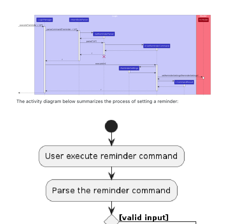
Thank you for the feedback! We wanted to prioritize making the diagram readable, so we decided to make it bigger. We believe the text is a reasonable size and is not jarring to read.
Items for the Tester to Verify
:question: Issue response
Team chose [response.Rejected]
- [x] I disagree
Reason for disagreement: https://nus-cs2103-ay2324s2.github.io/website/admin/tp-w10.html#admin-tp-deliverables-dg-tips

Let's take a look at another screenshot of the same diagram (and its surroundings). I see no reason why this particular diagram is of more importance that your text, or the previous diagram. Additionally, text that is too large is also less readable because it breaks the flow of the document

The size of the diagram and the font is too big compared to the size of the rest of the text