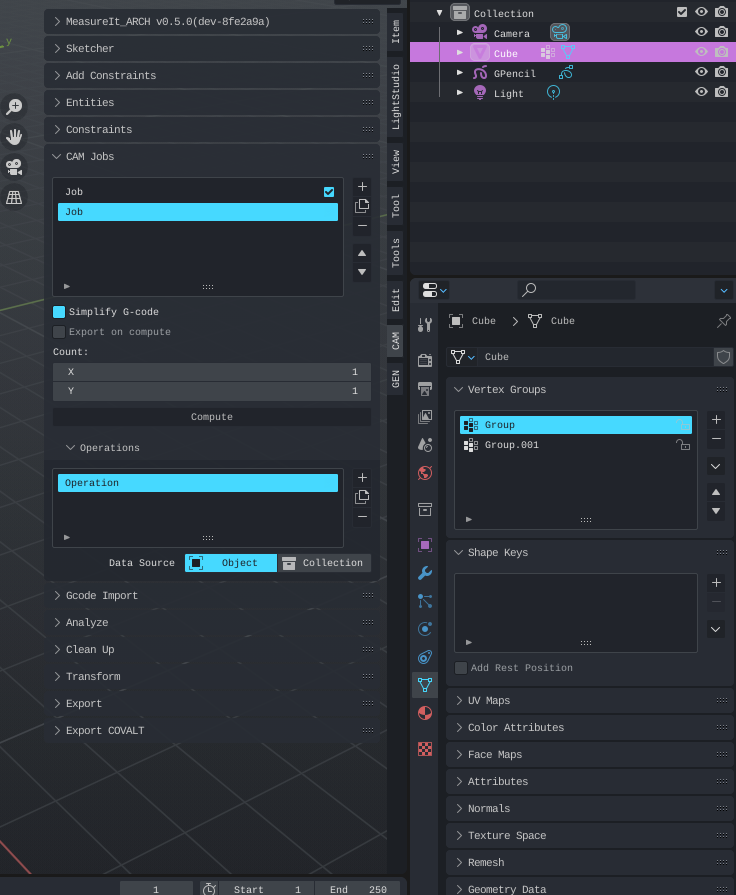
Hmm that's odd, mine looks a little different. My locks icons etc seem to be a light grey.

Open razcore-rad opened 1 year ago
Hmm that's odd, mine looks a little different. My locks icons etc seem to be a light grey.

That's interesting yeah. I am using Blender 3.3.0 Beta so that might be it?!
But in my opinion, the Blue saturated color is a bit too harsh and doesn't go well with other button press states either. Other icons are exactly the same color too, for example the viewport/render visibility

and others, like in the grease pencil lists, e.g. the onion skinning icon

the toolbar icons

It's a bit too close to the light colors on these buttons.
I was playing around with the same color from User Interface > List Item > Item and it kind of works, what do you think? :)


I'd use this or something a bit less saturated and light in the other places as well.
I see what you mean yea. I'll have a play around with it and see what I can come up with. If you do the same I'll take on board what you show.
It can be a little tricky sometimes because changing one thing can change multiple things you didn't intend to change.
By the way I have 3.5.0 alpha installed
I don't know the XML values to modify the theme, but these are the colors I gravitated towards.
# Stolen from Bone Color Sets > Color Set 8 > Regular
color=#4B707C
This gives us a good highlight on the tool shelf that has a variety of lighter color icons.


For the list items, I inverted Item and Selected:

By inverting those colors, when editing text fields we get:

I also used the Selected color from above for:
Tool > Selected
Radio Buttons > Selected
Option > Selected
This gives more of a unified look:

Don't know if I missed any. Seems like the icons from item lists are colored by Regular > Selected so I kept Regular > Selected and Regular > Item the same.
The only thing I'd change, but I don't know what's the option is the color of text input fields in the item lists:

Especially when editing the value:

Were you able to find the text input field option for item lists? I might be able to have a look and see if I can find it.
I didn't find it, wasn't that much of a priority, but it you have an idea of what to do with it, that'd be great.
Alright, I found that the colors for text entries in the list items are related to Regular and this is the solution I came up with:

So I made Regular > Text brighter which also changes the icon colors in the list items for me. And Regular > Selected is the same color as Regular > Text.
Which changes some other locations like these buttons at the top:

The list items text entries are like this:


I haven't really found any other good color combinations that go well with the blue selected list item.
In the end I'm going with this

Because most buttons are hard to determine if they're in toggled mode or not :)
This is a really nice theme, only problem I see is that most list icons aren't visible due having the same colors.
For example the checkbox and lock icons and many others. I really don't have any experience with themes, but if I figure out how to change the color I will and do a PR :)