Team's Response
No details provided by team.
The 'Original' Bug
[The team marked this bug as a duplicate of the following bug]
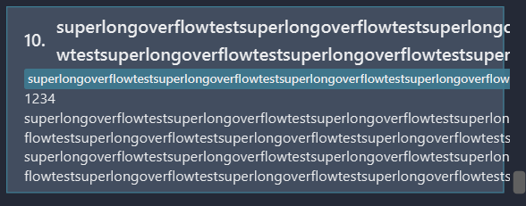
UI text overflow
Input: Very large inputs
Actual output: As shown in the image above, the text overflows from the UI if the name or details are extremely long.
Expected output: Perhaps an ellipsis at the end "..." to show it overflows, and provide a way to see the whole name. Alternatively, have a restriction on the length of the name and other inputs.
[original: nus-cs2103-AY2223S2/pe-interim#3515] [original labels: severity.Low type.FeatureFlaw]
Their Response to the 'Original' Bug
[This is the team's response to the above 'original' bug]
No details provided by team.
Items for the Tester to Verify
:question: Issue duplicate status
Team chose to mark this issue as a duplicate of another issue (as explained in the Team's response above)
- [x] I disagree
Reason for disagreement: Flagged as duplicate of a bug report that is about the contact UI being unable to handle overflow. This bug is about the meeting UI, which is separate (i.e. fixing that bug may not fix this bug as they are different UI objects and controlled by different fxml/java files).
## :question: Issue type Team chose [`type.FeatureFlaw`] Originally [`type.FunctionalityBug`] - [x] I disagree **Reason for disagreement:** Feature flaws are issues with the way a feature was designed. Seems unlikely that this is the intended behavior of the UI in this case (being unable to show all the names of multiple attendees to a given meeting should their names be long enough / enough attendees). This should be a functionality bug as the implementation doesn't match up with the (reasonable assumption of) purpose of the UI.
## :question: Issue severity Team chose [`severity.Low`] Originally [`severity.Medium`] - [x] I disagree **Reason for disagreement:** This bug is quite likely to occur for the target user who has to keep track of many meetings and contacts, as it is quite reasonable that the user will have some meetings that have >5 attendees (department meetings, team meetings etc). As it is rather disruptive (no other way to easily display all attendees), it should at least be of severity Medium.

If the number of characters total for all attendee's names exceed the length of the meeting UI box, their names are cut off instead of wrapping. This results in an issue of cut off names if there are many attendees assigned to a single meeting, or if the attendee names are long.
Below is an example with 2 attendees: Irfan Ibrahim and David Lee are assigned to Meeting 3 in that order. As you can see, David Lee is completely not visible in the UI.