 X-neuron
commented
5 years ago
X-neuron
commented
5 years ago import React, { useCallback, useEffect, useRef } from 'react';
import TextField from '@material-ui/core/TextField';
import Button from '@material-ui/core/Button';
import CssBaseline from '@material-ui/core/CssBaseline';
import Paper from '@material-ui/core/Paper';
import { makeStyles, withStyles } from '@material-ui/core/styles';
import Grid from '@material-ui/core/Grid';
import { SchemaModel, StringType } from '../../utils/schemaType/index';
import { useFormx } from '../../utils/useFormX';
const loginFormSchema = SchemaModel({
account:StringType().isRequired('用户账户不能为空').minLength(3, '账户名不能短于3个字符').maxLength(5, '账户名不能长于5')
.checkOnChange(),
pwd:StringType().isRequired('用户密码不能为空').minLength(3, '账户名不能短于3个字符').maxLength(5, '账户名不能长于5')
.checkOnBlur()
});
// console.log(loginFormSchema);
// const loginFormSchema = SchemaModel({
// account:StringType().isRequired('用户账户不能为空').minLength(3, '账户名不能短于3个字符').validateOnChange(),
// pwd:StringType().isRequired('用户密码不能为空').validateOnChange()
// });
const ValidationTextField = withStyles({
root: {
'& input:valid + fieldset': {
borderColor: 'green',
borderWidth: 2
},
'& input:invalid + fieldset': {
borderColor: 'red',
borderWidth: 2
},
'& input:valid:focus + fieldset': {
borderLeftWidth: 6,
padding: '4px !important' // override inline-style
}
}
})(TextField);
const useStyles = makeStyles(theme => ({
gridContainer: {
margin:theme.spacing(2),
padding:theme.spacing(1)
},
form:{
margin:theme.spacing(2),
display:'flex',
flexWrap:'wrap',
flexDirection:'column'
}
}));
export default function LoginPage() {
const classes = useStyles();
// const { useInput, isValid } = useFormx({
// account:'hello',
// pwd:'123'
// }, loginFormSchema);
const { useInput, isValid } = useFormx({}, loginFormSchema);
return (
<CssBaseline>
<Grid className={classes.gridContainer} container alignContent="center" alignItems="center" component={Paper} elevation={6}>
<Grid item ls>
<ValidationTextField
className={classes.TextField}
autoComplete
// autoFocus
placeholder="设置初始值"
label="账户名"
margin="normal"
variant="outlined"
type="text"
{...useInput('account')}
/>
</Grid>
<Grid item ls>
<ValidationTextField
className={classes.TextField}
autoComplete
// autoFocus
placeholder="设置初始值"
label="密码"
margin="normal"
variant="outlined"
type="text"
{...useInput('pwd')}
/>
</Grid>
<Grid item ls>
<Button color="primary" variant="contained" disabled={isValid}> 登 陆 </Button>
</Grid>
</Grid>
</CssBaseline>
);
}
 simonguo
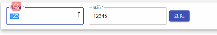
validateOnBlur,validateOnChange it's very usable to describe the schema of the form for the special use, for some case, i build a reack hook form for material. and errors property hasError is very useful for disable the button eg: type.js:
schema.js: