Team's Response
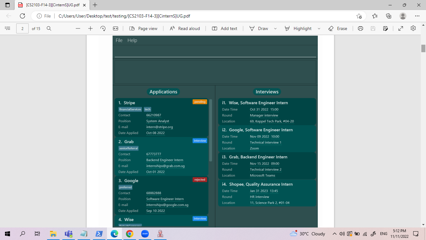
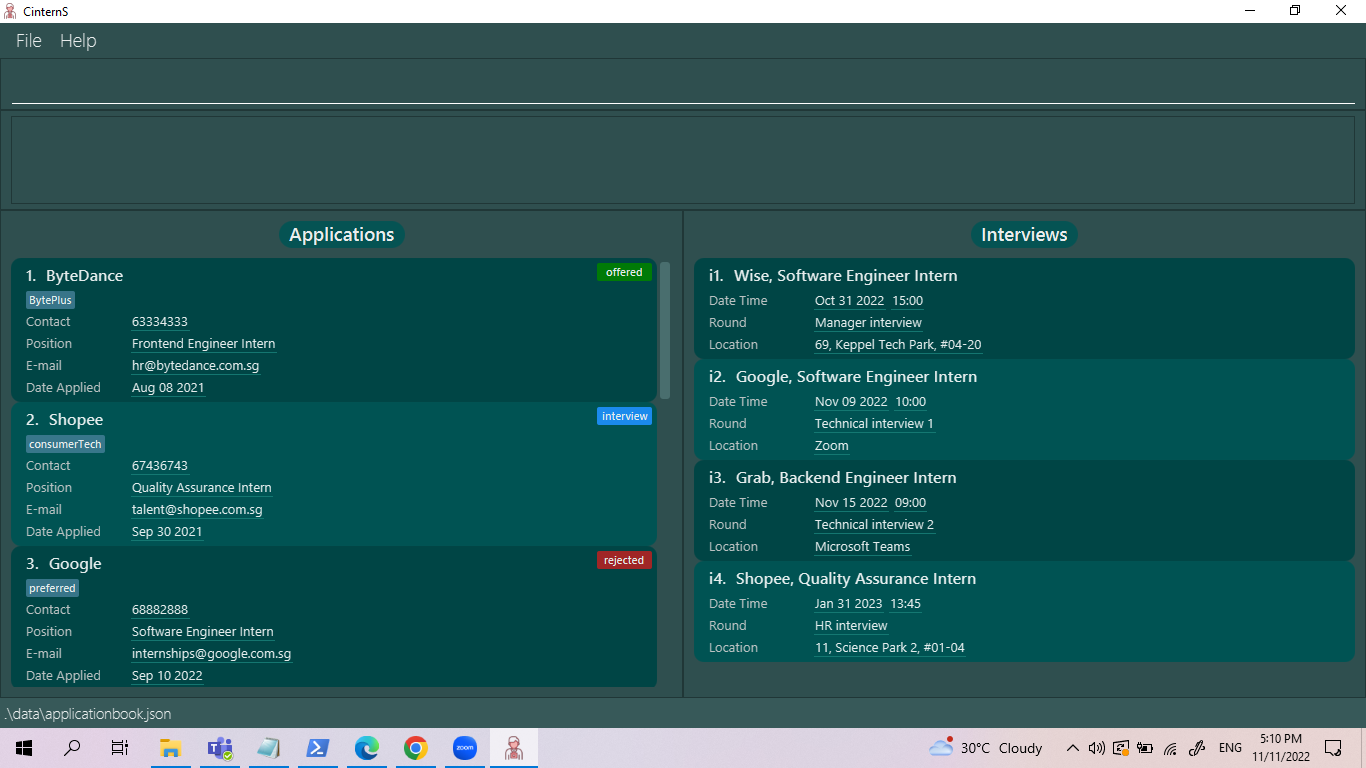
We agree that it might be good to match the image expected in UG and the actual app. However, we think that this is neither a cosmetic issue in our UG nor a problem that will cause inconvenience in using our app. There is no reason for a reader to scrutinise the sample data inside a picture inside the UG that was just meant to show what the app layout looks like, which does adhere to what the actual app layout looks like.
Items for the Tester to Verify
:question: Issue response
Team chose [response.Rejected]
- [x] I disagree
Reason for disagreement: I believe this is a cosmetic issue in the UG because of the mismatch in the image and the actual UI. For new users, they may be confused when they find that their sample data looks different from the one shown in the UG and might think that they have set up / launched the application incorrectly.
Additionally, the text description for the image was this: "When the app is started for the first time, sample data is included to help you get started." I believe it wasn't very clear that the image was just meant to show the app layout only, but rather the focus seemed to be placed more on the sample data.
Steps:
Expected (from the UG):
Actual:
Not a major issue, but might be good to have it match !