 nus-pe-bot
commented
2 years ago
nus-pe-bot
commented
2 years ago Team's Response
Thank you for the response :) However, we are rejecting it as we feel that whether or not the user wants to see more visuals is a personal preference. In order to cater to a wider range of preferences, we included more visuals. Some people like it to be more detailed. We designed each section to be self-contained, we do not expect the users to read from top to bottom. As mentioned on the “how to use this guide” section, the readers can use the hyperlinks to manoeuvre to their sections of interest. Therefore, repetition is necessary.
Items for the Tester to Verify
:question: Issue response
Team chose [response.Rejected]
- [x] I disagree
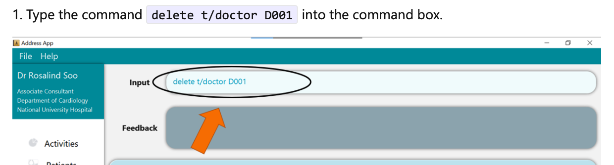
Reason for disagreement: Hi guys thanks for the response. As a user myself, I believe that the user guide, though definitely thorough, was unnecessarily long at points. The user should be familiar with the very basic use of the application, such as knowing where to input the command.
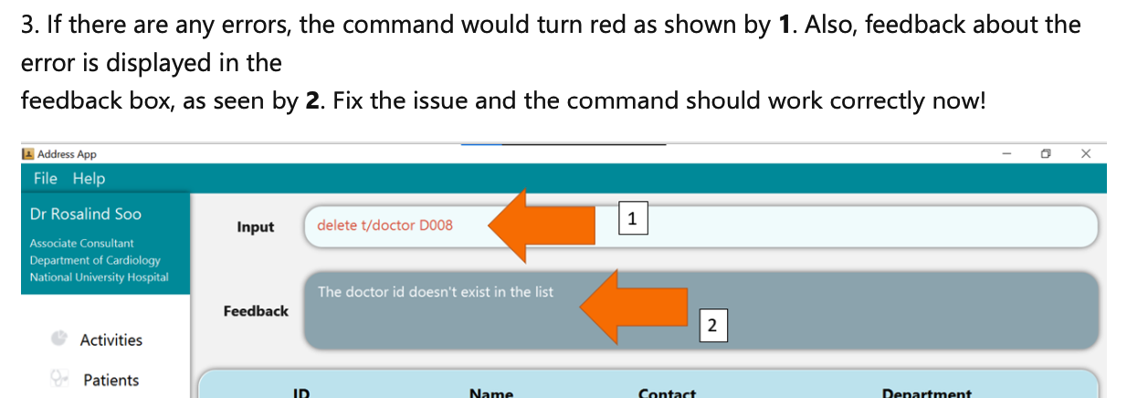
In addition, there is a screenshot of the error message for every command. This is not necessary as the error results in the command turning red, and users should be familiar with where the error message is shown. As identified in the PE, you may have encountered a bug that talks about different error messages for the same type of error. In this case, making changes to a particular error message (e.g. incorrect index) could require you to check through and update the screenshots for every command. Indeed in this case, repetition is necessary.
Therefore, the images are unnecessary. I believe the screenshots below encapsulate my points on why these excessive visuals are unnecessary. Firstly, any changes to the UI would cause you incredible inconvenience to replace every single image. Secondly, the quick start section already covers the various parts of the UI, and where the commands should be inputted by the user.
:question: Issue severity
Team chose [severity.VeryLow]
Originally [severity.Low]
- [x] I disagree
Reason for disagreement: I would classify this as 'very low' if the visuals were repeated once or twice, but this occurs for every command in the user guide. While it is good to be clear in your explanation, I believe that this repetition is unnecessary. While the user guide is within the maximum limit in terms of space, a 67-page user guide is extensively long for this application. I've already stated my reasons in the previous section. However, I really admire the amount of effort put in, as this is just a drawback of a very (sometimes too) thorough user guide.
Users should be able to learn this from the quick start feature, as there is only one place to input the command. To make the user guide less lengthy, you could avoid using visuals for this step.