 nus-se-bot
commented
5 months ago
nus-se-bot
commented
5 months ago Team's Response
Could be improved in future versions of the documentation. However, the team feels that there isn't that much options and that it should be relatively easy to find what you're looking for.
The entire table of contents should be able to fit the height of most 13 inch laptops.
Items for the Tester to Verify
:question: Issue response
Team chose [response.NotInScope]
- [x] I disagree
Reason for disagreement: The features are formatted in an unnatural manner. As mentioned in the bug report, the contents page can have features that are similar to be grouped together. This way, users can easily jump to the relevant section. For example,
- Features
- General Features
-
Viewing help
- Patient Management Features
- Adding a patient ....
- Appointment Management Features
- Adding an appointment note ....
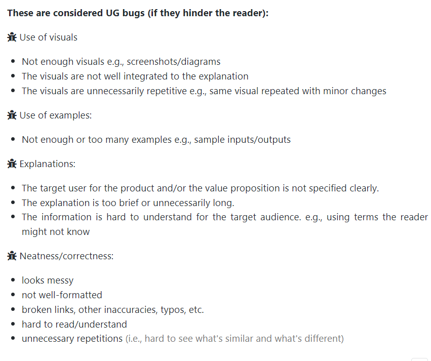
Having to look through the entire list is unnecessarily long, and the content page is not well-formatted which is a UG bug as mentioned by the course website:
Furthermore, this suggestion was provided in the original bug report (pertaining to there isn't much options).
As for fitting the height of most 13 inch laptop, having these additional lines would be unlikely to cause it to do so. Even then, it would make a more meaningful impact in navigating to the specific feature than having it fit to page. Otherwise, it will slightly hinder the user from navigating through the document fast, taking more effort to glance though the entire features list instead.
From the table of contents, it is rather difficult to navigate to the specific feature I am looking for. A helpful separation could be to group the features more distinctly, instead of listing them all together. For example, there could be a section in the contents page for General features (help, delete, archive etc), Appointment features, Patient management features.