 soc-se-bot
commented
5 months ago
soc-se-bot
commented
5 months ago Team's Response
While we appreciate the feedback on enhancing the user interface for first-time users, it's important to clarify that this concern does not reflect on the quality of the documentation we have provided for all existing command functions. Our documentation thoroughly details the expected success and failure messages for each command, ensuring users are well-informed about what to expect from their interactions with the system.
The suggestion to improve the UI by making it more intuitive for new users, although valuable, is a separate aspect from the documentation's quality and scope.
Items for the Tester to Verify
:question: Issue response
Team chose [response.NotInScope]
- [x] I disagree
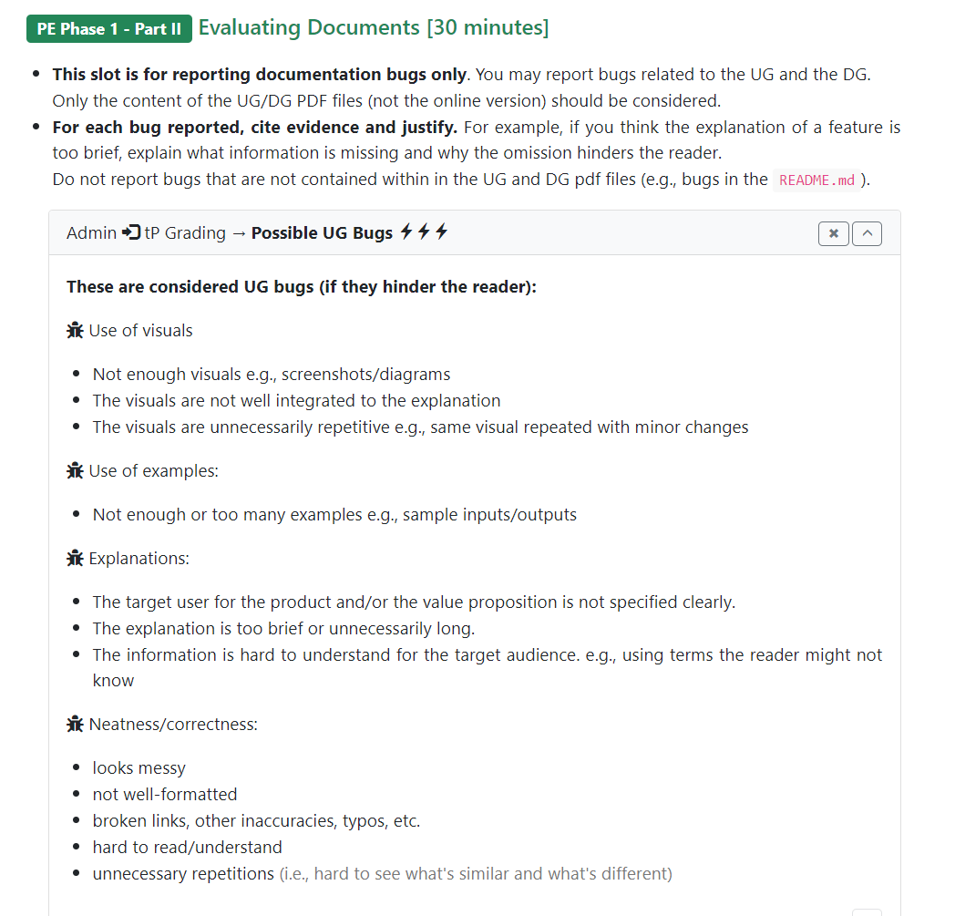
Reason for disagreement: The lack of explanation regarding the UI provides further challenges down the road. For example, in another bug report, the appointment notes section lack clarity for whether the list of appointments belong to a specific patient or all patients. By having a section to explain the UI, the developers will be able to inform users that the appointment notes section should be refreshed with list an if they wish to reference all appointment notes again, just in case they are unaware (since there are no indicators) that it may be only for a specific patient. Regardless I find that it should be of severity.veryLow as according to the course website,
"Not enough visuals" -> segmenting the UI to explain what each section does "Hard to understand" -> explaining how to navigate the UI
are UG bugs, and the UG fails to inform users of such important information, given that the UI is sufficiently complex with multiple panels/ sections.
On start up, the UI may seem daunting for first time users. Indicating where the user is supposed to key in commands, view feedback from their commands, where the relevant outputs will be could prove useful in facilitating the user's experience.