rydmike / flex_color_scheme

A Flutter package to make and use beautiful color scheme based themes.
Other
1.01k stars 110 forks source link

suggestion: widget button or mixin #16

Closed bksubhuti closed 3 years ago

bksubhuti commented 3 years ago

At the beginning of your doc. Have a nice easy quick start to add 36 standard themes and switch between them by user selection. For Stateful widgets.. it is difficult to see how to do this, examples are based on stateless widgets. Perhaps have a mixin to help integration. I do not see how to change the text color(I want to match appbar) and background color(I want grey).

rydmike commented 3 years ago

Hi @bksubhuti, thanks for your suggestion and questions.

Yes I agree the documentation is a bit involved and long, I plan to add simpler quick start, something like this example here: https://github.com/rydmike/fcs_simple_demo close to the top.

When it comes to StatelessWidget and StatefulWidget for the main MaterialApp or later widgets in its sub-three, it does not matter what you use from FlexColorScheme's point of view. It just produces normal ThemeData objects that you need to pass into the MaterialApp:s theme and darkTheme properties.

Of course, how you setup your application to define the ThemeData object with FlexColorScheme, either fixed in code or dynamically like shown in example 5), and get this object into your MaterialApp is another is another matter. It is not different from how you would otherwise also define/build a dynamic theme with just ThemeData. FlexColorScheme just makes most options much less tedious to setup.

The tutorial examples on purpose avoid using any state management and just use callback's from the sub widget to pass back what the user selected to dynamically change the demonstrated configuration and settings. With a lot of parameters this get tedious quickly, as seen in example 5, so I would recommend using Provider or Riverpod to do that more elegantly.

I plan to later add a more advanced example where I will show one way of doing it with Riverpod.

Still it is all basically the same as https://github.com/rydmike/fcs_simple_demo where the config is defined in fixed code, the only difference is in how the input to FlexColorSceheme is changed via UI, so it produces a new theme dynamically for the app when users change it.

About your current theming challenge. Are you looking for just a fixed defined theme configuration that is used in the app? Or something that users can change in many different ways in the app?

If you just want a fixed theme for the app, that should not be too hard, I can certainly try to assist. If you show me what you are trying to do, with an example pic, it does not have to be with the exact colors, but something in the desired direction, so I can see what you are looking for, than I can hopefully show an example of how to do it. ๐Ÿ™๐Ÿป ๐Ÿ˜ƒ

bksubhuti commented 3 years ago

You are very kind. I'm a monk and an ex programmer. These days I wrote a small app to learn flutter. I'm a google/youtube/stackoverflow programmer if you know what I mean. I used the single custom one from the video and it looks nice. (monk colours). I checked in my current code. I'd love to have example 4 working with the dynamic choose your 36 themes on my app with the custom wine (from your vid) as the default. I just don't know how to pass the variables to a stateful widget. The repo is https://github.com/bksubhuti/buddhist_sun I also manually made the text the same colour as the app bar. I'm not sure if that is the correct way. Otherwise the text is black and the background is white.

The volume slider on the timer is a little off for dark so i lock into light theme for now.. I think I need to change the background for that card manually to use the theme. However, I thought the theme widget would do more automatically. The video was good.. i was able to follow that and add. Many monks say it is better than the original way I did it on the play store. This version is soon to be shipped to the play store with your theme. I don' t know provider but I guess I should learn. Another project I'm managing uses that already. Latest build with theme.. https://drive.google.com/file/d/1-NnislJ1cRp_U77MPmXJ0SKOD-6zPSrE/view?usp=sharing

rydmike commented 3 years ago

Hi again @bksubhuti thanks for the kind words and wow, that is very nice and handy app - nice work!

So let me first try to understand how you want and expect things look.

First though, yes I saw in your code that you are using various Theme.of(context) theme colors to define colors for your own widgets. This is exactly what you should do (if the default theme based color the widget uses as its default value is not to your liking). All your custom widgets will then change and follow the theme, regardless of what you use as colors in the Theme, they will follow it. The trick is of course to know a bit how the theme changes and what colors it has where and when it is appropriate to use which of the colors.

Back to your app and target design, I can now see this. Oh yes, I set it to ThemeMode.system, so I could see dark theme too by switching theme mode in emulator:

Light Dark
image image

I saw in the code that you use the theme background as colors in places where the arrow points.

The default Material design theme based app bar mode in dark mode is to be "background" colored and not primary colored like in light mode, as shown above, naturally the texts in in dark mode "Speach Notify" etc can then not be app bar background colored in dark mode on a dark background colored card, it just won't be visible. The color is as you tell it to be, the app bar is just dark in dark mode, so is the text if you use that color for it.

You could just use Theme.of(context).colorScheme.primary or Theme.of(context).primaryColor then the text would be same color as the rest texts that use primary colors. Of course, if you really want to have text color that mimics the dynamics of this app bar style here in dark mode you could use mode based color

(Theme.of(context).brightness == Brightness.light ? Theme.of(context).appBarTheme.backgroundColor : Theme.of(context).appBarTheme.foregroundColor) ?? Theme.of(context).colorScheme.primary,

I gave colorScheme.primary as null fallback in case you ever use a Flutter default theme and not FlexColorScheme, since the default themes would be null and not have any color values, the widgets use internal defaults if the theme is null.

A small tip, you can totally define the colors you get from Theme.of(context) in a final Color in your build method, then you don't have to write Theme.of(context). ... so many times, if you use the same theme color many times in the same build method.

Here is what that would be like, for example for the primary color and for the above switch text color.

image

and of course then using the switchTextColor for the switch text color, if your target is for them to match app bar:

image

Light mode would the remain same, but dark mode would be like this:

Light Dark
image image

I'm not sure if that is what you are looking for and trying to do. Still even my above fix is problematic. Let's look at it again.

The theme definition above using AppBar themes for the text style for the switches has some other problems. For example if you switch to an app bar theme that is white in light mode you are again in trouble, you would get white text for the switch in light theme. Or also if your switch to an app bar theme that is "light" in dark mode, and thus has dark text you are in trouble again, as now its foreground would be dark again and again become invisible as text color for the switches.

I wanted to demonstrate this, it is important to understand how theme colors behave in light and dark mode, especially app bar is a bit complex in its behavior and possibilities.

So unless you are using a widget that has both background/foreground colors that are both AppBar theme based, (can be used in even reversed way too) they are not very usable, especailly not on theme scaffold background, colorscheme surface & background colors. You would have to write an awful lot of logic to deal with all situations you can get into.

Therefore, for the same effect as above I would recommend this:

    final Color switchTxtColor = Theme.of(context).brightness == Brightness.light
            ? Theme.of(context).colorScheme.primary
            : Theme.of(context).colorScheme.onSurface;

Then you get primary color in light mode on white/light background and the light grey in dark mode, regardless of app bar theme.

Also not sure what you meant with the Slider Widget being "a bit off". It uses the colorScheme.primary color by default design. Sure in this theme it is a bit dull and muted color selection in dark mode, it was jus something I used in the video as example, you can make the primary for dark a bit more bright, while still keeping the same spirit of the theme, try eg. Color(0xFFC690AB), or experiment with different color hues and choices.

With the above color it looks like this:

Your theme based color choices has a another problem in dark mode. The bottom navigation bar becomes invisible in dark mode. I recommend theme color Theme.of(context).indicatorColor instead, it looks as now in light mode, but gives you a grey style for dark mode. There are of course other possibilities too, depends on what you want.

image

With the above fix you get an indicator that works in dark mode too:

Light Dark
image image

Since I don't know exactly how you want things to look, it is bit tricky. Still below are some more possibilities.

You could add some surface branding ( the surface and background colors then get a hint of the primary color mixed in) and make dark mode app bar background styled (colored) in dark mode:

image

or make app bar primary color also in dark mode:

image

Light SB Dark SB, AppbAr BG Dark SB medium, AppBar Primary
image image image

Or you could make dark mode true black:

image

or even swap dark mode primary and secondary colors, while keeping them unswaped in light mode. It is sometimes an interesting effect when the colors swap places in dark mode.

image

Dark true black Dark swap colors
image image

Anyway just some examples. ๐Ÿ˜ƒ


As for setting it up so that you can allow users to make their own selections, it has less to do with FlexColorScheme and more with the famous topic state management, that everybody always talks about.

There are so may options. You could just use Flutter's own inherited widget, but it is complicated, so many choose to use Provider which is based on inherited widget but makes it easy to use.

Another option is Riverpod, which is also simple but even more powerful than Provider, both packages are made by same young brilliant developer Remi. I recommend looking into them. There are many other possibilities too, like flutter_bloc, mobx, getx, and many more. I sometimes Tweet about poularity of state management package, you can find a list of more options there: https://twitter.com/RydMike/status/1412501972998107144

Personally I prefer Riverpod. I plan to publish an example of how I use it for theming with FlexColorScheme and persist the theme too, but it won't be until a later release of the package.

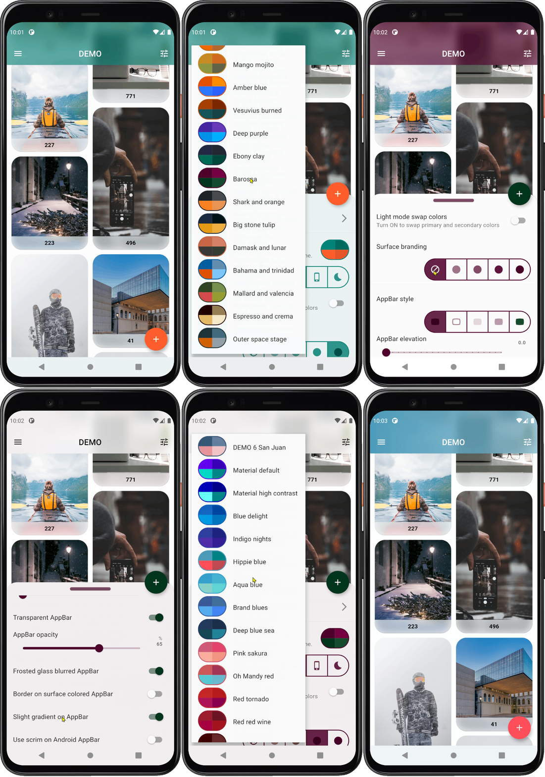
Using Riverpod (or other state management) it allows me to do things like this:

theme demo

The embedded animated GIF did not work in GitHub but this link works ok: https://rydmike.com/assets/demo1.gif

I see you have already made a very nice advanced application with Flutter, so I know you can figure out state management too. ๐Ÿ‘๐Ÿป ๐Ÿ™๐Ÿป

I did notice you have not used any state management yet in your app. I could certainly point you to some good reading/video materials to study, there are a lot available. I will add some later, about Riverpod and Provider.

It goes "a bit" beyond the scope of FlexColorScheme, but sure I could give you some initial starting suggestions on how to do something like in my GIF above too, using one way with Riverpod https://riverpod.dev/ ... there are many ways to do it even with just Riverpod ๐Ÿ˜ƒ

bksubhuti commented 3 years ago

I'm going to release "as is" for now.ย  I like using the primary theme color example you showed me (Dark SB medium, AppBar Primary).ย  I will try to implement this in next week's release. ย ย  I could be wrong, but I think I can easily let the user select a theme and then save that to a Prefs.themeIndexย  The Prefs object is singleton and static, so I should be able to use that to set the theme on the main.dart app .ย  So they choose a color and then reboot.ย  How does that sound?ย  A small inconvenience for them to pick their own theme.. and easy for a cut and paste coder like me.

Sometimes I recall how the internet community used to be in the early 90's, where I sent a personal check to a stranger on PCVR usenet who found a warehouse with a bunch of Mattel Power Gloves and was selling them for personal PC-VR systems (on 386 machines with 4mb of ram).ย  The glove broke and I sent it back to him and then he sent it back to me again fixed.ย  (That glove was a complete failure in the 80's but a gem for hackers when Byte Magazine published an article on them). Well... you are one of those nice people.ย  As a monk, maybe I am too.

General Background Color: In light mode, the default background was a pure white (undesired) with the theme 'as is' and nothing done to it.ย  So I changed it and I got a small tinted background which matched the chosen theme.ย  That was why i did that.

About my mixin suggestion If you look at the code inย https://github.com/bksubhuti/buddhist_sun/blob/master/lib/src/services/solar_time.dart It has a mixin object which is used in the timerpage.ย  I had the problem of sending a message to update the page from that helper timer object and the helper/friend who publishes iOS for me came up with this multi-Inheritance by mixin solution.ย  I was thinking that maybe something could be done with your Theme object for that.ย  That was my suggestion for this original thread.ย  I guess we both agree that stateful widgets are not fun. I'll see about what can be done to let the user choose the theme.ย  Another project I'm working on (in my git) is called tipitaka-pali-reader which uses Provider and Provider Themes.ย  I'm just guiding this project and it is the work of another programmer/monk who is way better than me and knows what he is doing.ย  However, I do need to learn Provider classes to understand how it works.ย  This buddhist-sun app is more of a learner project for knowing how to manage the programmers of the pali reader project.ย ย 

I really don't know what I'm doing.ย  I just cut and paste from youtube videos and stackoverflow and it works (most of the time).ย  That is how I got your theme to work. I think I chose the same theme in the videoย  :) I will try to integrate what you kindly wrote for me.ย  It is a simple app and this custom theme in the sample is working.ย  I might just leave it with a few adjustments and enable system themes for user selected dark themes.

rydmike commented 3 years ago

I found an old sample of mine with FlexColorScheme and using Riverpod based Providers. I will update it during the weekend to use latest package versions and give you a link to the GitHub project.

With it you will be able to do all you need and more, including so users can select all themes (+ any custom ones you have) and theme features you use. And change theme while using the app, without a reboot. You should still of course persist the settings so they are kept between runs.

You could use the example as a way to learn more about Riverpod providers and reduce singletons in your app too. Generally it could male your app architecture simpler and cleaner.

Your app is relatively small, bit useful app, so it does not really need a lot of complexity.

Get back to your later with more info ๐Ÿ™‚

bksubhuti commented 3 years ago

I'm trying to learn about provider, but it is quite above me. I also want to change the language by setting too and provider seems to be the way to do it. Riverpod should be similar so I look forward to see how this works.

rydmike commented 3 years ago

Hi again @bksubhuti,

Using Provider or Riverpod is quite simple and I do recommend learning how to use them. Riverpod is very similar to Provider, but it does not depend on Flutter's Inherited Widget internally like Provider, it has more features and capabilities, yet it is still quite simple to use.

This is a good guide: https://codewithandrea.com/videos/flutter-state-management-riverpod/ but there are many more good ones, both on YouTube and as articles, easy to find with Google.

Yes both Provider and Riverpod are very well suited to allow users to also change a language setting interactively for the app.

About my example of using FlexColorScheme together with Riverpod to control the theme, and as many of its settings as desired, I just updated my old example to latest Flutter and Riverpod version 1.0.0-dev.7. I will refer to it updated FlexColorsScheme documentation in next package update as well. I think other developers might find it to be a useful example too.

You can find the project here https://github.com/rydmike/theme_demo. You are welcome to clone it, study it and reuse whatever parts you find helpful and useful. This is just about changing theme, but the exact same concept can also be used to toggle the language interactively.

This example uses StateProviders in Riverpod, but you could also get the same end result with a custom class using a ChangeNotifierProvider or a custom class using an immutable StateNotifierProvider. This example just shows that you can also do it with the most basic and simple provider, the StateProvider.

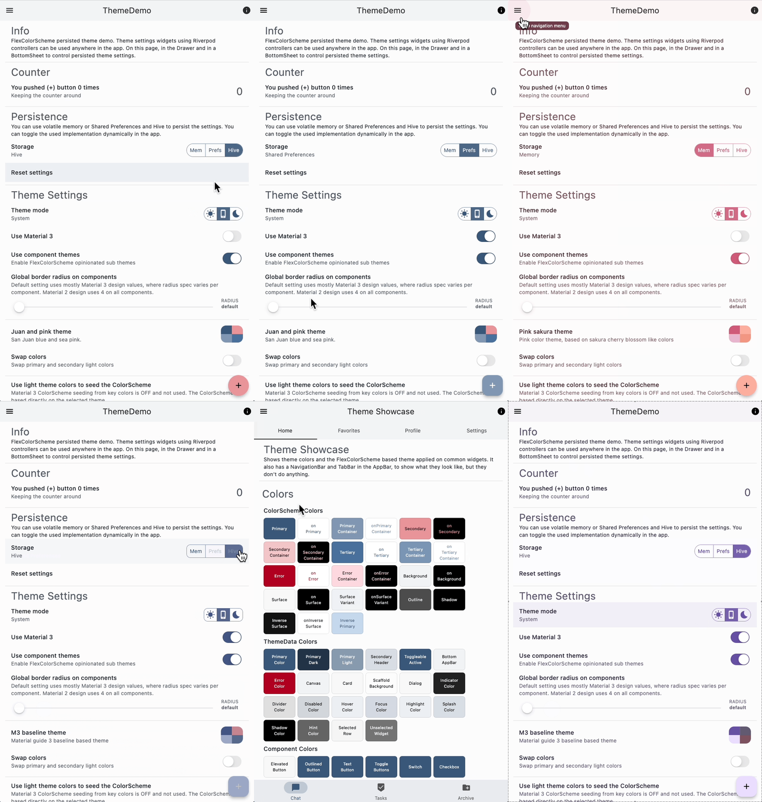
This updated and much more extended demo, compared to its older version, looks like this:

Theme toggle demo

The individual UI widget that controls various aspect of the theme, can in this demo be dropped into any page and if it is toggled, the same property in the active theme is updated immediately. In the example some of the theme control widgets are on the main page, which is a modified default StatefulWidget based counter page example. Other theme control widgets, like the theme mode toggle, is in the drawer, and in a bottom sheet, together with most of the other control widget, they work regardless of where you use them, it is very convenient.

I'm not claiming this is the best way to do this, but it is one way that is relatively simple and that I use frequently when it comes to theming part of the application.

This example does not show you have can persist the user's selections, so the app starts with the previous settings next time the app is started. That is of course an important feature too. Like this state management topic there are many ways of doing it too, shared preferences is certainly one way, but there are many other options too.

Hope this helps you to get some idea of how you could use this in your application.! ๐Ÿ™๐Ÿป ๐Ÿ˜ƒ


There are other small nice trick and tips in the demo too, like adding custom sub-theming, also totally different topic is the Dart and Flutter linting rules that the project uses. You can use that too. Just copy the files all_lint_rules.yaml and analysis_options.yaml to try the same Dart linting rules that I used in this example.

You can of course adjust the rules or use package for instead, my linting rules are VERY strict, most devs prefer more relaxed and forgiving code style. You can get some more info on linting here: https://rydmike.com/blog_flutter_linting

bksubhuti commented 3 years ago

I got the old example 4 running with multi-provider. I pushed the code as a base. I'd like to get theme based text next, or make themes with text colors, so I don't need to specify inside my style. I'll have to read more. Riverpod looks very nice. Buddhist Sun is a practice app for tiptitaka-pali-reader which was written using provider. The main dev-monk prefers riverpod and wants to try getx, but the code was written already with provider.

rydmike commented 3 years ago

I had a quick look at it, looks good. And yes using Provider with ChangeNotifierProvider and MultiProvider like your are using them is a perfectly good solution for both the theme and the locale and many states you might want want to use in in your app.

The ChangeNotifer concept in both PRovider and Riverpod is very simple to use and easy to grasp, it is a good way to start, and fine forever for a small app like this imo.

I don't recommend mixing both Riverpod and Provider in the same project. However if you later want to experiemtn and migrate to Riverpod (not that this project needs it), then you can totally reuse the mutable ThemeChangeNotifer and LocaleChangeNotifer with Riverpod too that you already have here. There are just a few things you need to modify to do so in Riverpod. Still for this app Provider is more than capable for what you want to do.

Personally I would not recommend using GetX, but you are of course free to use it. Imo it bakes too many features into one packages and does a lot of things in a way that is very different from how the Flutter SDK does things. At the very least I recommend getting a deeper understanding of how things work in Flutter before using GetX.


Some recommendations about the theme.

Do define and use darkTheme too, that matches the used light theme. I guess it is still on to do list. ๐Ÿ˜ƒ

Do provide a system mode choice to users too, when they select system mode the app follows the used dark or light mode setting on the device automatically, and then selecting light or dark, forces app into that theme mode, regardless of what the device is using. Give users the option to also let the app follow theme mode on their device.

Some apps don't even offer a theme mode override choice, they always use system but do have light and dark theme, but only switches with device mode changes. Certainly one way to do it too, very simple to do as well, which is certainly a strong point for it. Personally I like to offer the system mode as a setting in the app, but also to let users override device setting just for the app in question. This setup is shown in my demo I as well, still this is all a matter of preference.


About theme definitions and sub-themes.

I added some more examples to the demo of how to use the color scheme based colors to change the default color on eg the ElevatedButton throughout the app in the theme. It is quite simple, but you are of course limited to color properties that can be adjusted for each built-in widgets sub-theme, and for colors to the colors in the ColorScheme. Well of course you could just use custom color values for the sub-theme colors, but if you use many color schemes you would need a function that returns the correct totally custom color, for that theme, still doable too.

I also updated the example with how to re-use just selected FlexColor schemes, together with custom ones and to just re-use any pre-existing color definition.


About the themes with text colors, I'm not 100% sure I understand what you are asking or trying to do. But yes you are correct in that there are no predefined colored text themes in Flutter, that would use the the scheme colors as their color, the existing text themes are all just black or white.

If you want to make a Text that is for example always theme primary colored, you can just make a custom Text widget class, say eg PrimaryText for that, that always uses the primary color as text color and with either all other Text properties or just the ones you need, passed in as optional properties. Then just use that PrimaryText() widget instead whenever you want theme based primary colored text. That saves you from always defining Text style and color to Theme.of(context).colorScheme.primary.

Com e to think of, it might be a good idea to add an example of this to my demo as well. Not that it has anything to do with FlexColorScheme or even theming, it is just composing some custom widgets. If/when I do so, I will drop you a notice below so you can grab a copy or the idea if you like it.

There are ways to make totally custom theme extensions too, but that is a bit overkill for your needs. There is a good article on it though if you want to go into the deep end of things, see here https://www.didierboelens.com/2020/05/material-textstyle-texttheme/ the article is a bit old, but still excellent.


I'm going to close this issue now, since it was not really an issue with FlexColorScheme to begin with.

It was more of a general Flutter development question. Still I enjoyed the discussion and hopefully you learned a few new things, and I got a good push to make a starter for a more extended example for FlexColorScheme usage, that I can add as a reference link in the package documentation later too.

We can still talk in the thread here if you like, but I'm closing the issue. ๐Ÿ™๐Ÿป ๐Ÿ˜ƒ

bksubhuti commented 3 years ago

Your help was amazing.. I appreciate your comments.. I did not think about making a Text widget that has the style baked in. That is perfect!. When I learned how to use Provider and themes last night, i did so with a user selectable dark/light switch... It is still in the git somewhere. (change_theme_widget.dart) . I removed it until I fix the text in dark mode, which might happen tomorrow.

This project is small and overkill for the needs. It is a learner's project. My first actually. Tipitaka-Pali-Reader which is on my git is going to be a rewrite for Tipitaka-Pali-Projector which is also on my git. That was the plan and the reason why I learned Flutter. There is another monk who has written the base in flutter. He is a really good programmer. I just copy and paste code.. Using a citydb with sqFlite was totally unnecessary but I wanted to see how it worked for this other project.

Sadhu x 3 for your help. I'll fetch the new code sample.

rydmike commented 3 years ago

Glad if the discussions helped ๐Ÿ˜ƒ

Dart and Flutter makes it really easy to compose new custom Widget that uses and combines other widgets, or even just modifies default behavior of one Widget for more convenient use in your app, and only exposes any properties you may need to modify. You can keep it really simple, below I show a more complicated way but that can be really useful sometimes.


If you want to make a different version of a built in Widget, that is a bit different, you can also just copy that Widgets source code and make your own version of it. The built in Text widget is just a wrapped RichText widget.

As an example, I just pushed a new version of the demo app where I made a ColoredText Widget. It has a color property that defaults to Theme.of(context).colorScheme.primary, but you can also pass it a color to easily give it another color, and you can do so without the need to provide the color in the TextStyle in the style property.

Along the way I also exposed properties fontSize and fontWeight as direct properties that can be used without giving them via TextStyle. This again just for convenience. It occurred to me, I do repeat this kind of colored text quite often as well and making it is bit lengthy in Flutter SDK API, also making things bold, italic or other size via the style is very tedious too so I made shortcuts for them.

This is just a more convenient way of doing it. At the same time this ColoredText Widget keeps all the features Text has and implements all the things the framework expects of the Text Widget. In this case I made this widget by copying the Text widgets source code and customizing it to make my own version of it. I could have composed it from Text too, but this was actually quicker to do, at the end this ColoredText is just another wrapper like Text for the RichText widget.

I even included all the documentation from Text SDK comments, augmented with my own modifications. You can even still also use the style property, but if color, fontSize or fontWeight are defined as direct values, they will override same properties in style and color always default to primary if not defined, and even fi defined in style.

This was all just an example, but at the same time I made it generic enough to be generally useful, so I think I will use this one myself too, it seems quite handy! ๐Ÿ˜„

In the demo I updated the Splash page to use this example ColoredText Widget. It looks like this:

image

and the code that produces it:

image

Enjoy! ๐Ÿ™๐Ÿป

bksubhuti commented 3 years ago

I just pushed the theme settings. I now have theme choice and dark themes. No system. They can set themselves. sadhu x 3 (well done) . We are going to copy over most of the theme code to the major project called tipitaka pali reader. This project uses ThemeProvider package, but not for long. Because we need to change the language and use multiProvider, this themeprovider is out and you are in. The project is entangled with Provider so we will continue with that :)