Team's Response
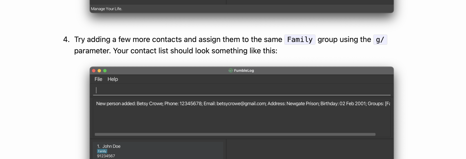
The first mention of Group was actually in step 4 of the FumbleLog tutorial (see the screenshot below) and it describes as quoted "Try adding a few more contacts and assign them to the same Family group using the g/ parameter.". For a new user, this description is actually quite clear that groups are used to contain multiple contacts. (shown as text and in the screenshot given in the user guide). Additionally, there are also multiple uses of the g/ command and Group before reaching add_person.
Additionally, there is a glossary for all the jargon we used in FumbleLog in the DG. We admit that a glossary can be added to the UG to make things clearer, so we are accepting this as a documentation bug. However, it should be a very low severity as almost all users should understand what a group is and the behaviours of a group through the tutorial. It does not prevent the user's usage of the functionality at all.
Screenshots
Step 4 of FumbleLog tutorial:

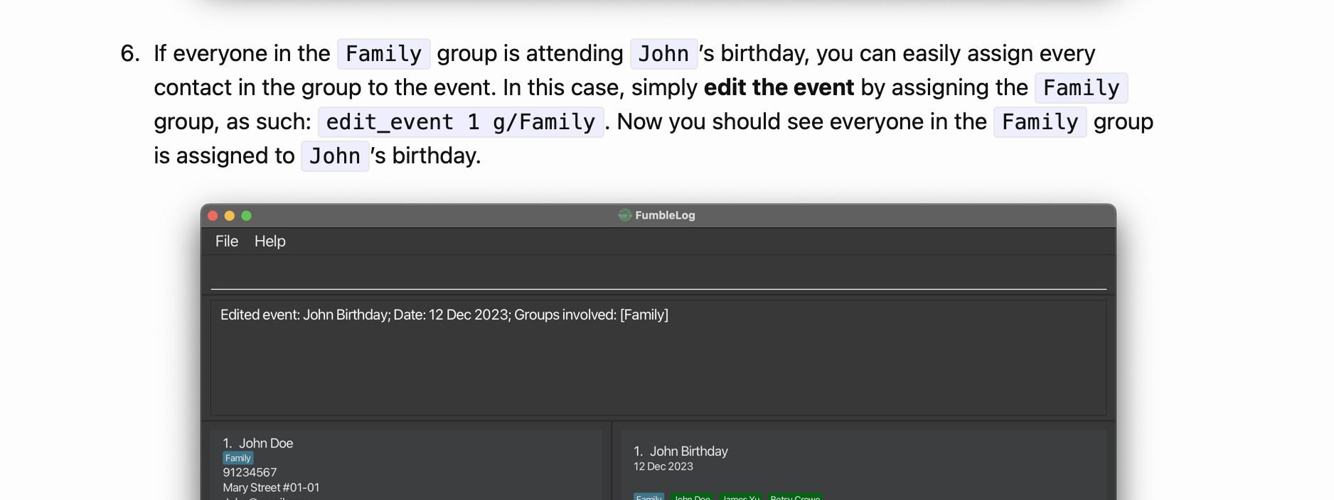
Step 6 of FumbleLog tutorial:

Items for the Tester to Verify
:question: Issue severity
Team chose [severity.VeryLow]
Originally [severity.Low]
- [x] I disagree
Reason for disagreement: Users should be able to know what is 'group' while they are adding a person because group is one of the inputs. There should be a dictionary-like lookup table and users should not have to read the whole UG with information scattered at different places to finally understand what is Group. This is very time consuming for the user and not user-friendly.
Additionally, there are also multiple uses of the g/ command and Group before reaching add_person The developers are suggesting that users should go through the entire 44-page UG in order, which is an unrealistic expectation.
This in fact, exposes another issue in the UG that it is excessively long. The AB3 UG is 7 pages but theirs is 44 pages. Does the developers absolutely need the sections Who is this guide for?, Quick Start when they already have the tutorial, Orientation to the Graphical User-Interface (GUI) when the interface is self-explanatory.
In summary of my points above, the lack of glossary reduces the experience for the user and is not merely a cosmetic flaw. Usage is affected as the presentation of the UG is a hindrance for the user to understand the app. The severity should be higher than very low.
I had to look through multiple commands in the UG to find hints of what group might be. The closest i have found: in add_person " When a person with an assigned group and that group has been assigned to an event, that person will be displayed with the respective [event.]".
This can hinder the user from using the UG, and understanding the elements of the app. A glossary will help the user find out quickly what the 'group' does.