saezlab / decoupleR

R package to infer biological activities from omics data using a collection of methods.
https://saezlab.github.io/decoupleR/
GNU General Public License v3.0
176 stars 23 forks source link

Problems to understand the analysis of the tutorial #110

Closed Gregjlt closed 5 months ago

Gregjlt commented 7 months ago

Hello, I'm having trouble understanding the interpretation of your example for the transcription factor activity inference in bulk RNA-seq, particularly on this graph : image

Looking at the code below, genes in red, are the ones that have the same sign for the MoR and the t value, and in blue the ones that have opposite signs. So, for the best predicted TFs, I would expect to have the majority of genes that are represented in red, as this means that the logFC observed corresponds to the type of regulation predicted by the MoR. However, we can see that for SP1, one of the best predicted TFs, almost half of the genes are in blue, so have a t value in opposite sign with the MoR. Am I understanding something wrong in this example ?

tf <- 'SP1'

df <- net %>%
  filter(source == tf) %>%
  arrange(target) %>%
  mutate(ID = target, color = "3") %>%
  column_to_rownames('target')

inter <- sort(intersect(rownames(deg),rownames(df)))
df <- df[inter, ]
df[,c('logfc', 't_value', 'p_value')] <- deg[inter, ]
df <- df %>%
  mutate(color = if_else(mor > 0 & t_value > 0, '1', color)) %>%
  mutate(color = if_else(mor > 0 & t_value < 0, '2', color)) %>%
  mutate(color = if_else(mor < 0 & t_value > 0, '2', color)) %>%
  mutate(color = if_else(mor < 0 & t_value < 0, '1', color))

ggplot(df, aes(x = logfc, y = -log10(p_value), color = color, size=abs(mor))) +
  geom_point() +
  scale_colour_manual(values = c("red","royalblue3","grey")) +
  geom_label_repel(aes(label = ID, size=1)) + 
  theme_minimal() +
  theme(legend.position = "none") +
  geom_vline(xintercept = 0, linetype = 'dotted') +
  geom_hline(yintercept = 0, linetype = 'dotted') +
  ggtitle(tf)

Thanks for your answer !

PauBadiaM commented 7 months ago

Hi @Gregjlt,

To compute enrichment scores we use the univariate linear model method: 
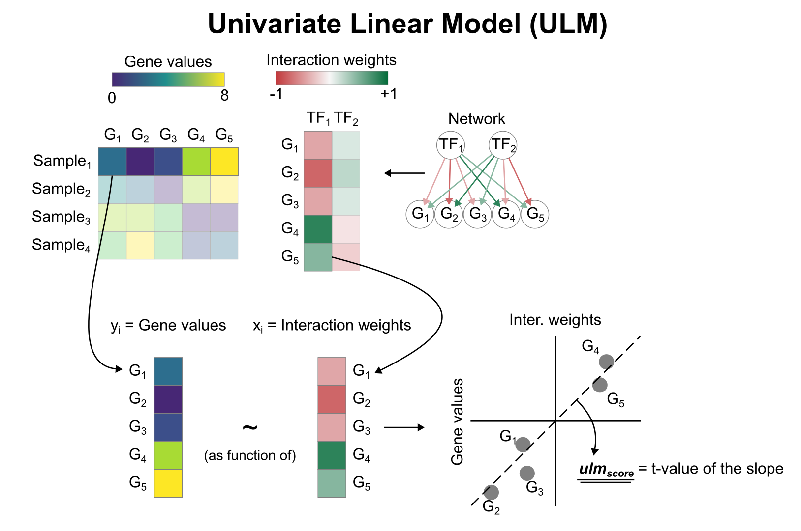
In this model where each gene is an observation, the response variable (y) is the change in gene expression and the explanatory variable (x) is the weight for that TF-Gene interaction. In the case of SP1, the red dots that have positive t-values belong to the first quadrant (+ and +), and the blue dots that have negative values belong to the 3rd quadrant (- and -). If you fit a line (like the one shown in the attached image) you would get a positive slope. The moment you have the contrary, blue dots with positive t-values (- and +) and/or red dots with negative t-values (+ and -) the slope becomes negative.

Basically, you can get a positive activity by having most positive targets with positive t-values, or by having most negative targets with negative t-values, or a combination of both. The moment this becomes inconsistent, for example, a random mixture of positive and negative targets with either positive or negative t-values, there will be no trend and the slope of the linear model will be flat.

Hope this is helpful! Let me know if you need any further clarification.

Gregjlt commented 7 months ago

Hi @PauBadiaM ,

Thanks a lot for the answer ! As I understand the Univaraite linear model you use, I still can't really get this plot and the explanation just below. image

Indeed, I don't understand how blue can means that those genes are "deactivating" the TF. Looking at your regulation network, image

I thought that it took into account the influence of the TFs on the genes (either positive or negative, and represented by the variable MoR) but not the influence of the genes on the TFs. Therefore, to me, a blue gene like CLU for example means that this gene should have, according to the network, a "theoritical" positive logFC (or t-value as they have the same sign), but has in reality a negative logFC. That's why I don't understand the choice of colors for your graph, where blue dots with negative logFC seems to be well placed but are in reality not "correctly" predicted by the network. So here, I understand that red means that the genes are correctly placed (i.e a correct logfc sign) and the blue ones are wrongly placed (i.e a incorrect logfc, if we refer to the network).

PauBadiaM commented 6 months ago

Hi @Gregjlt

Sorry for the late reply! Unfortunately I've been quite busy lately. Regarding your question, sorry I misinterpreted your question in my last reply. Indeed, in this plot blue means that it contributes negatively to the activity and red that it contributes positively. I agree that maybe this is not the best way to visualize where the activity comes from. In the end, the activity is obtained by fitting a linear model across the population of genes, where the x axis is the mor and the y axis is the observed change of expression. Here is how the distribution of genes looks for SP1: image If we fit a linear model here you can see a positive trend. On the contrary, let's plot now a deactivated TF such as GLI3: image And as mentioned, we see a negative trend. Does this plot help with the interpretation? I could add it to the vignette if needed.