ChengYanJin
commented
3 years ago
ChengYanJin
commented
3 years ago Hello @Cuervino Most of the points listed here have alreeady been addressed in PR #3305 What is missing:
-
The column and their header should be properly aligned We have this issue in ALL the tables because the scrollbar takes some space.
-
The Metrics tabs in Volumes should be aligned with the metrics tabs in Nodes
-
8px between label and icon. Because in the small screen we just don't have enough space..

Component: UI
Why this is needed: Having a better UX
What should be done:
[x] 1.The search bar should have the same height as the buttons. ( It looks like know the search bar height is calculated with padding) The correct height is 32px, or matching it with button size On Volume page and Node page.

[x] 2. The Latency in the volume tab of Node should be aligned to the right (because it's a numerical value)
[x] 3. The unit in the Partition tab of the Node page should have a space between the value and the unit, for having consistency.
[ ] 4. 4 px (or rem/em equivalent) space between the label and its sorting icon In Volume page, and in Volume tab of the Node page. For instance:
[x] 5. Having consistency (and 1 decimal) for usage units
GiB everywhere (@ChengYanJin to confirm)
Add a space between unit and value
Add a decimal In the Overview of Volume page.
[ ] 6. Pods tab
8 px between the columns 'Name & Status"
The column and their header should be properly aligned
Age column and header should be aligned to the right, and the value (for hours especially) should have a leading "0"
[ ] 7. Update the chart header style The Metrics tabs in Volumes should be aligned with the metrics tabs in Nodes
Remove UPPERCASE, put it as Pascal Case
Same date format for legends
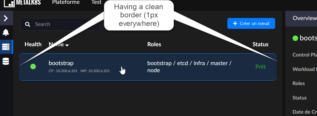
[x] 8. Having a full clean border on the left and right of Nodes rows