Closed cdeil closed 4 years ago
One idea I had for a slogan was "The VMM hammer" as a joke and equivalent to "The MCMC hammer" by emcee, where VMM means "Variable metric method", i.e. the core method of MIGRAD.
Probably VMM is too cryptic (most potential users don't know what it means or don't care). We could also use "The MLE" hammer, where "MLE" means "maximum likelihood estimation", which seems to be the most common term for non-MCMC fitting (see here, although there's also "MAP" for "maximum a posteriory" (see here).
So overall ... I don't have a good idea for a slogan and logo for iminuit ... please help!
cc @aarchiba
I wrote it for my thesis since ROOT Minuit interface is too painful. Data need to be reloaded every single time I need to fudge around with my model.
VMM is too cryptic. For first year grad student who is looking for a tool to use, he/she would have no idea what on earth is VMM that this is the tool that will cut his time by 1 year+. The slogan should be along the line of Minuit, Interactive, and improve workflow.
May be, Minimization like a boss?
Logo would be nice I could ask my lovely students to make one.
I like "Minimization like a boss". Maybe "Fitting like a boss" because Minuit does more than minimisation (and HESSE / MINOS are a real big advantage over scipy.optimize and other Python packages, not just MIGRAD)?
@kbarbary has been designing the Astropy and a few other great logos, and is using iminuit
for sncosmo, so I'd say let's wait a day or two if he has time before you ask your students.
@piti118 – If you can persuade someone to make a logo and / or banner for iminuit, please go ahead!
So, we have a slogan, we lack the banner. I am somewhat artistically apt, so I could throw some designs around.
@HDembinski - I don't think anyone else has done something. Please go ahead!
@cdeil @piti118 Do you guys have some ideas what the logo should display?
I don't have an idea for the logo. Maybe something abstract (points & lines) that represents a little bit what Minuit / iminuit do? Like how http://dfm.io/emcee/current/_static/logo-sidebar.png is (I presume) a trace of a probability density taken by emcee.
So Minuit means midnight in French. I like this: https://www.wikiart.org/en/marcel-broodthaers/minuit-1969 :)
This would make a pretty logo, but there is no connection to what Minuit does. NLopt has a logo which includes the name and whats going on. https://nlopt.readthedocs.io/en/latest/images/Nlopt-logo.png
I would prefer a simple logo that is still decent at e.g. 32 x 32 pix or at least for 64 x 64 pix. I'm not a fan of e.g. the one from nl-opt with the very fine lines and high level of detail. The name can appear to the right of the logo in the "banner", doesn't have to be part of the logo.
How did you want to turn https://www.wikiart.org/en/marcel-broodthaers/minuit-1969 into a logo? Is it possible to combine the idea of "minuit" = "midnight" but still have the logo show something that looks like a plot from fitting? E.g. a "moon" shaped likelihood contour, with some points in a valley where Minuit evaluates the likelihood? (just a thought, not sure if it actually would look nice or not)
First attempt
@cdeil Why do you want a logo at 32x32 or 64x64? We are not shipping an application that needs an icon. This is for the documentation front page and the README.
@HDembinski - Nice!
👨🎨
I'd be OK to adopt as-is. But let's wait a bit and see if other chime in with opinions. It's a one-time decision, probably we'll never change.
Here's my 2 cents: I like many things here:
Why do you want a logo at 32x32 or 64x64? We are not shipping an application that needs an icon. This is for the documentation front page and the README.
Agreed. We can keep as-is, it will work fine. But IMO this is almost a little painting about iminuit, not a logo any more.
If you're willing to simplify and change something here, my suggestion would be to drop the clock. IMO the 1-dim and 2-dim likelihood profiles as representations for what iminuit is about are most important, then the snake, and the clock is least important, while drawing most of the attention.
@cdeil I am happy to iterate the draft. I think I can simplify further, simplification is good. I also think that I should compress the height further.
I personally like the clock very much, like you said it is an eye catcher. A logo, especially one that does not have to be scalable to icon size should have a center that draws attention.
I am a bit worried about composition. The left side is pretty empty (that's why I put the text there, to fill it up), while the right side is very busy. I think I will try another version where the snake is on the left side only, to balance things a bit.
@jpivarski, any comments from you?
When you look at the logo try to scale it down, because the size shown here is larger than what I had in mind as display size.
That logo is way too complicated. A logo doesn't have to encapsulate every aspect of a software product. Some of my most recent examples:
uproot is a pure Python reader of ROOT files, focusing on high performance and Numpy compatibility. And yet, the logo has only one visual metaphor: extracting something nice (a flower). The colors are minimized to make it possible to adapt this logo to different backgrounds (by changing that color).
SciKit-HEP is a collection of Pythonic software for HEP (including uproot). The "Scikit" prefix is already well known, so the real job that this logo needs to do is to express high energy physics, which the bubble chamber tracks do pretty efficiently. Again, the colors are minimized, but they can't be minimized to 1 because we need contrast between the lettering and the complicated tracks. (A lot of back and forth went into simplifying those tracks!)
Histogrammar is a declarative language specifying aggregations, particularly histograms, and its name is already a relevant pun. The logo works with this (like uproot) in making it look like a dictionary definition.
If you don't believe me, think up a list of popular big data told and look up their logos: they each focus on one visual idea and have a minimum number of soft colors.
Oh, and look at the monstrosity Apple started with. They probably wouldn't have gotten much traction with a woodcut of Isaac Newton on every mousepad.
@jpivarski Thank you for the criticism, but you don't need to be so forceful. I know a bit about design and I understand all what you are saying. My draft logo intentionally has a limited palette of soft colours. I am aware of the fact that logos should be simple, I already said so above. You see there is no need to hammer down the point.
I would like to iterate to reduce, so do you have any specific ideas how to reduce the design of the logo? I prefer a logo with some symbolism. @cdeil already said to remove the clock, I would prefer to keep the clock and remove other aspects, but if there are some good suggestions, I will come around.
How about we remove the snake, the text, and the moon, and just keep the clock and the 1d minimum. The complexity is halved and @cdeil does not like text in the logo anyway. I am not a fan of text-heavy logos either. Text is also complexity, like in case of the histogrammar logo. And I like a bit of colours. A world in shades of grey is boring. The Google logos are extremely colourful, by the way.
Oh! I'm sorry about being too forceful. I can be tone deaf sometimes. Good luck with your logo development!
@jpivarski It is not a problem, I just wanted to say that I get you. Your input is really appreciated, obviously you know a thing a two about design yourself. So if you have any ideas about how to change the design in a specific way, that would be great. Or if you have a completely different idea, I am also open to that.
If it were up to me, I wouldn't include any visual elements indicating that this is related to Python— nowadays, a lot of things are Pythonic, it's the default glue language. Logos including a snake look old-fashioned (e.g. SymPy).
I also wouldn't go after the play on words between "Minuit" and "midnight" because it doesn't illuminate what the program does. I went for the visual metaphor with "uproot" because pulling up a flower by its roots is analogous to pulling data out of the ROOT file format. If anything, the relevant part of Minuit's name is "min" not "midnight." Maybe something could be made of the first three letters (smaller than the rest?).
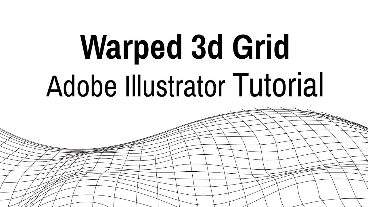
I've only given negative suggestions so far. As for positive suggestions, my only idea so far would be to put the word "iminuit" on some sort of warped grid, like this one:
It's rather uninspired, but it seems important to me to quickly convey that iminuit deals with this kind of function landscape. It's the picture users should have in mind while they're using it.
This is what the crescent moon is doing in your logo, but it takes more prior expertise to realize that color means depth in a nonlinear function space. Many users might come with that expertise, but nevertheless be two or three mental steps removed from identifying it as such in a logo. The curvy grid is more immediately recognizable.
But like I said, I'm not super gung-ho about this idea. And of course, it's your project: do what you want!
Thank you, these are good points.
Just to explain where I am coming from, the clock is a reference to this 1969 graphic https://www.wikiart.org/en/marcel-broodthaers/minuit-1969 I found that by Googling "Minuit", and fell in love with it. The idea of using an old clock in the logo emphasizes that Minuit is Old School. It is a classic algorithm that has survived the tides of time. In terms of key assets that Minuit can offer, this is a central one (we also emphasize it in the docs, too, 40-year old algorithm etc).
I think we can all agree that the logo should symbolize some kind of function with minima, which can be 1D (like in the current draft) or 2D. After all finding minima is what Minuit does, like you say.
I agree that the Python snake is unnecessary and looking old-fashioned. Let's drop that.
I also agree that the moon symbol is kinda hard to get at first glance and it is adding a lot of colors. So if we want to reduce the palette, this is another thing to drop. I originally wanted to have it, because the second key asset of Minuit is that it computes errors very nicely. A few years ago I tried to find any other Python module which computes errors as nicely as Minuit and couldn't find one that offers both the Hesse and Minos methods with box constraints on the parameters. The other minimizers out there (scipy, nlopt) do not give you error estimates. For the PyIK module I wrote my own versions of Hesse and Minos from scratch, but they are flawed compared to the original. The banana shaped sigma contours look like a moon, I thought, so it played nicely with the meaning of Minuit = midnight.
I was wondering if it's possible to actually show something produced by iminuit / MINUIT in the logo. If you have a 2-dim function (like the moon contours above, or the grid surface), and a starting point, MINUIT will evaluate at certain points and walk to the valley. My understanding is that this is a two phase procedure (if you don't give gradients). First take little steps up, down, left, right to orient yourself, then a big jump towards (hopefully) the minimum. This would create a path or arrows like in the illustrations at https://en.wikipedia.org/wiki/Gradient_descent with little groups of always 5 nearby points at which the function is evaluated.
Tweaking a nice example of a function (like the moon) and MINUIT parameters could give something that gives the right "mental model" for what MINUIT does. But after doodling two cases on a paper here, I didn't find something that looked nice or would be appropriate for a logo, so not sure it's a good idea. Still wanted to mention it, would be e.g. a useful docs addition IMO.
I like the idea in principle, but then we need to make the 2D contour quite large. I guess that means I would have to drop the clock.
Also, I would have to invent a function that looks like a half-full moon :)
@HDembinski - IMO the clock by itself is a logo, putting it as part of a larger thing makes it a painting, not a logo anymore. Maybe the clock could go as a separate "easter egg" on the "about iminuit" docs page instead of into the logo?
In case you do try your hand at the moon: I just now remembered http://scikit-learn.org/stable/modules/generated/sklearn.datasets.make_moons.html Don't know if that helps make a moon-shaped function.
How about a full moon that is also a clock? :)
Thank you for the URL to scikit-learn, but that just generates a moon-shaped point cloud. I need to generate a 2D-function that generates a half-moon shaped minimum. I will think of something.
Removing this issue from the 1.3 milestone: https://github.com/iminuit/iminuit/milestone/4
IMO we should do some more docs improvements and then put out a 1.3 release soon to ship improvements to users. It's been two years.
Logo and paper for iminuit can come later.
Agreed.
We have the logo now.
I saw it—it looks really good! (I like that the "u" is a local minimum.)
Very nice, thanks!
Yeah, nice 👍 !
Thank you all :)
As far as I know, iminuit is popular, but not very popular.
One reason is probably the
pyminuit
,pyminuit2
,iminuit
split. This is going aways .. the pyminuit guy recommendsiminuit
now, and I'll update the wikipedia page to also reflect this.Another reason is that the docs could be better, I'll work on that tomorrow.
A final reason is that a package needs a good slogan and a logo, see e.g. http://dan.iel.fm/emcee/current/
Is there anyone that would be willing to make an iminuit logo? (@kbarbary?) Any good suggestions for a slogan?