 thisandagain
commented
6 years ago
thisandagain
commented
6 years ago We are going to address this post-launch. /cc @carljbowman
Open rschamp opened 7 years ago
thisandagain
commented
6 years ago We are going to address this post-launch. /cc @carljbowman
 towerofnix
commented
5 years ago
towerofnix
commented
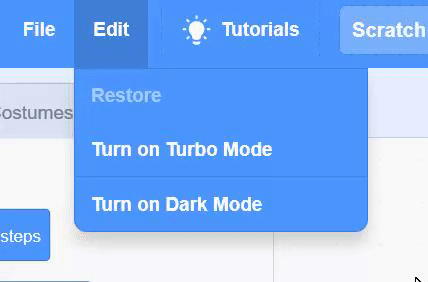
5 years ago Just wanted to share this dark-style userstyle I created - CSS here, screenshots below:


Thoughts? It doesn't cover everything and obviously the code is a mess of just-functional CSS overrides, but I think it's at least a good perspective as to what the editor might look like in a dark style.
 carljbowman
commented
5 years ago
carljbowman
commented
5 years ago @towerofnix - Right on! This is pretty similar to some of the explorations we have done. There are a few differences. Exciting to see that the UI is relatively easy to change, this was a goal of ours.

Still some kinks to workout, but great to compare these. Still thinking through how to deal with the icons, they are less easy to systematically modify. Ideally the gray/transparent icons would be white.
One difference, that I'd love to hear thoughts on... To me, dark mode really affords highlighting which Sprite/Stage is selected. Knowing which Sprite is selected and being modified is something that can be challenging to understand when you begin using Scratch, pretty common to see in workshops with new Scratchers. I noticed you removed the white backdrop and blue highlight in your version, curious why did you remove some of these elements?
towerofnix
commented
5 years ago @carljbowman - Thank you! I'm definitely happy to compare and discuss these.
Yeah, I noticed that it's relatively difficult to style icons since they are SVGs with hard-coded fill values (I don't think you can change that with CSS). As a workaround (although I missed a few places), I used filter: saturate(0) brightness(2) (or similar values). It's not a super elegant solution, but, it works!
The main reason I decided not to highlight which sprite is selected is because it is a bit of a distraction to me. The purpose of my dark style is primarily to make programming with Scratch more comfortable. To me, besides the inherent personal comfort in a darker screen versus the strong white light of the current Scratch 3.0 editor, that means having a view where I can focus on what I'm developing, with as few distractions as possible. That means I de-emphasized some accents - here's a brief list to get an idea, for comparison with your picture:
Particularly regarding highlighting the selected sprite more strongly, I think this is an interesting point of comparison between a dark and light mode in concept. As I mentioned, this dark mode I've created is essentially the ideal comfortable appearance for me. To me, it's more than a simple recolor of the editor. The existing light mode has been very well thought-out, and is exactly what I'd recommend to anyone getting started with Scratch - after all, it's been exactly designed to be welcoming and useful in teaching the editor.
In contrast (ha ha), I see a dark mode as a more comfortable design - to me, an experienced Scratcher. This means I've reduced emphasis on things that are now obvious to me - things like which sprite is selected, and what the various UI buttons do. I remember that a lot of Scratchers - tweens and up, mostly - were initially, instinctively against the look of the Scratch 3.0 editor. They tended to say Scratch looks more like it's being targeted towards younger kids - like the editor was becoming "babyish". This isn't the exact perspective I take, but I think their input has merit..:
Recall that Scratch 2.0 did not place a lot of emphasis on any UI elements. (Just compare them! 2.0, 3.0.) So when the community started seeing 3.0, they were surprised. The editor was placing focus on things where, to these experienced Scratchers, it felt unnecessary. Tack that onto blocks much larger than in 2.0 and changes made "for no reason" like switching the stage to the right, and you get a not-so-receptive crowd... Anyway, I want to compare that to my view on dark mode. While 3.0's light-mode design is great for new users, it emphasizes things that are already obvious to experienced users. (Even - well, moreso, perhaps - users who started with 3.0 will eventually well understand the Scratch editor's UI.) I'm probably just repeating myself at this point, but as I see it, the dark mode takes away emphasis from such parts of the UI, so that it can be a more comfortable design for experienced Scratch users.
At the end of the day, you could boil the dark mode down to an "advanced" version of the 3.0 editor, and the light mode as "introductory". But, in fact, that framing does make some sense: a comfortable place for experienced Scratchers to create is only a good thing. And these "experienced Scratcher" ideas fit well into a dark mode, where the very idea is to have a workspace that allows less eye-strain and greater focus. In my dark mode, the design is less about exploring the buttons and panes of Scratch's UI, and more about making use of what you've already learned while focusing on creating your idea.
OK, sorry for the mini-essay, but hopefully this helps highlight (ha, ha, ha) another perspective on what the concept of dark mode could mean. :) Happy to discuss!
carljbowman
commented
5 years ago @towerofnix - Haha, no need to apologize for writing a "mini-essay." It's great to hear your thoughts! Thank you for being so thoughtful in your response.
Re: Icons While it might not be as systematic, it's rather easy for us to export new assets in alternative colors. Although we should def continue to explore altering SVG fills or filtering methods.
Re: Zoom UI Our exploration (white buttons) certainly needs work. Ideally we'd get the dark mode UI colors into Blockly and alter those to fit within the larger visual language. The transparent could be read as disabled.
Re: Extension Gray vs Blue I'd love to hear more as to why you made this gray. To me, adding more blocks should have a similar prominence as adding a sprite, costume, sound... etc. While this could feel like a detail, I see it having larger hierarchical UI implications.
Re: Dark Mode vs Light Mode While I understand the desire to make the Dark Mode more "comfortable," "older," and "experienced," I do worry about how that the connotations of that alienate new comers. We find ourselves in a bit of a gray area (haha). While we want to support the desire to have a mode that fits some of the needs you described, I would want to make sure we stay true to designing for people who have never seen the editor before. Some of which might just have a preference for dark mode, not based on experience.
To me, the framing of an "Advanced Theme" and "Beginner Theme," sets a tone of evaluating the skill/experience of yourself and others. That feels contradictory to a major goal of Scratch, which is to make coding available to everyone regardless of their background, skill, experience, passion... That goal is a direct response to how alienating the current landscape of coding is towards anyone without prior knowledge.
Furthermore, while we would never use the language "advanced" or "beginner" in the UI, there would still be strong cultural connotations set in the larger community, especially if we made design decisions with that delineation in mind.
There are also concerns about dark mode and its relationship to the aesthetics of traditional Text Based editors (most are dark themed). This may seem slightly tangential, but I think we should be mindful of the larger coding ecosystem while thinking about this theme for the Scratch editor. We should try to avoid adopting “overly-technical” aesthetics that can lead to thoughts like, "Oh this looks like coding, this is not for me."
I hope people see Scratch and all the amazing things you can do with it and see themselves fitting in. Hence some of the changes in focusing on UI (adding sprites, blocks backdrops; more emphasized paint and sound editor tabs; more interactive UI elements like rotation dial). Those examples are all points for people to enter into making/shaping something of their own.
With all that said, I do NOT want to alienate Scratchers who have been using Scratch for a longer period of time. You make some very valid points. That’s why I am so happy to be discussing these ideas with you. So I’d love to hear your thoughts on some of the concerns I mentioned above or specific ideas you have.
Re: Feeling “Older” I’d love to hear more of your thoughts about this making the editor feel older. What are some things that make the editor feel “young” in your opinion?
 439bananas
commented
5 years ago
439bananas
commented
5 years ago I do quite like the current proposed dark theme. However, it still has a few lights on (navigation bar), and I feel the dark theme itself is a bit more of a strain on the eyes at night as opposed to other sites. A few times in my life, I've gotten up way too early in the morning, made my way downstairs to my computer and never turned the living room light on. Whilst it was a strain on the eyes, Discord was never that painful. In fact, its dark theme's pretty good.
 I propose a theme that matches a concept theme for the website I created. It has a dark themed navigation bar and is slightly darker and less of a strain at night. Introducing...
 This!
This!
Anyway, it's less of a strain on the eyes (not quite as good as Discord, but hey) and has a dark themed navigation bar.
towerofnix
commented
5 years ago @carljbowman - Thank you, too, for the detailed response! (PS, though, sorry anyway this time, it's even longer. Hopefully not too rambly, though! :))
To me, the framing of an "Advanced Theme" and "Beginner Theme," sets a tone of evaluating the skill/experience of yourself and others. That feels contradictory to a major goal of Scratch...
Agreed, for certain. We'd definitely want to avoid language like that. It's also worth thinking about in the design of the dark mode, too... like you said, while we want to make something that truly fulfills the purpose people have for dark themes, we also don't want it to look advanced, per se, or un-Scratch-like. I've noticed it's easy to think of the difference between light and dark as "fun" and "serious", but of course that's not the best view to take when designing a theme for Scratch. So then the question is, how do we make something that composes a dark theme while fitting the Scratch feel..?
I’d love to hear more of your thoughts about this making the editor feel older. What are some things that make the editor feel “young” in your opinion?
Hmm... so, when I designed my theme, I was thinking more in terms of "experienced" versus "inexperienced". At the same time, Scratch 3.0 does feel like it's targeted towards younger kids..
There was some interesting discussion over in the Snap! discussion thread really recently (totally coincidentally), which is relevant here. Here's one of the posts. It discusses how Scratch 3.0 being designed to work better on tablets might sort of inherently make it feel more kid-like; to a lot of people, tablets seem more "unprofessional" than computers, so designing the editor around tablet functionality makes it seem like it's "catering" towards kids who aren't "really" into making Scratch projects. It's a view I've seen a lot of forum-posters bring up. Some people brought up that those people who use tablets don't even exist yet, since Scratch had never run on tablets before, so it felt like the design was sort of going against everyone who already used Scratch.
(Now, the size of blocks definitely isn't something that should be changed based on light/dark mode, but it's worth bringing up anyway because I think it's a lot of the reason many users think that Scratch 3.0 feels like it's for younger kids.)
That said, I don't exactly agree... while that's everyone else's opinion as far as I've gathered, it's not mine! I don't find that the size of the blocks makes it feel kid-like; honestly, the new size/shape of blocks has been helpful while I've been creating large projects. So there must be something else - maybe something more related to light/dark modes.
Scratch 3.0 certainly feels more fun than 2.0. Making the menu bar thick and blue makes it a more pleasing thing to look at; the same goes for all the buttons, which are accented that same blue. Contrast to 2.0, where everything - everything - was a shade of gray. So, does this make the editor feel younger? That depends on if you have a view like "fun = young, serious = old". Or, maybe more sensibly, if you feel that serious programming takes a serious programming editor; and that, therefore, Scratch 3.0 is geared towards Scratchers who aren't so serious.
I noticed your design takes a much more blue overall look than mine - it certainly feels like a more literally-cold editor. (Not such a subtle nudge with the arctic scenery, eh? :)) I wonder if that tone makes it feel more "young" than my design? One could argue that "colors aren't serious", which of course is ridiculous, but worth thinking about anyway. This ties into your comment on text editors (which is definitely a good point, btw) - you might hear that colors don't feel like they fit into text editors. (This is, of course, not something everybody agrees upon. Your image reminds me a lot of Solarized's dark color palette. But I think the cultural idea that serious = less color still stands, even if it doesn't really make sense.)
In my dark design, I made the menu bar a much darker, desaturated blue. This was, of course, consciously done to make the editor easier to look at on the eyes. (@439bananas noted that above.) But perhaps, as a side-effect, it makes the editor seem more serious, and hence "older". I didn't 100% desaturate it so that it would be a shade of gray; that would make it look so dull and boring that I think it would utterly suck out the life the editor, in a way. You could argue it would be more "serious" that way, but it would be to a point where I think it's bad... it really reminds me that my goal for the dark mode userstyle was to be comfortable, not serious.
BTW, here's an interesting side-point.. When I look at your design, and see how it's so blue-focused, I find it.. well, less comfortable! Not because I find it looks young (I don't personally, despite my discussion above); rather, I just prefer working on a generally grayscale background than a colored one. It's easier on the eyes, for me. I imagine that I'm somewhat biased because I work in my terminal text editor, which is a color-on-black environment. (Versus, for example, a Solarized-dark theme, which I know some people do prefer, but..perhaps not most?) So I'm inclined towards a more gray than blue dark theme, not because it's more "serious" or anything along those lines, but because I'm more used to a dark gray than a dark blue style in my text editor.
That leads us to the weird conflict between making a design that's comfortable, which may in some ways inherently look like a text editor, while also avoiding making something that's unwelcoming or too serious...
I hope people see Scratch and all the amazing things you can do with it and see themselves fitting in. Hence some of the changes in focusing on UI (adding sprites, blocks backdrops; more emphasized paint and sound editor tabs; more interactive UI elements like rotation dial). Those examples are all points for people to enter into making/shaping something of their own.
Yes, this is exactly what I like about the new 3.0 design mentality! It seems like another double-edged blade, when considering dark mode, though. Dark mode only "works", i.e. is comfortable, if the brightest elements are de-emphasized.. but then, of course, you're de-emphasizing places where emphasis was intentionally placed so as to be welcoming to new users! A middlegrounds would be to do something very similar to your design - darken the background colors, but leave the emphasized elements just as emphasized. But this grants the bests of neither world - it's not as comfortable for experienced users, and, by having a darker backdrop, it's less welcoming to new users. (I believe that's sort of inherent - darker means more like a text editor, and hence more serious.)
So, is there a way to break that seeming conflict? I hope so, but I'm not certain. My dark style shows something that's all benefits of one world and nearly none of the other; vice versa goes for the Scratch 3.0 default light style. Yours is more midway, but I feel it lacks the benefits of either world.
I'd love to hear more as to why you made (the add extension button) gray. To me, adding more blocks should have a similar prominence as adding a sprite, costume, sound... etc. While this could feel like a detail, I see it having larger hierarchical UI implications.
This is actually more of an oversight on my part - I made the add-extension button gray because it was distracting in a way the add-sprite/etc buttons weren't, but of course I agree that it doesn't make any hierarchical sense. It would probably be worth restyling them all to a color that is less emphasized than the original sharp blue, but consistent, and not pure gray; similar to what I did for the menu bar.
Our exploration (white buttons) certainly needs work. Ideally we'd get the dark mode UI colors into Blockly and alter those to fit within the larger visual language. The transparent could be read as disabled.
Yikes, yeah, you're right. That's another case where the editor was designed as having more experienced Scratchers in mind. Of course the zoom buttons being solid white just wouldn't work at all in a dark mode style, but we don't want to make them look disabled.. maybe giving them an animation when hovered, similar to the "choose a sprite" bubble, would help? (Worth noting that they're pointer: default in any case ATM, which seems more like a bug than anything, since it implies they aren't interactive..)
While it might not be as systematic, it's rather easy for us to export new assets in alternative colors. Although we should def continue to explore altering SVG fills or filtering methods.
I've actually been working on a project that contains a dialog box which uses costumes to print text. Since I wanted it to support displaying text in any foreground colors, rather than creating duplicate costumes for every color (a bad idea, considering there's 100+ character costumes), I just made them all solid red - that way I can use the "set color" and "set brightness effect" blocks! Something similar might be applicable via CSS filters, to style icons to be exactly the wanted color. Just a thought, though!
carljbowman
commented
5 years ago @towerofnix - A lot of great ideas to unpack. Just a heads up it might take me a little while to respond. But very excited to continue this dialog.
carljbowman
commented
5 years ago Agreed, for certain. We'd definitely want to avoid language like that. It's also worth thinking about in the design of the dark mode, too... like you said, while we want to make something that truly fulfills the purpose people have for dark themes, we also don't want it to look advanced, per se, or un-Scratch-like. I've noticed it's easy to think of the difference between light and dark as "fun" and "serious", but of course that's not the best view to take when designing a theme for Scratch. So then the question is, how do we make something that composes a dark theme while fitting the Scratch feel..?
Totally agree, I believe there is absolutely believe is a good compromise for a Scratch feeling dark mode. I am glad that we both agree that a "technical" feeling or a "text editor" feeling is not the aim. I am picking up on a few qualities that we should continue to unpack: "younger" & "older"; "comfortable"; and "fun" & "serious".
Personally, I'd like to steer away from "experienced" as one of our primary goals is to always be designing for people who have never seen Scratch before. Some of the decisions we make in dark mode might impact "comfort" or "younger" not because we don't value those qualities, but because our aim is to make dark mode for anyone regardless of their exposure to Scratch.
There was some interesting discussion over in the Snap! discussion thread really recently (totally coincidentally), which is relevant here. Here's one of the posts. It discusses how Scratch 3.0 being designed to work better on tablets might sort of inherently make it feel more kid-like; to a lot of people, tablets seem more "unprofessional" than computers, so designing the editor around tablet functionality makes it seem like it's "catering" towards kids who aren't "really" into making Scratch projects. It's a view I've seen a lot of forum-posters bring up. Some people brought up that those people who use tablets don't even exist yet, since Scratch had never run on tablets before, so it felt like the design was sort of going against everyone who already used Scratch.
From the beginning of working on 3.0, we decided to design/develop an architecture that would support tablets. It's very early in development and still at lot more work to do to make these platforms a more viable place for using Scratch.
But why? While it may be seen as "young" or "unprofessional", that was not why we set out with the goal of putting Scratch on these devices. Our desire was again to make Scratch accessible to anyone, regardless what device they have. For some, tablets or lower powered devices like ChromeBooks are the only option. Both platforms are also becoming more and more popular in the world, regardless of Scratch's previous compatibility.
It seems as though we are back to not wanting to alienate people, but instead designing to actively extend an inviting hand. Frankly, I find the phrase "'unprofessional' computers" extremely concerning, it's places a value on the hardware/platform that creates a barrier for many. That phrase feels very elitist and focused on making Scratch better for those who already have access. I would much prefer curating an "unprofessional" environment if that mean't making space for the majority of people. A majority of people who are not "professional."
I have seen some feedback regarding larger UI elements, which can certainly feel "young". This most certainly is a side-effect of designing an environment for touch. Best practices for touch suggest hit targets should be at least 44px–48px. Some of our UI doesn't meet that guideline, but we did increase sizing of UI. Both to call attention to things hierarchically in a rather complex UI, but also for an improved touch experience.
We were okay with the inherent bias our design if it mean't making a new space for people who could not previously create with Scratch.
(Now, the size of blocks definitely isn't something that should be changed based on light/dark mode, but it's worth bringing up anyway because I think it's a lot of the reason many users think that Scratch 3.0 feels like it's for younger kids.)
That said, I don't exactly agree... while that's everyone else's opinion as far as I've gathered, it's not mine! I don't find that the size of the blocks makes it feel kid-like; honestly, the new size/shape of blocks has been helpful while I've been creating large projects. So there must be something else - maybe something more related to light/dark modes.
I agree that this is an issue. The ratio of the block size and workspace has a dramatic impact on the coding experience. There is certainly more we can do to improve the legibility of blocks a smaller scales, such that you can more easily navigate the workspace and/or make larger stacks of blocks more easily.
I am glad that you have found the redesign of blocks to be an improvement. We were really focused on making each block more distinguished, but also refining the proportion of block elements (e.g. inputs) to be more "readable" and distinguishable.
Very excited to start exploring ways of addressing this issue, but I agree, block size should be addressed outside the dark mode work.
Scratch 3.0 certainly feels more fun than 2.0. Making the menu bar thick and blue makes it a more pleasing thing to look at; the same goes for all the buttons, which are accented that same blue. Contrast to 2.0, where everything - everything - was a shade of gray. So, does this make the editor feel younger? That depends on if you have a view like "fun = young, serious = old". Or, maybe more sensibly, if you feel that serious programming takes a serious programming editor; and that, therefore, Scratch 3.0 is geared towards Scratchers who aren't so serious.
Hmm. Other than the color, are there other things that make things feel "fun = young"?
I want to better understand how you see the relationship between "fun" and "young". Are "fun" and "old" mutually exclusive: do you feel something feel both "fun" and "older"?
I imagine you still think Scratch is fun to use? What are some things that you do in Scratch that you enjoy and/or find fun?
Are there brands that you find particularly interesting? Especially, but not limited to, ones that are aimed towards kids (e.g Cartoon Network)?
Sorry to throw a lot of questions at you, just really curious about your thoughts!
I noticed your design takes a much more blue overall look than mine - it certainly feels like a more literally-cold editor. (Not such a subtle nudge with the arctic scenery, eh? :)) I wonder if that tone makes it feel more "young" than my design? One could argue that "colors aren't serious", which of course is ridiculous, but worth thinking about anyway. This ties into your comment on text editors (which is definitely a good point, btw) - you might hear that colors don't feel like they fit into text editors. (This is, of course, not something everybody agrees upon. Your image reminds me a lot of Solarized's dark color palette. But I think the cultural idea that serious = less color still stands, even if it doesn't really make sense.)
Certainly open to discussion here. A few reasons to keep the nav/toolbar blue:
It's nice to have consistent bridge between the community and editor. At least for the initial pass we are only imagining making the editor have a dark mode. A community wide theme would take a lot more work and scaffolding.
Furthermore, now that much of the code that makes up Scratch is open source, lots of people are building "Scratch-like" experiences. Overall we are very excited about this prospect and hope people continue to build things with parts of Scratch, for example the scratch-blocks codebase. With lots of blocks based editors based on Scratch popping up, we should probably keep some branding in mind. The nav/toolbar is a pretty propionate UI element that can unify Scratch regardless of theme (dark mode or light mode).
In my dark design, I made the menu bar a much darker, desaturated blue. This was, of course, consciously done to make the editor easier to look at on the eyes. (@439bananas noted that above.) But perhaps, as a side-effect, it makes the editor seem more serious, and hence "older". I didn't 100% desaturate it so that it would be a shade of gray; that would make it look so dull and boring that I think it would utterly suck out the life the editor, in a way. You could argue it would be more "serious" that way, but it would be to a point where I think it's bad... it really reminds me that my goal for the dark mode userstyle was to be comfortable, not serious.
BTW, here's an interesting side-point.. When I look at your design, and see how it's so blue-focused, I find it.. well, less comfortable! Not because I find it looks young (I don't personally, despite my discussion above); rather, I just prefer working on a generally grayscale background than a colored one. It's easier on the eyes, for me. I imagine that I'm somewhat biased because I work in my terminal text editor, which is a color-on-black environment. (Versus, for example, a Solarized-dark theme, which I know some people do prefer, but..perhaps not most?) So I'm inclined towards a more gray than blue dark theme, not because it's more "serious" or anything along those lines, but because I'm more used to a dark gray than a dark blue style in my text editor.
That leads us to the weird conflict between making a design that's comfortable, which may in some ways inherently look like a text editor, while also avoiding making something that's unwelcoming or too serious...
Totally a lot of nuance and room to play around with the tones of gray that we use. The cooler-grays that I used in both light and dark mode are derived from the motion category blue. This blue is also used on the site for the nav, buttons, links, and UI elements — it's a pretty core brand color.
All of our new colors were built using HSLA. For example all blocks have 3 colors: primary, secondary, and tertiary.

Secondary and Tertiary are always derivative tones of Primary, adjusting the S (saturation) and L (lightness) to create "darker" tones. In the same way the blocks have these color, we explored ways of the UI also have these tonal tiers.
As you pointed out my colors happen to be much more saturated resulting in cool grays. As you pointed out desaturating the grays can "utterly suck the life out of the editor, in a way."
I def think there is room to explore making these grays less saturated and/or exploring alternative primary derivatives. Maybe something that is a warmer gray, possibly making the grays derivative of controls orange primary.
Yes, this is exactly what I like about the new 3.0 design mentality! It seems like another double-edged blade, when considering dark mode, though. Dark mode only "works", i.e. is comfortable, if the brightest elements are de-emphasized.. but then, of course, you're de-emphasizing places where emphasis was intentionally placed so as to be welcoming to new users! A middlegrounds would be to do something very similar to your design - darken the background colors, but leave the emphasized elements just as emphasized. But this grants the bests of neither world - it's not as comfortable for experienced users, and, by having a darker backdrop, it's less welcoming to new users. (I believe that's sort of inherent - darker means more like a text editor, and hence more serious.)
So, is there a way to break that seeming conflict? I hope so, but I'm not certain. My dark style shows something that's all benefits of one world and nearly none of the other; vice versa goes for the Scratch 3.0 default light style. Yours is more midway, but I feel it lacks the benefits of either world.
That's helpful feedback. I am thankful you recognize the "double-edged blade" nature of these decisions and compromise. I do feel as though there may need to be some compromise here. We still want to emphasize some elements that are entry ways for new Scratchers. In addition that that, we also want to make sure that as we continue to design resources (like the Activity Cards or the Tutorial Window) for helping people get started or for showing using Scratch in new ways, that we have a consistent point of reference.
Often we reference elements like the "Sprite Tile" or "Add Sprite Menu", which ideally would look the same so that resources are relevant regardless of the mode is being used.
We can certainly continue to explore reducing some of the high-contrasty elements, but I wanted to share how these alternations have larger impacts beyond just the UI.
Now setting aside my ramblings above and setting aside the places we might not exactly align on a design decision, it brings me so much joy that you were able to hack on the editor codebase and make the editor your own. This is something we intended to do with 3.0.
It's not the most visible and we have a ways to go, but while we may not be able to make all your desired changes in the Scratch that everyone uses, my hope is we can continue to make Scratch modular in a way that you can modify Scratch for yourself and/or in this case foster discussion.
carljbowman
commented
5 years ago @towerofnix - See above ^^^. Mean't to 'at' you in that reply.
towerofnix
commented
5 years ago @carljbowman No worries, I get notifications for posts in threads I'm following regardless of if I'm mentioned or not! Also, sorry for the delay in responding.
There's one thing I'd like to bring up before further discussion, that is particularly relevant here...
Yes! Scratch 3.0 works very well for being themed, and this is critical here. The official dark mode that is created alongside discussion like this is going to be, well, official; but it won't be magic. While it's absolutely worth searching for the best compromise/solution possible, Scratch 3.0 will always have the capability to be themed as in my stylesheet - so users will be able to make stylesheets that match the kind of style they personally prefer.
(An unofficial tool for creating a Scratch 3.0 stylesheet to your own liking, even as a user inexperienced with CSS/userstyles, would be an interesting project.. that's a separate topic, though!)
It seems as though we are back to not wanting to alienate people, but instead designing to actively extend an inviting hand. Frankly, I find the phrase "'unprofessional' computers" extremely concerning, it's places a value on the hardware/platform that creates a barrier for many. That phrase feels very elitist and focused on making Scratch better for those who already have access. I would much prefer curating an "unprofessional" environment if that meant making space for the majority of people. A majority of people who are not "professional."
I absolutely agree - and thank you for this paragraph, because it makes me more confident in that and makes me wonder about some biases in terms of "professional"-ness I might have myself... As another thought, I figure new Scratchers - particularly, young Scratchers, say seven to ten years old - wouldn't have a bias like that. If you haven't been told that big workspace computers (or whatever) are more professional, you wouldn't really think to consider that, would you? So I wonder if Scratch being used on more devices will help to shift the view that any kind of device is more professional than another. If Scratchers show, to their family and friends, the kinds of things they make on a tablet, that will only help improve the view that tablets can be just as useful as anything else, I imagine.
(Aside: I admit I hesitate to call mobile devices as useful as a computer. I'm biased because I'm sort of intrinsically opposed to, for example, the lack of file/directory organization that I'm always using on my desktop computer; and especially Apple's somewhat extreme efforts to protect its users, by limiting the ability to do things such as writing (or even installing) userstyles or run code not explicitly curated by them - if I feel Apple owns my device instead of me, can I really call it my computer? I'm ignoring Android devices, though, and in any case this is rather a separate debate...)
Definitely agreed that styling www would be a quite large task... I've always felt dark styles fit editors and applications moreso than social media sites in any case! I suppose keeping the nav bar's color as a bridge would help make the dark mode feel more natural. If it were a different color, users may feel it doesn't fit so nicely with the rest of the site, and thus wonder why the rest of the site doesn't also have a dark theme.
That's a good point regarding the navigation bar being a sort of "brand" mark of Scratch. I sort of feel the distinct look of Scratch 3.0's blocks is more signifying, though, even if it's not exactly as consistent of an element? I also find the nav bar as an interesting point for other editors to change -- of all the elements to tweak, changing the color of the nav bar (or the general gui primary color, as to be discussed) may be an interesting way for developers to give their own editors a sense of identity... Although you could also say that this blue is Scratch's sense of identity.
Both these arguments should be weighed, though. I feel they make sense, but do they undermine, to essentially everyone, the worth of a dark-mode editor? Maybe; maybe not. That's probably worth asking of any discussion here.
I think tweaking the base colors the GUI uses in general, the primary-secondary-tertiary colors, could do well for recoloring the editor while keeping its hierarchy. I'll mention this is something that userstyles cannot do. Scratch 3.0 is many miles ahead of 2.0 and 1.4 in terms of hacking, but because its CSS variables are preprocessed, you can't tweak their values via userstyle (as far as I know). Have you considered using CSS variables? It always feels like they're a thing of the future, but the fact is that they're now supported on most modern browsers - maybe all that Scratch 3.0 targets. Unlike preprocessed variables, these values can be changed at runtime (and so by userstyles), so reworking the editor CSS to make use of them would contribute greatly to the hackability of it. (Especially since it would encourage users to write more simple styles - changing the three-color palette is far more likely to yield a consistent hierarchy than tweaking every component one by one!)
Hmm. Other than the color, are there other things that make things feel "fun = young"?
I want to better understand how you see the relationship between "fun" and "young". Are "fun" and "old" mutually exclusive: do you feel something feel both "fun" and "older"?
I imagine you still think Scratch is fun to use? What are some things that you do in Scratch that you enjoy and/or find fun?
Are there brands that you find particularly interesting? Especially, but not limited to, ones that are aimed towards kids (e.g Cartoon Network)?
Sorry to throw a lot of questions at you, just really curious about your thoughts!
No worries! Thanks for asking these, they're definitely interesting questions.
The idea of "fun = young" actually isn't something I feel is true, per se, though. It derives from the idea that older people ought to take things seriously. Maybe that's sensible in some sort of sense (..and maybe not..), but I think the more relevant problem is another idea, that serious things can't be fun. But I disagree with this!
Educational YouTube channels like KhanAcademy and especially 3Blue1Brown help demonstrate to me that something that's better done seriously, like learning a tough math topic, can be fun. Also, 3B1B is a channel that's generally targeted towards older people, i.e. people who are at least experienced in basic algebra for example; the same goes for KhanAcademy's more advanced lessons. Evidently they both believe math doesn't have to be dreadfully serious to be taught well. (Actually, they show it's rather the opposite.)
So, more specifically on terminology/concepts: As I've said here, I don't feel that "fun" and "older" are mutually exclusive. Maybe some might say that they should be, but, as in the math example, I think that in any case where they'd claim it should be serious and not fun, it would benefit from being fun.
Oh, for proper definitions here, I feel that fun means the particular spirit of enjoying something. Likewise, I feel that serious means an attitude of working on something and putting your all into doing something the best you can. These aren't the ways I've exactly been talking about the editor, though. Through this discussion, I've been placing myself in the imaginary shoes of imaginary people using the dark and light modes. So, now that I'm bringing up my personal thoughts on the terms - that's why what I'm saying here isn't exactly congruent with what I said earlier.
I do personally find Scratch fun to use - in that definition I said before. To me, it really is fun to create projects with Scratch, on pretty much any scale. I like messing around with relatively playful ideas, like making simple games and pen-block doodles. I find it fun to work on bigger projects, too. (3.0's many editor improvements, ala variable sorting and an easier to navigate workspace, help a lot here.) Especially with bigger projects, I'm often also serious - that is, determined to create. But, as you can guess, that does not compromise the fun aspect!
(Sorry I don't have a lot of input brand-wise... I actually haven't ever really paid a lot of attention to branding of things particularly targeted towards kids!)
 Nambaseking01
commented
4 years ago
Nambaseking01
commented
4 years ago Hello! I am not a contributor to this but I am a forum helper and I would like to say that people are urging for this feature: https://scratch.mit.edu/discuss/topic/217797/
Please make a move soon!
 Wyvest
commented
4 years ago
Wyvest
commented
4 years ago Hello.
We are going to address this post-launch. <
When are the Scratch Team going to address this?
Nambaseking01
commented
4 years ago @EastTV I feel like this should be made active again, it's extremely important for Scratchers with eye issues. If Scratch accepts all kinds of people in the Community Guidelines, then it should also keep to that promise. Not implementing this means the Scratch team going against their own rules.
 Kenny2github
commented
4 years ago
Kenny2github
commented
4 years ago @Nambaseking01 not having specific features to accept everyone isn't the same thing as not accepting everyone - just because there isn't a version of Scratch for people who can't move doesn't mean that people who can't move aren't accepted on Scratch. Likewise, just because there aren't accessibility features for people with vision problems doesn't mean that people with vision problems aren't accepted on Scratch. Additionally, the Community Guidelines are for the community - not for the program. They're guidelines for how the community should behave - not guidelines for the development of Scratch. Accessibility should be something to consider, but it should not be a driving factor behind features. After all, if color-blind people not being able to differentiate five block categories didn't hinder the color choices, why should visual accessibility require a dark theme? That being said, of course dark theme would be a much-appreciated addition - both for coding at night and, like you say, for people that see better on dark themes.
Nambaseking01
commented
4 years ago Yeah, I really should've thought more before making my post lol
Either way, dark mode is necessary - many people code at nighttime and it would be extremely useful.
 Explosion-Scratch
commented
4 years ago
Explosion-Scratch
commented
4 years ago So as Nammy said, the users of scratch are really pushing for this feature, in fact the main forum thread for this has 600 replies which is one of the biggest suggestions forum threads I've seen. Could we perhaps add the "help wanted" label to this @benjiwheeler ? That way people might be able to start working on this? I think that this would really help people who use the scratch editor in dark places (hackers for instance lol) as well as people with eye problems. Perhaps a even more versatile solution would be to make the scratch editor's colors completely customizable? This would solve the block colors suggestion, the block size suggestion, the block fonts suggestion, the dark mode suggestion etc. and be hugely helpfull to those with disabilities as scratch is for all ages and is aaccepting of all. Anyways, thanks for reading!
--Explosion--
 benjiwheeler
commented
4 years ago
benjiwheeler
commented
4 years ago @Explosion-Scratch the reason I don't add "help wanted" is because I'm not sure we have time available on our end to invest in evaluating submissions. So I wouldn't want someone to spend time implementing it, if we're unlikely to use their work.
That said, people should feel free to try implementing it, if only to share screenshots and discuss aspects of the design here.
Explosion-Scratch
commented
4 years ago Hmm, I understand, perhaps a disclaimer in the top post could help? I'm sure that despite this many people would be happy to help with it.
 apple502j
commented
4 years ago
apple502j
commented
4 years ago Implemented myself using @carljbowman and @towerofnix 's colors: https://apple502j.github.io/dark-mode/

Still missing scratch-blocks/scratch-paint support and image fixes.
 2br-2b
commented
4 years ago
2br-2b
commented
4 years ago I think this would be a great feature to add! Maybe there could also be a boolean for "dark mode?" and a hat "When [dark mode v] turned on"? These would be implemented later, of course, but it's a thought.
Nambaseking01
commented
4 years ago @2br-2b Maybe those blocks could be suggested in the Suggestions forum, as in Github there's mostly suggestions that can be done in a more complex way and not just implementing blocks.
 Secret-chest
commented
3 years ago
Secret-chest
commented
3 years ago The blocks should be darker.
 ajskateboarder
commented
1 year ago
ajskateboarder
commented
1 year ago January 2023, any updates? :)
benjiwheeler
commented
1 year ago One promising light at the end of the tunnel (or maybe, darkness at the end of the light?) is that the scratch lab project has that alternate set of block colors intended for better visual contrast. If that is introduced as an option, then it might mean adding support in the code for alternate color schemes.
 Gilbert189
commented
1 year ago
Gilbert189
commented
1 year ago One promising light at the end of the tunnel (or maybe, darkness at the end of the light?) is that the scratch lab project has that alternate set of block colors intended for better visual contrast. If that is introduced as an option, then it might mean adding support in the code for alternate color schemes.
Plus, adding a dark background on light-colored blocks would increase contrast even more. It's a win-win.
You should be able to toggle between "light mode" (as in the comp in #1) and "dark mode" (the current default look of scratch-blocks). The light mode should be defined as the default look in scratch-blocks.