Team's Response
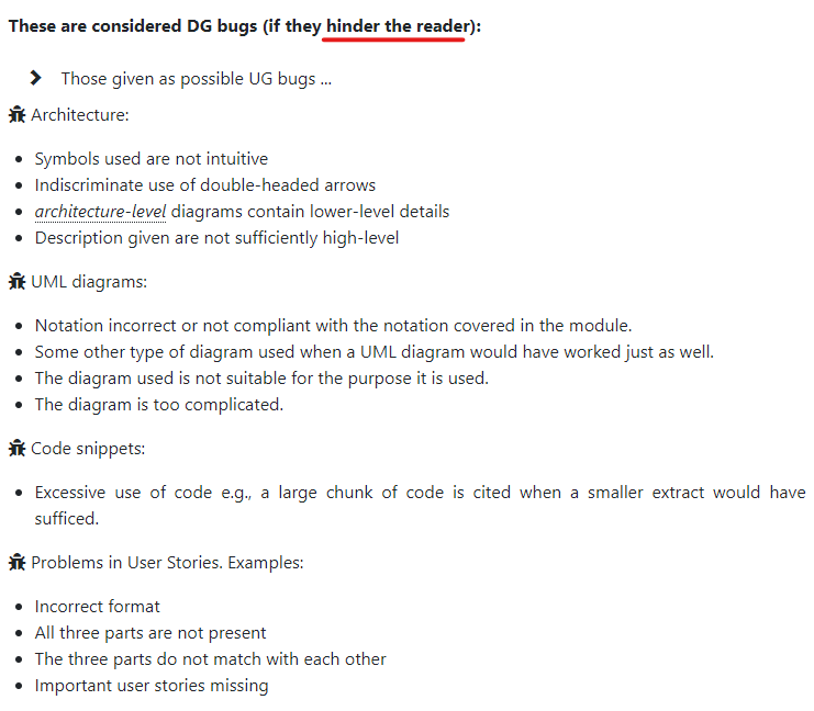
Hi, thanks for the input. However, this is not a bug as there is no requirement that the colour scheme of UG should be the same as the application. If you refer to CS2103T's website, documentation bugs should be issues that hinder readability. We do not believe that using an unrelated colour would affect the reader's understanding of our guide.

Items for the Tester to Verify
:question: Issue response
Team chose [response.Rejected]
- [ ] I disagree
Reason for disagreement: [replace this with your explanation]
In the userguide, not very sure if there is a reason why orange is used for the headers like 'Features' or the feature headings as well since there is no orange in the intern buddy app itself. Maybe the userguide could have had the same colour scheme as the app? Blue and black? Orange may seem a bit unrelated.