Team's Response
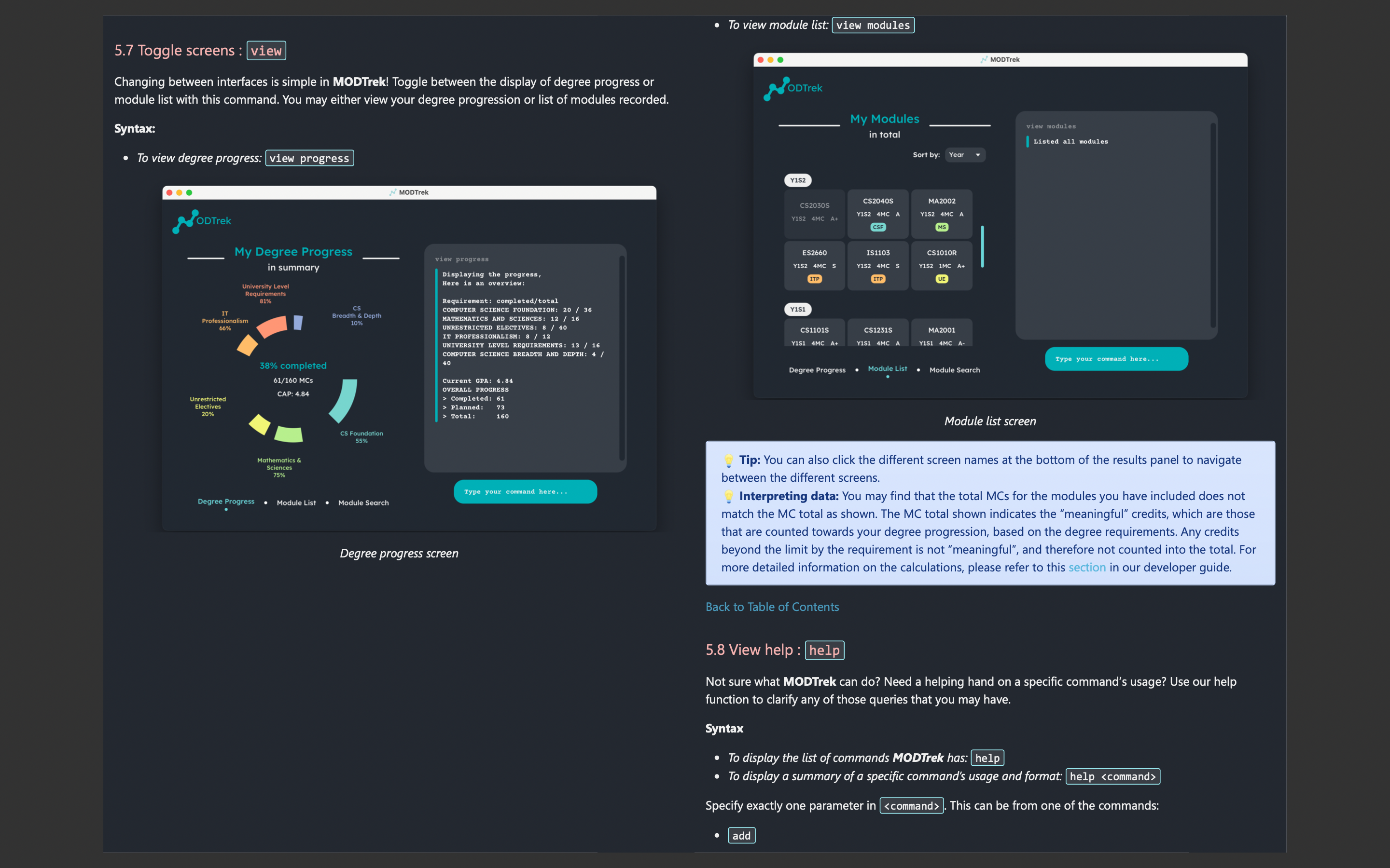
There is no fix for this as this is how the page is broken. The UG quality is not affected and there is the command summary to refer to as well
Items for the Tester to Verify
:question: Issue response
Team chose [response.Rejected]
- [x] I disagree
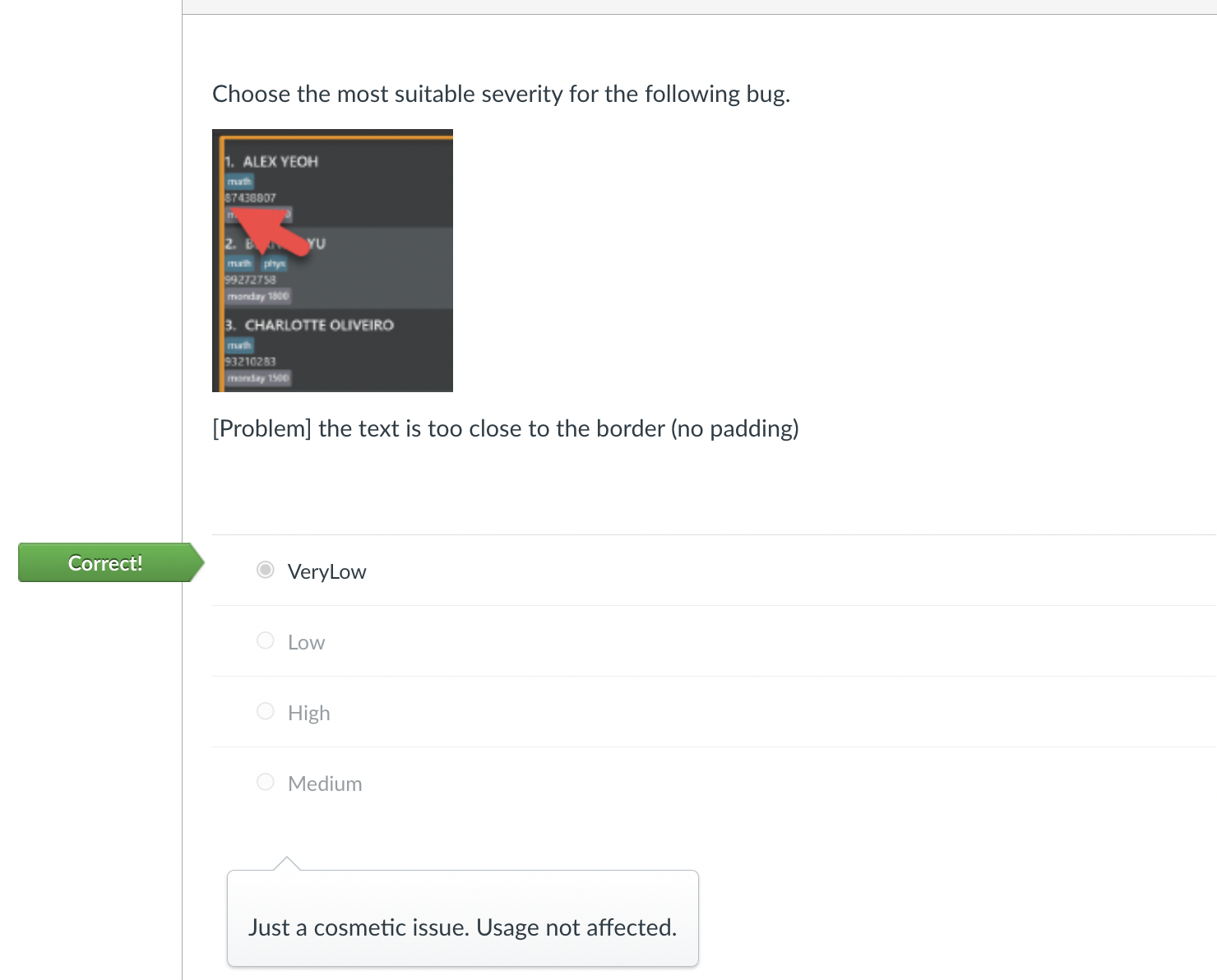
Reason for disagreement: This is a cosmetic issue similar to the one in the attached example. Since this is a cosmetic issue that makes it a greater or equal inconvenience the user (given that this is in the user guide) compared to the example, I have flagged it with similar difficulty. Hence this is well within the 'ball park of reasonable' and hence I hope you will graciously accept this.


The command syntax for the view module command is easily missed as it is located a very odd place, (top right side of the screen). Hence better placement is suggested so users will not miss out on it. Since this is a cosmetic suggestion , I will tag it as very low severity