Team's Response
We would consider this as a suggestion but thank you!
Items for the Tester to Verify
:question: Issue response
Team chose [response.Rejected]
- [x] I disagree
Reason for disagreement: 
According to the tP Grading, the not enough visuals is consider as a bug if they hinder the reader.
I think the team UG does not have the screenshot/image to let the user visual the example which could cause some issue for user when they reading it.
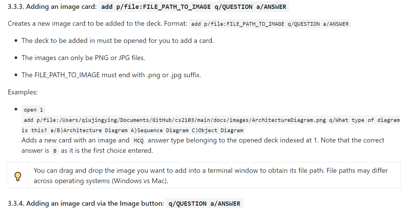
For example, the diagram below is screenshot for "Adding an image card" in the UG:

In the diagram above, the example given for the command is very long and hard to read. As a user, I might have difficulty to follow this example to add a new image card to the application. If there is a screenshot for the given example definitely will make my life easier. Other than that, the users might not understand what is the "terminal windows" and thus unable to obtain the file path from the "terminal windows". And they might not understand "drag and drop" in the given tips, and thus unable to get the file path. So they need to manually key in the file path due to unable to retrieve the file path from the "terminal windows"? All of these issues can be solved by simply provide a few screenshots to guide the user to use the UG without struggling.
So my conclusion for this is this is a Documentation Bug but with the Low Severity as this is unlikely to affect the normal operations of the product. Appears only in very rare situations and causes a minor inconvenience only.
I think the UG show contains more visual such as screenshot to guide the user to use the application as all words might make some of the confussion for user.
The only screenshot in the UG: