 virtualritz
commented
10 years ago
virtualritz
commented
10 years ago On that note: are there SVGs/vectors of the icons anywhere? It seems the repo only contains PNGs?
Closed virtualritz closed 10 years ago
virtualritz
commented
10 years ago On that note: are there SVGs/vectors of the icons anywhere? It seems the repo only contains PNGs?
 Kiwii
commented
10 years ago
Kiwii
commented
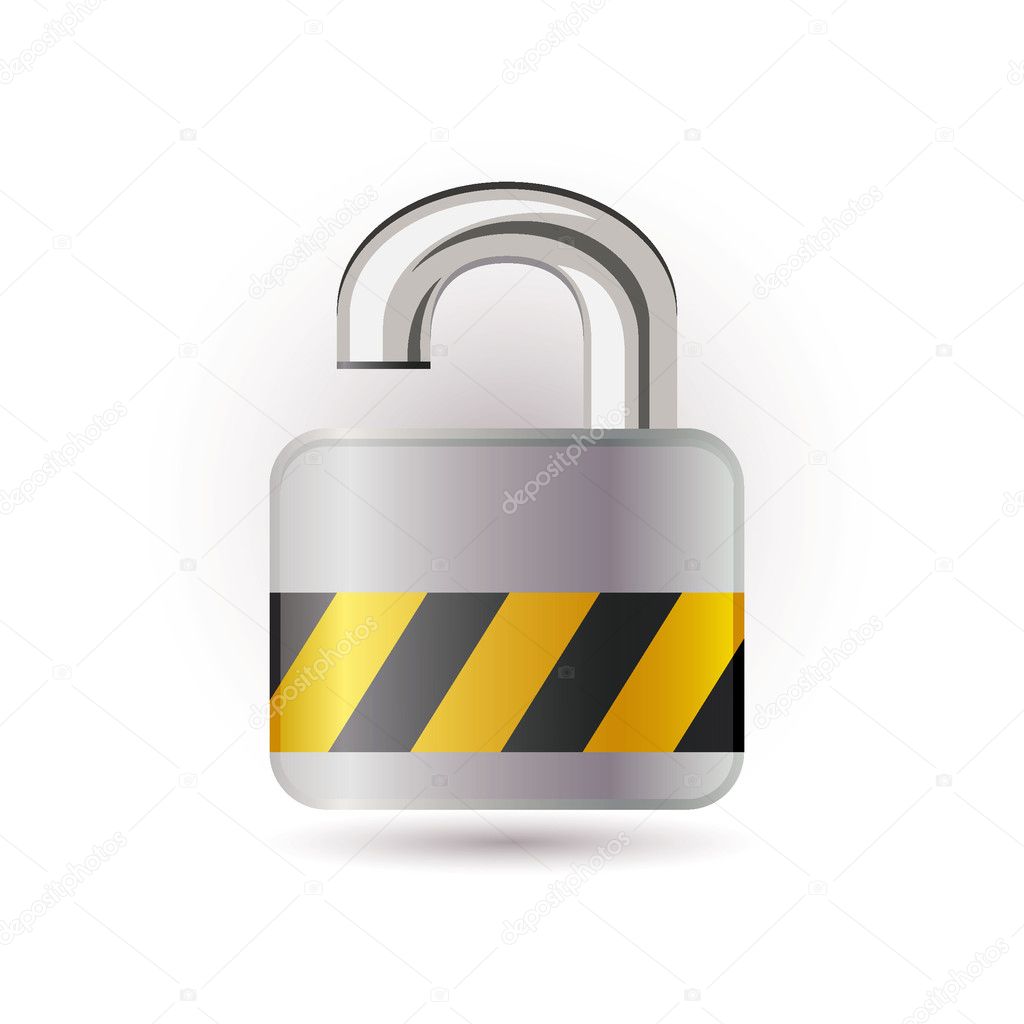
10 years ago Encrypted messages are colored blue, not green.
As it appears to me, the coloring of the bubbles does not indicate whether or not a message is encrypted but over which transport it's send. I guess green means SMS and blue means data channel.
virtualritz
commented
10 years ago Ok, then the lock should not have any color, unless it is know, beforehand, by what method the message will be sent (I guess this is true as soon as #671 gets resolved, somehow).
 monreal
commented
10 years ago
monreal
commented
10 years ago I get confused by the use of colors as well. Green is also used in the new message section to indicate that the contact is using textsecure but in this case does not say anything about the transport?
 mcginty
commented
10 years ago
mcginty
commented
10 years ago :+1: we do need a better encrypted send icon. To answer your question, any new icons I've created that are not directly from the Android icon pack have their source files put in the artwork/ folder. In most cases, however, the source files for icons aren't present (but I'd like to see our collection of big-density-ready source assets grow).
For the sake of my own pedantry, @Kiwii is right in that it's not always the case that encrypted messages are blue (blue just means sent over push, so doesn't account for encrypted SMS). #796 will change the message colors to a faded "best guess" of what the transport will be - I think it would make sense to have a grey, blue, and green send icon to essentially show what the background color of your faded bubble will be. Thoughts?
 generalmanager
commented
10 years ago
generalmanager
commented
10 years ago I think in addition to @virtualritz's proposals, the whole send Icon should be bigger, so that the lock is even recognizable. The lock should always be black and the triangle/paperplane beneath can then change color. We should make absolutely clear when a message is going to be sent unencrypted. Everything else is unacceptable from a usability perspective. For example with a wide open lock or a lock that's crossed through in a signal color like red.
virtualritz
commented
10 years ago A wide open lock that is crossed out means what? That the lock is not open (because it's crossed out) or that it is open? This is not improving usability but making it worse by introducing visual ambiguity.
We can either have an open lock or no lock for the unencrypted case but forget the cross. :)
generalmanager
commented
10 years ago @virtualritz No I don't mean a double negation, that would of course be unclear. The crossed out lock would have to be closed. But I agree that we should keep it the same across the app and because the cross isn't used anywhere else, we should use the open lock. I only came up with the idea of the cross because the open lock wasn't very obvious in V1. It was nearly indistinguishable from the closed one it you didn't inspect it closely. So maybe there is a better way to showcase the open lock, either by tilting the open "U" part, like some old locks allowed (http://thumbs.dreamstime.com/z/open-lock-white-1143257.jpg) or by turning the "U" by 180 degrees, like this: http://thumbs.dreamstime.com/z/open-lock-8619153.jpg In each case the icon will become wider, but I don't think that's of too much concern.
But we also have another signaling problem: The lock should usually be black and the triangle/paperplane beneath can then change color. The paper plane represents the transport channel, which changes dynamically. The lock represents security aka transport encryption, which can either be on (black, closed lock) or off (red, wide open lock). Currently we are signaling the state of the transport channel by changing the security symbol. And we omit the security symbol when we send unencrypted SMS, instead of strongly signaling that they shouldn't have any expectation of privacy. That's confusing and bad UX design, especially for an app that wants to bring secure encypted communication to the masses.
On that point I would like to propose similar changes for the security indicator on top of the conversations. There we also omit the security symbol instead of highlighting it, when there is no security to be expected.
generalmanager
commented
10 years ago @tinloaf made a good point over at #741: We can use the lock symbol in the header bar to signal the trust level. Together with the changes to the contact list I proposed in my last two posts in #741 I think this would be best for the header bar icon:
I'm open to discuss everything, but especially the coloring of the normal TS users' lock symbol. We may want to use black instead of yellow for their lock to signal what moxie said about TS: "privacy is normal". And a black lock is a secure lock. However this would break the well known and widely used traffic light analogy. And the green lock would be seen as highly optional by most people (as it technically is, because the keys are already verified). Personally I prefer the traffic light symbolism, as it adds a playful incentive to get all the way to the best security.
The same colours should then be used for the send icon. We may omit the lock in the send icon altogether because we already have the lock on top signaling the expectation of privacy, but with such an important information that it can't hurt to make it as clear as possible.
virtualritz
commented
10 years ago The color choices are still confusing. As a normal user, I would ask myself: Why are the text bubbles blue but the lock is green? Does that indicate that they are less secure or more?
Which is more or less the question that made me create this ticket. :)
I think color use should be reserved to indicate one constraint of a conversation only (in this case: transport channel). The icon should be self explanatory w/o color.
P.S.: I'm don't understand what manually verified TS users are. How do I manually verify a user? Could you elaborate?
virtualritz
commented
10 years ago One more thing: some parts of a conversation may be sent unencrypted. For example, what happens when the contact uninstalls TextSecure? My next message will have to use SMS fallback and will be sent unencrypted.
As a user, I do not want to look in a different screen area, every time I press send, to gauge the security of the channel.
That is why it makes sense to have a security indicator icon overlaid over the send icon, as it is now. I would vote against removing this.
 thoughtbox
commented
10 years ago
thoughtbox
commented
10 years ago Manually verified TS users are those whose keys you have verified either through QR-code verification ("scan to compare") or verified by other means, such as reading the hex values off over the phone.
And FWIW, I like your suggestion of different colours for different message security levels.
generalmanager
commented
10 years ago @virtualritz You can check if the keys of your contacts match by clicking on the TS icon in the messages overview -> Contact Keys and either scanning them or reading them to each other.
I understand that having two color sets may seem confusing at first, that's why we need a useful help 2 clicks away at max. For example after clicking on the settings icon (three vertical dots) inside a conversation. The help should explain the blue/green coloring of the messages/send icon (paper plane) as well as the color scheme for the open/closed locks on top and over the send button. We should open a seperate issue about that.
I've been doing web design and developed some corporate designs (what a big word for matching colors, logos and fonts across appearances) for some time (no, I don't have a math phd ;-) now and TextSecures biggest selling point is that it makes the previously complicated, bloated and inconvenient secure messaging hassle-free. That includes that it always has to be clear which level of privacy the user can expect. I think making SMS distinguishable from IMs shouldn't top the usability of the main feature, especially when we can do both. If we make the green of the lock icons lighter than the green of the messages there shouldn't be any confusion. And if there is, the big question mark right in the conversation options will clear things up.
I'm with you on the existance of the security indicator icon over the send icon, it should be obvious at first glance wether it's secure or not.
virtualritz
commented
10 years ago I think the problem really is that you want to communicate two important aspects of the connection in one icon.
The first aspect is the fact of whether this connection is encrypted or not. The other is the level of trust between you and the other party.
I think mixing those into one icon will indeed create a UX scheme that requires a dedicated help text to grasp. Imho a UX scheme that requires help to make the user understand the concept it is meant to convey is dubious design, maybe even bad.
As for color: there will be color blind users of TextSecure. For this reason alone, communicating the trust level of the channel through color is another dubious design choice.
I would keep the top bar lock icon as it is.
If we want to indicate the trust level, I'd do it on the avatar icon of the other user. I would overlay two shaking hands or a friendly (friend) face or a checkmark badge to indicate the raised level of trust. The lock alone is enough to let the user know that the connection is secured against a 3rd party.
What also needs to be considered is where information ends and noise starts. Certainly, adding the trust level adds information that users may want to see. But it also adds visual noise. That's why I would put this on the user's avatar and not clutter the top bar further.
Kiwii
commented
10 years ago If we want to indicate the trust level, I'd do it on the avatar icon of the other user.
This also makes sense for group chats where you may have verified the identity of some participants but not everyone's.
I would overlay two shaking hands or a friendly (friend) face to indicate the raised level of trust.
Maybe a badge similar to what twitter uses for verified accounts: https://si0.twimg.com/help/1307051362_737 People are already familiar with these kind of badges, I guess.
virtualritz
commented
10 years ago To prevent this from getting sidetracked: this ticket is only about two things:
send paper plane button presents with the blue colored message bubbles used for push messages.To re-iterate, I think the best way to remove the ambiguity is by simply, for now, removing the color from the lock. And ofc, rotating the lock and swapping for the icon used in the top bar. I do not think that indicating the message type (SMS/push) through the lock color is s good idea. If at all, I second @lindworm 's suggestion of tinting the paper plane. Slighly (it doesn't need to go fully blue or green, I think).
This ticket is not about other parts of the UI. Just the send button.
If you think there is need to also convey the trust level with the other party in a conversation, I really suggest to open a new ticket for this.
Because there will be lots of suggestions where this information is best placed, the send button, top bar or avatar just three possible.
There is now a new ticket, #910 for this issue.
generalmanager
commented
10 years ago @virtualritz I've been writing on this too long so your new post appeared before I could send mine. I'll send my answer here, because I think the same iconography should be used for the lock on send icon and the top bar icon. I also answer some points you raised that aren't connected to the top bar icon. I'll dive into the discussion about at the new ticket #910 you just opened.
I understand the two different symbolisms I want to combine into one icon. But the layman doesn't know about the differences between trust and encryption - and they shouldn't have to! Also because the contexts in which they are used are so similar, there will never be any confusing cases.
There will never be something like
The way I understood your previous post was that you were concerned about two color sets used to indicate the two (three if you really want to) different properties (security and transfer channel) of the conversation. And to make that distinguishable I proposed the help and using two easily distinguishable shades of green. Even with only one color set we should have a help section. The first thing my mom asked me after she installed TS was, what the difference between the blue and the green messages is.
Bringing color blind people up is a valid point, but we can not make design choices for a small minority, if those will negatively impact the usability for the huge majority. If you argue like that, we also shouldn't use the green/blue color scheme to indicate the transport channel, because there aren't just red/green color blind people. I think we should really consider adding a third theme in addition to the light and dark ones, with high contrasts and/or different shapes. This is supposedly a positive example: http://wearecolorblind.com/example/ichat/
I really like @Kiwii's idea to include a simple checkmark to the user pictures - but we'll have to make it look the same in the contact ist (#741), the message window and the contact keys page. If we do that to indicate trust, I think the send icon lock should be black most of the time but open and red when sending unencrypted SMS.
virtualritz
commented
10 years ago Why should a normal user not be able to understand this distinction. Surely, everyone understand the difference between speaking on the phone to someone you have personally met (and can identify by their voice, choice of words, accent etc) and speaking to a person you have never met or who isn't speaking in a distinguished enough way to be sure they are whom you think they were. The trust level is the analogy to that in chat.
I am not at all against help. To the contrary. The message color confused me too, on 1st use of TS. But again, if a UX scheme needs help to be understood, it is maybe not that great a UX scheme to start with.
Open lock and red can be misread as a double negative/ambiguous imho.
As @Kiwii pointed out, the checkmark is used in other apps with huge user bases already. Why invent a new UX concept when there is a working one people recognize already?
Also see my last comment in #741.
generalmanager
commented
10 years ago @virtualritz They will of course understand when it's explained to them, but they don't know anything about it at the point they install the app. If they have to do something before they see their first badge in the contact list, most users will never know that there is a badge. Please let's discuss that in #910 - I just made a huge post there explaining my thoughts in the hope of clearing things up.
generalmanager
commented
10 years ago I just made up some icons for the light skin based on the standard Android icon set. They are all based on vector files, so 10k ppi displays shouldn't be a problem ;-)
I made three basic sets with the icons orderd from safest and cheapest to most dangerous and expensive:


generalmanager
commented
10 years ago And because I liked the looks of it I there is an alternate version of set 3 where the icons with black paper plane icons have been removed. If we can usually be rather sure if the message is sent via data or SMS this would look sweet.


Please tell me what you think. Personally I prefer the last two sets.
BTW: I also made some matching icons for the top bar and contact list:


virtualritz
commented
10 years ago Here is my suggestion.
I increased the size of the paper plane to match the one in the official messenger app on Android 4.4 (about 15% larger). Then I overlaid the lock icon from the top bar at a matching size. I say matching because @lindworm 's suggestions look like a lock with a triangular badge behind it. You can't distinguish at all that this a paper plane anymore.
The primary intend this icon needs to convey is send (paper plane). The 2ndary information is encrypted. This is why the lock needs to be considerable smaller than the paper plane and also can't be put over it in such a way that the outline of the icon is completely altered.

Also please see my images in #910 about my suggestion re. the expression of trust level with the other party.
 L3st3r
commented
10 years ago
L3st3r
commented
10 years ago I think that it will be hard to see whether the lock is open or closed on small devices. So it would be maybe better to use a lock symbol which is obviously open. What I mean is something more like this: http://twittermania.nl/wp-content/uploads/2009/07/Open-lock.png instead of like this: http://static5.depositphotos.com/1027906/392/v/950/depositphotos_3923581-Open-lock-icon.jpg
Of course the red colour in @lindworm 's suggestion also indicate that the message will be sent unencrypted. But I think that this should be communicated as clear as possible, so also users who don't know what the colours mean will always know whether their messages are encrypted or not.
virtualritz
commented
10 years ago +1 for the open lock symbol with the outwards rotated handle.
generalmanager
commented
10 years ago @virtualritz looks great - I agree that the plane was even less obvious than before (I've never noticed this was supposed to be a paper plane until someone brought it up earlier).
I'd like to see the lock to be outward rotated handle and make it red when it's unencrypted. People expect maximum confidentiality of their texts when we market it as "THE really secure messenger". And the unencrypted SMS break the promise that the user can't get in trouble when using TS. After using it for some time and thousands of instant messages I could certainly see myself overlooking the little grey symbol (below my thumb), rotated handle or not. Maybe it just happens once, but for some people that may be one time too many.
btw: The colors from the send/receive messages are #64A926 at 85% opacity for green and #3A7EF2 also at 85% opacity (see #796 and https://github.com/WhisperSystems/TextSecure/blob/3dd27ed59a8fb686f50609ec4fef898ef4ff098f/res/values/colors.xml)
monreal
commented
10 years ago Trying to put too much information in a single icon is not a great idea. I think we only need three icons after all:
This will clearly show the information about transport and encryption to "advanced" users. Adding a third information (user trust/verification) as suggested before is way too much. Maybe the user could be notified about a lower trust when creating a new conversation to such a contact, but it is irrelevant if the conversation is already started (read: when the icon we are talking about is shown).
To help beginners I suggest to change the default text of the text entry. Currently it is "send a message" but it would be easy to make it more specific such as "send encrypted SMS" or "send message over data". This would also help teaching the meaning of the colors to users.
generalmanager
commented
10 years ago @monreal As stated before, I agree that it's best to put the information about trust into the badge and make the send symbol as simple as possible while conveying the most important information: "is it encrypted?" and may "I have to pay for it?".
- SMS not encrypted: just paper plane (no emblem here at all), colored in faint green
- SMS encrypted: paper plane with lock emblem, colored in faint green
- Push (always encrypted): paper plane with lock emblem, colored in faint blue
I agree on the second and third points, if you want to color the lock black.
But I am strongly against omitting the lock. Users think that everything they do with TS is secure and if it isn't we have to make shure they know. After sending hundreds of messages you will not notice if a little grey lock on the send icon (which is often hidden by the right hand for people using the "cruising eagle" typing style) is missing.
You will however notice a wide open red lock.
Why don't you want to use a red open lock with rotated shaft so it's obvious?
It's still only three icons and we could be sure people always know when to expect privacy.
I like your idea to use the default text to teach the iconography and colors a lot. (#908) How about "Send [un]encrypted SMS" and "Send [un]encrypted IM" ? That keeps it short and instant messages are always sent via the internet.
monreal
commented
10 years ago @lindworm
I agree on the second and third points, if you want to color the lock black.
A black lock would be fine, yes.
Users think that everything they do with TS is secure
I don't think so. Users probably know that normal SMS are not encrypted or "not secure" (it's one of the reasons they chose to install this app) and TS distinguishes between normal SMS (same icon as in official app) and encrypted SMS (lock emblem added).
generalmanager
commented
10 years ago @monreal Even if people don't think everything they do will always be safe. Why should we omit the information that something is different than usual? This certainly leads to some cases where people don't notice the message isn't going to be encrypted until it's already sent. In most cases this will be simply an annoyance, but for a few people this can actually lead to physical harm.
And I don't see any advantage of omitting the lock icon. Please tell me why you don't want to at least show the open lock with outwards rotated shaft. If you think another color worsens the user experience, removing an icon which has been there all the time, is a lot worse.
monreal
commented
10 years ago @lindworm:
Why should we omit the information that something is different than usual?
SMS are not encrypted usually, so there is nothing "different than usual" in that case. If someone sets TS as their SMS app they should be aware that it may send normal SMS in some cases.
This certainly leads to some cases where people don't notice the message isn't going to be encrypted
There should be a global preference to allow only secure communication to rule out this case. For those who are willing to also communicate insecurely the text label inside the text entry as well as the missing emblem is much more telling than having yet another icon. But we may disagree here.
I am not the one to decide, I only voiced my opinion.
L3st3r
commented
10 years ago It could be kind of a 'psychological' problem to always show the user a red sign, when he just wants to send a SMS. At least at the moment many users will probably have only a few contacts who use TS. So at first they will use it as an replacement for the stock SMS app. But now every time they see a red sign which works subconsciously just like a STOP sign. So they could in the end switch back to their normal SMS app to avoid this sign.
In general: Some apps explain import UI aspects when the user first enters a screen where they occur. Maybe we should do that, too. This should help avoiding the confusion. Here is an example for what I mean: http://www.view21.com/media/wysiwyg//view21/iPad-help-overlay-3.jpg
generalmanager
commented
10 years ago @monreal
SMS are not encrypted usually, so there is nothing "different than usual" in that case.
I meant that usually people will use the always encrypted data transfer and therefore be accoustomed to the lock
If someone sets TS as their SMS app they should be aware that it may send normal SMS in some cases.
That's currently a preset, which many users don't like and know about. And we also encrypt sms conversations, just not all.
There should be a global preference to allow only secure communication to rule out this case.
I would actually like this setting for #838
For those who are willing to also communicate insecurely the text label inside the text entry as well as the missing emblem is much more telling than having yet another icon. But we may disagree here.
I agree to disagree ;-)
@L3st3r
It could be kind of a 'psychological' problem to always show the user a red sign, when he just wants to send a SMS. [...] So they could in the end switch back to their normal SMS app to avoid this sign.
I am sure you are right, this effect is real and would probably cost us a few users. But I am also sure that if we don't use a wide open red lock, there will be a few edge cases in which people get hurt, because they accidentally send something unencrypted that they shouldn't have. This probably sounds exaggerated but I am sure that it will happen, if TextSecure gets widely adopted. When several hundred thousand (or more) people use an app that's predestined for times of revolution, public unrest and governmental surveillance, people will make mistakes and suffer for it. And an obvious warning every time they are not safe should work well to minimize that number.
I'ts not my little cousins convenience I'm worried about, it's more about some Syrian teenagers teeth and nails.
Some apps explain import UI aspects when the user first enters a screen where they occur.
Yep, we should definitely do that, take a look at #908 if you have specific ideas :)
monreal
commented
10 years ago When several hundred thousand (or more) people use an app that's predestined for times of revolution, public unrest and governmental surveillance, people will make mistakes and suffer for it.
If this is the scenario you want to cover, even the red lock is not enough. In such a case, a "do you really want to send unencrypted" warning should pop up and ask for extra confirmation.
Actually, this could be a good thing to do by default. The global pref I was talking about could have the following values:
TS could make the third option the default. Choosing the second option could even display some short explanation of icons/colors in a "got it!" way, just like Google does on Gmail etc
generalmanager
commented
10 years ago @monreal Oh yes, the popup warning would be a great feature, that I'd like to see activated for the medium setting in #838. And the paranoid setting would have unencrypted messaging disabled.
I also like the "got it" hints. They are informative and annoy you only a little bit once.
mcginty
commented
10 years ago Completely blown away by how productive this conversation has been. I'll drop some thoughts in here (will be focusing on the send icon since that's the original issue):
generalmanager
commented
10 years ago @mcginty I think if we don't make the red too strong it shouldn't feel like punishment but still be easily distinguishable from a grey lock ;-)
Will also be adding a help message in the conversation window for new users to explain the UX in a lightweight fashion.
That's great (and should relate to several different issues, I'll link them when I have time)
Currently thinking about whether we could have the send-with-closed-lock and send-with-open-lock also be a shade of the color expected to be the transport.
I think the paper plane should signal the transport and the lock the encryption, no need to mix that up ;-)
I did some mockups, the orange is used for SMS as proposed in #945 and we should also change the default text to "Send [un]encrypted SMS/IM. This way people would automatically learn the meaning of the indicators and colors:


Sorry, I didn't make any with open locks in the same color.


What do you think?
They are all vector-based so we can scale them however we want ;-)
 noschinl
commented
10 years ago
noschinl
commented
10 years ago The variant with colored plane and uncolored lock looks great. I am not entirely sure whether we need the open lock to be red, as the rotated bar is already a very distinguishable feature.
generalmanager
commented
10 years ago The variant with colored plane and uncolored lock looks great.
Thanks!
I am not entirely sure whether we need the open lock to be red, as the rotated bar is already a very distinguishable feature.
Please keep in mind, that the images you see on your screen are several times larger than on your phone. And you also don't closely inspect your screen every time you send a message, do you? You'll only notice that something is out of the ordinary (and insecure communication isn't what people expect when using TS) if it "pops out"
virtualritz
commented
10 years ago @lindworm Please, pretty please. This ticket is about the send icon. Nothing else. How did the style of the speech bubbles enter here? Make a new ticket. :)
As for the images. I think a shade works best. If the icon can be chosen at runtime, based on expected transport, as @mcginty suggests, that would certainly be a nice feature.
The lock should not be black but grey though. The reason being, again, that this icon is about sending and that is still the primary message. The secondary message is that the content is encrypted (or not). A black lock is too prominent. It seems to convey the message that you are sending a lock (or key?) not a message encrypted with the latter.
I also do not think we need to color the lock (but I said that countless times). I would also flip the open lock horizontally. For countries where people read from right to left, this will make the icon quicker to distinguish from the closed version.
generalmanager
commented
10 years ago @virtualritz
This ticket is about the send icon. Nothing else. How did the style of the speech bubbles enter here? Make a new ticket. :)
There is a ticket: #945. I just wanted to showcase the different send icon styles in an acutal message window. And I think we have at least 4 or 5 threads for different aspects of the UI now. But obviously the color scheme and iconography has to be seamless and compatible across the whole app. That's why I thought it couldn't hurt if people see the new message style and if they have any interest in or input for those, they can go over to #945 and discuss it there.
As for the images. I think a shade works best. [...] The lock should not be black but grey though.
Do you mean like the light grey plane with the lock in the same color? (first group, first icon) Or do you mean something else by shade? I personally prefer the black locks, but I am open to compromise. I don't really care if we highlight the lock, because the information it provides isn't that important (if somebody doesn't notice the lock, his messages are still protected).
I also do not think we need to color the lock (but I said that countless times).
We agree to disagree then :)
I would also flip the open lock horizontally. For countries where people read from right to left, this will make the icon quicker to distinguish from the closed version.
But it would make it harder to distinguish for people reading from right to left? I don't really see that it would be easier or harder to understand the icon either way. The reason I chose the shackle to be on the right is that it looks imbalanced if we just flip the lock vertically. We could put the open lock further to the right, but then we would have to move the closed lock to the right too, which again looks imbalanced to me.
 merkste
commented
10 years ago
merkste
commented
10 years ago As I stated it in #945 before, I really like the padlock that opens its clamp to the right. It is immediate clear that it means sending the message unencrypted. Using this shape, it does not even need to be colored. Regarding the colors of the paper plane, I suggest to have them consistent with the colors of the message bubbles. We could, e.g., come up with:
 bungabunga
commented
10 years ago
bungabunga
commented
10 years ago -i agree with @mcginty that people shouldn't be "punished for sending unencrypted messages" with the dangerous looking red padlock. -but if the unlocked icon isn't colored, then it's less noticable. -so i think that having a paper plane without the padlock makes more sense, being obviously different from the two (green and blue) padlocked airplanes.
(combined with the optional "don't send unencrypted messages" preference this should be enough even for paranoid)
also, please be cautious about bringing new colors to the UI because this would only make people confused (not to mention it would make the design appear more bloated). colours = transport, period.
generalmanager
commented
10 years ago @bungabunga
i agree with @mcginty that people shouldn't be "punished for sending unencrypted messages" with the dangerous looking red padlock.
No punishment, we can also tone down the red. The icon is really small, so it's not going to hurt your eyes or anything.
so i think that having a paper plane without the padlock makes more sense, being obviously different from the two (green and blue) padlocked airplanes.
One of the most basic rules of UI design is, that you can not take something away that you made people expect, by using something similar in it's place before
The information "this is not encrypted" is a lot more important than the information "this is not encrypted". In the second case nothing bad can come from not knowing the state, in the first this may well happen.
And you can't communication by stopping to give a statement:
Lock there and closed is a defined state: the encryption is on, chat away. Lock there and open: watch what you say, they may be listening Lock first there and then disappears->???
It also doesn't stand out at all. We notice when we get shown color, movement or something new, but we don't notice when something that's been there a while is taken away. Because our brain doesn't always see everything. It just looks at something new, saves how that looked and interpolates the old stuff while beeing actively on the lookout for new things to appear.
So I may be able to accept a black open lock icon (please not in the same color as the arrow...).
What I think is best, is the solution proposed in #945 for the messages. message light green -> encrypted message light grey/white ->unencrypted transfer channel is indicated in the text box ("send encrypted sms" instead of "Send a message") and either the text SMS/PUSH in the sent messages or an SMS/data icon.
Maybe we could attach an unintrusive little phone or computer icon to the send icon, meaning sms (phone) or data (computer).
combined with the optional "don't send unencrypted messages" preference this should be enough even for paranoid
No, because it makes TS unusable. As most I have it installed as my primary SMS app and still need to write to people without TS. I just want to be made aware when I do. And replacing the standard SMS app is the best selling point there is. Most people I tell to install it rightfully say that I'm the only one they can talk encrypted to. But they still use it, because they can use it for all SMS too and it already looks better than the standard Android SMS app.
This way they don't have to make space for the new icon on their homescreen, which is usually cluttered and they would put it on screen #3 and never use it, as soon as I'm out of the room.
But if it replaces the SMS app it has an extremely prominent place right on the quick access bar, and people get accustomed to the look and feel because they can still text everybody. And it automatically opens when they get new texts.
 mreppen
commented
10 years ago
mreppen
commented
10 years ago @lindworm
One of the most basic rules of UI design is, that you can not take something away that you made people expect, by using something similar in it's place before
With similar reasoning an open lock should not be added; it could be confusing to add them since normal SMS messages have always been unencrypted and without padlock, both in TS and in other apps. An open padlock would make sense when the user expects encryption, but encryption for some reason is not present (this should never happen anyway), not when sending normal SMSes "as I've always done it".
As a sidenote: There are examples where the non-existence of an icon symbolizes a deactivated service/feature. One example that I think of now when setting tomorrow's alarm is the clock in the top bar. When the icon is not there, the alarm is not active. This is a non-issue and should not be when substituting encryption for alarm in the sentence.
generalmanager
commented
10 years ago @mreppen
With similar reasoning an open lock should not be added; it could be confusing to add them since normal SMS messages have always been unencrypted and without padlock, both in TS and in all other apps. An open padlock would make sense when the user expects encryption, but encryption for some reason is not present (this should never happen anyway), not when sending normal SMSes "as I've always done it".
This of course applies mainly within the same app. Otherwise Apple would never have made OSX, because "everybody knows the windows design".
You have to think about the average user. To them, TS is "the incredibly secure chat app, that encrypts everything" because their friend Johnny excitedly told them about it. They associate security with the app. And what they subconciously take away from that is "everything I do with this app is encrypted/safe/private (it's all the same to them)"
So the expectation from a user perspective is that the normal case is secure, encrypted communication. And if we break this promise (his friend Johnny made), we just lost the users trust.
The average user does not distinguish between things they do inside the same app, especially when the difference is only a tiny lock.
The thing is that we have to convey this information, other apps don't. And with TS V1 you had to manually start a private session, so you didn't expect encryption if you did not initiate the session yourself.
TS v2 however automatically starts encrypted sessions, both via data and via SMS. It just "magically" works. This way users expect whatever they write to be encrypted. Because we taught them.
It's also not importat for to know when it is encrypted, but it's very important to know when it's not encrypted.
As a sidenote: There are examples where the non-existence of an icon symbolizes a deactivated service/feature. One example that I think of now when setting tomorrow's alarm is the clock in the top bar. When the icon is not there, the alarm is not active. This is a non-issue and should not be when substituting encryption for alarm in the sentence.
Then your clock's interface is designed very badly. But there is a technical reason for that. It probably uses an LC display which can not show arbitrary shapes, because it doesn't have pixels. Instead the needed shapes are "stamped" onto the screen. That's done for two reasons: price and energy use. They could make a second icon, indicating "alarm off" but it can't be at the same position as the "alarm on" sign. They probably didn't want the user to be aware of the technical limitations (which could make him think they bodged it to make more cash) or confuse him with making the icon "hop" to a different place.
For the alarm clock it's also not that bad, because you usually only have to set it once on sunday and it automatically wakes you at the same time until you turn it off on friday. And if you look at your clock you already thought about setting the alarm. If you had forgotten, you'd never have looked at the little display in the first place.
The user does look at the send button every time, to hit it.
mreppen
commented
10 years ago The average user might not imagine SMS as inherently insecure and simply installed TS for added security. An open padlock might then be mistaken to mean less secure than whatever SMS app was used before (and possibly cause to uninstall).
It seems like there are two ways to view the SMS functionality in TS:
The specific clock I'm talking about is the Android clock app so both of your proposed reasons do not apply. Furthermore, the developers could have chosen to have an icon in the top bar notifying me about not having set an alarm. This is what I meant with my example.
This way users expect whatever they write to be encrypted. Because we taught them.
No, the user is taught that the process of encrypting is super simple as soon as the other party also has TS. This seems more like an issue with expectation management than with the current design. Maybe it's better to add something that creates other expectations than the ones you describe.
My main point is that the user should only expect encryption when it is actually active, and at any point in a conversation where encryption has already been established, no unencrypted messages should at all be sent. Therefore open padlocks would be superfluous.
generalmanager
commented
10 years ago @mreppen
The average user might not imagine SMS as inherently insecure and simply installed TS for added security. An open padlock might then be mistaken to mean less secure than whatever SMS app was used before (and possibly cause to uninstall).
- It is likely that the user installed the app because he heard from a friend about it. In that case, he/she has at least one secure contact. Their communication is encrypted and marked as such with a closed lock, so the new user instantly sees the difference between encrypted and unencrypted messages.
- In case he/she is read about TS online and switched from one app to another for technical reasons like encryption and no plaintext going to W**App/Facebook then he is probably advanced enough to understand that the icon of the new, secure app probably means something else with this icon than "I'm even less safe than what you used before".
- Also @mcginty plans to add a help that pops up on first use, explainig the colors and icons: https://github.com/WhisperSystems/TextSecure/issues/766#issuecomment-36477338
The specific clock I'm talking about is the Android clock app so both of your proposed reasons do not apply. Furthermore, the developers could have chosen to have an icon in the top bar notifying me about not having set an alarm. This is what I meant with my example.
Alright, then I was confused. I somehow didn't catch the part where it said "in the top bar". I think the reason is probably twofold: Firstly top bar space is very valuable (many apps need it and there is just not much space) and showing it there would mean you'd have to actually run the program in the background, draining the battery. It would also be confusing because the top bar icons are very small and you can't convey much in grey on black in such a small icon. And both would have to look like a clock. You also have to show the symbol when active, because the app needs to run in the background and is required by Android to provide an icon for this (I think the latest versions may not be that strict about it anymore, but <4.2, maybe <4.3 they certainly are). So not showing the clock when active was probably not a choice for this, but instead for showing when active.
No, the user is taught that the process of encrypting is super simple as soon as the other party also has TS. This seems more like an issue with expectation management than with the current design. Maybe it's better to add something that creates other expectations than the ones you describe.
My main point is that the user should only expect encryption when it is actually active, and at any point in a conversation where encryption has already been established, no unencrypted messages should at all be sent. Therefore open padlocks would be superfluous.
My concern Is not really with the rare case that the encryption is for some reason not turned on any more, when it was before. (If one of the contacts just stops the private conversation while using SMS for example).
The main problem will be that people quickly switch between many different conversations. And they won't memorate "I have a secure session open with adam, pete, randy and carl, but use only sms with cherryl, homer, bart and lisa. Oh and my study group for economics uses insecure MMS, while my engineering study group uses secure push messages".
This is just not the reality. They will quickly switch between tabs and need a quick indication if the messages will be encrypted or not.
However, I think this discussion will become a lot less important, if the prevalent proposal in #945, to use message colors to indicate encryption is actually used. A neutral grey or white will show non-encrypted conversations while a very toned down green indicates encrypted ones. You can also see some mockups I made over there.
If this happens, I think the lock over the send Icon should be black or grey, because it doesn't have to draw attention to itself any more.
merkste
commented
10 years ago No punishment, we can also tone down the red. The icon is really small, so it's not going to hurt your eyes or anything.
Actually, the (alarming) red lock draws my attention immediately. That's a bit too much for me since it's nothing wrong with sending an unencrypted message to all the contacts that don't use TS (In fact, that's a common case).
@mreppen: My point of view it that TS replaces the standard SMS/MMS app and offers substantial enhancements when texting with other TS users. Telling the story this way helped a lot to motivate my friends to give TS a try alongside their current IM (e.g., WhatsApp) since they get immediate benefits instead of just another IM. Actually, the possibility to send (unencrypted) SMS is a very strong feature. It makes TS much more social than other IMs because non-TS users are not excluded anymore.
generalmanager
commented
10 years ago @mcginty just posted a comprehensive statement about the UI changes in https://github.com/WhisperSystems/TextSecure/issues/945#issuecomment-37583555 I'll copy the part he said about the send icon:
This seems to be one of the more settled topics. We need a send icon that has a more easily understandable upright lock which indicates the security of the message-to-be-sent. It shall also indicate, probably through color, the expected color of the message bubble once it's sent (remember, this is not promised, just a guess).
No word on the color of the open lock yet, but I asked him about it and will post his answer here.
generalmanager
commented
10 years ago Just wanted to let you know that @mcginty created a pull request for new send icons: https://github.com/WhisperSystems/TextSecure/pull/1233
Edit: 2.0.6 implements nearly everything we discussed here. If this isn't supposed to stay open for possible future changes, we can probably close this?
The icon for indicating to the user that the message is going to be sent encrypted is the paper plane with a green lock icon overlaid. The lock is rotated 90deg.
Two issues:
ic_menu_lock_...pngat the resp. size and same orientation.