silverstripe / silverstripe-elemental

Create pages in Silverstripe CMS using content blocks
http://dna.co.nz
BSD 3-Clause "New" or "Revised" License
110 stars 115 forks source link

Manage block layouts and groups #159

Open chillu opened 6 years ago

chillu commented 6 years ago

Overview

The base elemental module defines blocks as a flat list (Page has_one ElementalArea has_many Elements). Elements can be grouped through the optional dnadesign/silverstripe-elemental-list module (ElementList has_one ElementalArea has_many Elements). An ElementList extends BaseElement, so inherits all the attributes of an element.

Mixing presentation and structuring concerns has the potential to complicate blocks in a (hopefully) growing ecosystem of blocks, some of which might not be apparent yet (a/b testing, targeting, etc) - so we figured it's a good time to have an explicit discussion on the merits of the domain model. We should figure out if this structuring concern is part of the baseline blocks model (part of dnadesign/silverstripe-elemental), or can be treated as an addition on top of a simpler baseline. Given that we're releasing a stable version of Elemental alongside CWP 2.0 in mid February 2018, this is our last chance to make any changes to the underlying domain model for this major release (and the next 1-2 years of CWP usage).

Note: The below was extracted from a (project-specific) research exercise.

Use cases

  1. Define blocks as "full width" or "constrained width"
  2. Split blocks to the available width (for example 25%/75%, or 50%/50%).
  3. Set the (vertical) order that these blocks are displayed on mobile devices.
  4. A/B testing between blocks.
  5. Targeting, whereby a different version of a block is displayed based on request state (URL parameters, geolocation) or customer data
  6. Versioning of Layout and blocks within a Page.

Solutions

Option 1: Combine layout logic with block Objects

image

Pros

Cons

Option 2: Separate block and layout logic

image

Pros

Cons

Existing implementations

References

robbieaverill commented 6 years ago

I've just had a quick read through this - here's some thoughts:

Group blocks and blocks extend the same base class (BaseElement), but have (at a fundamental level) very different purposes.

As you say, now is the time to change this. We could always add an ElementInterface and change the ElementList (in dnadesign/silverstripe-elemental-list) so it doesn't extend from BaseElement.

In terms of the options listed above I think I prefer option 2. It would give a more flexible option in the long run, and the UI complexity of "a row only has one block" could be minimised with some display logic in the CMS.

I think that the use cases listed are all entirely valid, and that this feature would be a beneficial feature to have in the core module, but I'm not sure whether it should ship like this by default. My inclination is to say that it should, but I know that there will be some smaller sites that won't want it.

For example, a previous project I've worked on used elemental for its data structure, without using any of the presentation elements. In that project it would actually be an annoyance to have presentation logic and architecture changes bundled in because it doesn't care about them - having said that, I know it's not a standard use case.

This kind of thing is likely to be easier to opt into than to opt out of. This is the main reason I'd be unsure about making it a default feature.

Would we be able to leverage the creative commoners work on inline editing in the gridfield?

If time permits, sure!


I had wondered when I saw these ideas initially whether we could take a leaf out of the userforms book, where you have groups that can be dynamically added and the UI is in charge of their placement and function. They basically act like book ends that you can drag and drop into place via some JS.

This kind of approach would not add a level of hierarchy, as the "book ends" would just be elements themselves, or just form fields like UserFormsGroupField extending from CompositeField.

clarkepaul commented 6 years ago

~~Here are some of my original thinking around creating layouts, it's work in progress so don't take anything as truth without discussion (these concepts will continue to be developed). @chillu maybe you can add to the top initial post? https://invis.io/VMDZ9YAGX#/265320099_Layout_Group_-_Custom Note: Click on the grid in the corner to see all concepts.~~ Concepts no longer relevant:

pasted_image_18_12_17__3_06_pm
DrMartinGonzo commented 6 years ago

I actually began working on something similar before seeing this thread. I'm no good coder but I really needed the functionnality. My approach was to start with a bootstrap like grid system. You can define max columns and breakpoints class suffixes so in theory this would work with most css grid systems…

Here is a small demo : https://www.youtube.com/watch?v=Z61HZo99W6c

This was supposed to be a quick thing thrown together and is now a bit complex. I wanted something to be able to have a quick overview and make change easily and quickly, but it's quickly becoming a Jquery Entwine mess. This is work in progress and still has UI problems, I did not plan it enough in advance… Do you think it might be useful to the community ? I'm a bit reluctant to release it when finished seeing the code quality.

bummzack commented 6 years ago

I just found this RFC. Personally, I like approach 2 a bit better, because it clearly separates container- and leaf-nodes. But if this means you're limited to rows that can contain only blocks, then I kinda dislike it, because it imposes limitations over what layouts are currently possible. Or would a "row" also be capable of containing other rows?

What I mean is something like:

nested-rows

In this case however, a "row" is probably a misleading name. It should probably be "list" or "group".

@DrMartinGonzo That looks really nice, I think something like this could be a good idea for a thirdparty module once the API is stable.

DrMartinGonzo commented 6 years ago

I agree ideally a row should be able to contain other rows/groups. @bummzack Thanks for your comment, would be awesome if we can get a dedicated API for this type of stuff ! This will really raise the bar concerning what content writers can do in the CMS.

clarkepaul commented 6 years ago

Thats an awesome demo @DrMartinGonzo, I'm sure thats going to be useful to someones project. A few questions: It looks like everything would work for touch devices, is that right? We were going with edit in place (blocks expand to edit) so the user didn't have a page load for editing each block, what was going to be your approach to that? I didn't follow what the tabs were used for (eg. col-sm), is that for deciding the container width for that whole section?

@bummzack I agree that rows need to be able to be nested within rows, this must be a requirement IMHO

DrMartinGonzo commented 6 years ago

@clarkepaul Thank you for the compliment. It's a fun project to learn a lot of things.

thezenmonkey commented 6 years ago

There are some great ideas in here. My only concern is that the implementation doesn't get too opinionated around block structure. The days of the 12 column grid are numbered, so the structure should aim to be as future-proof as possible. Most of the new design work I'm getting these days is primarily flex-based and I do have some projects on the horizon that will be CSS grid first.

The terminology may be the biggest sticking point. When a container can act as either a row or column (as with flex) calling the base DataObject "Row" may not make sense.

From and end-user perspective I've found it quite difficult to train the user in thinking about a 12-column grid. @DrMartinGonzo's sample helps that, though getting clients to think responsively is a whole other challenge.

In a CSS grid world the containers matter less. If everything is dropped in grid container all the children can be positioned based on their class instead of DOM hierarchy. I see this being a being a benefit to content editors as they can focus more on a logical content structure and let the nature/options of the block determine position.

clarkepaul commented 6 years ago

Here are the designs for the concept of a Layout type block, I’m looking to receive feedback so I can make amendments before sharing to the wider community. I think we could break this into parts so it wouldn’t need to be developed all at once. The design will likely change a bit more before dev but hopefully there is enough guidance on the mockups to understand what my ideas are. Most layout type builders do a lot more in the front-end of their websites which is probably a stretch for us right now so hopefully these designs will help us progress somewhat in that direction.

You can take a tour click on the blue dots, there are three screens which have a few hotspots (clickable). https://invis.io/GWGSC8JHPSK#/289920127_Layout_Builder-Edit_Blocks

@chillu @pitchandtone

clarkepaul commented 6 years ago

Some more notes to go with the mockups, I’ve used a typical Bootstrap template structure for this example for defining a layout (most other frameworks use a similar structure) where Sections can only contain Rows and Rows can only contain Columns—hopefully its easier for people to follow a model which is more familiar.

The template structure should be flexible enough for a developer to set their desired structure based on their templates, and for a user to have control over them through the UI. I’m trying to create a framework which is flexible enough for different templating approaches including Flexbox or CSS Grids (So the Bootstrap structure doesn’t need to be used).

Step 1 could contain:

Step 2 could contain:

Step 3 could contain:

Not covered yet in the design yet: Dragging layout segments Deleting layout segments Showing empty structure in the edit view (eg. no blocks in column)

chillu commented 6 years ago

UX research (not final): https://projects.invisionapp.com/dsm/silver-stripe/silver-stripe/folder/components/5b5e5d21b01fb0001188831e Lots of discussion happening on #content-blocks in the community Slack at the moment.

clarkepaul commented 6 years ago

cc @newleeland

tractorcow commented 4 years ago

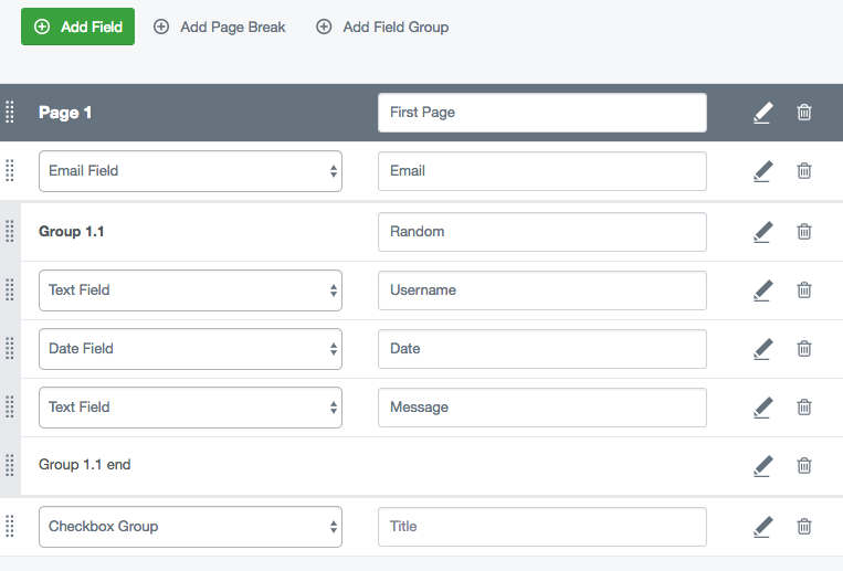
How about we re-use the field group solution we built for userforms.

https://github.com/silverstripe/silverstripe-userforms/blob/5/docs/en/userguide/creating-and-editing-forms.md

It's implemented as yet another linear list item, but can be used to logically nest components.

pitchandtone commented 4 years ago

Hi all,

I've just been building a site in Squarespace and as of 7.1 it separates "sections" from blocks. Sections control width, padding, background colour and include things like background images. Blocks then fit into a grid structure.

All of the actual work is then done by a GUI, not a gridfield.

All of the work is closely coupled to their theming idea, but I think it's worth following their lead on stuff like this. So I'd be pro option 2, even if we can't get the GUI right now.

On Mon, 3 Feb 2020 at 16:14, Damian Mooyman notifications@github.com wrote:

How about we re-use the field group solution we built for userforms.

https://github.com/silverstripe/silverstripe-userforms/blob/5/docs/en/userguide/creating-and-editing-forms.md

It's implemented as yet another linear list item, but can be used to logically nest components.

— You are receiving this because you were mentioned. Reply to this email directly, view it on GitHub https://github.com/dnadesign/silverstripe-elemental/issues/159?email_source=notifications&email_token=AAIBSUYRDV53LVV6MJM27ZDRA6DX3A5CNFSM4EGG6HL2YY3PNVWWK3TUL52HS4DFVREXG43VMVBW63LNMVXHJKTDN5WW2ZLOORPWSZGOEKSLHJQ#issuecomment-581219238, or unsubscribe https://github.com/notifications/unsubscribe-auth/AAIBSUYAQ5Q62MVRHSXLIFTRA6DX3ANCNFSM4EGG6HLQ .