 dburka
commented
6 years ago
dburka
commented
6 years ago To get the ball rolling here are a few logos that I was riffing on for the app.
Download the Sketch file here on Dropbox
(My contributions are Copyright: CC0)

Closed dburka closed 6 years ago
dburka
commented
6 years ago To get the ball rolling here are a few logos that I was riffing on for the app.
Download the Sketch file here on Dropbox
(My contributions are Copyright: CC0)
 infernocloud
commented
6 years ago
infernocloud
commented
6 years ago Is the app / brand intended to be localized for other languages, or will it always be the English word "Simple"?
If translation of the brand name is intended, we may want to stay away from "S" shapes.
dburka
commented
6 years ago Excellent question @infernocloud. The app will be localized into many languages and ideally we would translate the name itself. You are correct that it would be better to avoid "S" shapes. Thank you.
dburka
commented
6 years ago @dannnn submitted an idea that I'm reposting here.
What if the Simple.org mark was like the blood pressure readings 120/80 type thing?

Here's the .ai file -- if interesting, help make it better https://www.dropbox.com/s/jh3ido36ly3oqyx/simple.ai?dl=0
Copyright: CC0
 menachemkrinsky
commented
6 years ago
menachemkrinsky
commented
6 years ago "Simple" heart icons that double as an arm in the middle of a blood pressure.

Copyright: CC0
 kellyjepsen
commented
6 years ago
kellyjepsen
commented
6 years ago Darn, just read the localization comments above (and avoiding the 'S' shape) but thought I would share my ideation anyways! ✌️
Logotype:

Logomark:

App icon:

Sketch file: https://drive.google.com/file/d/13krlCq9akGA8BcEqPH9Vh0O8TmFGl7r3/view?usp=sharing
Copyright: CC0
dburka
commented
6 years ago Thanks for your idea @kellyjepsen! I love that you can drop the "i" and keep the heart in the app icon — I never would have thought of that. Really clever work. Interesting that you're using a serif too... it adds a bit of gravitas that could be good for the brand overall. Thanks again for putting your idea in the mix. 🙌
 tdrach
commented
6 years ago
tdrach
commented
6 years ago Thanks for putting this together @dburka this is fun! I spent some time this weekend playing around, like @kellyjepsen above, I may have gone to far with the "S" shape in the color version, but there might still be something to the b/w version.
Sketch file in Dropbox Copyright: CC0


I tried a bit to combine two hearts, and have a lil nod to the "S" as well. I also saw you "gradient" comment and thought maybe the digital version could have a bit of gradient? While the mark still worked in solid form.
Excited to hear everyone's feedback 🎉
 webalys
commented
6 years ago
webalys
commented
6 years ago Just playing a bit :-)

Copyright: CC0
webalys
commented
6 years ago A try with a friendly logo :-)
webalys
commented
6 years ago 
kellyjepsen
commented
6 years ago There are so many differently awesome approaches in here, I love it! 😍Really love that final shape created by the two hearts, @tdrach. Also plays into the #/# blood pressure format nicely. Also really like the totally different approach you have at the end there, @webalys, with the "friendly" heart. 👍
Question for @dburka: Are you and the team looking to embrace the "heart" or shy away from it? Does the heart translate well across languages? (I'm hesitantly thinking maybe it does, and that maybe it's a good symbol to explore?)
 designernaut
commented
6 years ago
designernaut
commented
6 years ago I riffed off the ideas of @menachemkrinsky and @tdrach. Using the heart shape and shaping it slightly to make the shape of a cuffed arm.
Sketch file available on dropbox
Copyright: CC0


dburka
commented
6 years ago Some comments on the ideas above:
@menachemkrinsky Whoa. I love how simple these are. The top left and bottom left both have a great paper-like quality that could translate well across the whole app. I think the paper concept is one worth pursuing by a bunch of us — in many places this software is replace largely paper-based systems. I'm less sure if the dual-color thing will be too jarring... I often gravitate towards brands that own one color hard (e.g. Ally bank = eggplant) but obviously it could work.
@tdrach Ooooo, I like these! I never would have found the "S" in the middle of two interconnected hearts. I'm always so impressed when designers find these hidden connections. I find the second, angled version a little more obviously "hearts"... especially in the monotone version the vertical stack takes a second to register as "hearts". The second lockup also would more easily translate into places like a website or app icon. This is super clever work. As @infernocloud pointed out above, we may want to avoid "S" for internationalization reasons, but your concept leans more heavily on the hearts than on the "S". Great contribution.
@webalys I love that you're throwing ideas in here. The dotted-heart one is clever. I'd also played with some graphs. It's kind of interesting: we want to show control rates going up, but blood pressure going down, which makes graphs a little funky. That first concept with the + is hot. So... simple. I think there's somethere there worth exploring for sure. I wonder if we could adapt it for languages other than English and use the + as an accompanying icon. It's also interesting to see you using lowercase "s" in the wordmark. We're balancing 'security' and 'friendliness'... I wonder if the lowercase "s" is nice and friendly or a bit juvenile for this context? Love your concepts.
dburka
commented
6 years ago @designernaut Oooo. It's so hard to do an asymmetrically-shaped heart that I hadn't even really tried it. You nailed it. I love how we've seen thousands of hearts and yet this is still iconic with the oblong shape. It's also really helpful to see the logo in a context in an app icon. This has heaps of potential. PS: I love that you're riffing on the word of @menachemkrinsky and @tdrach.
dburka
commented
6 years ago @kellyjepsen To be honest, I'm not sure how well the "heart" translates across cultures. Would love if someone (you?) did some research on it and reported back here. I personally think it could be great for this app, though there are challenges with being iconic with such a common symbol. I would love to see people explore other symbols too.
 sgarrity
commented
6 years ago
sgarrity
commented
6 years ago I wonder if a biologically accurate heart shape might be more culturally agnostic. Much harder to convey in a visually simple way than the symbolic heart, of course.
 mheesakkers
commented
6 years ago
mheesakkers
commented
6 years ago I went for a simple ;) approach. Using the heart symbol combined with blood pressure colors. Could also be used in grayscale. Combined with a nice simple sans-serif. Happy to contribute!

Copyright: CC0
 ToferFlowers
commented
6 years ago
ToferFlowers
commented
6 years ago Hey all, based on the comments above I am not sure if the heart idea or the S will work, however, idea 1 uses two hearts to create an S in the negative space. Also for both concepts, I have used 2 hearts one on top and bottom as a reference to the blood pressure over/under measurement.


Copyright: CC0
 mikeindustries
commented
6 years ago
mikeindustries
commented
6 years ago Wow, am I an idiot or are there no threaded comments on GitHub? I really like some of the approaches here! Love what @webalys did to combine the heart with a nice little smile. Those symbols should translate well internationally. It's a very disarming mark. Also like how @designernaut riffed off @menachemkrinsky's idea of a heart doubling as an arm. Of those treatments, I like the type outside the mark better. The serif face works well here, and I definitely feel like this brand lends itself to lowercase lettering, but would like to see what that mark looks like with some softer, friendlier type options.
 Uppalled
commented
6 years ago
Uppalled
commented
6 years ago Loved the friendly logo concept by @webalys, added features of a blood pressure cuff kit to the heart

mikeindustries
commented
6 years ago On the issue of the heart translating across cultures, we did a bit of work on that when we changed the Star to the Heart on Twitter and ran into no problems. In fact, it was a better understood symbol than the star. That's not to say this context is exactly the same, but just directionally, it's a pretty widely understood symbol.
Uppalled
commented
6 years ago @mikeindustries for the typeface, bariol has a nice soft touch to it http://atipofoundry.com/fonts/bariol
webalys
commented
6 years ago @mikeindustries Check also the Bryant typeface: https://processtypefoundry.com/fonts/bryant-2/
 HarlowRaven
commented
6 years ago
HarlowRaven
commented
6 years ago Thought about trying one with negative space. I think some of the others are my favorites over this concept, but thought it might inspire some ideas!

Here's my super rough ai file if anyone is interested: Simple.ai.zip
Copyright: CC0
 bryansellersdesign
commented
6 years ago
bryansellersdesign
commented
6 years ago A drop of blood and wave form. Also an alternate red version as well as black & white.

dburka
commented
6 years ago @ToferFlowers Oh, wow! That's super cool. I love that you're building on some of the other ideas and it works really well. Those cutouts in the hearts are really unique on their own and the negative space "S" only adds to it. I really appreciate that it reads well even if the audience doesn't recognize the "S" or if the name was written in another language. The second concept is clever as well — I'm not sure if it's a fully-formed cohesive idea, but it's the beginning of one. I wonder if the top-and-bottom hearts would be iconic enough when inevitably displayed on their own.
@Uppalled Really nice to see you building on the previous concept. And, a sphygmomanometer (the fancy word for a blood pressure cuff) is a good idea. I think the current rendering has too much going on... but I wonder if a simplified concept from this is possible? Great work.
@HarlowRaven Oooo, that's lovely and simple. I especially like the single color version. How would you imagine that idea working as an app icon (where it's not surrounded by tons of whitespace) or together with the name "Simple" for a situation like a website? I'm sure it's possible, but it would be nice to see it mocked up in context. I really appreciate how little you're using here to create something unique — that's likely our best path forward... a simple logo for a Simple brand.
@bryansellersdesign There's a lot to love here. It's iconic, it's simple, it ties so nicely between the dot on the "i" in the wordmark and drop of blood. Do you think we'd have to go "red" to differentiate between water and blood or am I being too literal? Also, it's super easy to imagine a heck of a 3D trophy (one of the likely applications) made out of the drop shape. Hot. Nice work!
dburka
commented
6 years ago @mheesakkers That's iconic and simple. I love the retro look... combined with the meanings for low/normal/high/extreme blood pressures. Smart. Also, the similarity to the old school Apple rainbow logo is pretty rad. The more I look at this striped heart, the more I like it. Do you think it needs to be a slightly less generic heart shape or am I overthinking it? I'm going to keep chewing on this.
 juhi42
commented
6 years ago
juhi42
commented
6 years ago So many great ideas here already! @webalys, your smiling heart really jumps out to me as less “tech” and more friendly. I like that the symbol also feels very ”healthcare”. Specially since the name “Simple” itself has no association with health. For this reason, I am also looking forward to seeing some riffs on the shields in @dburka's original ideas.
I love the flexed-arm ideas too. Though I wonder if the arm and sleeve can somehow be made more obvious. In both @designernaut and @menachemkrinsky's versions, I had to look for several seconds to find the arm.
Love that negative S in @ToferFlowers's two hearts!
@bryansellersdesign I love your clean aesthetic! Though my first guess upon seeing an app-icon with a drop of blood would have been a period-tracking app.
About the typography, I feel sans-serifs look more “simple” than serifs. They also convey security and reliability better than serifs. Bolder type like in @ToferFlowers's first image is bringing out the safety aspects. While the thin, spaced-out sans-serif in @webalys's very first blue-and-green logo is really bringing out the simplicity aspect. (Nested comments would have really helped here!)
About the heart symbol's understandability across cultures, I have done zero research on this but at least in India it's one of the most well-understood symbols.
bryansellersdesign
commented
6 years ago @dburka I agree the blue reads as water. I think for this mark the red works better. What are the reasons behind the blue/green color palette? Thanks for the opportunity.
Uppalled
commented
6 years ago I got to researching the significance of 120/80, and how its considered benchmark/textbook blood pressure, combined with numbers being the universal language

dburka
commented
6 years ago @Uppalled Interesting concept, thanks for contributing. I like the typeface that you've chosen and the arrangement is really unique. There are a couple of challenges. One is that the word "Simple" is pretty small even at this large size... in an app icon it's going to be almost unreadable, especially for people who don't have perfect vision. And secondly... blood pressure readings are surprisingly divisive — some places use 120/80 as 'normal' and some places go by anything under 140/90. Even the USA only recently revised their benchmarks. So, it can be a bit problematic using specific numbers. PS: I love that you're thinking out of the box here.
 ashimagarwal
commented
6 years ago
ashimagarwal
commented
6 years ago An addition to the discussions above -
The heart symbol represents love across cultures and religions. So, just using a heart symbol without any reference to blood pressure or hypertension might convey a different meaning or require further explanation.
 rmalpass
commented
6 years ago
rmalpass
commented
6 years ago Hello! What a fantastic project with some amazing work being produced. Here is my initial contribution trying to take things in a slightly different direction. Along with a little explanation behind the design decisions I've made.
I wanted a wordmark that would not take up too much space within an app but still stand out and be used in isolation from the logo; Uses an open source font so that localization is easy to implement; and is smart and insightful, but with a little bit of sass. I landed on Abril Fatface. It's a nice contrast to the sans-serif fonts used throughout the App screenshots and stands out without needing to shout.
To pair with the wordmark I experimented with some simple shapes to symbolise high and low pressure. Then explored some ways to lay them out along with how they could be applied to an App Icon.
Overall I wanted to create something that feels like it belongs with the existing design direction of the app and website.
The Sketch file is on dropbox https://www.dropbox.com/s/tqafr521alqec0m/Simple.sketch?dl=0 (including a page of nasty quick explorations of some other directions).
Copyright: CC0


And just to explore a Sans Serif option after reading @juhi42 's comments;

 philhammel
commented
6 years ago
philhammel
commented
6 years ago Really nice ideas and feedback so far folks. This is still a little rough but playing around with building off a couple of other concepts to create a 'blood drop S'.
I know localisation was mentioned but thought if a mark was symbolic enough, it could avoid the potential issues?

Copyright: CC0
 kylejohnston
commented
6 years ago
kylejohnston
commented
6 years ago This design plays off the face of a blood pressure gauge, using the need to form part of the 'S'.
In this case, I like the look of an all lowercase 'simple'. The typeface, Bryant, is a rounded sans serif from Process Type Foundry. It was inspired by mechanical lettering, which you might find on old medical and industrial equipment.

kylejohnston
commented
6 years ago This design uses a droplet to form part of the 'S', which allows for a strong connection between the logotype and the app icon.

menachemkrinsky
commented
6 years ago Love seeing these. Here's another clean concept that came to mind that combines a universal heart and blood droplet. It was intentionally created so the main type can work along side it no matter what language its spelled in.


Copyright: CC0
dburka
commented
6 years ago @philhammel I LOVE your design concept here. I know you're going for an "S" but I read it also as an infinity symbol. One of the core aspects of the app is that it will keep a longitudinal record of a patient's blood pressure... track them for a long time no matter where they receive treatment. I had personally tried some infinity ideas early on and didn't come up with anything I liked. But THIS. This is cool. Infinity + Blood Drop + "S"... there's a lot to like here. Thank you. PS: It reminds me a bit of the Maori jewelry design Pikorua!
@friendlyduck Nice! I love all of the contextual examples with your concept. And, the idea of shapes as basic building blocks is a good one. I could imagine using these basic building blocks to create separate but related brands if/when we have a small suite of products for different audience (e.g. Simple for Clinicians, Simple Reports, Simple for Patients). I love where you're going here. And the font experiments are really helpful too. I'm thinking more and more that both serif or sans-serif could be appropriate here.
@kylejohnston Really clever work using the serif for the blood drop. That's a classy option. It's nice to be able to avoid the ICON + WORDMARK option and just have an integrated symbol into the wordmark itself. I'm going to think about this one a bit... it's a really strong start to a good idea. Love it.
@menachemkrinsky Daaaaang! That's really interesting. A heart... and a blood droplet... in one elegant shape. There is a LOT to like about this. The only negative I can think of... it looks a bit like the Airbnb logo upside down. Not enough to be copying. And, our key audiences in India/China/Ethiopia/etc aren't already super familiar with the Airbnb brand. Does anyone think this is an issue of concern? No big deal?
mikeindustries
commented
6 years ago Interesting. When I first saw @philhammel's mark, it reminded me of the Rod of Asclepius (the symbol for medicine) because of its serpent-like qualities. I also see a stethoscope in there. Either way, I like it!
I also like @menachemkrinsky's heart mark. Clever way to use a blood droplet without it looking scary.
 csosebee
commented
6 years ago
csosebee
commented
6 years ago Here's a concept that incorporates quite a few previous versions above. It has elements of a heart, cuff, and hints at a check mark shape. Copyright: CC0 | Source files

philhammel
commented
6 years ago @dburka I did see an infinity symbol when making it but struggled to make a connection but it's cool to see that it actually has some accidental relevance. @mikeindustries Rod of Asclepius, Stethoscope I accidentally on purpose meant it to be all these things too. Thanks for the feedback. Also, if anyone has ideas on how to take it further, go crazy :)
I really like the simplicity of the blood drop heart by @menachemkrinsky too. I didn't see it at first but since the airbnb logo was mentioned, I can't unsee it. If you haven't already, I wonder if exploring some different line weights of the mark could help alleviate the potential connection?
I'm also a fan of the asymmetric heart but agree with @mikeindustries and would love to see some softer, friendlier type options. Some great work so far!
rmalpass
commented
6 years ago Found myself doodling in a meeting. Just dropping a friendly droplet shape here in case it inspires anything. Can be found in the Dropbox file.

(this is not supposed to be a logo, just ideas for separate themes. I added the "SIMPLE" wordmark set in Futura underneath just because)
 jamtrash
commented
6 years ago
jamtrash
commented
6 years ago Here's my idea. Copyright: CC0 I have taken the UX approach to the design and chose to focus on the following:
So I have chosen a 2D representation of an object that is originally 3D and associated with pressure. The chosen colour that exceeds WCAG AAA contrast guidelines (9.37:1 against white) and maintains the connection with blood. It is deliberately simple to be easily scalable, won't lose detail in cheap prints and is quick to scan by the users. The simplicity and strong contrast means that it will be easily readable on a mobile phone in bright light. The font used is from Google fonts, so is free.
All source files are in https://github.com/jamtrash/simple.git


designernaut
commented
6 years ago @dburka @mikeindustries I made an attempt at softening up my logo but switching to a sans serif font (Quicksand on Google Fonts) and rounding the logomark slightly.
I also created an inverse version of the logomark just to get a different feel for it. I don't think I did anything to strengthen the imagery of an arm, but I'm not sure how obvious that needs to be, really.
Copyright: CC0


 patrickhill
commented
6 years ago
patrickhill
commented
6 years ago 
Copyright: CC0
patrickhill
commented
6 years ago  patrickhill
commented
6 years ago
patrickhill
commented
6 years ago  dburka
commented
6 years ago
dburka
commented
6 years ago @csosebee Nice! I love how simple that is. Too basic shapes creating dual meaning. I read the checkmark really easily... and the heart after just a second. It's so easy to imagine animating those two shapes together too. Thanks so much!
@friendlyduck Thanks for tossing those ideas in here. It's a neat idea to overlay the drop shapes like that. Might be something in there for sure.
@jamtrash Nice! I really appreciate you adding your reasoning to your post. I could easily imagine this being rendered in 3D and as you show, the bulb could be animated so easily. There's a lot to like here. A lot of nurses will be familiar with that shape for taking patients' temperatures... do you think there's a way to differentiate this for BP as opposed to patient vitals generally?
@designernaut I like the revisions to the heart. The softening works really well. I still love how unique that heart is. Nice refinements!
@patrickhill DANG! Both of these simple concepts (heart+drop and drop/smile) are super strong. Oooooooo. The first one is super clever. A lot like @menachemkrinsky's earlier concept but clearly differentiated. I love to see how these ideas are building up. I'm not sure what to even add to this comment — the ideas are both super strong.
infernocloud
commented
6 years ago @patrickhill replying to your idea here https://github.com/simpledotorg/simple.org/issues/1#issuecomment-401090069
There is another brand named "Simple" - the banking app Simple.com. I'm sure we'll want to stay away from designs that resemble its logo entirely just to avoid copyright issues and confusion. I think this design resembles Simple.com's mark too much.
NOTE: See Step 2 of the brand project here.
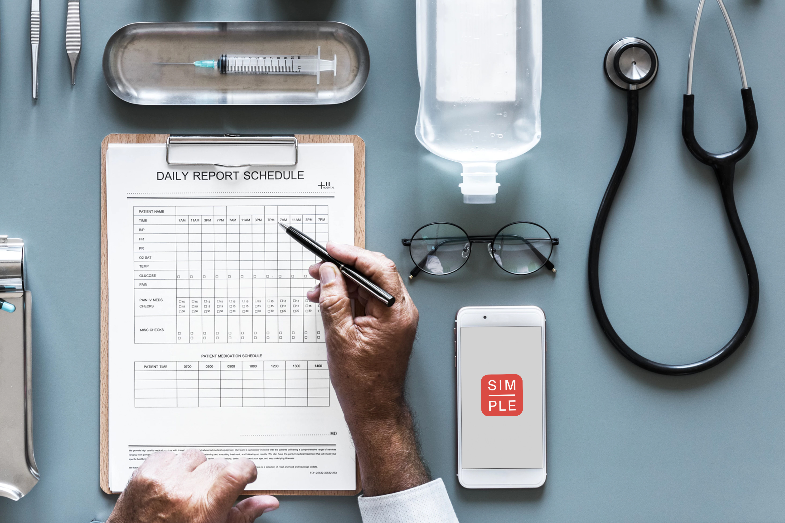
We are asking designers to consider participating in an open-source effort to create a brand for Simple. Please see this post on Medium for the background of this not-for-profit project. Thank you so much to everyone who participates.
The creative brief for Simple
Great brands often begin with one clearly articulated statement. What makes the "Simple" project different from any other project like it? For us, this all starts with the idea of radical simplicity:
Most other software that healthcare workers use is complicated and hard to learn. Our aim is to be a breath of fresh air — an app that's simple, which nurses and doctors actually like to use.
Brand personality
Think of the brand like your favorite nurse: smart, insightful, careful with your privacy, and treats you as a human being. The brand isn't goofy, corporate, aloof, or complicated.
The audience for the brand
This software will be deployed all over the world, starting in India, so take cultural considerations into account.
Common touch points
The brand will sometimes be used in low quality one-color physical prints (e.g. a training manual), so keep your design simple and unfussy. Really thin lines or gradients might be hard to reproduce.
Foundations of community
We wrote these foundational statements based on discussions with designers who work in open-source. Don't agree with the statements? Think something is missing? Let's discuss in the comments on Medium!
How to participate
We asked several designers to take the lead on critique. When you submit your ideas, you will likely receive feedback from:
Keep in mind, this is a collaboration not a contest. The only prize is that in a few years, together we will have improved the cardiovascular health of millions of people.
The world is improved by the combined efforts of many people in big and small ways. We are excited to see what we can create together.
Thank you.
Thoughts on open-source design
This open-source branding project is a bit of an experiment. There are a few concerns that I would like to address:
Doesn't good design cost money?
Asking people to do work for free makes me nervous. Although we are a well-funded not-for-profit and could hire a design agency to create this brand, we are taking a collaborative open-source approach to involve a broad community from all over the world.
Isn't this spec work?
I'm sensitive to designers' concerns about spec work and I'm genuinely concerned that I'm asking designers to volunteer their professional skills. Spec work usually promises something down the road if you do unpaid work now. This is not spec work - it's volunteer work with no promise of exposure or compensation down the road.
In addition to contributing in a small way to a project that will save lives around the globe, I hope that our critique group will benefit designers who contribute their ideas.
Design by committee results in mediocre design, right?
Design can easily be watered down by making decisions as a group. But, design also benefits from a diversity of ideas. The diamond shaped design process has a lot of value - generate lots and lots of ideas and then narrow in on the best ones.
At the beginning, the brief needs a strong viewpoint. At the end, the decision-making process needs a strong viewpoint. Those parts should not be done by committee. Our team wrote the brief with input from friends. And at the end, I will art direct with input from the community as well as from the designers who I have asked to help moderate the critique.
I'm mostly hopeful that this process will generate many great ideas and fruitful discussions about which ideas best serve the brief.
This isn't a new idea.
Correct. Many designers have done open-source work. Projects have done open-source brand solicitations previously - check out the relatively recent projects by WebAassembly and NodeJS. I am not the most knowledgeable person in the world about open-source and design, but I did speak to some of the experts. I hope we can adjust, learn, and try to create a great process for projects like this.
About Resolve to Save Lives
Resolve to Save Lives is a five-year, $225 million initiative funded by Bloomberg Philanthropies, the Chan Zuckerberg Initiative, and the Bill & Melinda Gates Foundation. It is led by Dr. Tom Frieden, former director of the US Centers for Disease Control and Prevention, and housed at Vital Strategies, which works in 60 countries with the vision of a world in which every person is protected by a strong public health system. To find out more visit: https://www.resolvetosavelives.org
About Vital Strategies
Vital Strategies is a global health organization that seeks to accelerate progress on the world's most pressing health problems. The Vital Strategies team combines evidence-based strategies with innovation to help develop and implement sound public health policies, manage programs efficiently, strengthen data systems, conduct research, and design strategic communication campaigns for policy and behavior change. To find out more, visit www.vitalstrategies.org