 simsulla
commented
7 years ago
simsulla
commented
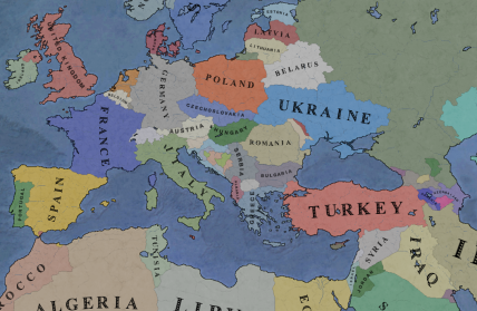
7 years ago - I am open to changing the projection. As long as it is a real world projection. Currently we use EPSG:4326. Suggest another and I'll look into it. The vanilla Vic2 is a fantasy projection. There are issues with the map (canal endings, black lakes), I will look into correcting those.
- Some work will be done on the graphics. Adding this issue to milestone 2.00. But not a reversal to vanilla Vic2. It is a modern time mod, and the graphics should have an aura of that - currently i am thinking clean bootstrap:ish.
 opportus
 samwoodzadrot
 James9883
Hello @simsulla, a hat tip for your work and contributor's, I really enjoy this mod.
Though, I just can't deal with this new graphical map... I've seen you mention on another issue something like that Europe is not at the correct size on the original Victoria 2 map style. But the new map style you're using is of special kind, I mean that it makes you look at the world like through a "fish eye" lens. It's all the correct size on the equator longitude, but it flattens the world more and more as you go at top or at bottom of the map... So basically, nothing has the correct size also.
Furthermore, I'm not modder at all but I guess that the issue with the 3 canals + the ressources that are off-center of the provinces (displaying on the limit of other provinces) + naval units sometime displaying on land are all related to this new map?
Your mod is great but imo it should have stayed graphically more lean. It's maybe too ambitious to retouch this way so deeply the original graphical elements.
Just my 2 cents!