 sisterAn
commented
4 years ago
sisterAn
commented
4 years ago 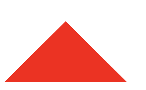 前端小技巧:边框写三角形
Open sisterAn opened 4 years ago
sisterAn
commented
4 years ago
前端小技巧:边框写三角形
 latte03
commented
4 years ago
latte03
commented
4 years ago 当div 的宽高为0,存在边框的时候,四条边框的中心将会是一个点,通过设置其他三条边框的透明度,实现三角形。
div{
  width:0;
  height:0;
  border-width:8px;
  border-style:solid;
  border-top-color: transparent;
  border-right-color: transparent;
  border-bottom-color: transparent;
  border-left-color: red;
}
 U-LAN
commented
4 years ago
U-LAN
commented
4 years ago 通过border模拟实现
当div 的宽高为0,存在边框的时候,四条边框的中心将会是一个点,通过设置其他三条边框的透明度,实现三角形。
div{
  width:0;
  height:0;
  border-width:8px;
  border-top-color: transparent;
  border-right-color: transparent;
  border-bottom-color: transparent;
  border-left-color: red;
}
显示不出来需要再加一个属性: border-style:solid;
latte03
commented
4 years ago 通过border模拟实现
当div 的宽高为0,存在边框的时候,四条边框的中心将会是一个点,通过设置其他三条边框的透明度,实现三角形。
div{

  width:0;

  height:0;

  border-width:8px;

  border-top-color: transparent;

  border-right-color: transparent;

  border-bottom-color: transparent;

  border-left-color: red;

}
显示不出来需要再加一个属性: border-style:solid;
啊 漏了..补上
 ryadav96
commented
3 years ago
ryadav96
commented
3 years ago Using clip-path property
.triangle { width:200px; height: 200px; background-color: #119933; clip-path: polygon(50% 0, 50% 0, 100% 100%, 0 100%); }