snowie2000 / mactype

Better font rendering for Windows.
https://mactype.net
GNU General Public License v3.0
9.64k stars 435 forks source link

MacType INI Development #651

Open sammilucia opened 4 years ago

sammilucia commented 4 years ago

Hi everybody! I hope everyone is staying safe and staying well during the age of COVID−19 that we're all in. With all of us having more time on our hands, I thought I'd post my latest .ini file settings, my customized "Microsoft Sans Serif" font which I've used to replace both Tahoma & micross (Microsoft Sans Serif). My customized font is a duplicate of my glyph-customized SegoeUI font with widths and heights of U&lc being tweaked to provide a more eye-pleasing display on surfaces in the UI that default to Tahoma or micross. The result is a more unified experience across the UI.

My latest tweaks to the .ini file have proven so pleasing across so many different parts of the UI, that I haven't made any changes to it since February 21, 2020 (which is a long time relative to prior attempts). I have a series of steps I go through after each install of the Windows Insiders Fast Ring updates, and so far MacType continues to provide fantastic results (current Windows Insider Build is 19603.1000 released 2020.04.08). These steps are:

(1) Install my customized fonts for SegoeUI and Microsoft Sans Serif in particular.

Thorn Custom Fonts.zip

(2) Run MacWiz to reset the Mode used to "Registry" (I still find this mode to be the best overall way to load and use MacType in my experience, and since it continues to work, I will continue to use it). I also reload/reselect my desired .ini profile (although this appears to be unnecessary since it seems to persist build to build).

ChicoThorn-v1.5.1.0.8.zip

(3) Load my customized font substitutions into the Registry at:

HKEY_LOCAL_MACHINE\SOFTWARE\Microsoft\Windows NT\CurrentVersion\FontSubstitutes

I exported a registry file with my custom settings a while back, so now after each build I just run that registry file to update Font Substituions more quickly.

Thorn Custom Registry Font Subs.zip

(4) I double-check my scaling options in Windows Settings — Settings > Display > Scaling and layout = 100% (this setting persists build to build) Settings > Ease of Access > Make text bigger = 113% (this setting also persists build to build). I've found that these scaling settings work really well for a number of reasons. First off the 100% scaling makes older .exe apps continue to function properly (case in point is Microsoft Keyboard Layout Creator, which I use to change my keyboard layout to accomodate my customized glyphs. If the scaling is set to anything other than 100% this app no longer displays properly and becomes unusable). The 113% "Make text bigger" setting enlarge most of the Directwrite renderings in the UI (at least I think it's Directwrite, that all gets so confusing to me), including the Taskbar Jumplists, Action Center flyout, the Start Menu, UWP apps, Chromium Edge Canary and others).

(5) I use WinAero Tweaker to change the default font size of Icons from 9pt to 10pt (which also changes the sizes of all filename text displays in File Explorer). 10pt scaling of the Icons and filenames nearly matches perfectly the 113% scaling produced by the Ease of Access setting, thus providing a very uniform overall look and feel within the UI. Here's a link to WinAero for the download (scroll down past the adds for the download link) — Note: When you install WinAero Tweaker Windows will pop up a security warning that it's 'dangerous.' It is not. I have been using Tweaker for over five years with no problems. Sergey Tkachenko is the sole programmer with a small operation. The software is safe and reliable. https://winaero.com/download.php?view.1796 Here is the install files for WinAero Tweaker:

winaerotweaker.zip

(6) I make sure my monitor is adjusted and calibrated properly. — This one is important. It makes a HUGE difference in overall font display quality if monitor gamma, brightness, and contrast are improperly set. This took a little trial and error; but using calibration software (and my own eye) to adjust the overall look I was able to come up with very pleasing results. I imagine these settings would differ from monitor to monitor and brand to brand. For me these monitor settings are (input through the onboard settings of the monitor itself): Brightness=85; Contrast=75; Gamma=Medium. I also adjust the Nvidia Control Panel settings to a vibrancy level of 60%. All of these display/monitor settings have a big impact on display ultimately.

Finally, here are a few screenshots of my current setup at this time:

Screenshot Samples.zip

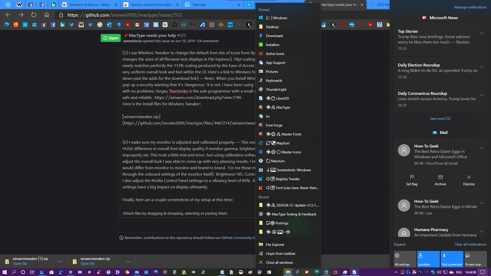
Edge Canary, Taskbar Jumplist, Action Center sample: Canary Jumplist ActionCenter

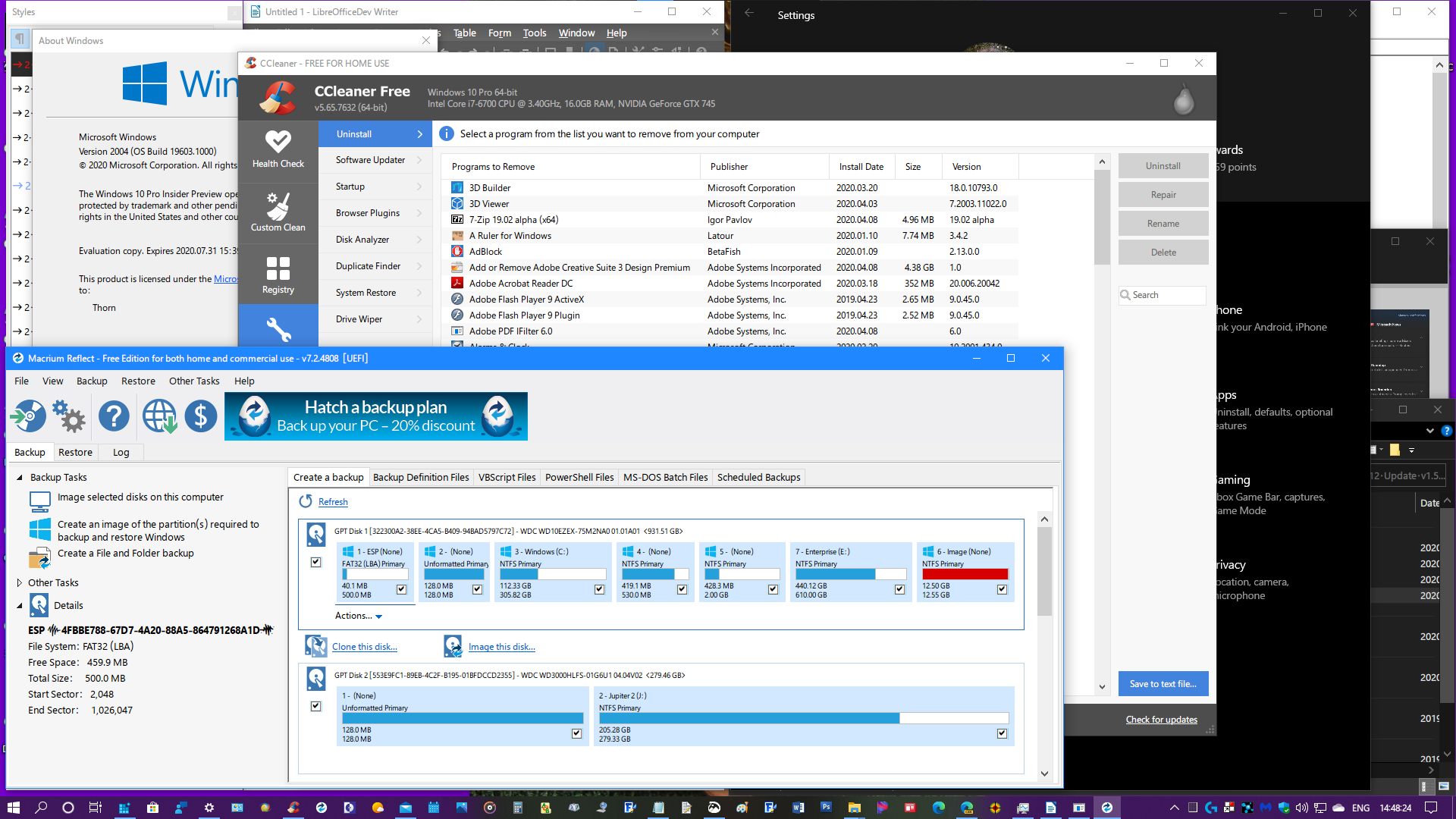
Custom MS Sans Serif Font UI samples: Custom MS Sans Serif Font Examples

Custom MS Sans Serif Font Examples-2

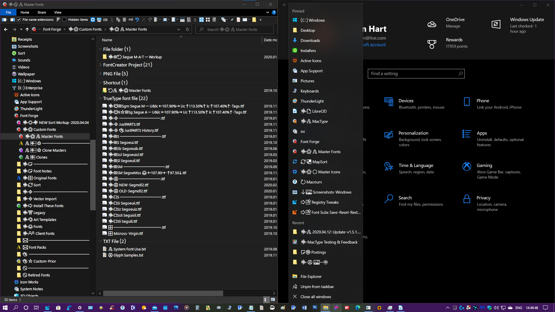
File Explorer, Taskbar Jumplist, Settings samples: File Explorer Settings

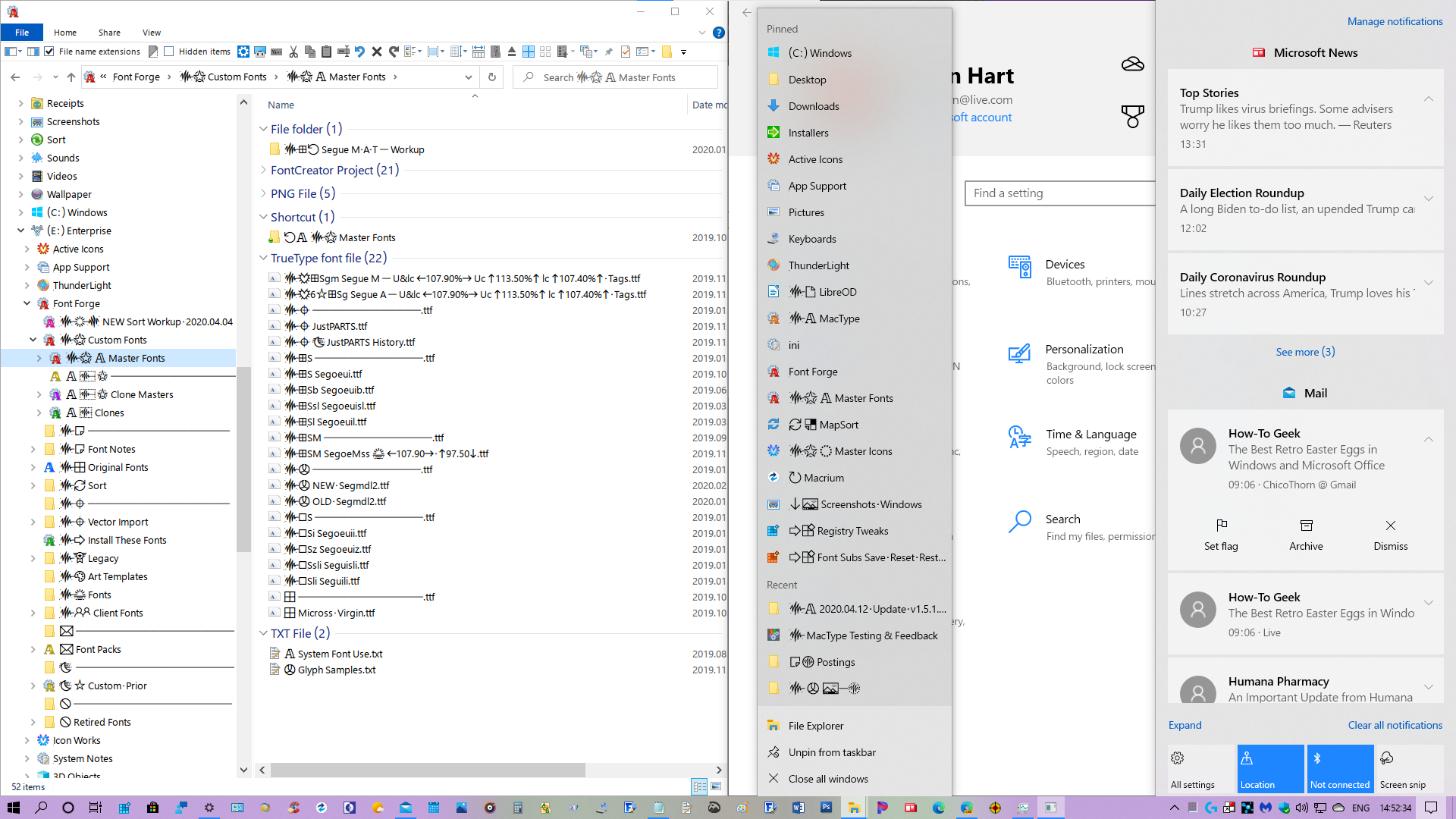
Light Mode samples: Light File Explorer Jumplist ActionCenter

Light File Explorer Settings


Thanks for all your hard work on MacType @snowie2000 and @sammilucia ! MacType continues to be the most important add-on to my PC and makes my everyday work so much more pleasurable and tolerable. I'm looking forward to helping out in the future as you develop new versions! Stay well everyone! 😊

Originally posted by @ChicoThorn in https://github.com/snowie2000/mactype/issues/553#issuecomment-612683662

sammilucia commented 4 years ago

@ChicoThorn I've moved this into a new thread because I think it's going to be better for both the dev AND ini discussions, being both fairly active.

I think ChicoThorn's ini seems to be the most tuned and balanced to my eyes and is probably the best introduction to MacType for new users for the roman fonts. And probably also a good starting point for new users to tune to their own preferences.

However, there are so many MacType users using Japanese/Chinese/Korean/etc ... how does it perform for those. Can anyone comment?

wmjordan commented 4 years ago

However, there are so many MacType users using Japanese/Chinese/Korean/etc ... how does it perform for those. Can anyone comment?

The config did not display very well on my system. Microsoft Yahei, the default system font on Chinese system, has terrible hintings. With that turned on, some characters will appear taller than others. I prefer using No Hinting (HintingMode=1).

And sub-pixel rendering will cause my eyes. I have to turn it off. (AntiAliasMode=1)

Having changed that, the config appeared better. I am comparing it with my own, which had been used for about years.

sammilucia commented 4 years ago

@wmjordan thanks! how does it look with those changes? (and the rest of @ChicoThorn's recommendations?)

wmjordan commented 4 years ago

@sammilucia After some more minutes' experience with @ChicoThorn's configuration, I found that the font SimSun (a font used to be the default font in Chinese version of Windows) was rendered too thin, so were some fonts named MingLiU (default font used in Hong Kong). I also copied the [Individual] settings from the default.ini to his config.

I had not yet rebooted my computer to apply the 113% settings. I will post some screenshots after doing so.

ChicoThorn commented 4 years ago

I use LibreOfficeDev and discovered something interesting so I thought I'd share it. I don't know exactly how OpenGL works nor Skia — but these settings in LibreOfficeDev really have a huge effect on how text is rendered. Interestingly, it affects all the dialog boxes as well, which is why I used the setting dialog for the comparison screenshots:

With both OpenGL and Skia turned OFF

LibreOfficeWriter - All Rendering OFF

With Only OpenGL turned ON LibreOfficeWriter - OpenGL ON

With Only Skia turned ON LibreOfficeWriter - Skia ON

With Both OpenGL and Skia turned ON LibreOfficeWriter - OpenGL   Skia ON

OpenGL when on, produces light and sketchy text rendering. Skia when on (either alone or combined with OpenGL), produces excessively heavy and dark rendering. It's pretty obvious that OpenGL and Skia must be turned off in order to produce the best text rendering with MacType. Is this something unique to LibreOffice? Or does OpenGL and Skia cause text rendering to behave this way when and wherever it's used? — Thorn

LibreOfficeWriter - OpenGL & Skia.zip

wmjordan commented 4 years ago

After rebooting with the 100% scaling & 113% Make text bigger setting, I found that most text on my laptop with a 14-inch monitor 1920*1080 resolution was too small (icons were so small in many application windows). Therefore, I reverted to use a tool which had been there for years to adjust the entire system resolution to 113% and tried to see whether it was good or OK--previously I was using 125% scaling.

Here is how it looks on my computer now. sample

Document font: SimSun Menu bar: Microsoft Yahei + Segeo UI - the official one Tab bar: Times New Roman Folder and File list: FZKai (it looked a little blur and pale)

explorer

System font: Microsoft Yahei + Segeo UI

cmd

The dot on the "i" looked quite weird in the command console. The "i" was displayed correctly with the same font in other applications.

Modified settings were listed below:

HintingMode=1
AntiAliasMode=1

[Individual]
宋体=,,30,,,
新宋体=,,30,,,
Batang=,,30,,,
MingLiU=,,30,,,
PMingLiU=,,30,,,
PMingLiU_HKSCS=,,30,,,
MingLiU_ExtB=,,30,,,
PMingLiU_ExtB=,,30,,,
PMingLiU_HKSCS_ExtB=,,30,,,
MS Mincho=,,30,,,
MS PMincho=,,30,,,

Note: The tool which I used to adjust the DPI setting was called XPExplorer - Windows 10 DPI Fix.

DPI Fix tool

sammilucia commented 4 years ago

@ChicoThorn hmm, i really really prefer the first one (With both OpenGL and Skia turned OFF)! ... the second one the hinting is all crazy. Third looks like hinting crazy and weight too heavy. Fourth hinting looks fine but weight is too heavy?

sammilucia commented 4 years ago

@wmjordan Explorer looks really nice to me with those settings, but I can't read Chinese so I can't comment as to legibility?

wmjordan commented 4 years ago

Third looks like hinting crazy and weight too heavy. Fourth hinting looks fine but weight is too heavy?

You must have been gotten tricked. :-P I pasted the 3rd and the 4th into an image processor and subtracted one with the other. The only difference was the check box and the background surrounding the dialog. shot

wmjordan commented 4 years ago

Explorer looks really nice to me with those settings, but I can't read Chinese so I can't comment as to legibility?

I compared this configuration with my own. For this configuration, the legibility was good and strokes were clean, nevertheless, it looked a little bit lacking of contrast that the black characters appeared to be dark gray. Perhaps it is a shortcoming of gray scale rendition compared with sub-pixel rendition--the former is usually a bit lighter than the latter. However, my eyes are too susceptible to colorful pixels and consequently I can't live with sub-pixel rendition. While I worked with documents with a lot of characters for a while, I felt my eyes a bit tired. I think that the configuration needs more tuning for me.

ChicoThorn commented 4 years ago

You must have been gotten tricked. :-P

I thought the 3rd and 4th looked the same too... Not sure why, but OpenGL and Skia don't play nice with MacType, at least not in LibreOffice... 😉

I'm really curious also to see what you come up with for tweaking ChicoThorn-v1.5.1.0.8.ini to work better in Chinese.

sammilucia commented 4 years ago

@wmjordan oh wow! isn't that interesting!

i'm an audio engineer (one of my gigs lol), and what i find most interesting about the ears is they're not at all like microphones ... we talk about "psychoacoustics" because it's very easy to 'trick' the ears into hearing what you want ... Any number 1 pop song - they use that extensively to keep you engaged for 3:20 minutes.

It's the same with the eyes... Which is why we need tools like subtraction! Good one! 😜

sammilucia commented 4 years ago

However, my eyes are too susceptible to colorful pixels and consequently I can't live with sub-pixel rendition

I get that... could you give us a screenshot of your normal INI?

wmjordan commented 4 years ago

Hi @ChicoThorn

I thought the 3rd and 4th looked the same too

OMG. I read the same line in both screenshots: GL is currently disabled. They already told us that :)

I'm really curious also to see what you come up with for tweaking ChicoThorn-v1.5.1.0.8.ini to work better in Chinese.

Thank you for sharing your configuration which has demonstrated a better legibility over my existing one. I afterwards began to compare it against and tweaked mine, and compared again and again. I will post my experience later when I am finished.

give us a screenshot of your normal INI?

The specific items for the configuration that I have been using for years are listed below

HintingMode=1
AntiAliasMode=1
NormalWeight=16
ItalicSlant=-2
Contrast=1.7
RenderWeight=1.4

; and some Chinese font specific configurations

Its rendition was deep enough for me. But it did not have the legibility as @ChicoThorn's. Some strokes were stuck together.

Here are some screenshots taken with ChicoThorn's original configuration (I reverted my screen resolution scale from 113% to 125% since it was too small for my laptop).

shot

ChicoThorn's original configuration, with Hinting and SubPixel turned on The strokes are cleanly separated from each other

problems

The problem of hintings in Microsoft Yahei is that it does provide good legibility but quite a few characters are higher/taller than others, and some are lower/shorter than others--characters do not line up aligned to each other. I enlarged part of the screenshot of Explorer and put two red horizontal lines around the characters to indicate that. The correct rendition by the same font with 59 pixels height was placed below, in dark red. The color spots around characters by sub-pixel rendition were also obvious when the screenshot was enlarged (my eyes could spot them without enlarging, thus I always try to avoid any sub pixel rendition).

I tried to specify an individual setting for Microsoft Yahei by adding the following lines under [Individual]. Quite unfortunately, it did not work.

微软雅黑=1,,,,,
Microsoft Yahei=1,,,,,

Gotta go. I will post more later.

wmjordan commented 4 years ago

@sammilucia From the aspect of "a good starting point for new users to tune to their own preferences", let's define the goal of the ini in our discussion. And then we will try to achieve this by tweaking the configurations.

  1. Universal
    1. It should provide decent display enhancement for ordinary users, most of who just install and run the application.
    2. It should work well for most widely used characters in the world.
    3. It should work well with the most popular system fonts (those installed with Windows), it does not need to install customized fonts to work.
    4. It should work well in most popular applications.
    5. It may work well in different screen resolutions and DPI settings. If it does not work well on all resolutions, it should work well enough on mainstream screen resolutions nowadays (1366768, 19201080, 2560x1440).
  2. Legible
    1. It provides high enough contrast for reading with ease.
    2. It looks pretty, like printed material as much as possible.
    3. Display defects such as characters being partially clipped should be avoided.
  3. Stable
    1. It does not use unstable features, such as font substitution, which may lead to system hanging or application crash.
  4. Performant
    1. It does not use fancy effects to slow down the computer.
    2. It balances well between memory usage and speed.

Please add your comments.

sammilucia commented 4 years ago

@wmjordan wow, yes this is perfect and very well thought out!

It would also be good if DW and GDI are of similar weight/legibility. I.e. consistency between legacy and new rendering.

I don't think it's a problem if we end up with two starter INIs ... one for Character fonts and one for Roman... but it would be amazing if it's possible to have one.

Perhaps we could even provide it in a few weights (3?) to suit people's preferences and screen, then they can tune from there? I'm really just thinking out loud at this point...

wmjordan commented 4 years ago

@sammilucia

It would also be good if DW and GDI are of similar weight/legibility

I have taken some experiments recently among various setting conbinations. I am afraid at this moment it is not so possible.

The HintingMode value is the most important element for legibility of CJK ideograph characters, for most of those characters have quite a few strokes.

I found the default Chinese system font (Microsoft Yahei) was rendered the best when HintingMode=2 (or 3), but unfortunately that settings did not work in DW applications such as Chrome based web browsers, the hinting mode of that font just fell back to as if it was HintingMode=0. I guessed it was the limitation of DW nowadays since HintingMode=2 or 3 was based on FreeType.

Is it possible for MacType to apply some kind of DW-specific individual settings for fonts? If so, I'd love to apply HintingMode=1 for Microsoft Yahei in DW applications but using 2 for that value in GDI applications.

I don't think it's a problem if we end up with two starter INIs...but it would be amazing if it's possible to have one.

I agree. I think it is possible to have one, if the above issue for hinting modes could be mitigated.

Perhaps we could even provide it in a few weights (3?) to suit people's preferences and screen, then they can tune from there?

I agree. Different monitor screens do need different weights. As @ChicoThorn had mentioned above, the brightness and gamma mattered a lot. I had observed obvious difference after I copied a config which was great (for me) from a Lenovo ThinkPad with a 12-inches TN monitor to an unbranded desktop PC with an IPS screen, on which the config looked too heavy.

wmjordan commented 4 years ago

Test suite of characters

In order to examine the appearances of the rendered characters in various settings, I used a set of characters, including:

  1. all visible ASCII characters (code between 33 and 126),
  2. the full-width counterparts for the above ASCII characters and Chinese punctuation marks,
  3. the most frequently used 2500 Chinese characters sorted by strokes (actually we don't need so many, we could select some them, but I could not predict Microsoft Yahei's weird hinting, thus I used all of them initially). They are used to examine the overall appearance and legibility of the renditions.

For people using Traditional Chinese, Japanese or Korean, they can populate a similar array of characters to experiment their settings.

After some days of experiment, I found that HintingMode=2 for Microsoft Yahei could still render characters taller or shorter than their original shapes, and HintingMode=0 or HintingMode=2 for SimSun (another popular font in Chinese system) could cause square brackets missing their heads at certain sizes. Hereby I'd like to stick to HintingMode=1 for both GDI and DW modes.

Here's the sample character array

The problem of this type of testing is that although it has quite comprehensive character coverage, the sample character array is not alike the typical character sequences we read on the web pages or code editors, among which have punctuation marks and white spaces between lines and paragraphs. We may need a better set of test characters.

snowie2000 commented 4 years ago

MacType actually was delivered with the GDIBench and a well-covering test file with it.

gdi++11px.txt

wmjordan commented 4 years ago

MacType actually was delivered with the GDIBench

The GDIBench crashed every time I launched it.

Anyway, after days of experiments, I settled down to my own settings (download at the end of this post). I dropped the idea of making a universal configuration since various monitors do differ a lot each other. I tuned my settings against a poor laptop computer with a very modest TN screen.

Here's a screenshot of it, with Windows Explorer, Command Console, my favorite notepad and the Vivaldi browser (using direct write) at the back.

shot

The configuration began with HintingMode=1 (NoHinting). Considerations:

  1. the weird hinting of Microsoft Yahei, which caused some characters taller and some shorter, some thicker and others thinner, thus I completely disabled hinting.
  2. Another system font on Chinese system, SimSun, could get cropped at a certain font sizes with some characters (specifically, the square bracket pairs), when hinting was applied.
  3. The default display settings of macOS and iOS appear NOT using hinting very much, by my observation. And nowadays more monitors are having relatively higher resolutions (1920*1080 up) than those in ten years before when GDI++ was invented. The needs to use hinting can get less and less.

Then I stuck to use AntiAliasMode=0 (Gray scale). Considerations:

  1. My personal experience. I tried various settings which used colorful sub-pixel rendition, provided by other users and also the default settings that came with MacType. My eyes got tired quickly until I got back to gray scale anti-alias mode.
  2. I magnified the screenshots and watched screens of a iPad and a MacBook Pro. Neither of them seemed to be using colorful sub-pixel rendition.

NormalWeight=16, Contrast=2, RenderWeight=2, TextTuning=9 Consideration:

  1. The poor contrast of my monitor.
  2. More and more web pages today are using dark gray instead of black to display contents. Pure black over white is scarcely seen.
  3. I had to read tens of thousands of words a day. Higher contrast of content and background did help me.
  4. The Contrast value and RenderWeight were a bit higher than default ones. To compensate it, using a higher TextTuningvalue could make the surrounding pixels of every characters lighter. As a result, the black characters over white background like many web pages are now using deeper colors yet legibility is improved.
  5. Even though, the legibility is not yet as high as hinting mode turned on. Here I made a trade-off between legibility and beauty.

ItalicSlant=-2 Consideration: The default italic angle did not look good to me. Thanks to this setting, -2 or -3 could be a nice one.

[DirectWrite] GammaValue=1, Contrast=1.4, ClearTypeLevel=0 Consideration:

  1. I found that in DirectWrite mode, a higher contrast value could help make the characters deeper. I felt better in Visual Studio after tuning Contrast and GammerValue.
  2. No hinting and no colorful sub-pixel rendition required ClearTypeLevel = 0.

[Individual] The NormalWeight of SimSun was made 30 (a pretty high value) since that font was very thin on the screen. Maybe 28 or a bit lower were also good.

Download of Deep Gray No Hinting ini

DeepGrayNoHinting.zip

ChicoThorn commented 4 years ago

Hi @sammilucia, @snowie2000 ! I hope everyone is continuing to stay well during these most bizarre times. I did my part to help stimulate the economy recently by spending my stimulus check on a new Computer! WooHoo! 😁 It's so much fun and way faster than my old one. It's a Dell XPS 8930 with a 9th Generation Intel i7, Nvidia GeForce GTX 1660ti graphics card, and an SSD system drive. It's been a blast setting it up! Going through this whole process again gave me a few moments to revisit my ChicoThorn ini file. I made a couple small tweaks to it and am sending it along with some screenshots.

Primarily I wanted to thin-out and tone down the stroke widths a bit and to see if I could get it to work better in both light and dark modes. I only changed the [General] settings, leaving the [DirectWrite] settings as I had them before. Specifically, I changed the GammaValue from 1.8 to 1.77 and the RenderWeight from 1.3 to 1.27. Small changes, I know but the difference they made visually to my eye seemed significant enough for me to share them with you. 😊

2020 06 19 - Dark Mode

2020 06 19 - Light Mode

ChicoThorn - v1.5.1.1.0 ini.zip

2020.06.19 - Screenshots.zip

wmjordan commented 4 years ago

@ChicoThorn Nice to see you back, sir. You may also try various combinations of NormalWeight, Contrast, RenderWeight, TextTuningR/G/B values and see some funny effects. I experimented them and found a better configuration for my own.

I guess Snowie is fine since she's in China.

I also planned to upgrade my laptop to a 13 inch one with a 2K resolution IPS monitor, so I can try to see whether the configurations we developed above work well on nicer and higher DPI monitors.

ChicoThorn commented 4 years ago

I experimented them and found a better configuration for my own.

Hi @wmjordan! I'd be curious to see what you came up with in your experiments, always trying to find that 'just right' combo you know, lol! 😉 I've got a 1920 x 1080 IPS monitor (HP Pavilion 27 xi), I love it! Viewing angles are fantastic, and the clarity is amazing. I've not seen any 2K monitors, but I looked into 4K monitors, and found out that very little would be gained since Windows doesn't really support them very well. Problems with scaling and legacy programs and such. So I'm sticking with my 1920 x 1080 for now. Looking forward to seeing some of your settings and giving them a go on my monitor! 😃

ChicoThorn commented 4 years ago

While adjusting my new computer's monitor settings using the Nvidia Control Panel (NCP), it suddenly dawned on me that I could use this tool as an easy way to determine visual gamma for text rendering. The slider is dynamic, with the entire screen's appearance changing in real time. It shows you directly how dramatic an effect even a change as small as 0.01 in the gamma setting can have on how rendered text appears onscreen. I opened the Task Manager window on the left of my screen, and the Settings Home page window in Dark Mode on the right. Then using NCP I started at a baseline of 1.00 and moved the slider back or forward 1 tick at a time, all the while observing what affect it had on the black text on white background in Task Manager, and the white text on black background in the Settings Home screen. This provided clues as to where I needed to either increase or decrease the .ini file's gamma, contrast, and/or render weight settings. I reset NCP to its original default settings and closed it. I experimented a bit with my .ini file settings and what I came up with comes closer, I think, to my goal of having all text rendering beautifully on all UI surfaces, in both Dark and Light Modes. I'm really happy with the results! Give this experiment a try on your computer, I'd be curious if it helps in your own fine-tuning. 🙂 —————————— My system has an Nvidia Graphics card, hence the Nvidia Control Panel... I'm guessing that other graphics cards vendors provide similar adjustment software that would work for this as well.

Screenshot of how I did the adjustment with Nvidia Control Panel: 2020 06 20 - NvidiaGamma-1 - v1 5 1 1 1

Dark Mode — ChicoThorn - v1.5.1.1.1 2020 06 20 - Dark Mode - v1 5 1 1 1

Light Mode — (ChicoThorn - v1.5.1.1.1) 2020 06 20 - Light Mode - v1 5 1 1 1

Zip files with screenshots and the ChicoThorn - v1.5.1.1.1.ini file 2020.06.20 - Screenshots - v1.5.1.1.1.zip

ChicoThorn - v1.5.1.1.1 ini.zip

wmjordan commented 4 years ago

Good. I prefer to lower the Gamma value to 0.85 on cheap TN monitors to make it look a little better. For IPS monitors, I think Gamma = 1 is OK. While tweaking MacType, I usually do not change the gamma of the video card since it not only changes the text but also the background of the text and other things. Therefore I go directly to modify the values in the ini file.

Be bold to try various values. Make larger range of value changes won't harm. You can always revert them if they do not serve you well. The bold moves can show you some interesting results.

Have you ever compared the rendered results of apps using DirectWrite (like the Windows Settings dialog) with those using GDI (like the Windows Explorer)? If you zoom the above screenshot into a larger proportion, you will see that the Windows Settings dialog is anti-aliased with Gray Scale and the Explorer is done with colorful sub-pixel rendering. How do you feel about those two kinds of anti-alias algorithms?

Also watch out for #653 while you are tweaking the ini files otherwise your CPU could get choked after a few experiments.

ChicoThorn commented 4 years ago

I usually do not change the gamma of the video card

Ditto! I don't change the video card gamma either, except when I experiment with the gamma slider as I mentioned above. I don't save any of the changes I made during my experimenting, reverting all the video card settings back to their original values.

ChicoThorn commented 3 years ago

Hi Everybody! This is my latest effort. I've been experimenting with creating settings that will work both in Dark and Light Mode and at a variety of scaling options. I think these .ini settings come pretty close to that goal. It works at 100%, 113%, 117%, and 123%. Lately I've been liking using the larger scaling of 123%. The text matches more closely in size to much of the newer DirectWrite rendering sizes that are being used more frequently both on the web and in UWP apps (plus it's a bit easier on my old eyes!). These latest settings produce a crisper, clearer look for the rendered fonts, rather than a softer more fuzzy look. Check it out with your system and see if it works for you. I'm especially curious how it looks with the Chinese or other Asian fonts.

Samples below are at 123% in both Dark and Light Modes. I've also included the screenshots in the zip so you can view them in Paint on your own computer which will give you the true rendering results (rather than the fuzzy results we see when just viewing them online).

2020 07 26 - Dark Mode - v1 5 1 2 1

2020 07 26-2 - Dark Mode - v1 5 1 2 1

2020 07 26 - Light Mode - v1 5 1 2 1 png

2020 07 26-2 - Light Mode - v1 5 1 2 1 png

2020.07.26 - Dark & Light Samples - v1.5.1.2.1.zip

ChicoThorn ini - t123% - v1.5.1.2.1.zip

Thanks everyone, and I hope you're all continuing to stay well and safe! 😊

sammilucia commented 3 years ago

okay, that looks freaking amazing. and the DW is matching the Freetype perfectly. great work!

ChicoThorn commented 3 years ago

@sammilucia @snowie2000 — Happy Autumn everybody! Hope everyone is staying safe and well! Just a quick update, I did some fine tuning on the .ini settings I shared with you last time and came up with a variant I like even better (GammaValue=1.72 - Contrast=1.61 - RenderWeight=1.4. No changes to DW). I upped the gamma a bit and sharpened the contrast slightly. I've tried it in both Dark and Light modes. These new settings work much better in Light Mode; there isn't as much fade out and sketchiness particularly with gray text as seen on the Settings Home page. Dark mode is even better; cleaner and sharper. I've tested it on scaling resolutions from 100% through 125% and it seems to work well in all the different sizes! I'm confident that these settings will pretty much work with any scaling size a User may choose to use. 😊— Give it a try and let me know what you think. 😀

2020 10 05 L1

2020 10 05 L2

2020.10.05 L1.zip

ChicoThorn - v1.5.1.2.3.zip

sammilucia commented 3 years ago

Hey @ChicoThorn this looks really nice! Best yet. For some reason your screenshots remind me of Amiga days 😂.

I'm sorry I haven't been around much lately, I've been focused on getting licorice.io released, but I've been following along... I badly need to clean up old issues here.

taprobane99 commented 3 years ago

@sammilucia , I added the default lcd filter from Linux Freetype (beveled 5 tap) to chicothorn.ini and it looks good, wondering your thoughts? This is supposed to be a general purpose default filter that works for most people and looks excellent on Linux.

you have to add LcdFilterWeight=8,77,86,77,8 to the .ini, or do it by adjusting the sliders in the advanced GUI.

Also, @ChicoThorn what is the logic behind the 113% 117% and 123% scaling? At first glance these seem odd values to choose

ChicoThorn commented 3 years ago

Also, @ChicoThorn what is the logic behind the 113% 117% and 123% scaling? At first glance these seem odd values to choose

Hi @taprobane99! They do seem to be odd ducks these values. When I first started testing scaling and which sizes rendered best with MacType, these were the values at the time that seemed to work best for fitting a glyph's strokes properly with onscreen-pixels without under- or over-bleed. However, since those early experiments I've settled on newer .ini settings that seem to work in all scaling sizes. Give my latest .ini a try... it's attached below.

ChicoThorn - v1.5.1.2.3 - MS Fonts.zip

Interested to try the LcdFilterWeight you suggested. I'll let you know how it goes! 😊

ChicoThorn commented 3 years ago

you have to add LcdFilterWeight=8,77,86,77,8 to the .ini,

@taprobane99 I tried this, but I'm not really sure what difference it's supposed to make... I did a cursory visual check of glyph formation and rendering and am not really seeing a difference... perhaps I'm not looking for the right change? Please let me know what it is I should be looking for. Thanks! 😊

taprobane99 commented 3 years ago

On closer inspection, perhaps the LCDFilterWeight I mentioned is identical to the baked-in one on Optimizations 1 and 2 (both of which appear identical). You can always check by zooming in using a magnifier until you see the sub pixel bands. This would make sense as it is the Freetype default filter.

I attach an image showing Freetype rendering on Linux (top) vs Mactype (bottom), as you can see they are very similar. I set Weight, Gamma, and Contrast to 1. Font properties all 0. Text tuning 0, Freetype auto-hinting on, LCD Filter as above.

Screenshot_20201018_162328

I have explored the sliders a lot using your latest .ini in Windows. Finally I came to the conclusion that W/G/C of 1, Font properties of 0, Text tuning 0, LCD Filter weight as above, Hinting set to no hinting was perfect (Windows scaling of 125%).

I appreciate the work you put into your settings, but perhaps they are better suited for low quality or non-IPS monitors? It seems, at least to me, that default Freetype is now matured enough to make sensible rendering choices without tweeking.

sammilucia commented 3 years ago

hi @taprobane99

I think this is a really worthwhile exercise... the font rendering on most mature Linux distros is excellent, and I think what we should be trying to replicate as a default. after all, embedding Freetype into Windows is kinda what started GDI++ etc. in the first place 😊

with that said, if I invert the colours of the two examples you've provided above and average them, I get this: inversion

the two fonts are rendered at slightly different sizes, however we can see there are quite a few of differences.

it's also possible that even though Freetype works "out of the box", its settings are tuned on Gnome etc. if so, I wonder what settings they use?

taprobane99 commented 3 years ago

@sammilucia Subjectively the rendering still looks better on Linux, so the average image you made does make sense. Some of the difference could be due to the size difference.

The Linux distro that text is rendered on is Manjaro KDE Plasma. In fact, very shortly, it will be updated to Freetype 2.10.3 which enables Cleartype without patching. I did find that there are various internal parameters like QPlatformIntegration::FontSmoothingGamma, so I will investigate further. It is definitely the case that on several different monitors the "out of the box" config works perfectly.

One thing I am not clear about is that in Linux you can set Hinting to 'slight' which is defined as "Use native vertical-grid-only-snapping if driver and font supports it and vertical-grid-only auto-hinter otherwise" i.e. "use internal hinting, if not then use auto-hinter only vertically". What is the equivalent setting in Mactype?

ChicoThorn commented 3 years ago

I appreciate the work you put into your settings, but perhaps they are better suited for low quality or non-IPS monitors?

Thanks @taprobane99 it's great to hear how others are handling these issues! It provides an opportunity to learn some new tricks! 😀— As for my system setup, I'm using an HP Pavillion 27xi IPS monitor (1920 x 1080), a Dell XPS 8930, 9th Generation Intel i7, with an Nvidia GeForce GTX 1660 Ti graphics card, running Windows 10 Insider Preview Build 20236 (released 2020.10.14). The text rendering results on my screen are pretty much spot-on; but then again I've literally spent months fine-tuning the ChicoThorn .ini file to work with my screen. There are so many factors that eventually influence and affect text rendering (on-board monitor settings, Windows UI settings and build differences, on-board GPU drivers and settings, and of course the many MacType settings themselves)... I'm pretty much convinced that a person starting with one of the supplied .ini profiles will need to do some tweaking, trial-and-error testing, and some fine-tuning in order to achieve optimal results on their own monitors. For the most part I've made my adjustments by editing the .ini file directly, bypassing the MacType Tuner. Your method of comparing results by enlarging the text and comparing pixel values is exactly one of the tests I put my own settings through, and it works really well! But being an Artist what matters most to me is how the rendering looks to my eye in real time... and therein lies the rub: we all perceive color and clarity a bit differently, hence the need for individual fine-tuning. 😊

taprobane99 commented 3 years ago

Actually, my above comments were made using a virtual machine. Since returning to Windows on a physical computer I find that ChicoThorn's latest profile is the best I have seen on Windows, I only had to change the normal weight from 12 to 14.

But obviously this is a very different profile to the default on Linux, and the end result is not as good. I can easily compare by unplugging the monitor and taking it over to a Linux desktop.

sammilucia commented 3 years ago

@taprobane99 just be aware I've found some settings that don't get saved correctly using Mactype Tuner. I really need to document these for Snowie.

I agree that @ChicoThorn's ini looks great in windows and is a good place to start for new users. it would be good to have an ini that emulates Linux "in general" though, too, because I think a lot of people like its don't rendering.

there's a few interesting ini's included with Mactype now for us font rendering needs, I feel like a Linux emu would complete it.

taprobane99 commented 3 years ago

Does anyone have an answer to this?

One thing I am not clear about is that in Linux you can set Hinting to 'slight' which is defined as "Use native vertical-grid-only-snapping if driver and font supports it and vertical-grid-only auto-hinter otherwise" i.e. "use internal hinting, if not then use auto-hinter only vertically". What is the equivalent setting in Mactype?

For example, I know that the Segoe UI font has been extensively hand hinted at many sizes by Microsoft, which is why it looks best with internal-hinting on, however other fonts, especially more modern ones, don't have any hinting instructions so would benefit from light i.e. vertical auto-hinting.

sammilucia commented 3 years ago

yes... I'm against hinting in general, but I think that's more because I'm really into paper-based typography, typesetting, graphic design etc

On Mon, Oct 19, 2020, 16:22 taprobane99 notifications@github.com wrote:

Does anyone have an answer to this?

One thing I am not clear about is that in Linux you can set Hinting to 'slight' which is defined as "Use native vertical-grid-only-snapping if driver and font supports it and vertical-grid-only auto-hinter otherwise" i.e. "use internal hinting, if not then use auto-hinter only vertically". What is the equivalent setting in Mactype?

For example, I know that the Segoe UI font has been extensively hand hinted at many sizes by Microsoft, which is why it looks best with internal-hinting on, however other fonts, especially more modern ones, don't have any hinting instructions so would benefit from light i.e. vertical auto-hinting.

— You are receiving this because you were mentioned. Reply to this email directly, view it on GitHub https://github.com/snowie2000/mactype/issues/651#issuecomment-712449751, or unsubscribe https://github.com/notifications/unsubscribe-auth/AAZEQNSTVJQ5VH6WVANY7I3SLSUYFANCNFSM4MHDYY6A .

ChicoThorn commented 3 years ago

ChicoThorn's latest profile is the best I have seen on Windows, I only had to change the normal weight from 12 to 14.

Hi @taprobane99 — I gave your Normal Weight setting change to 14 a try, and I like it! After living with it for a while I found that modifying the Contrast setting slightly helped to crisp it up a bit. Overall I like how the text is rendered darker and fuller. It works equally well in Dark and Light modes and at various scaling sizes (I like 125% myself). — 😊

Here are my latest screenshot samples and the new ChicoThorn - v1.5.1.2.5 .ini profile:

2020 10 31 D1

2020 10 31 L1

2020.10.31 D1.zip

ChicoThorn - v1.5.1.2.5.zip

snowie2000 commented 3 years ago

@sammilucia Subjectively the rendering still looks better on Linux, so the average image you made does make sense. Some of the difference could be due to the size difference.

The Linux distro that text is rendered on is Manjaro KDE Plasma. In fact, very shortly, it will be updated to Freetype 2.10.3 which enables Cleartype without patching. I did find that there are various internal parameters like QPlatformIntegration::FontSmoothingGamma, so I will investigate further. It is definitely the case that on several different monitors the "out of the box" config works perfectly.

One thing I am not clear about is that in Linux you can set Hinting to 'slight' which is defined as "Use native vertical-grid-only-snapping if driver and font supports it and vertical-grid-only auto-hinter otherwise" i.e. "use internal hinting, if not then use auto-hinter only vertically". What is the equivalent setting in Mactype?

The 'slight' hinting mode in Linux is corresponding to the FT_LOAD_TARGET_LIGHT mode in FreeType while the full hinting mode corresponds to FT_LOAD_TARGET_LCD.

Due to a bug in MacType, there is actually no light+LCD mode (ft.cpp, line 2391 overrides the light mode with LCD mode). I fixed the bug and tested again only to find out that the only difference between the light mode and the LCD mode now is that the light mode always forces the FT autohinter while the LCD mode will use the embedded hinting if available and autohinter otherwise.

taprobane99 commented 3 years ago

@snowie2000 , I'm not sure that is correct. When I try Segoe UI in the tuner, "internal hinting" "no hinting" and "auto freetype hinting" all give different results in the preview. Unless you are saying that setting "internal hinting" will fallback to the autohinter if none found?

snowie2000 commented 3 years ago

@snowie2000 , I'm not sure that is correct. When I try Segoe UI in the tuner, "internal hinting" "no hinting" and "auto freetype hinting" all give different results in the preview. Unless you are saying that setting "internal hinting" will fallback to the autohinter if none found?

That's the problem. With light mode on, the internal hinting should be omitted, and the autohinter is enforced.

Doc: https://freetype-py.readthedocs.io/en/latest/ft_load_targets.html

FT_LOAD_TARGET_LIGHT A lighter hinting algorithm for non-monochrome modes. Many generated glyphs are more fuzzy but better resemble its original shape. A bit like rendering on Mac OS X.

As a special exception, this target implies FT_LOAD_FORCE_AUTOHINT.

snowie2000 commented 3 years ago

And this is what the slight hinting really is in Cairo: https://github.com/andrenatal/gecko-dev/blob/c8bccb5451b4caf53a90a9579cd7f6bbffbff534/gfx/cairo/cairo/src/cairo-ft-font.c#L1882 as Cairo is the default backend of gnome.

taprobane99 commented 3 years ago

Ok, but the normal mode behaves in the same way, so it seems that there is no setting in Mactype which has the behaviour "use internal hinting, fallback to auto vertical-only if none available"?

snowie2000 commented 3 years ago

Ok, but the normal mode behaves in the same way, so it seems that there is no setting in Mactype which has the behaviour "use internal hinting, fallback to auto vertical-only if none available"?

No, there is no such option. If no hinting is embedded in a font, possible results are:

AA mode hinting mode result
gray/LCD use native unhinted
gray/LCD autohint autohinted
light/light+LCD both autohinted

Note that there is scarcely any difference of hinting between LCD+autohint and light+autohint, because

FT_LOAD_TARGET_LCD | A variant of FT_LOAD_TARGET_LIGHT optimized for horizontally decimated LCD displays.

They are basically the same thing when used in horizontal texts.

If you test with gray and light, the FreeType ttfautohinter will give you a clearly different result. 111

PS: Linux disabled subpixel rendering of FreeType by default because of patent concerns.

ChicoThorn commented 3 years ago

Hi @taprobane99 — I gave your Normal Weight setting change to 14 a try, and I like it!

I've been using the ChicoThorn.ini version that has the Normal Weight set to 14 and after careful (and very subjective) consideration I think I like the 12 weight better. On my monitor (and with my eyes) the 12 weight just appears better overall; crisper, cleaner with more well defined glyph-strokes. Here are some samples and the new ini file below. 🙂

2020 11 02 D1

2020 11 02 L1

2020.11.02 D1.zip

ChicoThorn· v1.5.1.2.5.zip

sammilucia commented 3 years ago

@ChicoThorn I think you've done it (for me anyway)! I've actually switched from my Clean Dark INI to your new lighter stroke weight, and I prefer it. I've disabled Font Substitutions because I prefer my own - I think when we bundle this with the next build of MacType we should probably disable them too, as a lot of people use MacType very differently—but this can be discussed.

Anyway, this is a screenshot at 100% scaling, as I run at pretty high res for design work, and it's perfect for me. I still feel like it's missing some of that "Linux smoothness", but I always seem to feel that with FreeType on Windows. Yet to me this is very, very pretty 😊. Great work!

image