 quadcom
commented
5 years ago
quadcom
commented
5 years ago the workaround, for now, is to manually code @media flex column for the desired resolution.
Open quadcom opened 5 years ago
quadcom
commented
5 years ago the workaround, for now, is to manually code @media flex column for the desired resolution.
quadcom
commented
5 years ago This also affects any other style changes such as font size changes. I tried to make the mobile version of the menu a larger font to fill the screen (easier to press buttons) but those changes were applied to all resolutions.
 netherscurial
commented
5 years ago
netherscurial
commented
5 years ago I am having the same problem. This is a pretty big bug, I hope it is fixed soon.
 sunnyt7
commented
5 years ago
sunnyt7
commented
5 years ago I have the same issue. I have a simple horizontal menu in my footer. At a certain breakpoint, I would like to be able to switch it to a vertical menu (especially since I don't think you can have 2 mobile menus on the same page).
quadcom
commented
5 years ago You can have multiple menus with MQ's turning one of and the other on. I used that for an issue with nested menus items parents showing in the responsive menu when they shouldn't. As for a hit on SEO using two menus I'm not sure.
On Sat., May 11, 2019, 11:41 p.m. sunnyt7, notifications@github.com wrote:
I have the same issue. I have a simple horizontal menu in my footer. At a certain breakpoint, I would like to be able to switch it to a vertical menu (especially since I don't think you can have 2 mobile menus on the same page).
— You are receiving this because you authored the thread. Reply to this email directly, view it on GitHub https://github.com/soflyy/oxygen-bugs-and-features/issues/240#issuecomment-491561842, or mute the thread https://github.com/notifications/unsubscribe-auth/ABWB624VC2HM5CNPLCX7FWTPU6GWLANCNFSM4HGC3JPQ .
netherscurial
commented
5 years ago This issue needs to be fixed as soon as possible. It's a real pain
 shoelaced
commented
4 years ago
shoelaced
commented
4 years ago Seeing this as well, and also in the Social Icons block.
 trittich
commented
4 years ago
trittich
commented
4 years ago the workaround, for now, is to manually code @media flex column for the desired resolution.
Since the bug remains to be solved - Can you maybe shortly explain how to manually work around the issue?
Thanks in advance to anyone who can help.
 nvFede
commented
9 months ago
nvFede
commented
9 months ago Still unsolved? I'm having the same problem
Describe the bug Menu in a footer template set to horizontal in All Devices and vertical in other @media retains the vertical layout on All Devices resolutions
Have you tried all the steps at https://oxygenbuilder.com/documentation/troubleshooting/troubleshooting-guide/? Yes
Are you able to replicate the issue on a Sandbox install at https://oxygenbuilder.com/try? If yes, provide the link to a Sandbox install where the issue is present. If the issue only exists on a specific post or template, provide a direct link to that post or template.
Yes - http://innocent-tiger.w5.wpsandbox.pro/
To Reproduce Steps to reproduce the behavior:
Expected behavior When the browser window is desktop sized the menu should be horzontal. When the device is a phone the menu should be displayed vertical with links stacked on top of each other.
What actually happens The menu is displayed vertically (stacked) no matter the resolution of the browser window when a smaller @media is defined with a vertical setting even though All Devices was configured for horizontal display.
Screenshots
Add menu to a page, remove responsive action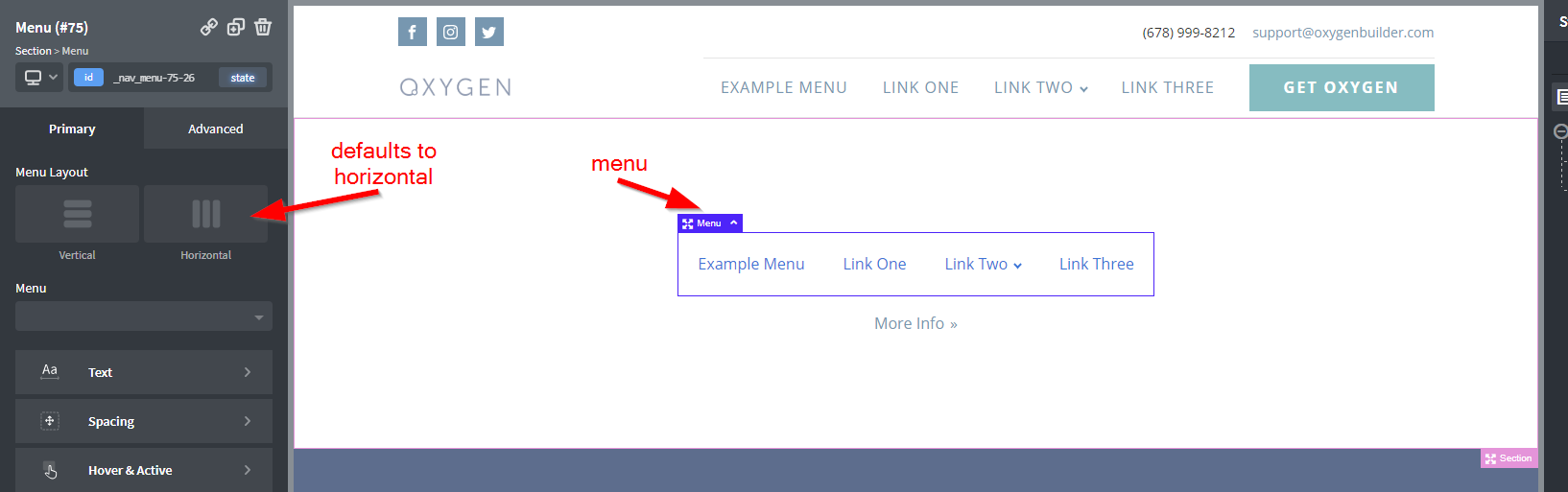
View page, menu shows horizontal as expected
Define a 992px @media and set the menu to vertical display. The dev UI does not reflect the change
Looking at the live page at the All Devices resolution, the menu is displayed in hte vertical stack as defined in the 992px @media declaration
Desktop (please complete the following information):