 ikeydoherty
commented
7 years ago
ikeydoherty
commented
7 years ago I think I'd want to go with a charcoal tone instead of straight up black, with at least 2 tones for it (i.e. status, "dim" type)
Open christiankaindl opened 7 years ago
ikeydoherty
commented
7 years ago I think I'd want to go with a charcoal tone instead of straight up black, with at least 2 tones for it (i.e. status, "dim" type)
ikeydoherty
commented
7 years ago I think the Notifications label is redundant fwiw
 cybre
commented
7 years ago
cybre
commented
7 years ago ^ Yes, it's distracting me from the actual content.
ikeydoherty
commented
7 years ago RE: Grouped notifications, the start of each notification text should be xaligned with the label for the group (i.e. "Firefox) - otherwise the grouping is unclear. The icon could probably be outdented a bit too
 JoshStrobl
commented
7 years ago
JoshStrobl
commented
7 years ago All feels really Plasma / KDE esque if I'm honest.
ikeydoherty
commented
7 years ago [15:13:20]
if it was "iOS'd" up it would be better [15:14:10] like a very very very tiny amount of translucency [15:14:24] a less harsh contrast [15:14:26] etc
ikeydoherty
commented
7 years ago Could probably drop the "back" label, the go-previous-symbolic icon should be clear enough, if not a tiny bit bigger. Solves sizing issues when using different locales, too.
ikeydoherty
commented
7 years ago I hope that first round of feedback is help, @christiankaindl. Thanks for getting this kicked off, and your mockups :D
 ghost
commented
7 years ago
ghost
commented
7 years ago Totally not digging the white panel, but that my taste. The transparency is good, however can be problematic with maximized windows. To me at least its distracting. Having the panel go opaque with max windows is a good way to have your eye candy and eat it to. I don't see an issue with using the word back in the label to exit raven. If you plan to eliminate icons for the categories in the meu, it helps to make the panel/raven a more cohesive unit. It's right aligned, I don't see a space issue. How long could the word "back" be in different languages? I'd like to see Brisk become part of Budgie as is. So a Quit/logout button in the panel/raven seems redundant. Still voting to put those buttons beside the search bar in Brisk. Reason being it solves the issue of the menu looking strange in a non default location, ie; Top instead of bottom. It does this because you can make sure the search and session controls are always next to the launcher button. (some guy named Fitt said it was a good idea.) For the settings, I found raven's approach refreshing, The simple toggles and dropdowns for common simple settings a button to launch full gnome settings. So a settings manager, with two tabs quick/personal settings and all settings would be similar. Gnome settings is sort of rigid, it doesn't incorporate settings for 3rd party apps well, and its ugly. So thats my critique, hope it helps.
ikeydoherty
commented
7 years ago Disagree with most, sorry.
ghost
commented
7 years ago No worries, its your show. You listened that's all I can ask. Out of curiosity what don't you disagree with?
ikeydoherty
commented
7 years ago Well a fair amount of it disagrees with what I've set down for Budgie 11, a quick example is the fact that we must split settings out of Raven. We're thoroughly restricted with it in terms of screen estate, and in almost all translations the sidebar grows immensely.
We're also not phasing out icons. Symbolic icons make sense in place of text. Icons and text is a dated concept. When you don't use monochrome icons it also looks tacky.
I'd recommend checking the info repo first so you know what it is I have in mind.
Buttons beside the "search bar" looks utterly offensive and disgusting so I won't be doing that. Look at latest Brisk it doesn't suffer from placement issues.
I'll get back to this tomorrow with some more thoughts.
 ckrzen
commented
7 years ago
ckrzen
commented
7 years ago Hi all,
I just wanted to throw my hat in with the following:
Budgie has become my go-to standard for transitioning folks from "Windows 10(ver. 1607)" to Linux and as such, the really 'helpful' parts are:
a. Win-10 themeable(arc-darker + faba icons)
b. Bottom panel position
c. 54-pix panel size for the elderly and sight-impaired(cramps up against volume and brightness indicator bars, though, at sizes larger than 40 or so pix)
d. Settings(gnome-control-center) button at bottom of Raven(similar to "All Settings" tile in Win-10 'Status / Notification' thingy)
e. Right-side window controls(:minimize,maximize,close)
f. Clean, elegant & familiar, if somewhat 'traditional' design elements for those who have been "clicking & drooling" for many a decade in other W.I.M.P. based desktop environments. ;-)
GREAT alternative to gnome-session-flashback
Budgie brings a fresh approach to a lightweight, yet modern & featureful looking D.E. for *nix's.
I'm pretty sure that I read that Mark Shuttleworth over at Canonical got excited about an official Budgie spin added to the *buntu family. And he bought a seat on a Russian space shuttle up to the International Space Station just for fun ... how cool is that?
Thanks for all your work and looking forward to Budgie-11 as the best-yet !!
~Chris Rainey Tulsa, OK U.S.A.
On Sat, Dec 31, 2016 at 4:23 PM, Ikey Doherty notifications@github.com wrote:
Well a fair amount of it disagrees with what I've set down for Budgie 11, a quick example is the fact that we must split settings out of Raven. We're thoroughly restricted with it in terms of screen estate, and in almost all translations the sidebar grows immensely.
We're also not phasing out icons. Symbolic icons make sense in place of text. Icons and text is a dated concept. When you don't use monochrome icons it also looks tacky.
I'd recommend checking the info repo first so you know what it is I have in mind.
Buttons beside the "search bar" looks utterly offensive and disgusting so I won't be doing that. Look at latest Brisk it doesn't suffer from placement issues.
I'll get back to this tomorrow with some more thoughts.
— You are receiving this because you are subscribed to this thread. Reply to this email directly, view it on GitHub https://github.com/budgie-desktop/budgie-desktop/issues/763#issuecomment-269883981, or mute the thread https://github.com/notifications/unsubscribe-auth/AGnuRVRDjkyi4-iBii9g9u4uDYQHZambks5rNtXVgaJpZM4LYkaD .
ghost
commented
7 years ago Fair points, But I didn't mean to say keep the settings in raven. Just that it was good to have simple stuff, fonts, themes, etc.. in their own tab and everything else in another tab in your new Budgie settings app. One that is extensible to 3rd party setting dialogs, like plank as an example. Throw the rest of the stuff I said out if you like. My thoughts for settings is just me trying to visualize something that "feels" like it belongs to Budgie, and evolution of how raven split things up.
 somasis
commented
7 years ago
somasis
commented
7 years ago The height of the panel is 39px, just like it is today in Budgie.
This is a little bit of a nitpick, but I think that the way the panel is sized is a little odd. Often I find myself having to contort the panel size in order to get the icons on the task list to look sharp. I think it'd be nice if the panel sizes followed more standard heights (16, 24, 32, 48, 64, 72...)
Or if that's not something that could be done, it might be nice to have the task list be smart enough to always size the icons to where they'll look sharpest...
ckrzen
commented
7 years ago Good point!
I usually find the default panel size to be 24 and then I increase to 48(sometimes only 46 for icon sharpness ... gnome-flashback, in this case, seems to need this).
On Sat, Dec 31, 2016 at 6:36 PM, Kylie McClain notifications@github.com wrote:
The height of the panel is 39px, just like it is today in Budgie.
This is a little bit of a nitpick, but I think that the way the panel is sized is a little odd. Often I find myself having to contort the panel size in order to get the icons on the task list to look sharp. I think it'd be nice if the panel sizes followed more standard heights (16, 24, 32, 48, 64, 72...)
Or if that's not something that could be done, it might be nice to have the task list be smart enough to always size the icons to where they'll look sharpest...
— You are receiving this because you commented. Reply to this email directly, view it on GitHub https://github.com/budgie-desktop/budgie-desktop/issues/763#issuecomment-269887487, or mute the thread https://github.com/notifications/unsubscribe-auth/AGnuRXcdM4VTF5J184ibo-y_0wTAYmhEks5rNvUXgaJpZM4LYkaD .
 christiankaindl
commented
7 years ago
christiankaindl
commented
7 years ago @snkiz the back button on Raven's notification view is meant to go back to Raven's "main" or "home" screen - not to exit it. At least this is what I intended it with this mockup.
@all I'll work on your feedback and maybe get the first round for the Budgie Menu tomorrow, thank you so much. :sunglasses:
 Solarunit
commented
7 years ago
Solarunit
commented
7 years ago I like android Clear all notification button. Scroll-bar is too thick. I would like to see a dark version without transparency.
christiankaindl
commented
7 years ago Here's my update I am working on:
First of all I looked at the colors that were criticized and left too much contrast. Black and white tones were changed and 2 more blacks were added. No pure blacks and whites are used anymore. New colors are the following:

These follow more or less the Material Design Guide's color scheme now. For easier customization the MD guidelines suggest that instead of the different black variants a deep black (#000000) with transparency should be used for font colors. Reasoning seen here:

As it can seen here these two snippets have the same visible color although one has the value #212121 and one is pure black with a bit of transparency. The advantage of the latter being it is more flexible against background color changes:


So this could be an interesting thought as a integrated customization option in the future: being able to easily change the theme or accent color without lots of modification.
Note that these .svg files do not yet use the transparent variant although that might change as design development for Budgie 11 goes on.
Second major change that was made happened in Raven's notifications screen. The positioning changed to put the focus more on the content itself - the notifications. An unsolved problem I see is the double usage of the word "notifications" which still resist in this iteration and is also present in currents Budgie implementation. Please view it in full screen and let the color changes take effect:

The scroll-bar is a bit thinner now:

Finally, for those who are interested in the .svg files I'll set up a GitHub repo so everyone can mess with them.
cybre
commented
7 years ago Repeating ikey's point here
RE: Grouped notifications, the start of each notification text should be xaligned with the label for the group (i.e. "Firefox) - otherwise the grouping is unclear. The icon could probably be outdented a bit too
christiankaindl
commented
7 years ago RE: Grouped notifications, the start of each notification text should be xaligned with the label for the group (i.e. "Firefox) - otherwise the grouping is unclear. The icon could probably be outdented a bit too
Looked at it now, current approach being:

This does not only solve the mentioned issue but also makes them actionable. What do you think?
Btw, here's the GitHub repo for all the files: Budgie 11 mockups
@ikeydoherty What do you mean with Groups have a "last time", sort by this.
cybre
commented
7 years ago When a new notification is added to a group, the group's last-time is updated. This property is then used to sort the groups making the group with the most recent last-time appear on the top.
This is more of a backend thing so it's not something you can represent in a mockup.
 TheBabu
commented
7 years ago
TheBabu
commented
7 years ago Just a little thing I want to add for notifications... because you have so many animations, when opening up windows and such, it feels very... out of place for the notifications not to have a sliding away thing, when clearing them. Somebody else may of already said this, but I just wanted to make sure!
christiankaindl
commented
7 years ago Small update on my front:
I've put more thoughts into Raven's Widget view, which is now a lot cooler :B Also, the sidebar (in general) is a bit thinner now - 1/5 of the screen to be precise - and content distribution has a red line now that leans more on the current design of Raven and has its future support for widgets in mind. This is the first draft:


As further work gets done I will update the initial post of this issue with the updated mockups and resources so it is clear to newcomers what the status quo of this issue is.
cybre
commented
7 years ago The Input/Output sinks below the volume bar are actually radio buttons. Yours look like bullet points.
TheBabu
commented
7 years ago @cybre What do you mean "radio buttons"... Can you explain that to me?
cybre
commented
7 years ago @Hacksaurus https://en.wikipedia.org/wiki/Radio_button Radio buttons in GTK+: https://developer.gnome.org/gnome-devel-demos/stable/media/radiobutton.png
TheBabu
commented
7 years ago oh I see... I think I like them as bullet points actually...
cybre
commented
7 years ago Yeah, but there has to be some distinction between the selected sink and other sinks in the list.
TheBabu
commented
7 years ago Isn't there?... In the normal budgie, it changed color... I assume that he did that?
cybre
commented
7 years ago They're all the same colour in the mockup. It's a mockup so it's not a huge deal. Twas just an observation :)
TheBabu
commented
7 years ago Oh I see it now... I guess he'll change it later
 cunidev
commented
7 years ago
cunidev
commented
7 years ago I found the audio I/O settings panel to be a little too... minimal even in previous Budgie versions. I'm not a designer, but there are some things I'd like to propose:
christiankaindl
commented
7 years ago New draft for the Notifications screen of Raven:


 ben-kuhn
commented
7 years ago
ben-kuhn
commented
7 years ago We're also not phasing out icons. Symbolic icons make sense in place of text. Icons and text is a dated concept. When you don't use monochrome icons it also looks tacky.
Symbolic icons without text are a usability nightmare, despite--possibly--having a slightly dated or tacky look. Trying a new icon set, or introducing a system to a new user, without text describing the icons (I'm talking about application icons here, not obvious stuff like back button, save, volume, etc...) discovery is a real issue.
Slightly off-topic, but I'm also a huge proponent of the traditional task list on the panel as opposed to the icon task list. If I have multiple terminal, browser, or file manager windows open, it's much quicker to know which one I want to switch to at a glance rather than having to hover the mouse or toggle through alt+tab. Panel width can also be smaller, as the buttons on the list are easier to distinguish and click.
 villekivela
commented
7 years ago
villekivela
commented
7 years ago Did some mockingups also. I do understand that blurs are not feasible with the current compositor, but maby in the future.

ckrzen
commented
7 years ago Looks really good to me!
On Fri, Feb 3, 2017 at 6:56 AM, Ville Kivelä notifications@github.com wrote:
Did some mockingups also. I do understand that blurs are not feasible with the current compositor, but maby in the future. [image: budgie_mockup] https://cloud.githubusercontent.com/assets/5814559/22592155/f8c2c41e-ea20-11e6-833c-9b4f439c5bde.jpg
— You are receiving this because you commented. Reply to this email directly, view it on GitHub https://github.com/budgie-desktop/budgie-desktop/issues/763#issuecomment-277240690, or mute the thread https://github.com/notifications/unsubscribe-auth/AGnuRcVgFamfDXW8o5MNjRUSfNktgH68ks5rYyQUgaJpZM4LYkaD .
cunidev
commented
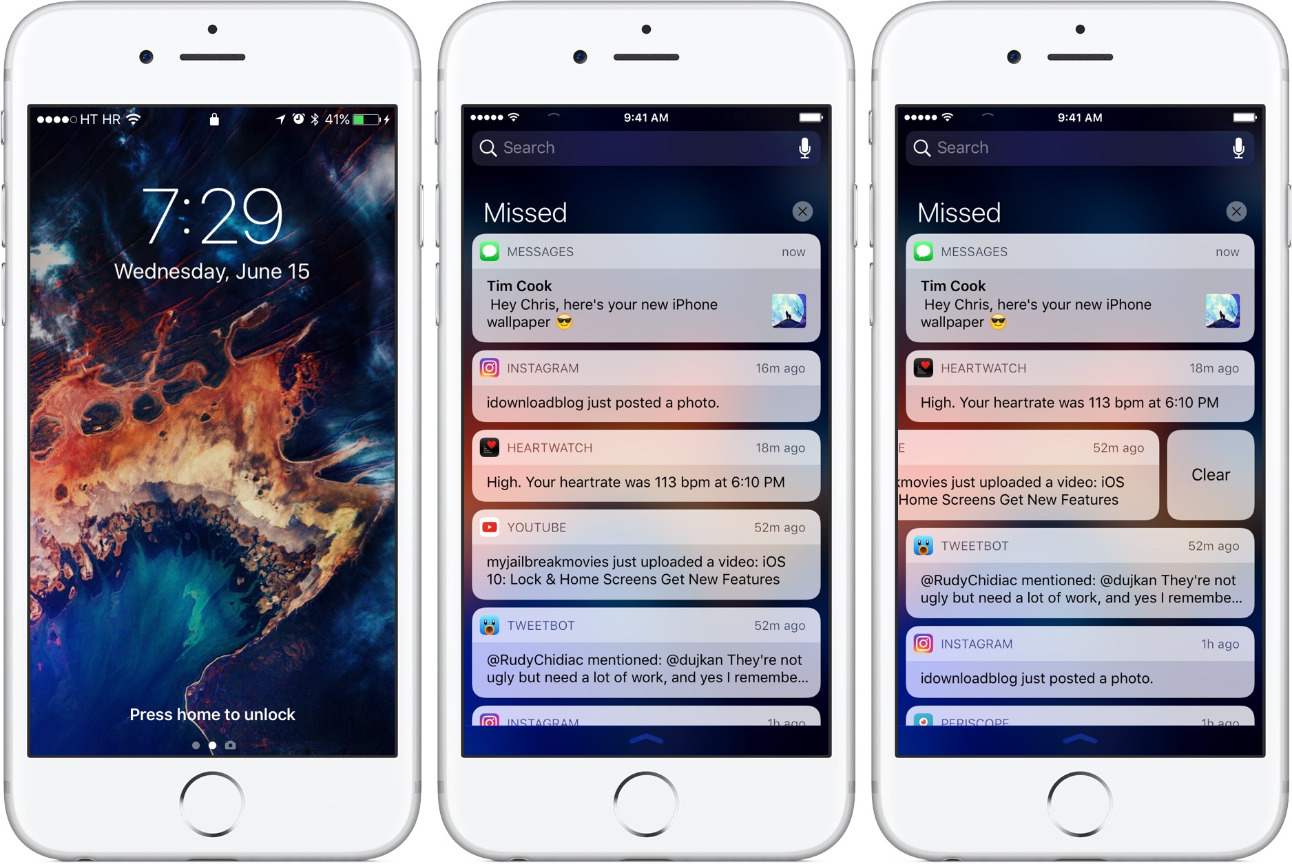
7 years ago While @villekivela's mockup has some valid points, I don't find it solid and convincing enough. For instance, the black borders make too much contrast imho, and feel very basic. I'm also not sure about how you use blur. I'm not an iOS design enthusiast, but for instance iOS 10 uses blur only on the background, but keeps notifications in "boxes", like Android does, to separate them clearly from the blurred background (http://media.idownloadblog.com/wp-content/uploads/2016/06/iOS-10-Notification-Center-cleart-alert-iPhone-screenshot-001.jpg). However, I'm not sure blur is needed at all, but that's just my opinion. Writing from my smartphone at the moment, sorry for my terrible English.
villekivela
commented
7 years ago Thanks for the feedback. I agree with the dark lines. I tried to clean it up some.
Personally I like the blur with transparent elements. If there is no blur behind all the info gets hard to focus on. Still not quit happy with the panel.

cunidev
commented
7 years ago Thanks for reading, now the mockup has a definitely more consistent design. However, look at this screenshot: http://icdn8.digitaltrends.com/image/macos-sierra-features-notifications-1351x900.jpg Doesn't that look quite a little too similar? I mean, @christiankaindl mockup is somewhat similar, but it also has several differences, while a design like this, while solid might look just as the latest osx clone, while imho Budgie should try to follow independent design lines. (Although I share Joshua's perplexity regarding the fact that the way it uses blacks and whites looks very Plasma). Regarding the menu, doesn't it remind you of this? http://surfontech.com/manjaro0811pre2KDEEN/startmenua.png I personally wouldn't like Budgie to look that similar to KDE. But that's only a matter of taste.
villekivela
commented
7 years ago They do look quit alike. I dialed down the transparency. It's bit more flat now and I tried to tie the color scheme with Sams icons. The GTK theme is very much inspired by Arc, just made the colors bit lighter. The menu still looks pretty similar, but I guess there are so many ways you can make a menu :)

ckrzen
commented
7 years ago I don't mind the lack of transparency. I'd always pick legibility over dazzle!. I do prefer darker themes, though(arc-darker).
On Sun, Feb 5, 2017 at 12:19 PM, Ville Kivelä notifications@github.com wrote:
They do look quit alike. I dialed down the transparency. It's bit more flat now and I tried to tie the color scheme with Sams icons. The GTK theme is very much inspired by Arc, just made the colors bit lighter. The menu still looks pretty similar, but I guess there are so many ways you can make a menu :) [image: budgie_mockup] https://cloud.githubusercontent.com/assets/5814559/22628652/6c736efc-ebe0-11e6-9352-a5f29dc51ef8.jpg
— You are receiving this because you commented. Reply to this email directly, view it on GitHub https://github.com/budgie-desktop/budgie-desktop/issues/763#issuecomment-277537867, or mute the thread https://github.com/notifications/unsubscribe-auth/AGnuRQCzNfZTgh9o-6Qop5m2PemYVjcjks5rZhLEgaJpZM4LYkaD .
TheBabu
commented
7 years ago I really like the blur and I also do like dark themes @ckrzen! I think there should be an option for transparency... I think there should be a Budgie Settings application! Also you know how Rhythmbox shows up as an applet in Raven, could we have that for DeadBeef? That would be really cool!
Also... I noticed that there is a terminal notification there... How does that work?
ghost
commented
7 years ago I think there should be a Budgie Settings application!
Is already planned: https://budgie-desktop.org/roadmap/
Also you know how Rhythmbox shows up as an applet in Raven, could we have that for DeadBeef? That would be really cool!
The applet is not for Rhythmbox only, if your player supports MPRIS it will be shown in the Raven applet.
TheBabu
commented
7 years ago @feskyde Ahhh ok! I think there is a plugin for that in DeadBeef!
EDIT:
Yep there it is!

Another question... I read in an article that in Budgie 11 you will be "DeGNOMEING" and moving to Qt... First of all what is Qt, and what is the reason for this?
 QORTEC
commented
7 years ago
QORTEC
commented
7 years ago @Hacksaurus, the simplest way I can think to explain both GTK and Qt; is that they are responsible for drawing the Graphical User Interface for Budgie. So right now GTK is what's responsible for drawing the Budgie Menu, Panel, and Raven that you see on your desktop.
As for the reason; back when Budgie first started it was a lot smaller and now that it has grown in both size and complexity. Solus found that GTK (made by Gnome) no longer works well for what they are trying to do, you can find specifics in their blog post. In the end they decided to switch to using Qt since it meets most of the needs that budgie currently has...
TheBabu
commented
7 years ago @QORTEC Thanks for the answer! Could you give some specifics for Qt? I understand that GTK and Qt are both responsible the the GUI. Is that I just never really heard about Qt...
QORTEC
commented
7 years ago @Hacksaurus, sadly I don't think I would be able to describe Qt that well. I wouldn't call my self a programmer and I've only took a quick look at Qt a year ago... I think that you would get more knowledgeable answers form someone else, if you have specific questions you can try asking @ikeydoherty on Solus IRC channel. (irc.freenode.net | #Solus)
TheBabu
commented
7 years ago @QORTEC Sure I'll try that! Thanks for the help anyways!
villekivela
commented
7 years ago I fiddled with the mockup some more.
Panel:

Raven widgets and menu:
In the current iteration the raven is in drawer mode. Notifications button on the top of raven shows the amount of notifications. Widgets would show the most important information on the header.

Raven notifications:

The purely informative notifications would be automatically shrinked eg. the Inkscape one and similar notifications could be grouped up eg. Terminal. Actionable notifications would show the full information with the actions.
Edit: Updated pictures with more consistent design
Budgie 11
Budgie 11 will definitely bring some good enhancements and one of them is its look and feel - or the theme. As planned by project leader Ikey Doherty Budgie 11 will ship with an updated or even completely new theme, thus now is a good time to talk about in which direction it should go and what aspects are important. For this reason I want to share some ideas in the form of mockups specifically made for Budgie 11.
This issue is just for discussion. I am not a team member of the Solus project. Also, not all UI components are finished yet and they get added while time goes by and discussion raises.
Mockups!
I tried to make things as tangible as possible and please be ugly about the details so it can improve. There are separate mockups for all the corresponding UI elements. Also, all images are available as a .svg file and thus easily editable. For more details on the images view them full screen.
Colors
Currently used colors:
5294e2
172121
f0f3f2
Panel
The height of the panel is 39px, just like it is today in Budgie. The main difference with this design is the color selection. Also as can be seen in the other images spacing has been generally increased - especially the "dock" on the rightmost.
Menu
not yet finished
End Session Dialog
Not yet finished
Run Dialog
Not yet finished
Raven
The sidebar is a crucial part of the desktop experience and should get a lot of attention to make it a great user experience. View them in full screen!
On the left Raven's default screen and on the right its notification screen


Here is everything on one picture:
More importantly, these Raven mockups take care of almost all things pointed out from Ikey Doherty:
Notifications
PolicyKit
The Whole Thing™
~So for you to be happy, of course there is a all in one file. But... be cautious: Maybe you would not expect this but it is pretty power intensive to all those elements at once (especially the shadows), so a decently fast computer is needed if you want to edit them.~
Resources
Some info
I used Inkscape to make these mockups (especially v0.91). All images and corresponding .svg files are licensed under CC0 as you can see below. So please feel free to download and work with them :)
License
To the extent possible under law, Christian Kaindl has waived all copyright and related or neighboring rights to Budgie 11 mockups. This work is published from: Austria.