solus-project / budgie-rd

R&D repository for Budgie 11 bits
https://budgie-desktop.org
68 stars 9 forks source link

Budgie 11 HIG & mockups discussion (continued) #1

Open christiankaindl opened 7 years ago

christiankaindl commented 7 years ago

This is a follow up/continued discussion for Budgie 11 styling/theming. Previous discussion was on the budgie-desktop repo issue #763. For more background and already discussed ideas/mockups I suggest you to check it out.

Let's make Budgie 11 look great (again)!

ikeydoherty commented 7 years ago

Cheers for starting the new thread! Ok so from my perspective there are 2 clear things to avoid for us (aesthetically)

Ideally we want a new Budgie (Shell) specific theming component, with at least:

The rest should be well defined, and we need a palette. Personally I'm kinda tired of blue, it's overused as the de facto "this is professional" colour. Personally I'm hoping for something "light" and "fresh". If possible, I'm open to green. Psychologically speaking we kinda crave these things, and being sat in front of the computer for long periods, well, we should make sure our users "feel" good.

I'd like to avoid information overload, favouring progressive disclosure for settings and such. As the core mantra (and cliché) we want to keep out of the users way, but also look after them. Additionally the users need to own their experience, but with sane defaults. So it should be customisable at it's core.

Transparency and blur are nice when used sparingly, and when the user interface isn't modified solely to show off these blurs, rather it should take advantage of it. I'm in favour of a "nearly flat" UI approach as opposed to complete flat (depth + shadow are critical visual cues), as well as obvious layouts. You'll notice in more modern UIs the focus is on clear separation in column layouts.

I think its safe to say we also need to account for applications to some regard, so think of the "OS basics" and the System Settings (we won't be using GNOME Control Center).

Hopefully this opens the floor to a more open discussion and frees up some constraints (i.e we're not just focusing on the shell chrome, but more of a formal HIG.

To assist me (codemonkey) in implementing mockups, please provide hexadecimal colour schemes along with the various layout critical pieces (padding, font point sizes, etc.)

wisetux commented 7 years ago

When I read that you were personally tired of blue, this is the color that immediately crossed my mind. And there it is in your very next line - "Green". image

ikeydoherty commented 7 years ago

Could be nice as an accent yeah

ikeydoherty commented 7 years ago

I think it might be worth us exposing parts of the palette to allow several "add-on" palettes. A typical pattern we see in GNOME applications is the use of red + blue for suggested-action and destructive-action. Unfortunately those are kinda no-go areas for colour blindness, etc.

So while we could use those in the core palette, a mechanism to change to another well defined palette is a must imho. Only core concepts such as accent, suggested (primary) and destructive (deletion). I think for much of Budgie we should at least provide undo mechanisms for dangerous actions instead of relying on scary "DON'T DO THIS" red buttons though.

Mazino-Urek commented 7 years ago

If gnome settings not used, what will be used? Native or kde settings? As far as I know KDE is revamping their settings menu through QML. As budgie is going qt, latte dock can be considered for docking. It is well maintained.

ikeydoherty commented 7 years ago

We're not using KDE apps. We'll have our own settings application. Latte dock is separate and shouldn't be considered part of our project scope. It's third party.

ikeydoherty commented 7 years ago

We're still going to provide a full transition from Budgie 10 to Budgie 11, which means we still have a configurable and powerful panels system, Raven, etc.

JohnBlood commented 7 years ago

@ikeydoherty If I may ask, why did you name it Raven? Were you reading Poe at the time? I do agree that the computing world (mobile, Windows, Linux. Mac) is very blue heavy (well, except for Ubuntu). Help us move towards greener fields. :smile:

ikeydoherty commented 7 years ago

Actually John McCormack helped name that. Basic idea was around the delivery of information and intelligence. Plus it kept the avian theme going.

bmeznarsic commented 7 years ago

Kaka parrot to the rescue http://nzbirdsonline.org.nz/sites/all/files/Kaka%20on%20kowhai%20Wilton%20Sep%202013.jpg

Mazino-Urek commented 7 years ago

Is Wayland coming along with this project?

ikeydoherty commented 7 years ago

Yes - but lets keep this thread specific to design :D

Mazino-Urek commented 7 years ago

Hope this may help adjust colour contrast: https://color.adobe.com/explore/?filter=newest

MrMonotone commented 7 years ago

I like the theme right now. I think the shades of blue that were chosen are nice. For whatever reason I just think of SUSE when I think green. I do not know why it turns me off the color it just does. EDIT: ALso I feel that blue looks better with the Solus logo!

tobcro commented 7 years ago

Since this is a open discussion :) I really like the thought of a global dark/white theme. The accent color is also important, I would however not focus so much on a specific standard color (blue, green etc) - I probably would want to change it anyway to match my desktop background. So to be able to change the accent color - I am thinking a few presets but also the ability to add your own hexadecimal values as well - would just add a little little extra for me. Of course there is always the option to create your own theme, "the Linux way" . But I think that is silly when you only want to change the accent color...

SLmanDR commented 7 years ago

Reply to Ikey's "... use of red + blue ...colour blindness, etc." But could you use those colour concepts and get a colour blind persons input and add perhaps a subtle pattern. Thus enhancing the colour blind person experience and maintaining a "standard".

tuxattack80 commented 7 years ago

http://www.dailyinfographic.com/wp-content/uploads/2012/09/psychology-of-color.png

I say red accents and a partnership with McDonalds lol! But seriously may be something to consider when picking colors, I personally like the blue but if there is going to be a true dark and light theme id say just invert the accents. Other than that you really can't go orange because many will think Ubuntu and green is okay if done right and in the right shade (Android system icons before they went blue) don't need people think Linux Mint when using Solus. And red isn't really a neutral color and is often used for a sign of importance or warning I can see the wide spread panic amongst users that don't read messages when a lot of red buttons come popping up 🤔

tuxattack80 commented 7 years ago

And stay away from yellow unless you want Solus to be known as the OS that makes babies cry lol!!

haunt98 commented 7 years ago

May be a bit more retro like this This palette I get from gruvbox

tuxattack80 commented 7 years ago

https://goo.gl/photos/pYPEdEn7fkEootzt5 I know it's Android but it's the closet device I had at the time but just wanted to give an example of how white and black could work and in a dark theme id say just invert the colors.

tuxattack80 commented 7 years ago

Like the retro look displayed above, seems like that could be very theme friendly, I actually think a legit theme engine in Solus would be something to consider. Not just something that stores and displays themes installed but something that would allow the user to tweak accents and background colors along with icons for system apps, notification drawer and application icons. Could be built in with budge settings or whatever settings manager is used in Budgie 11. Too bad icons built for Android can't be crossed over to Linux 🤔 Yeah pipe dreaming at the moment. But yeah I think user control would be the way to go and just have several accents to choose from like zorin without the need of paying for it.

rroll1 commented 7 years ago

One suggestion I'd like to see would be an improved alt-tab dialog. It's entirely functional at this point, but I feel it needs to be refined a bit.

For instance, it'd be nice if the alt-tab box were to auto-size to the number of windows opened. If I only have 2 windows open, for example, there's a ton of empty space on the right-hand side.

While that is primarily about design, in regards to behavior it'd be nice if we had the option to click-to-raise: currently, when you hover your mouse over the icons, nothing happens, when I'd expect it to be more like GNOME/Cinnamon/Windows/MacOS, which is that hovering will select an icon, and then clicking brings it to focus immediately. Current behavior is:

Hit alt-tab, dialog opens While holding alt, you can click an icon thereby selecting it The application in question does not come forward until you let go of alt

I personally think that it'd be more expected behavior to have hovering the mouse to select the icon, then releasing alt OR clicking the icon would bring it forward immediately. (So if you clicked it you wouldn't have to release the alt key)

PretzelJones commented 7 years ago

Is there a plan to edit the Solus and Budgie logos as well? They currently have an "Arc" theme with the grey and blue (intentional?).

SLmanDR commented 7 years ago

Sea greens, blues and greys to fit the nautical logo theme seems appropriate. Anyone own a Pantone swatch kit on the island? Go forth! Compare and record.

kucho commented 7 years ago

I would love to see a theme with these styles: flat with transparent elements or flat and morder style

yaymalaga commented 7 years ago

I agree with @mrkucho, the second theme(https://www.gnome-look.org/p/1187179/) is just amazing.

It looks like a modern arc theme mixed with adapta, so this way budgie 11 style would still be very familiar and modernized. The green color is also perfect (named teal), as it is so material.

cunidev commented 7 years ago

path5049 current-design

A simple wireframe idea for the "do not disturb" switch design (no icons of course, can be adapted to most design guidelines) vs. the current simple, somewhat Apple-like "do not disturb" Raven switch in the current budgie-rd build. Cheers!

STiAT commented 7 years ago

@cunidev could you elaborate what would be the diffeerence between silent and do not disturb? I could think on a few possibilities...

STiAT commented 7 years ago

While I personally dislike red in designs (too fretful for my taste, I get uneasy if something is red on my desktop), I've checked with a colleague who's red/green blind, and the design @mrkucho and @yaymalaga seem to prefer (Matcha) works. I'd certainly prefer it without red though.

cunidev commented 7 years ago

@STiAT I was also thinking of separate switches for sound and popups, but then I thought I might be overcomplicating it for nothing.

So my idea was:

Normal: sound, popups, raven Silent: popups, raven DND (or maybe something like "Immersive" mode?): raven only

Not showing notifications even in Raven looks kinda pointless to me, as we'd basically be throwing them away for nothing. The systray icon should remain as it is, except maybe show a half-moon icon instead of a white or red bell to symbolize that there might be or not notifications, but you won't be bothered unless you check manually. Is the systray icon gonna remain anyway? Looks somewhat redundant, I'd rather have the unread notifications number near the Raven trigger...

MaxJonasG commented 7 years ago

I really like what Christian and villekivela have done in the old thread, if you want green I'm sure you can replace the blue with teal. I guess you are looking for an evolution of the existing design, not a a complete makeover. Please keep the recent improvements to the panels/docks and the ability of intelligent transparency etc. I also agree with trying not to emulate MacOS

cunidev commented 7 years ago

Any ideas for an improved search dialog, possibly not kde- or osx-clone? It'd be nice to have it query several asynchronous threads for each "service" (app search, file search, calculator), but that'd require complex file indexing etc., which isn't a priority at the moment. I'm unsure whether the box should have a translucent dark blocking mask to cover the desktop or not for instance.

kucho commented 7 years ago

What about using Cerebro? It's open source

cunidev commented 7 years ago

That's literally a Spotlight clone though. I prefer the idea of a maybe simpler, better integrated budgie-run-dialog.

MaxJonasG commented 7 years ago

the 4th picture from the top ticks all the boxes (semi-flat, column design, teal highlights). http://www.fromupnorth.com/user-interface-inspiration-696/

ikeydoherty commented 7 years ago

Grrr at unclickable pinterest links.. :)

tristan957 commented 6 years ago

Cerebro looks extremely nice. The author has done a lot of good work. Looks good and extremely impressive.

yaymalaga commented 6 years ago

Just saw this video: https://youtu.be/cwzT6IL9320

Deepin remains me of budgie, but it's also true that it seems to have a more polish UI.

Maybe budgie 11 can also take ideas from it :p

dermariusz commented 6 years ago

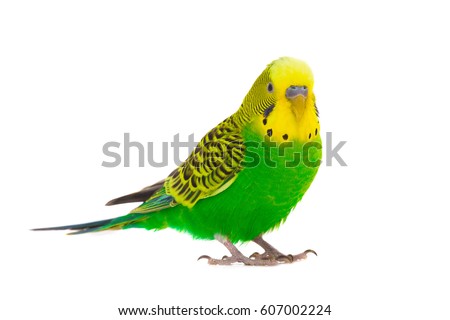
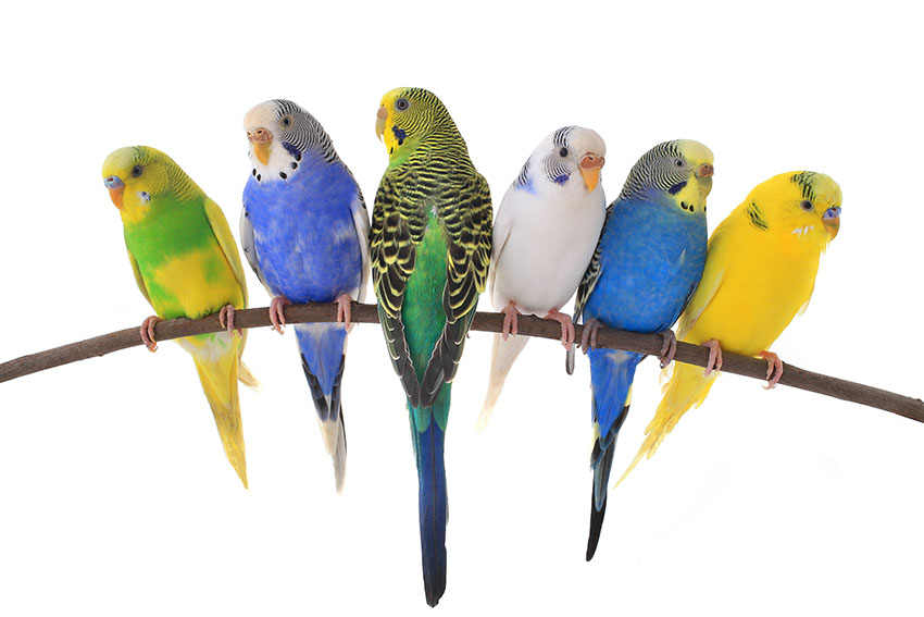
If we take green we probably should also take yellow. After after all it's called Budgie Deskop: Green Budgie

Justinzobel commented 6 years ago

They come in a variety of colours..

bollian commented 6 years ago

Currently, the two biggest features that are keeping me with GNOME are:

  1. The window and workspace overview (called Activities)
  2. The ability to open Activities and switch workspaces with touchpad gestures under Wayland

The ability to graphically drag windows between workspaces or get an overview of all your windows is, to me, very intuitive. Now that this works on both macOS and windows 10, any non-linux user anyone who tries to use my laptop expects these features.

Obviously you'd also want ways to access the overview for when you aren't using a laptop, but that could be as simple as an applet and keyboard shortcuts.

Extarys commented 6 years ago

I started playing with the configurations available in Budgie I tried putting my panel transparent but depending on the wallpaper it's hard to see the text. So, we should be able to choose the background

Also maybe - but just maybe:

zoomer296 commented 6 years ago

May i suggest the option of an iconified app list similar to what Pantheon offers? It may help to draw in previous Unity users. I'd suggest scroll progression rather than pages.

lachlan-00 commented 6 years ago

@calciferSparks suggestions regarding the overview are the big reason gnome-shell works so well for me.

I am always throwing my mouse to the top left corner hoping for an overlay no matter teh OS. The current hotcorners applet is for running commands but something more like the activities overlay with app search would be a killer feature for anyone who uses gnome regularly.

If the window manager could allow that through an applet/command i'd write one for budgie straight away. It's much easier to use over alt/super + tab

vikz95 commented 6 years ago

Just saw this video on YouTube: https://youtu.be/-5tak0tHqIg It seems interesting. The guy is trying to make a new OS with nodejs, but I don't think that he alone could do much. But would be great to have creative people working on Budgie 11 to bring us a good desktop environment, with an innovative interface and user experience. I think that Budgie is too much flat and minimalistic. Just my opinion, greetings.

craig-toyoracer commented 6 years ago

First off, I really like Budgie 10.4 so I hope Budgie 11 will keep the overall feeling. Adding a color pallet say from GIMP may be over kill but choice would be unlimited. Personnel favorites for a base line http://www.color-hex.com/216-web-safe-colors/ 0000cc - 00cc00 - 660000 - 6600cc - ff6600 - ffff00 also a muted (softer) version choice.

Would be great to have active calendar in Raven. Right click date to open menu - highlight color with attached memo, eg: birthday, appointment ...

If user choice settings could be made as layers. Then an undo history would be possible, again like GIMP.

Jacalz commented 6 years ago

I really like the look of budgie 10.4 and as @MrMonotone said, the shades of blue goes very well with the Solus logo. I would say that you should definitely improve the design and make it look more stylish. But at the same time you should not stray too far away from the feel of 10.4!

After looking through the old thread I saw all the mockups and the ones from @villekivela. The mockups that he made just simply look amazing with consistent styling from budgie 10 but still with a taste of freshness. Dark and blue are the way to go, not green! Sorry @ikeydoherty

Here is the link to the absolutely awesome mockups created by @villekivela if anyone is interested: https://github.com/#issuecomment-280838956

Jacalz commented 6 years ago

I would say that budgie 11 should have the buttons to turn off the computer in the menu on the left, just like in the brisk menu in Solus Mate 😅

ikeydoherty commented 6 years ago

me thinks that link is broken

Jacalz commented 6 years ago

I see that too, strange :P Maby need to use the picture link instead: https://cloud.githubusercontent.com/assets/5814559/23313231/83013ade-fac5-11e6-98ac-b00f1ce8f584.png