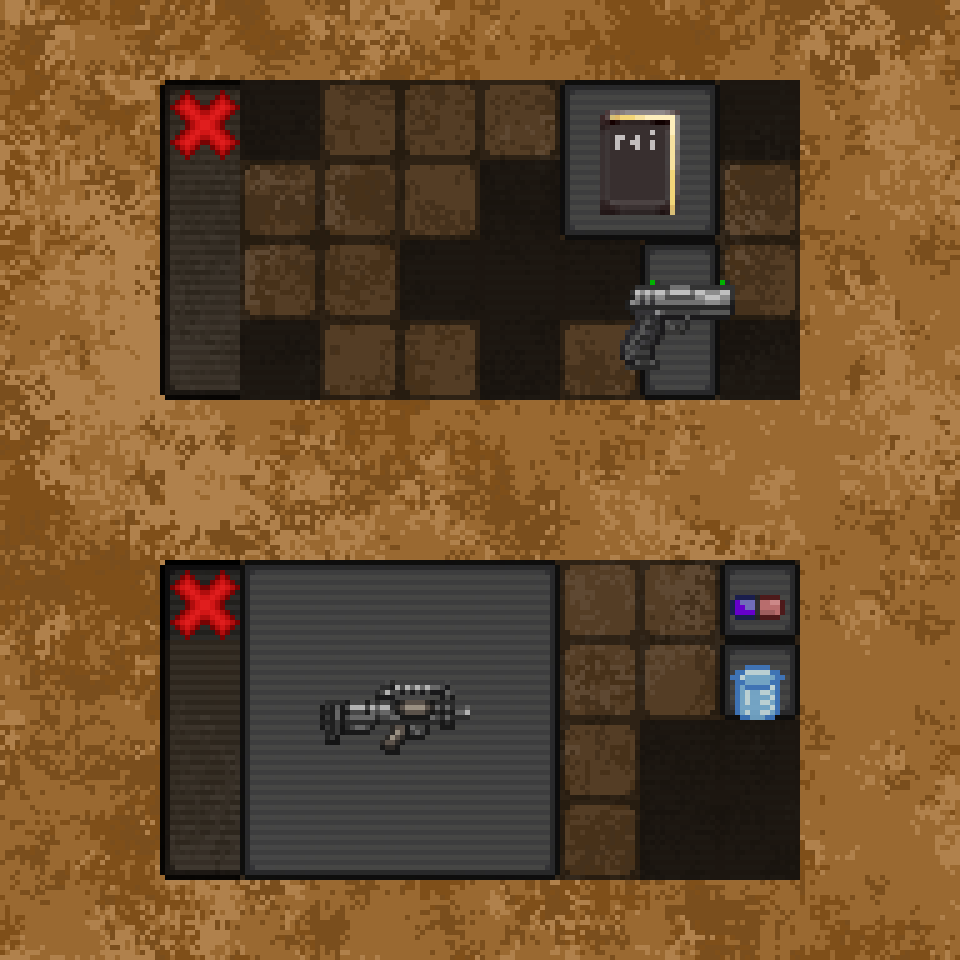
Its intentional. It represents space in the bag that cant have items inserted. Is the issue the visual appearance in some way? How should it look?
Closed UbaserB closed 8 months ago
Its intentional. It represents space in the bag that cant have items inserted. Is the issue the visual appearance in some way? How should it look?
Maybe it should have a background dependant on the color of the bag? So med bag, white background. Stock bag, grey background etc. And maybe a patchwork sewing around the actual inventory boxes to represent fabric. Il actually make a design dock later for that maybe idk, the black background always seemed bad
Is the issue the visual appearance in some way? How should it look?
Didn't you show an example of an unusable grid tile in the mockup? The issue ends up being that unusable tiles are opaque black here.

They're opaque because this screenshot has the opaque window option enabled. They're translucent with the default mode.
Then the best I can offer is "make it the same/a slightly darker gray as the cell border gray". It's the fact that it's #000000 that makes it look off.
Its intentional. It represents space in the bag that cant have items inserted. Is the issue the visual appearance in some way? How should it look?
Right now, when you hover over the black you can see a faint outline saying you cant place items. I would prefer for the black to just not exist, be empty space you can interact with the background. That's how id love it (of course, it can be toggleable if needed) 👍🏻
I say either make it empty space or match the vertical bar on the left (the one with the close button).
My two cents:
Both work. Preferably toggleable between the two in the options with matching the vertical bar being the default and the second option aiming at "UI minimalists".
agree the black is a little visually inconsistent
Description
Im pretty sure this is a bug and it looks bad ingame. Either way, i want the black to be either removed or toggleable because as a satchel-only user i cant tolerate this.
Screenshots