squidfunk / mkdocs-material

Documentation that simply works
https://squidfunk.github.io/mkdocs-material/
MIT License
20.73k stars 3.52k forks source link

Unnecessarily little room for site description in social card #7610

Closed pekkaklarck closed 2 weeks ago

pekkaklarck commented 2 weeks ago

Context

No response

Bug description

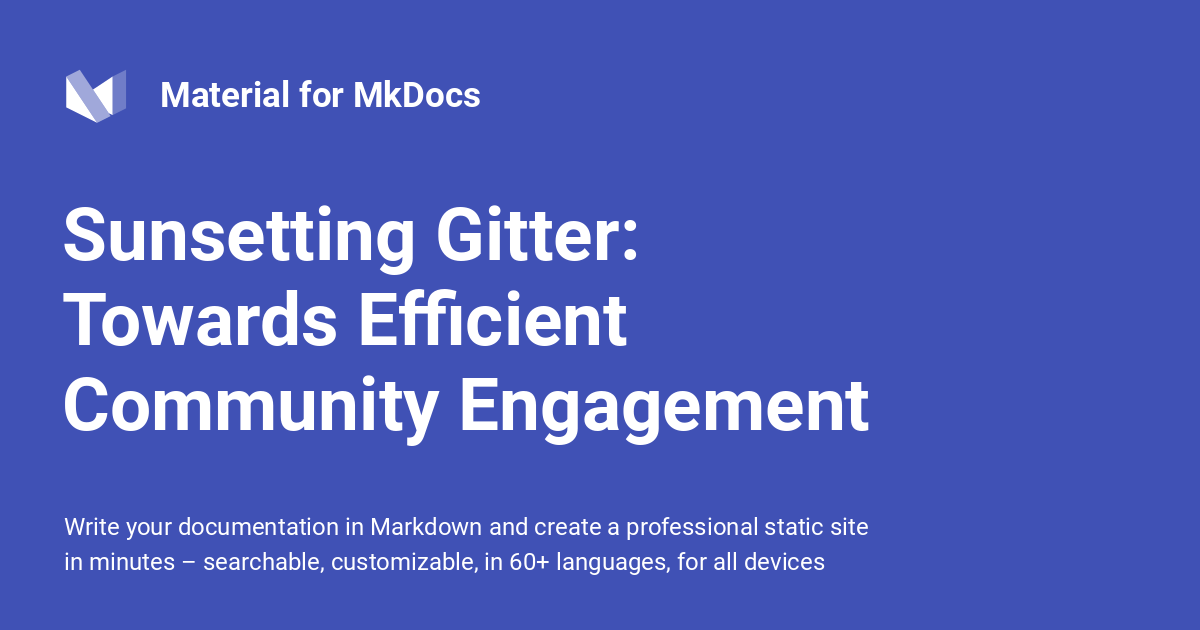
If the site description is long, it is not fully visible in the generated social cards.

In our case the description is this:

Robot Framework is a generic open source automation framework for acceptance testing, behavior-driven development (BDD) and robotic process automation (RPA).

And this is how the social card currently looks like: bad

Obviously there cannot be room for overly long descriptions, but it seems that the horizontal area that is currently reserved for the description is unnecessarily small and the text doesn't get even close to the right margin.

I already checked from the source code that the horizontal space (826 pixels) reserved for the description is exactly the same that's reserved for the site name and page title. With the latter two the width needs to take the space reserved for the logo into account, but the description is fully below the logo so it could use more horizontal space.

I also tested that increasing the width that's reserved for the description really helps. I increased it to 1026 pixels and our social card looks good: good

I'd be happy to provide a pull request increasing the width, but I'm not sure what exact value to use. The generated image is 1200 pixels wide and seems to have ~75 pixels of padding. That would leave 1050 pixels for the content, but I'm not sure should some safety margin be added and the value be a bit smaller. Perhaps that 1026 I used would be just fine.

Related links

Reproduction

9.5.40-description-clipped-in-socialcard.zip

Steps to reproduce

  1. Create a longish site_description. The content doesn't really matter, but in our case it was:

    Robot Framework is a generic open source automation framework for acceptance testing, behavior-driven development (BDD) and robotic process automation (RPA).

  2. Create a site with the social plugin enabled.
  3. Look at the generated site/assets/images/social/index.png file.

Browser

No response

Before submitting

squidfunk commented 2 weeks ago

Thanks for reporting. First of all, why there are only two lines: there can be more than 1 line of page title, up to 3 lines:

Yes, we could stretch it to the entire width, but honestly, I don't really like the looks of it, as the title will now break earlier than the description, which looks unaligned. This is, of course, a matter of taste.

We understand that requirements for social cards can be quite different, which is why we completely rewrote the rendering engine in Insiders! If you want to adjust the layout, I recommend checking out the documentation, and taking a look at this excellent video that explains how to build custom social cards.

pekkaklarck commented 2 weeks ago

I don't think the title and the description aligning on right is that strong of an argument. It can happen only if the title is long enough and even then depends on how the lines wrap. For example, only the last title line in your example actually aligns with the description.

I hope the reason not to improve social cards isn't that it could make paid social card features less interesting.

squidfunk commented 2 weeks ago

Well, as I said, it is a matter of taste, as is most of this project. You have one perspective, which is reasonable. Consider that there are 50-100k more perspectives, so we need to find some common ground. Nothing is stopping you from forking Material for MkDocs and adjusting it to your taste – it is MIT-licensed after all.

Additionally we have absolutely no reason to make the community version suck to sell Insiders. Au contraire – we try to make it as compelling as possible, so you actually want to check out the early access to extra features that come with Insiders. I just don't consider your proposal an improvement that (almost) everybody would agree on. Please respect that.

kamilkrzyskow commented 2 weeks ago

I'll add that, if the suggestion is to maintain a fork of the material theme to modify Python logic, I would instead advise to use some monkey-patching, as this should be overall quicker and less cumbersome than maintaining/syncing the new theme with the upstream origin. I explained a bit more here:

pekkaklarck commented 1 week ago

Yeah, I can fork the project, replace the social plugin with my own, or just monkey patch the SocialPlugin._render_card plugin as mentioned above. I need to fix the description being clipped somehow, and monkey patching shouldn't be too much work compared to alternatives and it would also produce the output I prefer.

I still think it's some kind of a bug that the description only fits ~120 characters. In addition to there being room on the right, there could be three lines reserved to the description instead of two.