 sapegin
commented
5 years ago
sapegin
commented
5 years ago I guess we need to add a new page to the docs that would explain how to show non-component docs. It would be super awesome if you or someone else start that and send a pull request, that we can improve later.
Here you can find an example of showing design tokens: colors, whitespace and typography: https://github.com/component-driven/component-driven-development
 eragon512
 jkarttunen
 leahprin
 petry
petry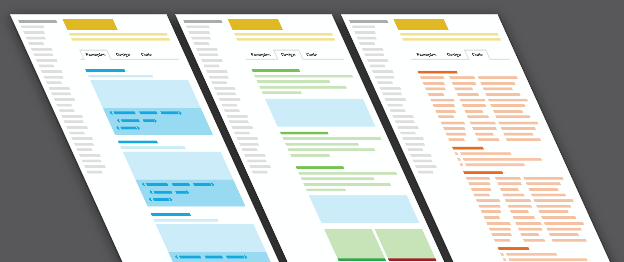
The problem
When using styleguidist for design system docs, not just as a component library, there is a lot of additional content that one want's to add to styleguidist. See article from Nathan Curtis here: https://medium.com/eightshapes-llc/documenting-components-9fe59b80c015 Styleguidist default templates are a bit tuned towards documenting component api and code examples. Eg. having props and methods first
In general I'd like to see a few more examples of themes for document page and for sidenav too. E.g. how to arrange stuff to tabs / paragraphs and prioritize.
I'm not sure if this needs actual new features, or just more examples.