 robhrt7
commented
8 years ago
robhrt7
commented
8 years ago Interested in sourcejs-react-styleguidist users? I know @ndelangen uses it quite extensively.
Closed sapegin closed 8 years ago
robhrt7
commented
8 years ago Interested in sourcejs-react-styleguidist users? I know @ndelangen uses it quite extensively.
 sapegin
commented
8 years ago
sapegin
commented
8 years ago @operatino Yep ;-)
 ndelangen
commented
8 years ago
ndelangen
commented
8 years ago Me and my team are using sourcejs-react-styleguidist as @operatino says. We currently document 58 spec pages, ranging from Utilities/Colors, Utilities/Fonts, Atoms/Buttons, Atoms/Image, Molecules/Map, Molecules/ProductList, Modules/Hero, Modules/StoreLocator, Scaffolds/Header, Scaffolds/Footer.
Spec pages are grouped together according to a somewhat atomic design principle to the extend that worked for us.
On each spec page there are on average 5 representations of each component, in different states, variations, with different modifiers etc. Some specs only have a single representation, some have over 20.
This is for example how our Atoms/FormElements looks like:

sapegin
commented
8 years ago @ndelangen Cool, thanks!
 mik01aj
commented
8 years ago sapegin
commented
8 years ago
mik01aj
commented
8 years ago sapegin
commented
8 years ago @mik01aj Awesome!
sapegin
commented
8 years ago  pke
commented
8 years ago
pke
commented
8 years ago I stumbled over this project a couple of weeks ago, starred it and then forgot how it was named and that I had it starred. Last week I was desperately googling anything with react component documentation by example example.md but did not find this project. react components in example.md finally lead me back to this repo.
Now I can work on our example files for about 80 components/containers and I will present screens later here. Thanks for creating the project!
sapegin
commented
8 years ago @pke Would be interesting to see the result ;-)
sapegin
commented
8 years ago sapegin
commented
8 years ago Feel free to add your project here!
 zecaptus
commented
7 years ago
zecaptus
commented
7 years ago Hello from Whataboon ;)
Change from the original react-styleguidist (without forking / only webpack aliases) :
Future :

Good job @sapegin !! Probably the best styleguide that I've found !
sapegin
commented
7 years ago @zecaptus Wow that’s cool! Thanks for sharing ;-)
pke
commented
7 years ago @zecaptus Care to share the webpack config?
zecaptus
commented
7 years ago @pke : I'm not really sure, it's really helpfull but here it is.
styleguide.config.js
var path = require('path');
var glob = require('glob');

module.exports = {
    title: 'Whataboon UI Components Library',
    sections: [
        {name: 'Introduction', content: 'docs/introduction.md'},
        {name: 'UI Components', content: 'docs/ui.md', components: function() {
            return glob.sync(path.resolve(__dirname, 'src/components/**/*.jsx')).filter(function(module) {
                return /\/[A-Z]\w*\.jsx$/.test(module);
            });
        }}
    ],
    showCode: true,
    template: 'config/styleguide/template.html',
    updateWebpackConfig: function(webpackConfig, env) {
        // Your source files folder or array of folders, should not include node_modules
        var dir = path.join(__dirname, 'src');
        var config = path.join(__dirname, 'config/styleguide');

        webpackConfig.resolve.alias['rsg-components/Layout'] = path.join(config, 'Layout');
        webpackConfig.resolve.alias['rsg-components/Wrapper'] = path.join(config, 'Wrapper');

        webpackConfig.module.loaders.push(
            // Babel loader will use your project’s .babelrc
            {
                test: /\.jsx?$/,
                include: [dir, config],
                loader: 'babel'
            },
            // Other loaders that is needed for your components
            {
                test: /\.css$/,
                include: [dir, config],
                loader: 'style!css?modules&importLoaders=1'
            },
            // Image URL config. Generate data URI's for images smaller than 10,000 bytes
            {
                test: /\.(png|gif|jpe?g|svg)$/i,
                include: [dir, config],
                loader: 'url?limit=10000'
            }
        );
        return webpackConfig;
    }
};Our LovelyBooks styleguide grew much bigger since then. Now we have 72 components with 120 examples. All our examples are also used as unit-tests (we just check that they render without any warnings or errors; this turned out to be a really good test).


Good job @sapegin and everyone :)
sapegin
commented
7 years ago @mik01aj I like this idea of testing. Could you please share some code?
mik01aj
commented
7 years ago @sapegin I did already in https://github.com/sapegin/react-styleguidist/issues/34
mik01aj
commented
7 years ago sapegin
commented
7 years ago @mik01aj we have Dialog in the Showcase in Readme. I can’t add Nordnet because they have removed a link to Styleguidist.
 kulakowka
commented
7 years ago
kulakowka
commented
7 years ago We finally started using it in production.


sapegin
commented
7 years ago @kulakowka Awesome!
sapegin
commented
7 years ago @kulakowka Could I add your company logo to a site? ;-)
@zecaptus Are you still using Styleguidist? ;-)
@mik01aj Do you know if they are still using Styleguidist?
zecaptus
commented
7 years ago @sapegin Yes, I still use it, moreover I will update it to make it work for react-native with exponent, probably in 2018.
kulakowka
commented
7 years ago @sapegin We just started developing our components. They will be released in a couple of weeks. Unfortunately, we can not open the source code. No one will be able to see our documentation, except for employees of our company. Does it make sense then to place a logo?
sapegin
commented
7 years ago @kulakowka No, it doesn’t ;-)
kulakowka
commented
7 years ago I started a new project: react-bulma - React.js components for Modern CSS framework based on Flexbox - bulma.io

Docs created with styleguidist: https://kulakowka.github.io/react-bulma/
 cameron-martin
commented
6 years ago
cameron-martin
commented
6 years ago @zecaptus which part of this gives you the one component per page?
zecaptus
commented
6 years ago @cameron-martin nothing here. 1/ The trick is to overwrite styleguide components 2/ parse current component in the url 3/ and insteadOf showing a list of components, just show it as if it was open in isolated mode.
Hope this can help you ;)
 ajainvivek
commented
6 years ago
ajainvivek
commented
6 years ago I started a new project preact-fluid a minimal UI kit for Preact
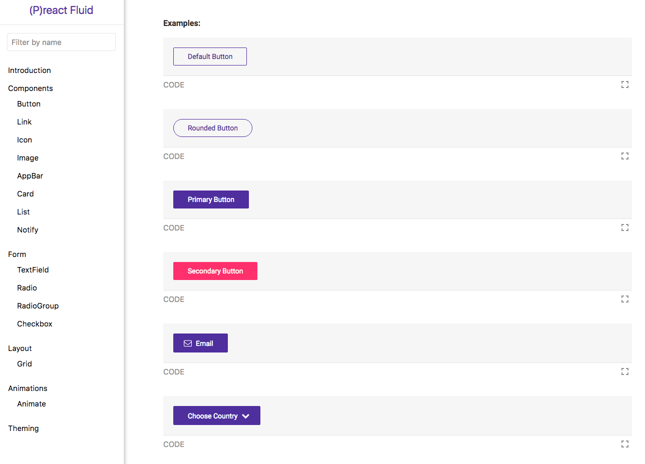
Docs created with styleguidist: https://ajainvivek.github.io/preact-fluid/
sapegin
commented
6 years ago @ajainvivek Looks cool!
 konradk
commented
6 years ago
konradk
commented
6 years ago  SaraVieira
commented
6 years ago
SaraVieira
commented
6 years ago 
We are also using it at Joyent: https://joyent-ui-toolkit.now.sh/
 stepancar
commented
6 years ago
stepancar
commented
6 years ago  artola
commented
5 years ago
artola
commented
5 years ago @stepancar Your styleguide customisation is great! ... could you please share it?
 elevatebart
commented
5 years ago
elevatebart
commented
5 years ago @artola a quick search in github just in case put me here
artola
commented
5 years ago @elevatebart Thanks a lot!
 tizmagik
commented
5 years ago
tizmagik
commented
5 years ago @konradk wow that is a really beautiful styleguide -- mind sharing the config/customizations you made for that? I especially like how the sample code is offset to the right column like that. 😍
 mealeyst
commented
5 years ago
mealeyst
commented
5 years ago I am starting to move our components at our organization over to styled components and I am using styleguidist as our organization's pattern library.
 gazpachu
commented
5 years ago
gazpachu
commented
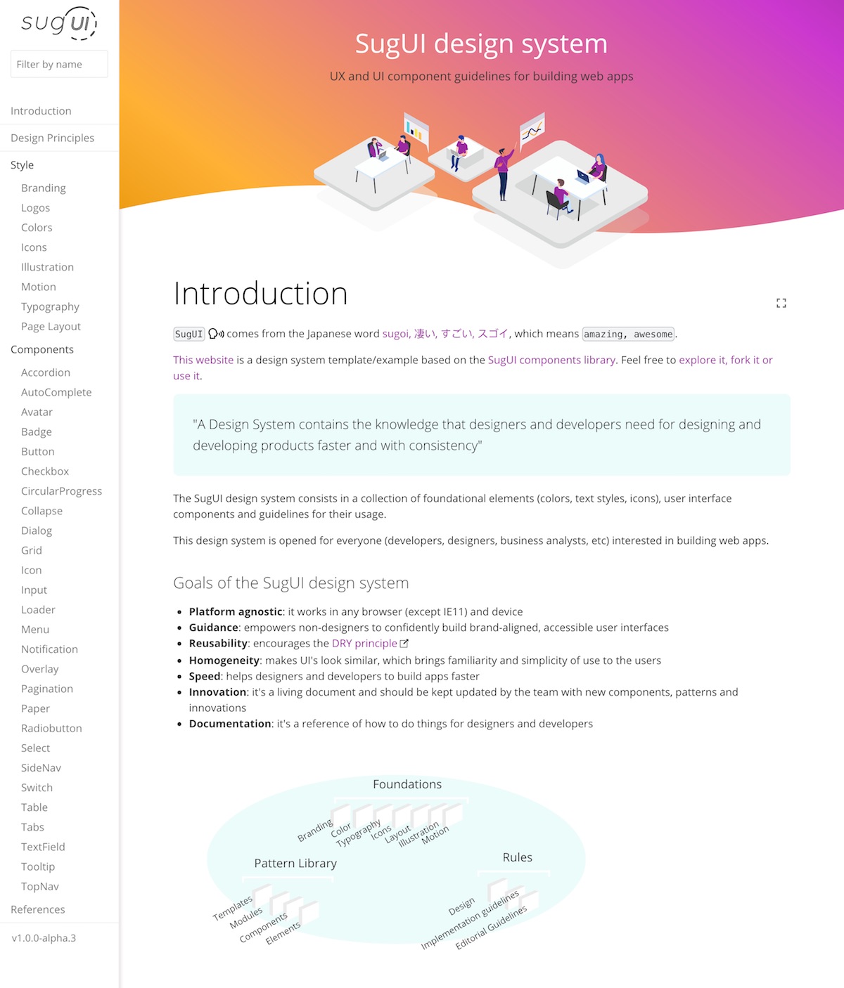
5 years ago Hiya!,
I've just released sugUI, a design system template based on Styleguidist that uses the sugUI components library: https://gazpachu.github.io/sugui-design-system/
 poteirard
commented
5 years ago
poteirard
commented
5 years ago  jenniesyip
commented
5 years ago
jenniesyip
commented
5 years ago Our design system for Udacity is using Styleguidist! https://veritas.udacity.design/

 galhavivi
commented
4 years ago
galhavivi
commented
4 years ago  hosseini44444
commented
2 years ago
hosseini44444
commented
2 years ago 


Do you use React Styleguidist in your project? Let us know about that! It’d be great if you can share some details: screenshot, link, number of components, etc.
We use it at Here for a component library that we use to develop internal tools. Right now we have 41 component and it’s growing: