It might be helpful for someone to reimplement snippets in a plugin as a test-bed.
Open FichteFoll opened 6 years ago
It might be helpful for someone to reimplement snippets in a plugin as a test-bed.
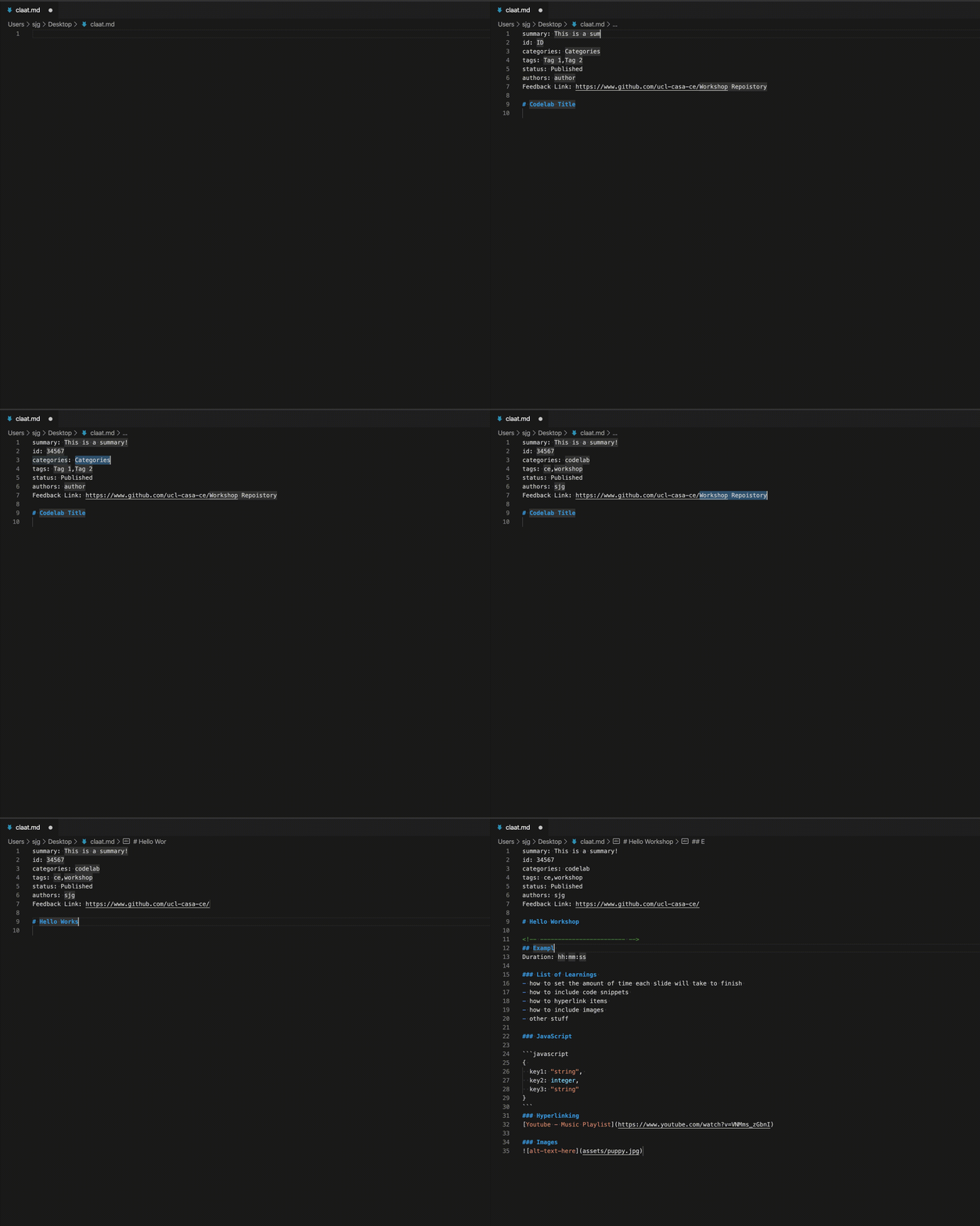
Here's a visualization example I found while reviewing packages. Probably from VS Code.

When you are within a snippet field and there are more fields to be tabbed to, it is not visible where you are going to jump to on the next tab press and, more importantly, that you have snippet fields active in the first place. The latter is only visible in the status bar as "Field x of y", which definitely not noticable enough.
Instead, I propose some visualization, for example colored vertical bars different from the caret, that indicate where you can still jump to. It probably needs to be experimented whether all remaining or only the next field should be shown, considering that through multiple selections each field can have multiple carets.
Related: #974