Team's Response
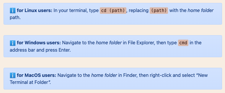
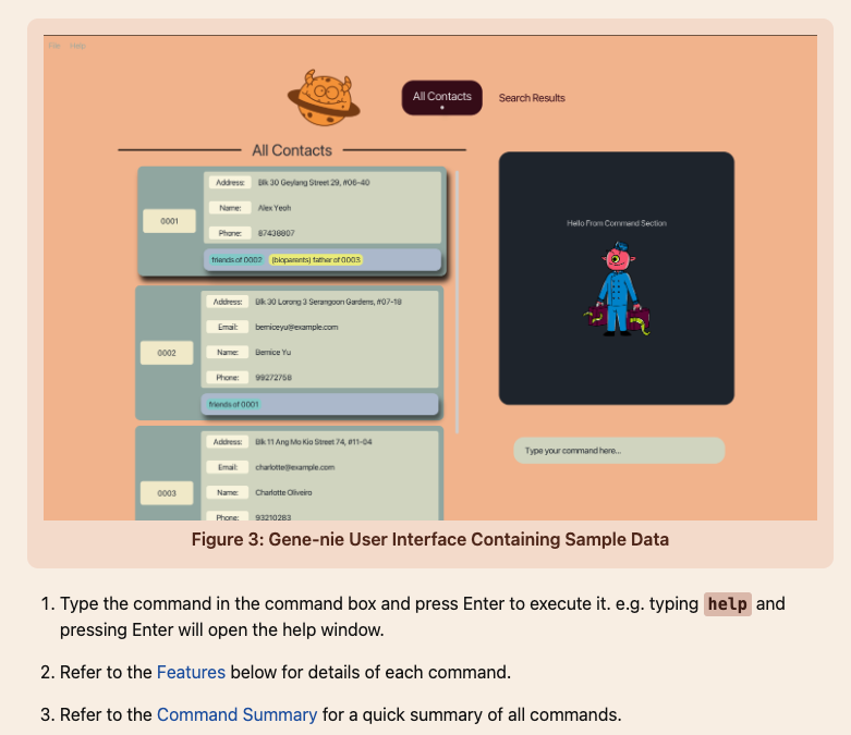
Thank you for your feedback. However, we feel that you have misread our Quick Start. It is 2 pages instead of the 9 pages that you wrote, where you may have counted the other sections not included in the Quick Start. Additionally, the information that is in the Quick Start section is how to install and start up our app. Furthermore, if you feel the 2 page Quick Start is too long, it also includes many information which may not be relevant to your OS but would be relevant to another user which does not have the same system architecture as yours. Shown below.
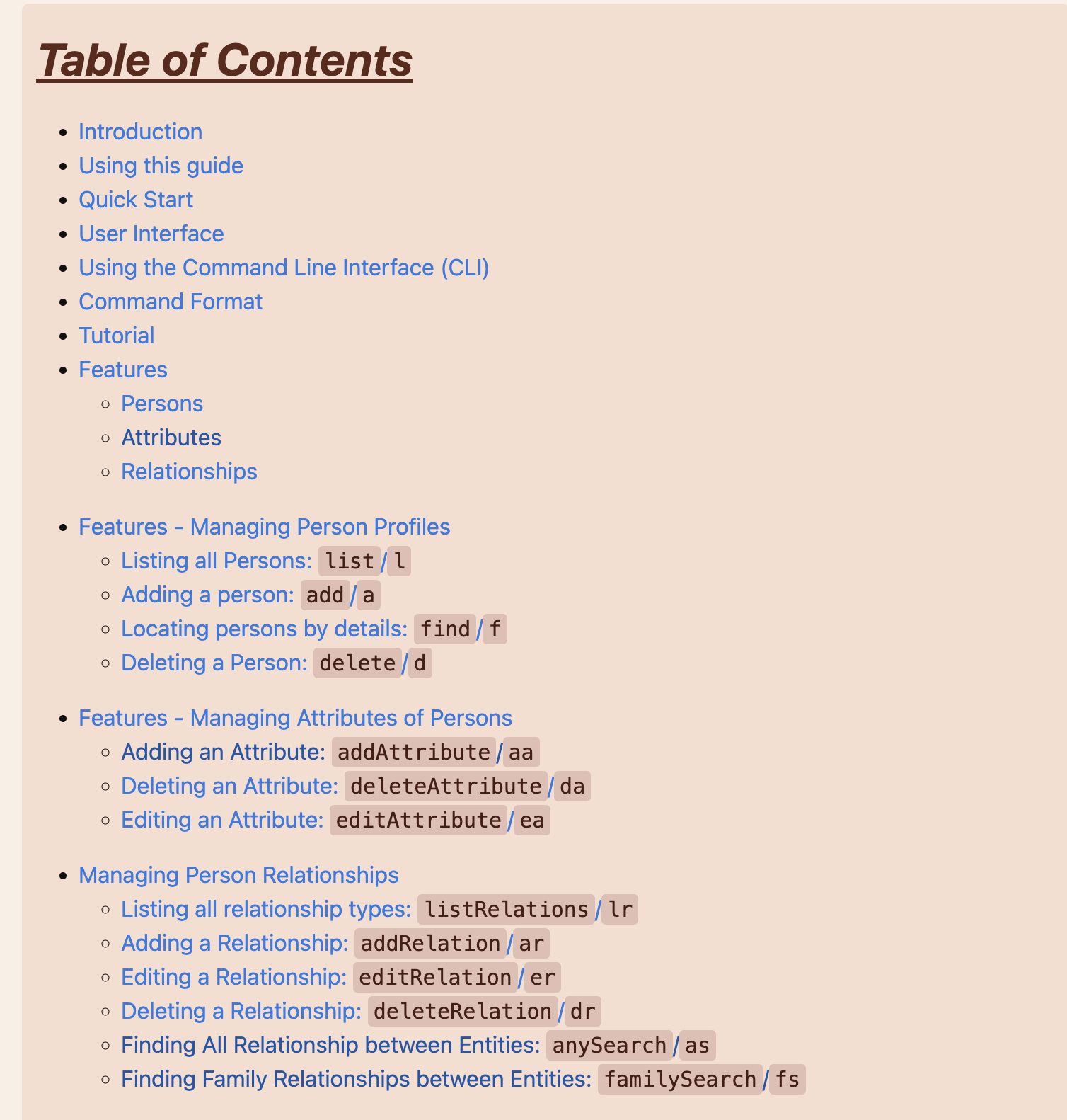
 Furthermore, the relevant information which the user needs to read is only 8 lines which includes how to install the app and to get the app started up properly in the users system. The rest of the information is tips and example images for users which are not as technically inclined as yourself. Furthermore, we hyperlinked the relevant sections for the user to click to allow for a more technically sound user such as yourself to quickly dive into the UG and get the app running to how you would want it to. See below for the hyperlinked example.

Additionally, due to the complexity of our app, we wanted to make sure that the user understands the various components of our app before they move on to actually using our features, hence, we believe that having a long introduction is justified. Moreover, for users that are more advanced, we have a table of contents right at the start of the user guide to enable users to navigate to the exact page that they want.

Furthermore, if this accepted as a bug it should not be of severity high. At best this would be of low severity as it only mildly hinders an above average user.
Items for the Tester to Verify
:question: Issue response
Team chose [response.Rejected]
- [x] I disagree
Reason for disagreement: Good use of hyperlinks! However, there is still an issue of readability. Perhaps your quickstart might be only a few pages long, but the UG indeed is very long and tedious to read through. It indeed might be very difficult for novice users to get lost in the plethora of information you have provided in the UG - which has its own benefits - but so does it have disadvantages.
The main issue I pointed out is that the UG might be a bit difficult to navigate for novice/amateur users. Perhaps, you can include some sample commands in your Quick Start/Tutorial so that new users can quickly get down to use the app right after installing it.
(I have included more feedback about it on this in my general feedback, if you are interested in that)
## :question: Issue severity Team chose [`severity.Low`] Originally [`severity.High`] - [ ] I disagree **Reason for disagreement:** [replace this with your explanation]
I love the way the UG is written - especially the playing around with words. It was fun reading the UG. However, it might not be as amusing for someone who just downloaded the app and has to read through 9 pages before they can add their first person... I love how informative the UG is, but please make it short. It took a long time to read the DG before I could actually start testing for bugs. Especially the Quick Start- which should be fast and succinct.