Team's Response
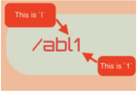
The font is the standard font, look at the font that you use for this issue, the "l" looks the same as the "1" used in the UUID, from your example, there is a clear difference between the "1" and "l", and an average user would definitely be able to see the difference. Here is the screenshots below to illustrate the difference better:

Furthermore, we will show you that even in the command box, when put side by side, you can see the clear difference between the "l" and "1", as shown below:

Hence, we feel that there is absolutely no ambiguity between the two, and this definitely cannot be considered a bug as it does not affect usage or readability at all.
Items for the Tester to Verify
:question: Issue response
Team chose [response.Rejected]
- [x] I disagree
Reason for disagreement: Perhaps you may wish reconsider my advice for changing the font you have chosen. I absolutely love the look and feel of the app and am impressed by the effort you team put in. However, you may wish to reconsider your decision as
- It might be that not everyone is blessed with the sharp eyesight.
- You are using two different fonts, interpretation of which might be arbitrary to the user.
Moreover, although your statement of "Furthermore, we will show you that even in the command box, when put side by side, you can see the clear difference between the "l" and "1", as shown below:" is warranted, you must remember, are using two different fonts in UUID and in the Command Box.
## :question: Issue severity Team chose [`severity.Low`] Originally [`severity.Medium`] - [ ] I disagree **Reason for disagreement:** [replace this with your explanation]
Font's "l" and "1" looks too similar. I advise using a different font for uuid field, at least.