[IMPORTANT!: Please do not edit or reply to this comment using the GitHub UI. You can respond to it using CATcher during the next phase of the PE]
Team's Response
Thanks for raising this issue! However, this is a known issue listed under "Planned Enhancements" in our Developer Guide (see https://ay2425s1-cs2103t-t15-4.github.io/tp/DeveloperGuide.html#planned-enhancements).

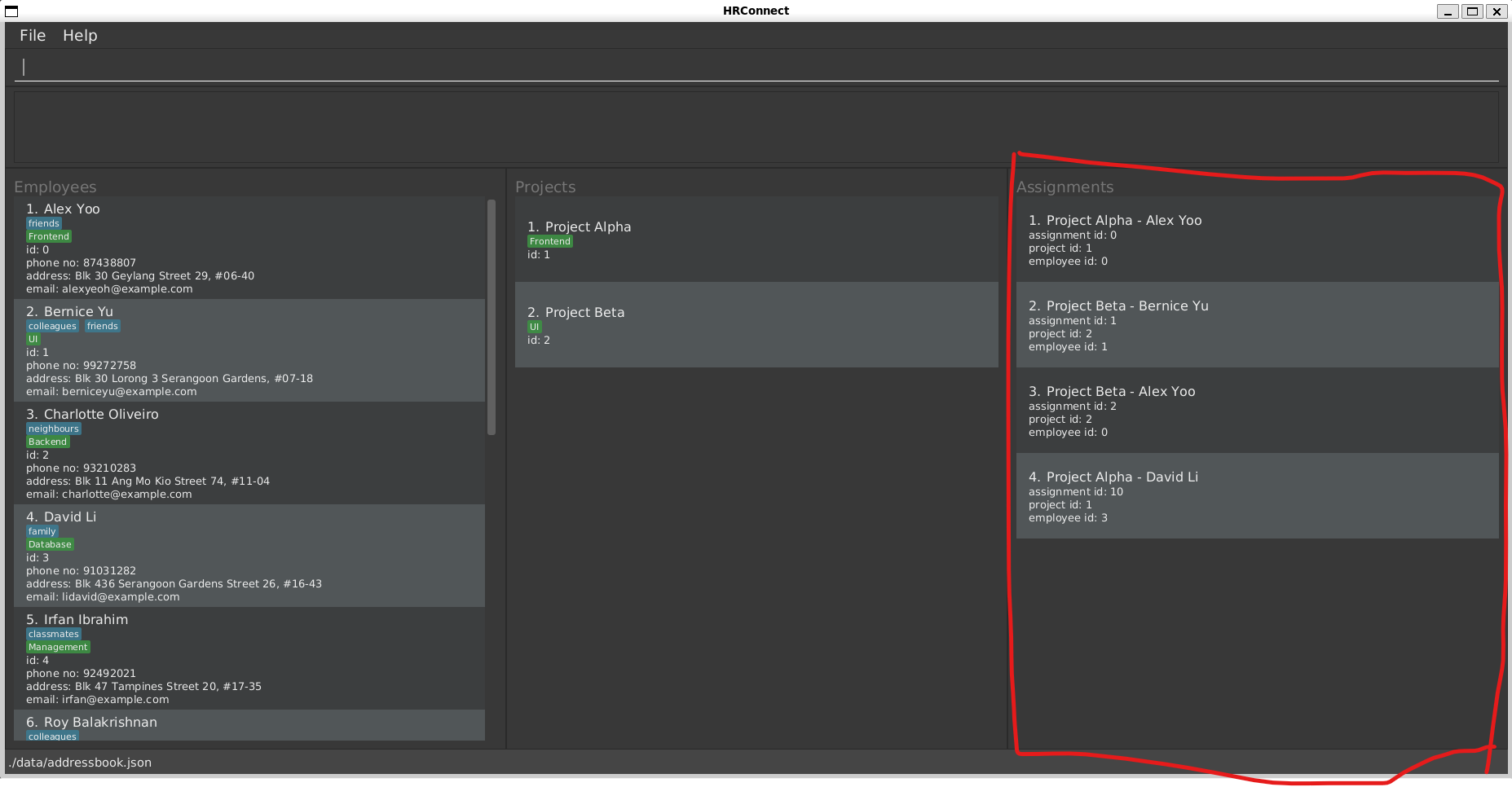
Furthermore, we think that both displaying the ids and the names are acceptable design choices. We chose to display the ids because different projects or employees can have the same name so we felt that displaying the id would be less ambiguous. Additionally, the names of the created assignment are displayed in a larger font under the assignments panel:

Nevertheless, thanks for raising this issue! We will consider different display formats in future iterations.
Items for the Tester to Verify
:question: Issue response
Team chose [response.NotInScope]
- [ ] I disagree
Reason for disagreement: [replace this with your reason]
After successful assignment, displaying the employee and project id's is not very meaningful and doesn't really help the user in cross checking if they assigned correctly. It would make more sense to include the names of the employee and project being assignment in the success message after successful assignment. Furthermore, the format where scrolling down to see each number is not the most user friendly. Consider having the message displayed in one sentence for ease of the user.