 nus-se-bot
commented
5 months ago
nus-se-bot
commented
5 months ago Team's Response
No details provided by team.
The 'Original' Bug
[The team marked this bug as a duplicate of the following bug]
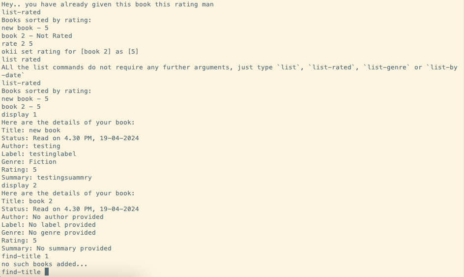
No spacing or borders between commands
The lack of spacing or separating lines between commands make previous commands hard to read. An example is given below, it is hard for the user to see what the command
display 1displays (i.e., what book it is talking about).Image for reference:
[original: nus-cs2113-AY2324S2/pe-interim#2185] [original labels: type.FeatureFlaw severity.VeryLow]
Their Response to the 'Original' Bug
[This is the team's response to the above 'original' bug]
Hi, thanks for pointing this out! We agree that it is kind of an eyesore...
Items for the Tester to Verify
:question: Issue duplicate status
Team chose to mark this issue as a duplicate of another issue (as explained in the Team's response above)
- [ ] I disagree
Reason for disagreement: [replace this with your explanation]
When doing multiple commands in a row, the UI printed becomes very cluttered, making it difficult for the user to know what is the information that is necessary to them. I suggest having some dividers.