Team's Response
This is not a formatting error and more of an issue with the layout of the commands. This should not be a hindrance to the user and if it was, the user could also use the command summary at the bottom of the UG that gives a concise look at all the commands. Also, this seems like a personal opinion of the author of the bug and may not apply to the entire target audience to be severe enough to be classified as a documentation bug.
Items for the Tester to Verify
:question: Issue response
Team chose [response.Rejected]
- [x] I disagree
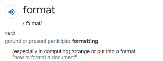
Reason for disagreement: The definition of format is as stated below:

The layout of your commands constitutes the arrangement of your commands and thus falls under a formatting error. As mentioned in my original bug, all other parts of the UG has related parts listed together as shown in this example below:


VS your team's decision here to mix the todo task commands between the lecture commands as shown below:


Your team had a total of 5 unrelated commands sandwiched between the lecture commands. Another interesting point to note is that your todo commands have their related commands listed together as shown above as well.
As a new user reading this document, it is natural that we will take a top down approach to reading your document, and I believe that this can be counted as a documentation bug simply by the way the rest of your UG is formatted, this does not seem to flow similarly and does confuse new users who would be confused as to why there is no delete/list command for lectures until the read through the next 5 commands to reach the place where the delete/list commands for lectures are listed.
Neatness/correctness:
Calendar listing/deleting lectures is not directly below calendar add lectures in UG, inconvenient for users looking at UG. As other parts of the UG has related parts listed together.
few more commands before