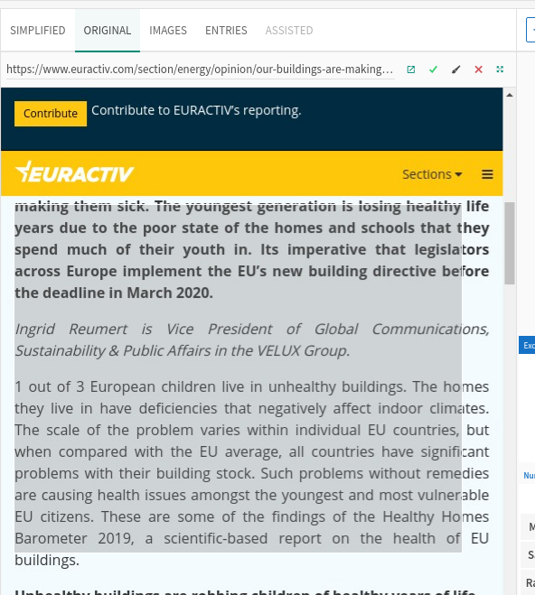
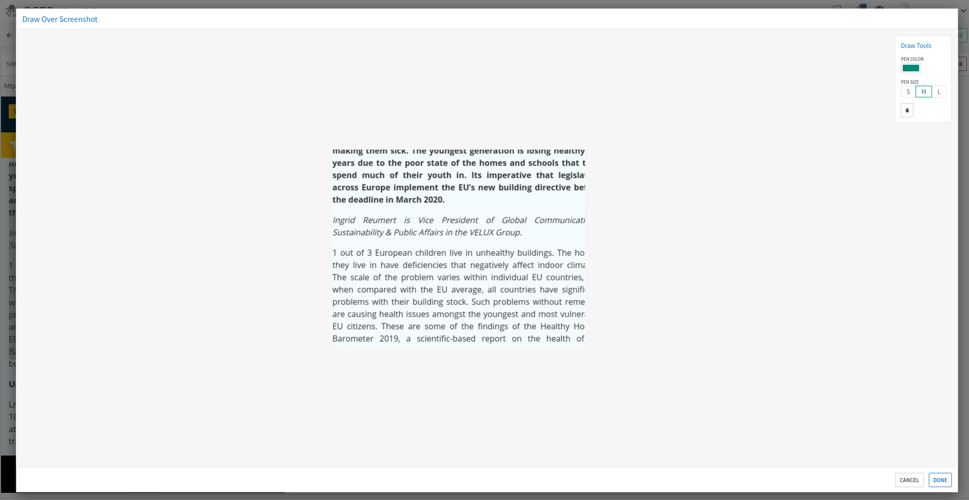
- Draw over the screenshot.
- Have clear action.
- Converted to the image after.
- Different size brushes and different colors.
- Support eraser.
Closed AdityaKhatri closed 4 years ago
@Mariam-Asatryan , here are the screenshots you requested. Let me know if you need anything else.


@AdityaKhatri Thanks for sharing these. So, I'd say the functionality is pretty good and clear. We will need to make more explicit icons, action bar, etc. But that will come with the UI library. In the meantime, may be worth replacing the brush with something else more explicit, like:

Not sure if this works. Also the action items are a bit too small.
Lastly, when you are in the edit view, do we need to go full-screen with the screenshot centered and action items quite far? May be worth making it much more around the screenshot size itself with of course enough space for the functionalities. This way Done and Cancel can be closer and more visible too. We will tackle those in the UI library too.
Please let me know if this makes sense. Thanks!
Thanks @Mariam-Asatryan , we'll work on the icons and try to work on the modal was well.