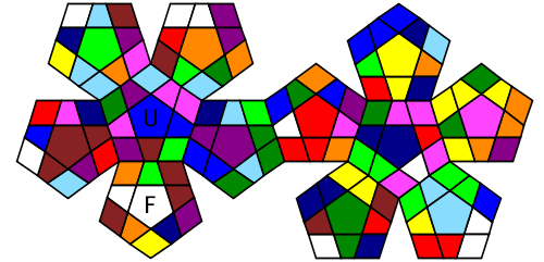
I'm gonna look into copying the Mark 2 layout and color scheme: http://www.cubing.net/mark2/#competition_name=&rounds=%5B%5B%22minx%22%2C%22Round%201%22%2C1%2C5%5D%5D
To consider: Label faces U and F.
Closed pedrosino closed 12 years ago
I'm gonna look into copying the Mark 2 layout and color scheme: http://www.cubing.net/mark2/#competition_name=&rounds=%5B%5B%22minx%22%2C%22Round%201%22%2C1%2C5%5D%5D
To consider: Label faces U and F.
Man, it was annoying enough writing my own code for Mark 2. In this case, I had to sort of give up and spaghetti it. But I think that it's pretty easy to interpret the scramble images now:

Top-part of the preview works if I start with middle-blue on front, on a mefferts color scheme. But the bottom doesn't.
Also, I don't like the preview shows no front face, but instead a B, RB, LB, LF and RF faces. Tilting the image some degrees might be good.