Can we add an indicator for location with 0 slots? I personally think it's useless to display the location, but maybe just a red border or something around the schedule button is fine

Closed resir014 closed 3 years ago
Can we add an indicator for location with 0 slots? I personally think it's useless to display the location, but maybe just a red border or something around the schedule button is fine

@pveyes This will need a rework on how we display each facilities' information in the VaxLocation card. We have a good start in #36, though.
Agree, 36 is good enough for now
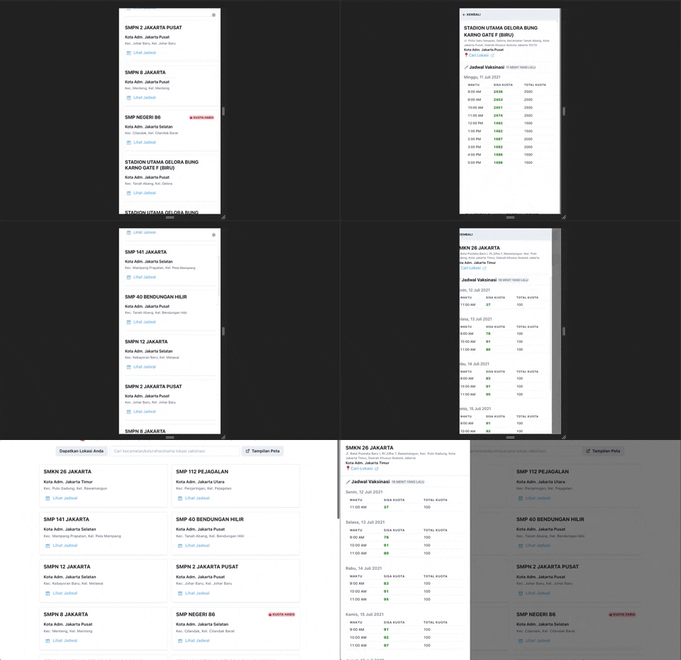
I quickly mocked together (in Tailwind CSS, lol) a possible redesign of the cards, right here:

https://play.tailwindcss.com/qVoFc70Nmq
"Lihat Jadwal" will open up a modal showing the details + address, as well as the schedule.

https://play.tailwindcss.com/mEWZ566LjS
Let me know if you have any comments, @pveyes.
Also @sonnylazuardi need to let me know if the above designs can be easily implemented on the map.
i think it's possible to put it on map popover
nice ❤️ it
what if we move the empty slot label above distance so it doesn't take too much horizontal space like this

@pveyes yep, that could work!
All the subtasks are done, I should be able to spend a night tomorrow implementing this redesign!
looking really good ✨
any chance we add tailwind to this repo? or chakra is enough?
All the data is on uppercase character right now, it cause loss of focus.
I think we didn't need to show all the data in uppercase. I mean, maybe we need to transform the data manually on the client, or it can be done on the API level (ideally it should be fix on the API)
The "faskes" name is okay to use an uppercase, but the rest are not ideal using uppercase.
It's already fixed here https://github.com/tibudiyanto/jakarta-vax-availability/pull/48
any chance we add tailwind to this repo? or chakra is enough?
@sonnylazuardi We can try to re-implement these in Chakra UI, I don't mind, lol.
I quickly mocked together (in Tailwind CSS, lol) a possible redesign of the cards, right here:
https://play.tailwindcss.com/qVoFc70Nmq
"Lihat Jadwal" will open up a modal showing the details + address, as well as the schedule.
https://play.tailwindcss.com/mEWZ566LjS
Let me know if you have any comments, @pveyes.
this looks great!
Decided to incrementally redesign this, instead of doing the whole thing as a "big bang" change. Current progress:

First phase of the redesign has a bug where it doesn't properly truncate. Tracking this in #66.
I also notice that some location title is still uppercase

@pveyes Yeah, I reverted the facility name to use the names as-is from the API. The remaining data (kec/kel, and kota administrasi) is still properly capitalised.
I'm currently working on overflow fix, should I normalize it to capital or let it be uppercase?
IMO. Capital is better for readability, but we can't always know if a name contains an acronym.
@arieare Yes, capitals are good for title, but when the entire card is all caps (like the raw value that we get it from the API), it can lead to disorientation.
We had to do string manipulation because the name + kec/kel + kota adm. values we get are all caps, since as I said above, having the entire card in all caps is also not a good idea.
 Hi All, I did some adjustments to the vax location card based on some references here. Put the location details, vax quota and schedules inside the drawer.
Let me know what do you guys think. If it's okay, I'll make a new PR. The drawer PR is #79
This issue is now finished! 🎉

Any further improvements to the card's design can be made as another issue/PR separate to this.
Thanks for the help <3
Tasks